Tired of staring at the same boring backsplash every time you cook? Kitchen backsplash ideas for 2026 focus on texture, natural materials, and unexpected patterns that turn your cooking zone into the most interesting part of the house. These kitchen backsplash tile ideas show you how to use herringbone layouts, vertical stacking, mosaic patterns, and statement materials to create a backsplash that works with white cabinets, wood tones, and modern kitchen designs. Save these kitchen backsplash ideas modern and farmhouse styles for your next update.
Have You Ever Noticed How Much A Backsplash Changes A Kitchen?
I spend a lot of time in kitchens – measuring them, sketching layouts, figuring out why one feels cramped while another with the same square footage feels open. And the backsplash is almost always the detail that tips a kitchen from functional to actually interesting. It’s the one surface you see constantly while you’re working at the counter, and it sets the tone for whether the whole space feels thoughtful or like someone just grabbed whatever was cheapest at the tile store.
The 2026 kitchen backsplash ideas I’m seeing move away from basic subway tile in straight rows and lean into texture, dimension, and materials that have some personality. Herringbone patterns, vertical stacking, natural stone with visible variation, textured ceramic, even bold color – these are the details that make a kitchen feel custom rather than builder-grade.
I’ll walk you through what’s working right now, from classic neutral palettes to more adventurous choices, and explain why certain patterns and materials hold up better than others in a space where you’re dealing with heat, moisture, and daily use.
1. Herringbone Backsplash In Neutral Tones
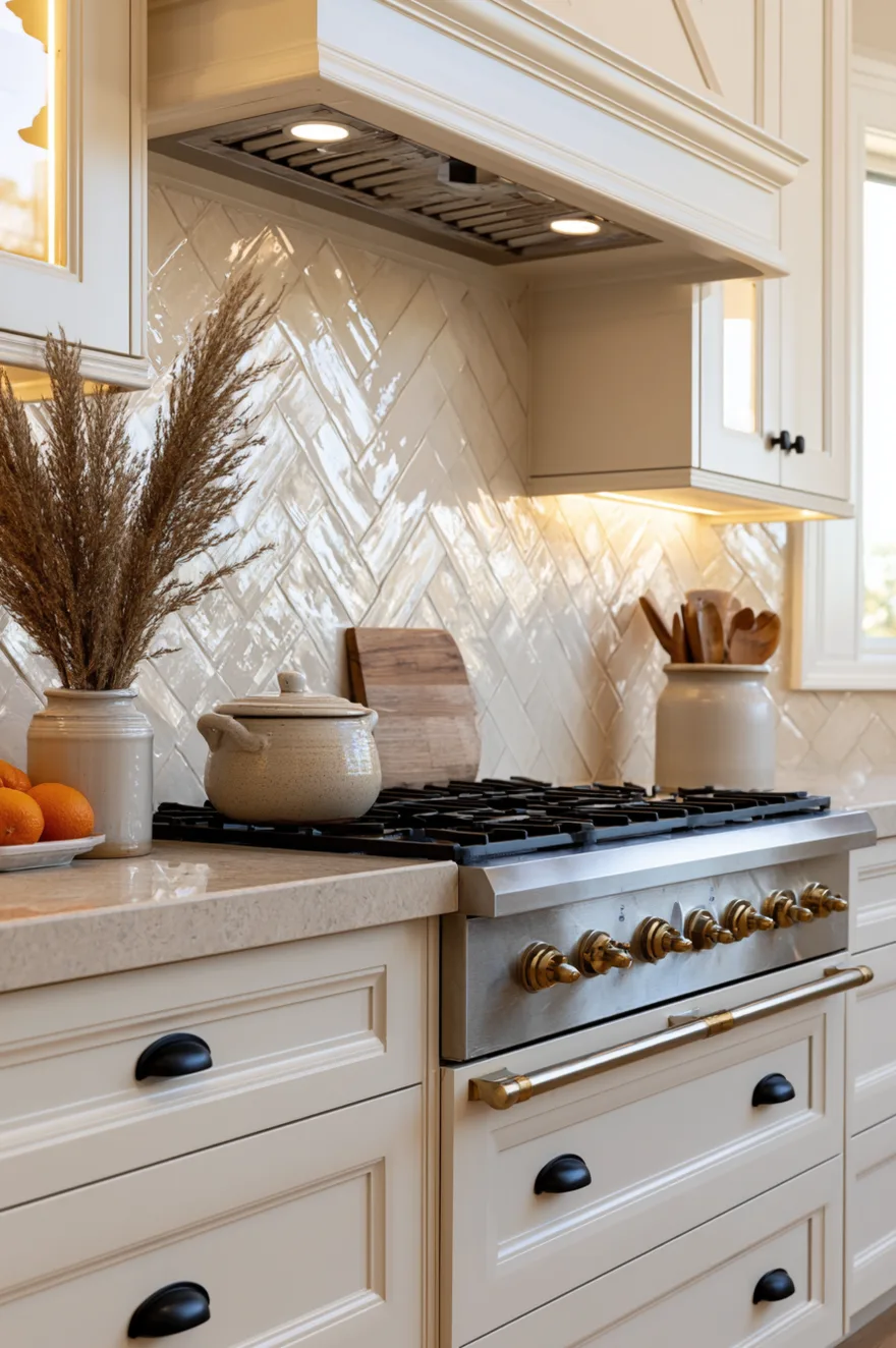
A herringbone pattern instantly makes any tile look more considered, and when you use it in cream or light beige tones, it adds visual interest without competing with the rest of the kitchen. The diagonal lines create movement across the wall, which is especially helpful in kitchens where the backsplash is the only place you have room for pattern.
I installed a herringbone backsplash in a client’s kitchen last year using 2×6 inch tiles in a soft cream with subtle texture, and the way the light hits it throughout the day keeps the space from feeling flat. Pair it with shaker cabinets and a natural stone counter, and the whole kitchen feels pulled together without looking like it’s trying too hard. The herringbone layout does take more time to install than a standard grid, so factor that into your budget if you’re hiring it out.
2. Open Shelving With Handmade Tile Backsplash
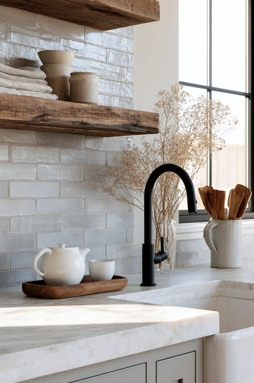
Handmade tiles have irregularities that make them feel more authentic than machine-made versions, and when you pair them with open wood shelving, the whole setup reads as intentional rather than rustic in a forced way. The slight variations in glaze and size add character without making the kitchen look overly styled.
Use a simple rectangular tile in a soft gray or beige with a glossy finish, and stack them in a standard grid or vertical layout to let the texture do the work. The open shelving breaks up the wall and gives you a place to display the ceramics and glassware you actually use, which makes the kitchen feel more lived-in. Just make sure the shelves are deep enough – at least 10 inches – so you can fit plates and bowls without everything looking crowded.
3. Colorful Square Tile In A Laundry Or Utility Kitchen
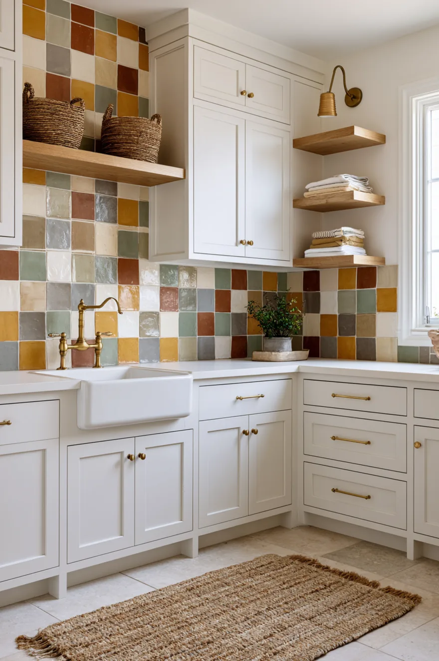
Laundry rooms and utility kitchens are good places to take more risk with color because they’re not the main kitchen, so if the trend shifts or you get tired of it, the stakes are lower. Use handmade square tiles in a mix of earthy tones – ochre, rust, sage, cream, gray – and arrange them in a random or patchwork layout for a collected look.
Pair the colorful tile with white or cream cabinets and brass hardware to keep the space feeling intentional rather than too casual. Add open wood shelving and woven baskets to reinforce the organic, handcrafted feel. The colorful backsplash turns a purely functional space into something you don’t mind spending time in, which matters more than people realize when you’re folding laundry or dealing with household chores.
4. Vertical Stack Tile For A Modern Look
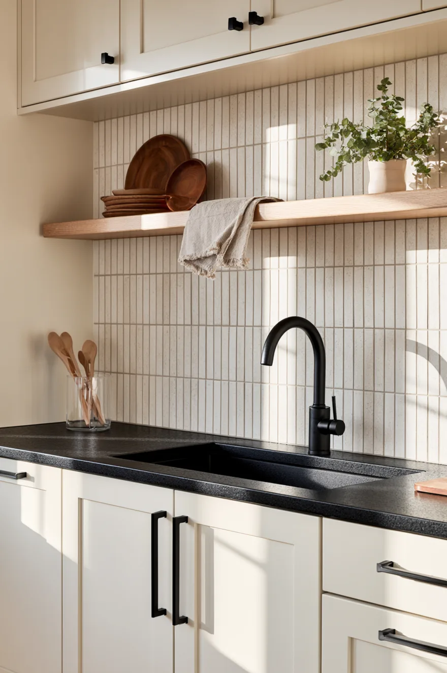
Vertical stacking – where tiles run up and down rather than left to right – elongates the wall and makes standard 8-foot ceilings feel taller. It’s a simple shift from the usual horizontal layout, but it changes the proportions of the room in a way that feels more modern without requiring any special materials.
Go with a narrow tile in a neutral tone – something like 2×8 inches in a soft taupe or greige – and keep the grout lines tight and consistent. The vertical emphasis works especially well in kitchens with a lot of upper cabinets because it breaks up all that horizontal cabinetry and gives your eye somewhere else to go. Pair it with matte black hardware and a dark countertop to keep the contrast strong.
5. Bright Yellow Subway Tile For A Cheerful Kitchen
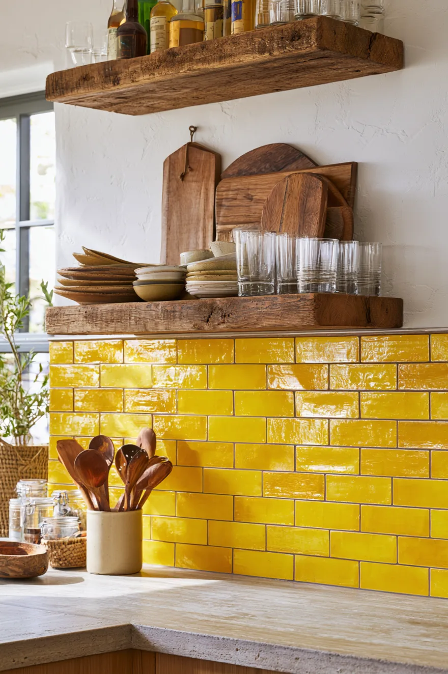
Yellow tile might feel like a risk, but when you use it in a warm golden tone rather than a neon or lemon yellow, it reads as sunny and inviting rather than overwhelming. Pair it with open wood shelving, brass or copper accents, and warm-toned countertops to reinforce the vintage-inspired look.
This works best in kitchens with good natural light because the yellow tile amplifies whatever light is already there. If your kitchen is on the darker side, test a few tile samples on the wall and live with them for a week to see how the color shifts throughout the day. The key is making sure the yellow feels warm and golden rather than too bright or artificial, which means sticking with glazes that have some depth to them rather than a flat, uniform finish.
6. Textured Linear Tile With Integrated Lighting
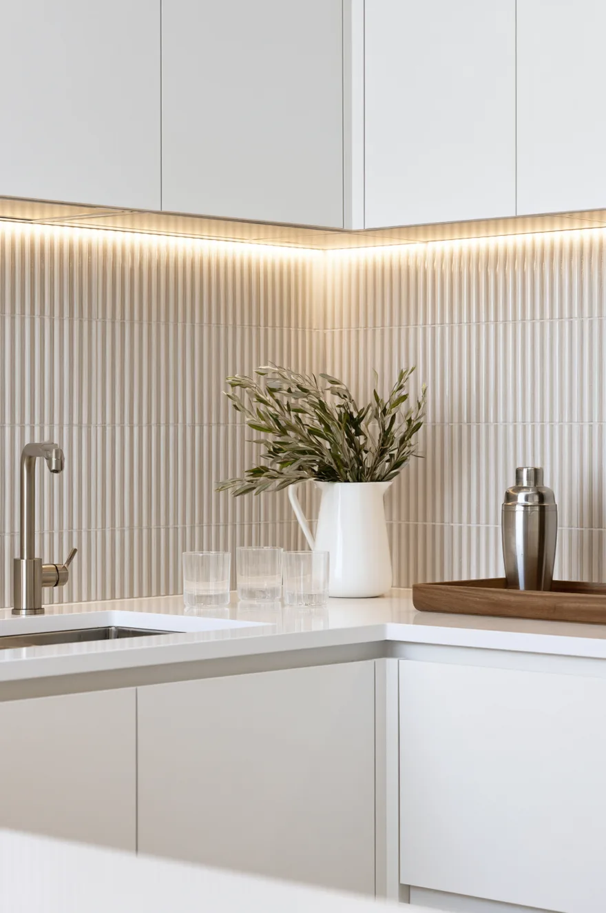
Adding LED strip lighting under the upper cabinets transforms a backsplash from a static surface into something that shifts throughout the day. When you use a textured linear tile – something with ridges or a ribbed pattern – the light catches those grooves and creates shadows that make the whole wall feel dimensional.
I’ve used this setup in a few projects where the kitchen doesn’t get much natural light, and the difference is immediate. Go with a warm white LED around 2700K so the light doesn’t read as clinical, and make sure the tile has enough depth to actually cast shadows – a flat tile won’t give you the same effect. The ribbed pattern works best when it runs horizontally because it complements the linear shape of most countertops and cabinets.
7. Open Concept Kitchen With Two-Tone Cabinetry And Marble Backsplash
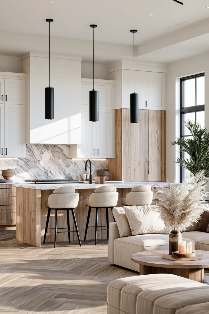
In an open-plan layout where the kitchen flows into the living space, the backsplash becomes more visible from multiple angles, so it’s worth investing in a material that has some presence. Marble – especially something with soft gray or gold veining – adds enough visual weight to anchor the kitchen without overpowering the rest of the room.
Pair a marble slab backsplash with two-tone cabinetry – white uppers and wood-tone lowers – to create layers of contrast that keep the space from feeling too uniform. The marble should run from counter to upper cabinets in one continuous piece if your budget allows it; the fewer seams, the more polished it looks. This setup works best in kitchens with good natural light because the veining changes appearance depending on how the light hits it.
8. Vertical Multicolor Tile For An Artisan Look
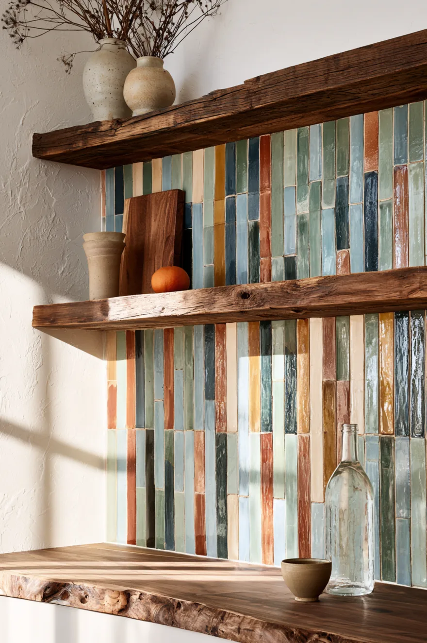
Handmade tiles in varying colors stacked vertically create a striped effect that feels artisan without being overly rustic. Use colors that share the same saturation level – soft blues, greens, yellows, oranges, and creams – so they read as a cohesive palette rather than random leftovers from different projects.
The vertical orientation makes the ceiling feel higher, and the color variation keeps your eye moving across the wall rather than landing on any one spot. This works especially well in kitchens with simple cabinetry and minimal hardware because the backsplash provides all the visual interest. Pair it with open shelving or a single floating shelf to break up the tile and give the wall some breathing room.
9. Luxury Black Cabinets And Marble
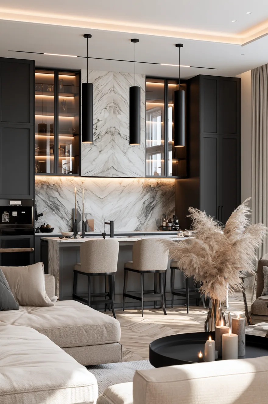
Black cabinets have more staying power than trendy colors, and when you pair them with a marble backsplash and thoughtful lighting, the kitchen feels expensive without relying on flashy details. Use a slab marble with noticeable veining behind the cooktop as a focal point, and keep the surrounding backsplash simpler – either the same marble in smaller tiles or a coordinating neutral.
Glass-front upper cabinets with interior lighting add another layer of finish and give you a place to display glassware or ceramics that tie into your color palette. The key is balance – if you go bold with the marble, keep the cabinet hardware understated, and if you use dramatic pendant lights, let the backsplash stay neutral. I’d stick with brass or aged brass hardware to warm up the gray tones and prevent the kitchen from feeling too cool.
10. Mosaic Wave Backsplash For A Coastal Feel
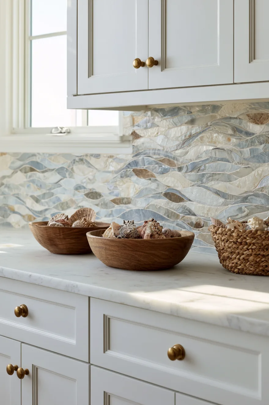
A mosaic backsplash with a wave or organic pattern brings in movement and texture without requiring a bold color. Use tiles in soft blues, grays, and creams arranged in a flowing pattern that mimics water, and the result feels intentional without being theme-heavy.
This works especially well in coastal homes or anywhere you want the kitchen to feel a little softer and less angular. Pair it with white shaker cabinets and brass hardware to keep the overall look grounded, and use a white or light marble countertop to let the backsplash be the focal point. The mosaic installation is more labor-intensive than standard tile, so expect to pay more for both materials and labor – but the payoff is a backsplash that doesn’t look like anyone else’s.
11. Mother Of Pearl Mosaic For Subtle Glamour

Mother of pearl tiles catch light in a way that standard ceramic or stone can’t, and the iridescent finish adds a layer of sophistication that works in both traditional and modern kitchens. Use small square or rectangular mosaic tiles in white or cream, and the result is subtle enough for everyday use but special enough to feel like a deliberate upgrade.
Pair this backsplash with white or light gray cabinets and polished brass faucets and hardware – the warm metal tones complement the shimmer without making the space feel overly decorated. This material shows water spots and fingerprints more than matte tile, so plan to wipe it down regularly if you’re particular about keeping things pristine. The tradeoff is worth it if you want a backsplash that changes throughout the day as the light shifts.
12. Marble With Gold Hardware
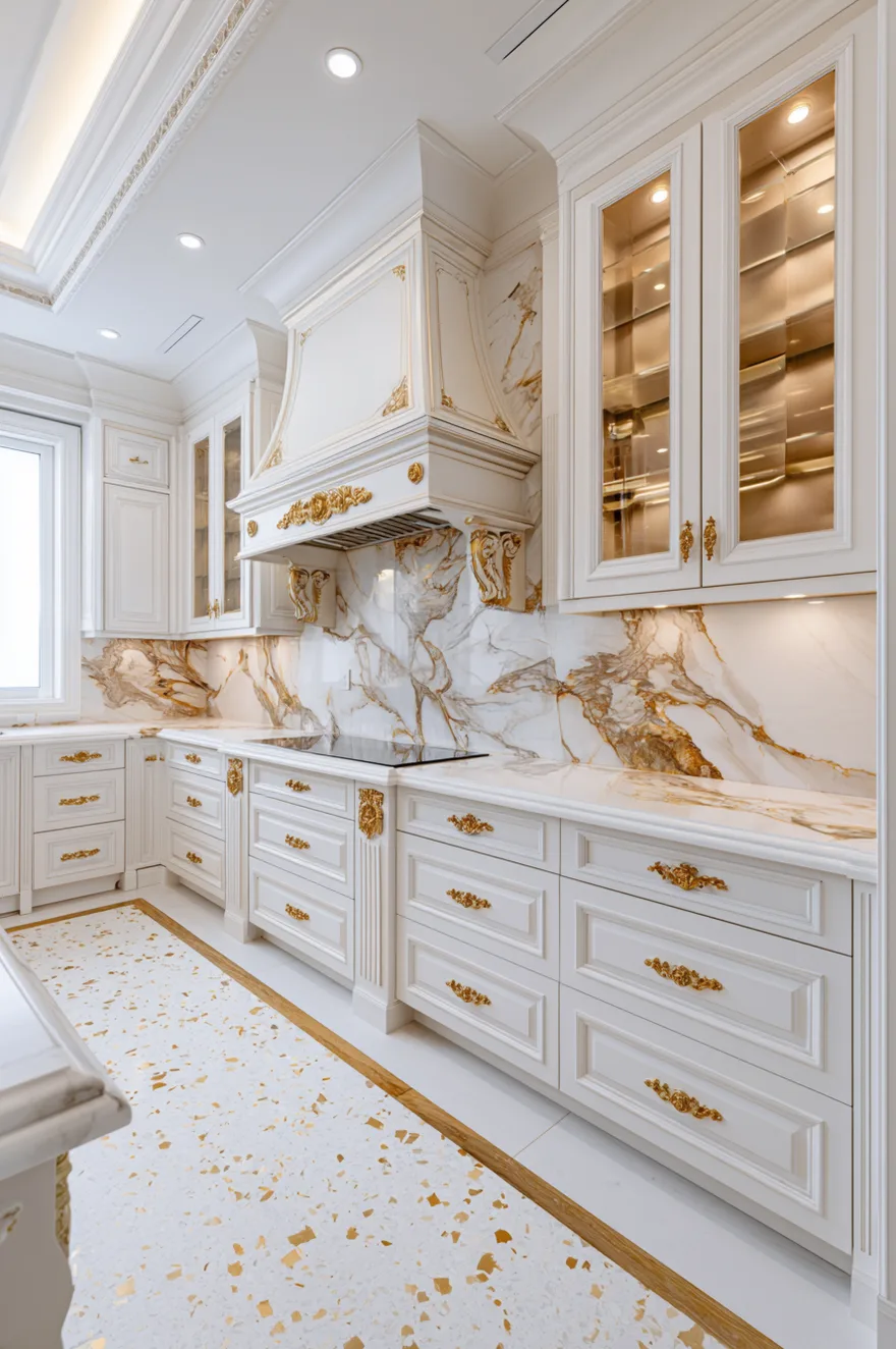
When you run the backsplash all the way to the ceiling – or at least to the bottom of a decorative range hood – the kitchen feels more finished and the proportions shift in a way that makes the space seem grander. Use a high-end material like marble or a coordinating stone, and add gold or brass hardware throughout to tie everything together.
This approach works best in kitchens with 9-foot or higher ceilings; in standard 8-foot spaces, a full-height backsplash can make the room feel shorter unless you use a vertical tile pattern to counteract it. The gold hardware – drawer pulls, cabinet knobs, faucet – should all be in the same finish family to keep the look cohesive. I’d avoid mixing polished brass with brushed gold; pick one and stick with it throughout.
13. Honeycomb Tile For Geometric Interest
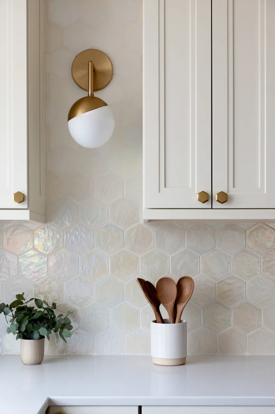
Hexagonal tiles – especially in a larger format like 4 or 6 inches – add geometric interest without feeling too busy, and the honeycomb pattern works in both modern and transitional kitchens. Use them in a glossy finish if you want the backsplash to reflect light, or go matte if you prefer a softer, more understated look.
I like pairing honeycomb tiles in a soft cream or ivory with brass or gold accents – the geometric pattern reads as modern, but the warm tones and metallic hardware keep it from feeling cold. The installation is straightforward since hexagonal tiles come on mesh sheets, but make sure your installer pays attention to alignment; if the pattern is even slightly off, it’s immediately noticeable. This is one of those details where precision matters more than speed.
14. Geometric Pattern Tile With Detailed Molding
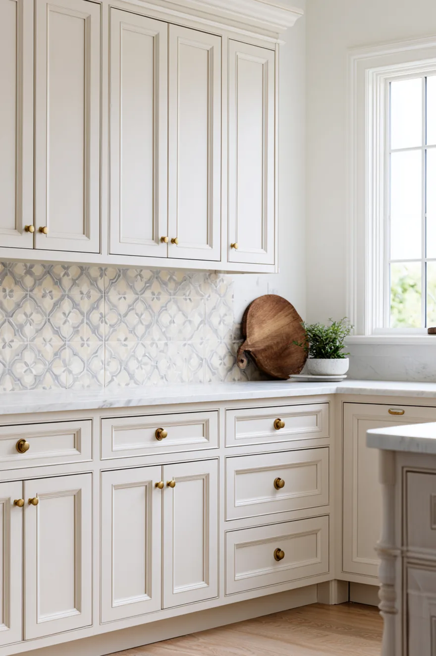
If your kitchen has traditional details like crown molding and raised-panel cabinets, you can use a patterned tile backsplash to add another layer of visual interest without the space feeling too fussy. Go with a geometric pattern in neutral tones – something like a quatrefoil or Moroccan-inspired design in cream, beige, and soft gray – and let the pattern do the work.
The key is making sure the tile pattern doesn’t compete with the cabinet detailing. If your cabinets already have a lot going on, keep the tile pattern smaller and more subdued; if the cabinets are simpler, you have more room to use a bolder tile. Brass hardware and a warm-toned countertop help tie everything together and prevent the kitchen from reading as too formal or museum-like.
15. Two-Tone Cabinets With Taupe Upper Trim
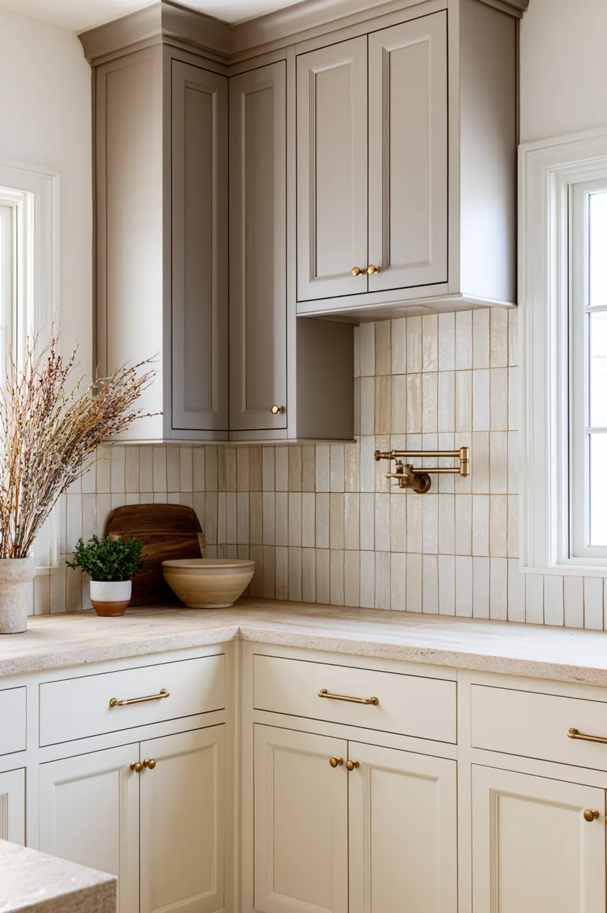
Using a darker tone on the lower cabinets and a lighter tone on the uppers creates visual weight at the base of the kitchen, which makes the space feel more grounded. Pair this with a neutral backsplash – something in taupe or soft gray – and the two-tone effect stays subtle rather than reading as a trend that will date quickly.
The backsplash should bridge the two cabinet colors, pulling in tones from both so the transition doesn’t feel abrupt. I usually run the darker cabinet color up to counter height and then switch to the lighter tone for the uppers, with the backsplash acting as the buffer zone between them. This setup works especially well in kitchens where you want some contrast but don’t want to commit to a bold color or pattern.
16. Textured White Oak Backsplash With Natural Wood Hood
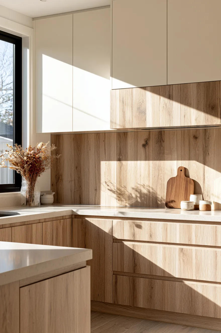
A wood backsplash – especially when it’s the same wood as a custom range hood – creates a cohesive look that feels warm and organic. Use white oak with a matte finish and visible grain, and treat it with a water-resistant sealer rated for kitchen use so it holds up to splashes and heat.
This works best when the wood is installed with tight seams and runs vertically to elongate the wall. Pair it with cream or light gray cabinets so the wood reads as an accent rather than overwhelming the space, and keep the countertops light to maintain contrast. The wood backsplash needs more maintenance than tile – you’ll need to wipe it down regularly and reseal it every few years – but the warmth it adds is hard to replicate with any other material.
17. Warm Beige Subway Tile With Brass Fixtures
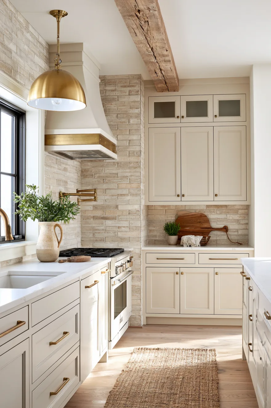
Subway tile gets a bad reputation for being overdone, but when you use it in a warm beige instead of stark white and pair it with brass fixtures, it feels more considered. The key is choosing a tile with some texture or slight variation in tone so it doesn’t read as flat and one-dimensional.
Run the tile in a standard horizontal layout with tight grout lines, and use a grout color that’s a shade darker than the tile to define each piece without creating harsh contrast. The brass faucet and hardware warm up the neutral palette and prevent the kitchen from feeling too safe or builder-grade. If you want to take it a step further, add a brass range hood or open shelving with brass brackets to reinforce the metallic accents throughout the space.
18. Colorful Geometric Tile For A Bold Statement
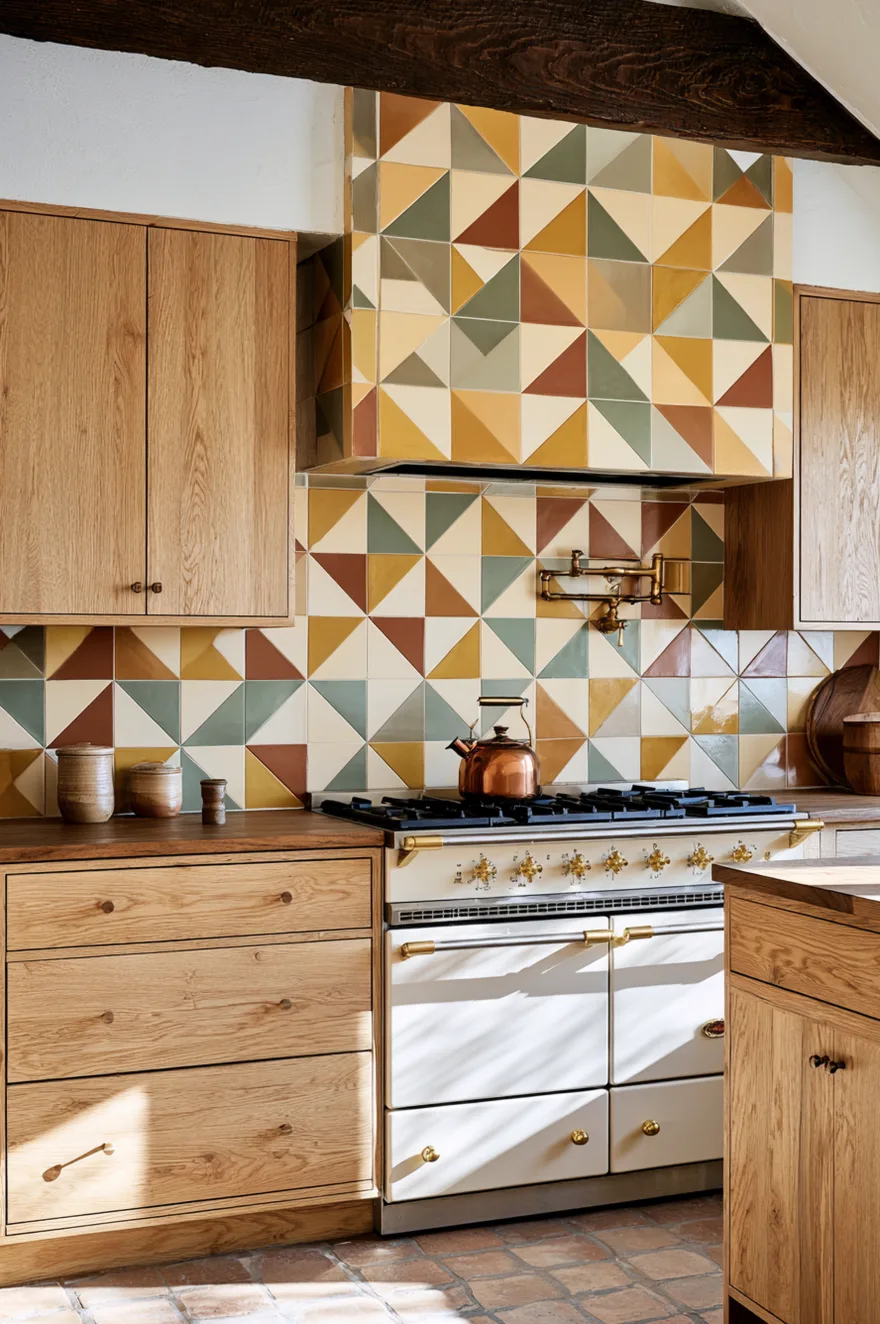
If you’re willing to commit to color, a geometric backsplash in warm tones – mustard yellow, terracotta, sage green, cream – can anchor the entire kitchen and make it feel more personal. Use a tile with a repeating pattern where the colors shift across the surface, and keep the rest of the kitchen neutral so the backsplash can be the focal point.
This approach works best in kitchens with white or light wood cabinets and simple hardware. The colorful tile provides all the personality you need, so resist the urge to add patterned curtains or busy countertop accessories. One bold element is enough; pile on more and the kitchen starts to feel chaotic rather than intentional.
19. Terrazzo Countertop And Backsplash For A Cohesive Look
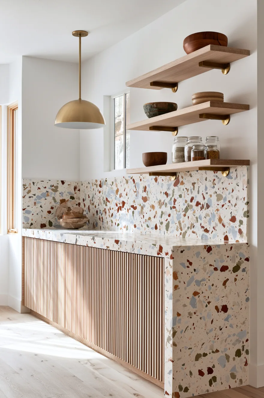
Running the same material on both the countertop and backsplash creates a seamless look that makes the kitchen feel more custom. Terrazzo – with its speckled pattern of stone chips in a neutral base – works especially well for this because the pattern has enough variation to stay interesting across a large surface.
Use terrazzo in cream or beige with flecks of rust, sage, and gray, and pair it with wood-toned cabinets to warm up the stone. The terrazzo should wrap from the counter up the wall in one continuous surface if possible; if seams are necessary, make sure your fabricator places them strategically so they’re less noticeable. This setup requires a bigger upfront investment than tile, but the lack of grout lines and the seamless appearance make it worth considering if you’re doing a full renovation.
20. Neutral Plaster Wall With Mixed Material Backsplash
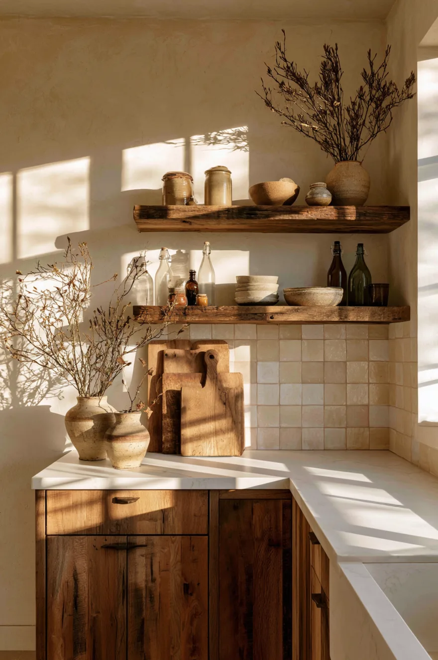
A textured plaster wall paired with a small section of tile or stone backsplash behind the cooktop creates a layered look that feels collected rather than overly coordinated. Use the plaster in a warm off-white or soft beige, and choose a backsplash material with visible texture – something like handmade tile, natural stone, or even reclaimed wood.
This approach works especially well in kitchens where you want a softer, more organic feel. The plaster provides a neutral backdrop that lets the materials shine, and the combination of finishes – smooth plaster, textured tile, warm wood – gives the space depth without requiring bold colors or patterns. The plaster does show scuffs and marks more easily than painted drywall, so plan to touch it up periodically if you’re particular about keeping it pristine.
Picking The Right Backsplash For Your Kitchen
The backsplash you choose should make sense with the cabinets, countertops, and overall style you’re working with. Herringbone and vertical layouts add pattern without color, making them safe bets for neutral kitchens. Handmade tiles, terrazzo, and wood bring in texture and warmth that work well with modern farmhouse or organic modern styles. Colorful geometric patterns and bold subway tile are for kitchens where you’re ready to commit to a specific look and aren’t worried about resale value in the next few years.
Which of these kitchen backsplash ideas feels like the right fit for your space? Let me know in the comments which style you’re leaning toward – I’d love to hear what direction you’re taking your kitchen.
See you soon,
Rachel