Warm neutral bathroom ideas are everywhere right now, but most of them stop at “beige walls and a wood vanity” without explaining the underlying logic. What separates a bathroom that feels grounded and genuinely calm from one that just feels unfinished is a specific sequence of decisions – wall texture before fixtures, stone temperature before tile pattern, light quality before anything else. Work through these ideas in order and the whole room lands differently.
Seattle bathrooms have a lighting problem. We get roughly 226 overcast days a year, which means a bathroom with a single overhead fixture and stark white walls reads less like a calm spa and more like a fluorescent-lit waiting room. I noticed this pattern long before I switched from architecture to interiors – even in well-designed buildings, the bathrooms were always an afterthought. Same cool white tile, same chrome fixtures, same single can light doing nothing for anyone’s skin tone or the room’s proportions.
The fix isn’t complicated, but it is sequential. Warm neutral bathrooms work because every surface – wall, floor, vanity, fixture – sits in the same temperature family. Pull one element cold and the whole room fights itself. The sections below walk through each decision in roughly the order I’d make it: the big anchor pieces first, then the details that lock everything together. None of this requires a gut renovation. Several of these moves cost less than a new light fixture.
1. The Freestanding Tub That Earns Its Floor Space
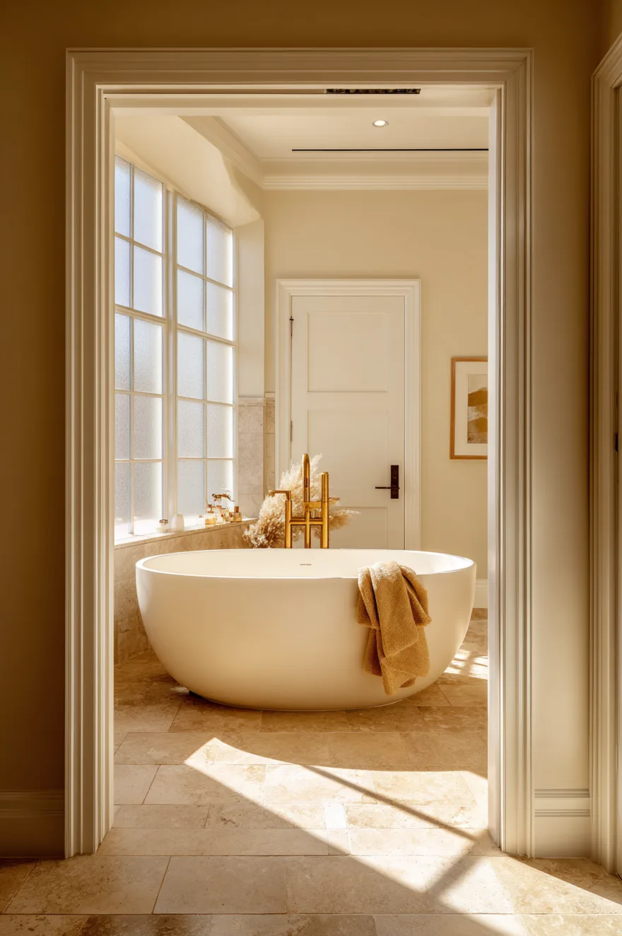
A freestanding tub only makes sense if the room is large enough that it doesn’t simply block traffic – and if the floor beneath it is worth showing. A large-format warm limestone tile (something in the 24-by-48-inch range) handles both problems at once. The slab-like scale of the tile makes the floor itself a design element, so the tub reads as placed within something considered rather than just dropped into the center of the room.
The fixture pairing matters more than most people expect. Unlacquered brass on a freestanding filler will age toward a honey-brown over a few years, which deepens in tone alongside the limestone rather than contrasting against it. Polished chrome would compete. A single linen towel draped over the tub rim does more visual work than a full towel rack – it breaks the hard silhouette of the tub without adding furniture. And if the window is frosted and west-facing, late afternoon light rakes across the limestone at a low angle that shows every fossil and variation in the stone. That’s the moment the room earns its floor plan.
If you’re choosing the tub first, go matte white over glossy. Gloss shows water spots within a week, and in a warm neutral bathroom it reads slightly clinical against the softness of the stone.
2. Warm Neutral Bathroom Ideas Start With The Wall
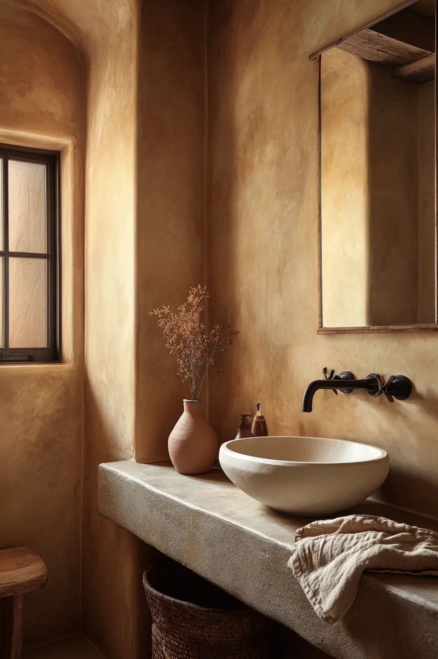
Before you choose a single fixture, commit to the wall finish. Limewash plaster in a sandy ochre tone is my preferred starting point for warm neutral bathroom ideas because the texture is doing real work – it shifts from pale gold in morning light to something closer to deep terracotta by dusk. That range of tone means the room never looks flat and you don’t need art to make the walls interesting.
Pair it with a simple white ceramic vessel sink and dark iron hardware, not brass. Against an ochre limewash wall, iron reads as honest and grounded where brass would read as decorative. The contrast also sharpens the sink’s silhouette. Apply the limewash in two thin layers and leave the variation visible – smoothing it out defeats the purpose entirely.
3. Why A Light Wood Bathroom Vanity Changes Everything
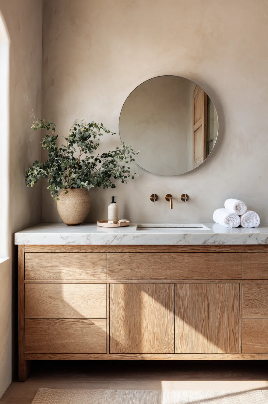
Rift-sawn white oak reads differently than plain-sawn. The grain runs straight and tight rather than producing the cathedral-arch pattern most people picture when they think “wood vanity,” and in a bathroom that matters because rift-sawn stays visually calm at close range. Paired with a honed Calacatta marble slab top – not polished, honed – the wood and stone sit beside each other without competing. Honing removes the mirror-like surface and brings the marble’s temperature down toward warm ivory rather than bright white.
The finish question: matte oil or matte lacquer, not satin or gloss. Satin lacquer on white oak turns slightly plasticky in natural light, and a bathroom vanity gets touched constantly. A hardwax oil finish shows the grain more honestly and is easier to spot-repair. The warm wood tone bridges a cooler stone counter and a warm greige wall by sitting precisely between them in temperature – it’s neither as cool as the marble nor as warm as the plaster, so both read correctly.
One practical note: specify the hardware before you finish the door fronts, because the pull hole placement affects the grain reveal. I made the opposite mistake once and had to re-drill.
4. Terrazzo Floor Bathroom Done In Earth Tones
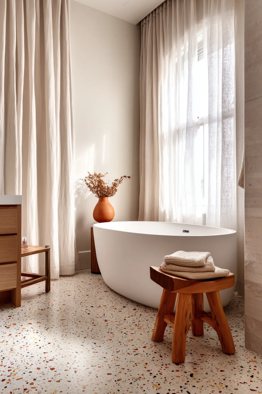
Most people’s mental image of terrazzo is the speckled grey you find in 1970s office lobbies. That version is cold and institutional. The move for a warm neutral bathroom is a cream binder with warm rust, tan, and mushroom aggregate chips – the floor ends up reading like a poured stone, earthy and irregular, with enough tonal variation that it carries the whole warm palette upward without requiring a single accent wall.
Poured-in-place terrazzo is expensive (budget around $25-45 per square foot installed, depending on aggregate and region), but precast terrazzo tile has gotten genuinely good. The floor does so much compositional work – anchoring the palette, adding texture, eliminating the need for a patterned wall – that it often simplifies every other decision. Choose the terrazzo first, then pull the wall color from its lightest chip.
5. Gold Bathroom Fixtures As The Punctuation Mark
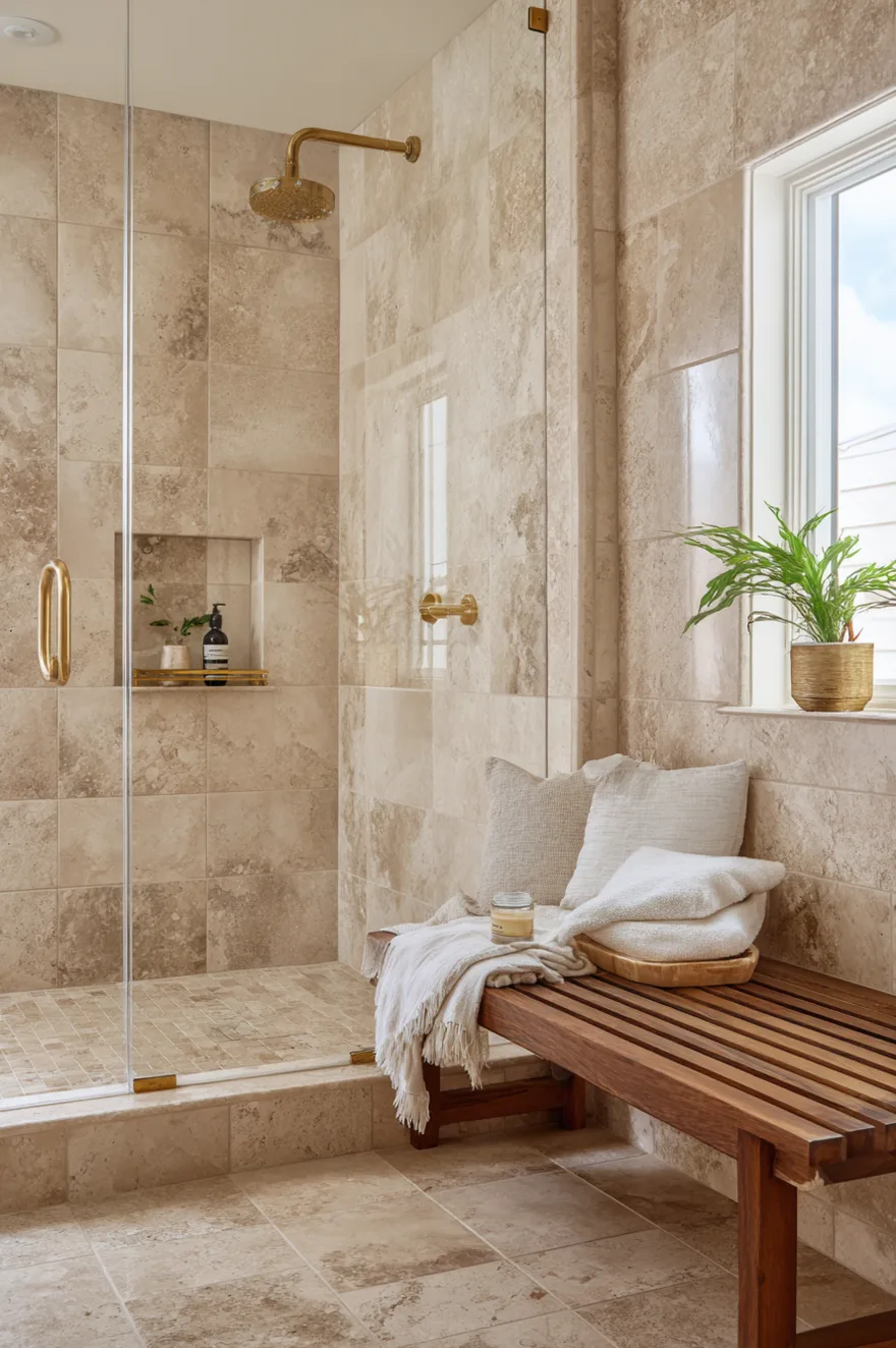
Brushed satin gold is not the same as polished brass, and the difference is most visible in rooms with strong natural light. Polished brass is reflective – it throws light around the room and reads as shiny, which in a bathroom with a honed travertine tile surround creates a finish mismatch that’s hard to name but easy to sense. Satin gold has a matte, almost powdery surface. Against travertine’s soft fossiled texture, satin gold reads as natural rather than applied.
Wall-mount fixtures also change the visual logic of the sink area. Removing the faucet from the vanity surface frees up counter space and, more importantly, makes cleaning easier – which matters more after year two than it does in the showroom. Unlacquered brass will age and develop patina; PVD-coated satin gold will not. Both are valid choices, but they’re different products with different life arcs. I’d take unlacquered brass in a private bath and PVD in a high-traffic powder room.
Spec the drain and p-trap cover in the same finish as the faucet. Mismatched metal under the sink is the detail that gives away a rushed finish out.
6. Beige Bathroom Ideas That Don’t Feel Dated
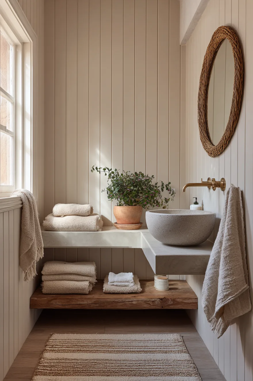
I used to think beige was a forfeit color. I was half wrong. The version that feels dated is flat beige paint on drywall with no texture and builder-grade chrome fixtures. Benjamin Moore Pale Oak or Sherwin-Williams Accessible Beige on vertical shiplap paneling is a different thing entirely – the vertical groove creates shadow lines that give the wall dimension, and the warm undertone of both paints sits in the same family as natural wood and rattan without muddying them.
Pair it with a rattan mirror (not a farmhouse-style one – look for a tighter weave and a simple round shape), a concrete basin, and a flat-weave jute bath mat. The concrete and jute bring texture without color, so nothing competes with the warmth the wall is already doing. The room feels modern because nothing is overdone.
7. The Vanity Nook Nobody Thought To Design
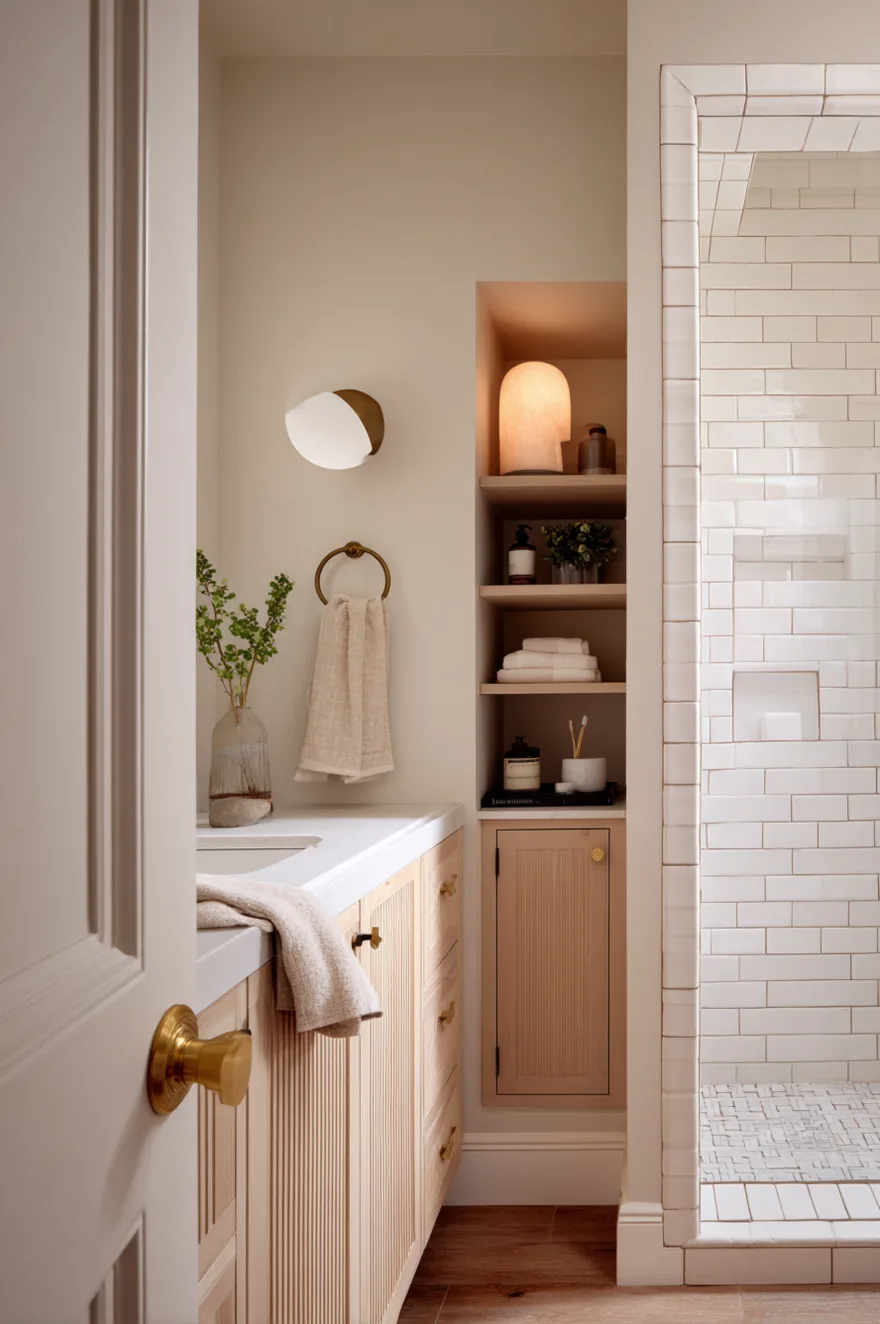
In a project I did a few years ago – not a client’s, my own bathroom renovation – there was a 30-inch gap between the shower wall and the door that everyone had been treating as dead space. A towel hook lived there. That was it. I sketched a fluted white oak vanity cabinet built to fill the alcove exactly, with a recessed medicine cabinet above it so the wall stayed flush. The fluting added enough surface texture that the cabinet didn’t disappear into the wall even though it was the same warm white oak tone as the adjacent trim.
The hardware was unlacquered brass pulls – small bar pulls, not cup pulls – and a round alabaster wall sconce mounted just above the medicine cabinet. Alabaster diffuses light softly and evenly, which matters in a tight space where a bare-bulb sconce would create a hot spot. The subway tile in the shower used warm white grout rather than bright white, which kept the tile from reading starkly against the wood. The whole nook cost less than a standard pre-built vanity from a plumbing showroom.
If you have a similarly awkward gap in your bathroom, measure it before assuming nothing will fit. Thirty inches is enough for a functional single-sink vanity, and custom cabinetry in a small footprint is more affordable than people expect.
8. Neutral Bathroom Paint Colors That Work In Low Light
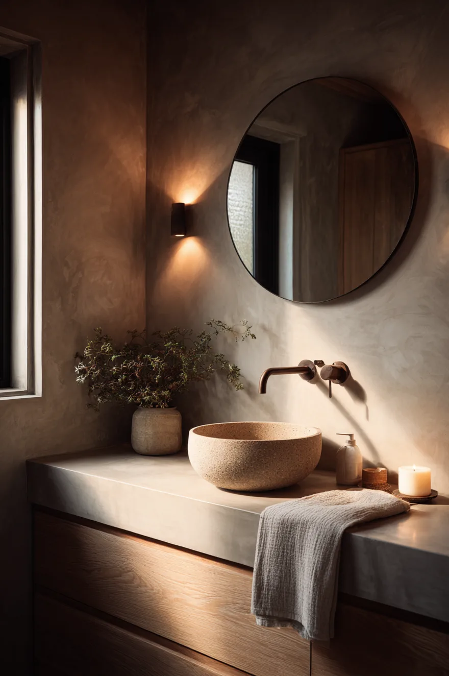
North-facing bathrooms are unforgiving because the light is cool and flat all day. True whites – Benjamin Moore Chantilly Lace, Sherwin-Williams Extra White – turn visibly blue in that kind of light, and blue is the last thing a warm neutral bathroom needs. The paints that survive a north-facing room are warm greiges with enough yellow or red undertone to hold their color when the natural light fails: Farrow and Ball Elephant’s Breath, Dulux Natural Hessian, or Sherwin-Williams Accessible Beige (which appears here again because it earns it).
But paint is only half the problem. A single warm-filament sconce at 2700K on a dimmer shifts the entire reading of the room. Even at midday in a north room, switching on that sconce pulls the wall color back toward its intended tone. The sconce doesn’t need to be expensive – a simple ceramic or alabaster shade with an Edison-style filament bulb handles it. Mount it flanking the mirror, not above it, and the light falls where you actually need it.
9. Marble Bathroom Ideas With An Earthy Slant
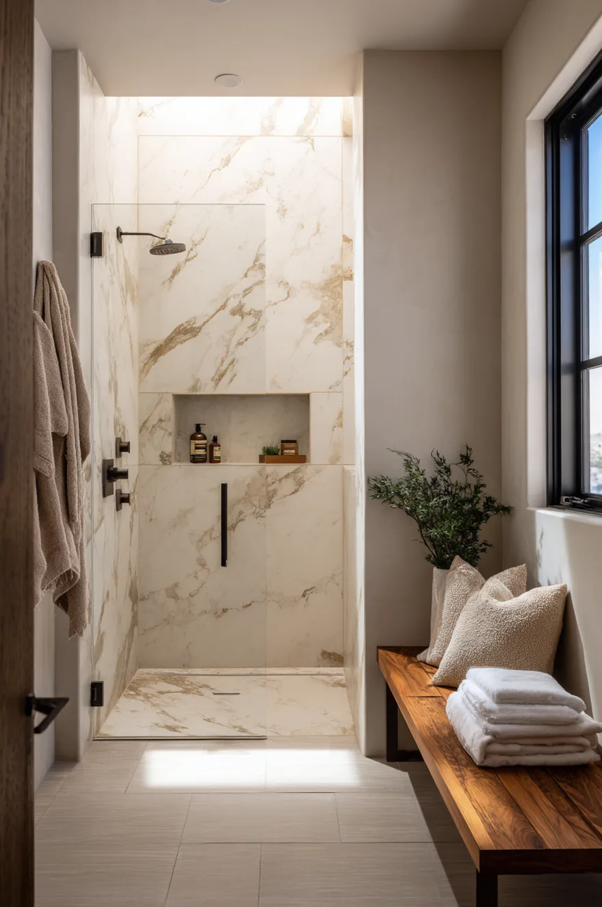
Carrara marble’s blue-grey veining is genuinely beautiful, but it runs cool, and in a warm neutral bathroom it pulls the whole room toward the grey end of neutral. Crema Marfil and Emperador Light are the warm-veined alternatives: Crema Marfil has a cream-to-golden binder with soft amber veining, while Emperador Light runs toward warm brown with darker chocolate movement. Either one on a full wet-wall behind the shower creates a rich, continuous surface that doesn’t need any additional decoration.
The remaining walls should stay in matte plaster – warm white, not bright white. That contrast between the stone’s polished or honed wet surface and the flat plaster gives each material room to read clearly. Pair with oil-rubbed bronze fixtures rather than chrome or polished nickel, which would pull the palette cold. Oil-rubbed bronze and warm-veined marble occupy the same brown-amber temperature range, so the fixtures disappear into the composition in the right way.
10. Natural Wood Bathroom Decor Beyond The Vanity
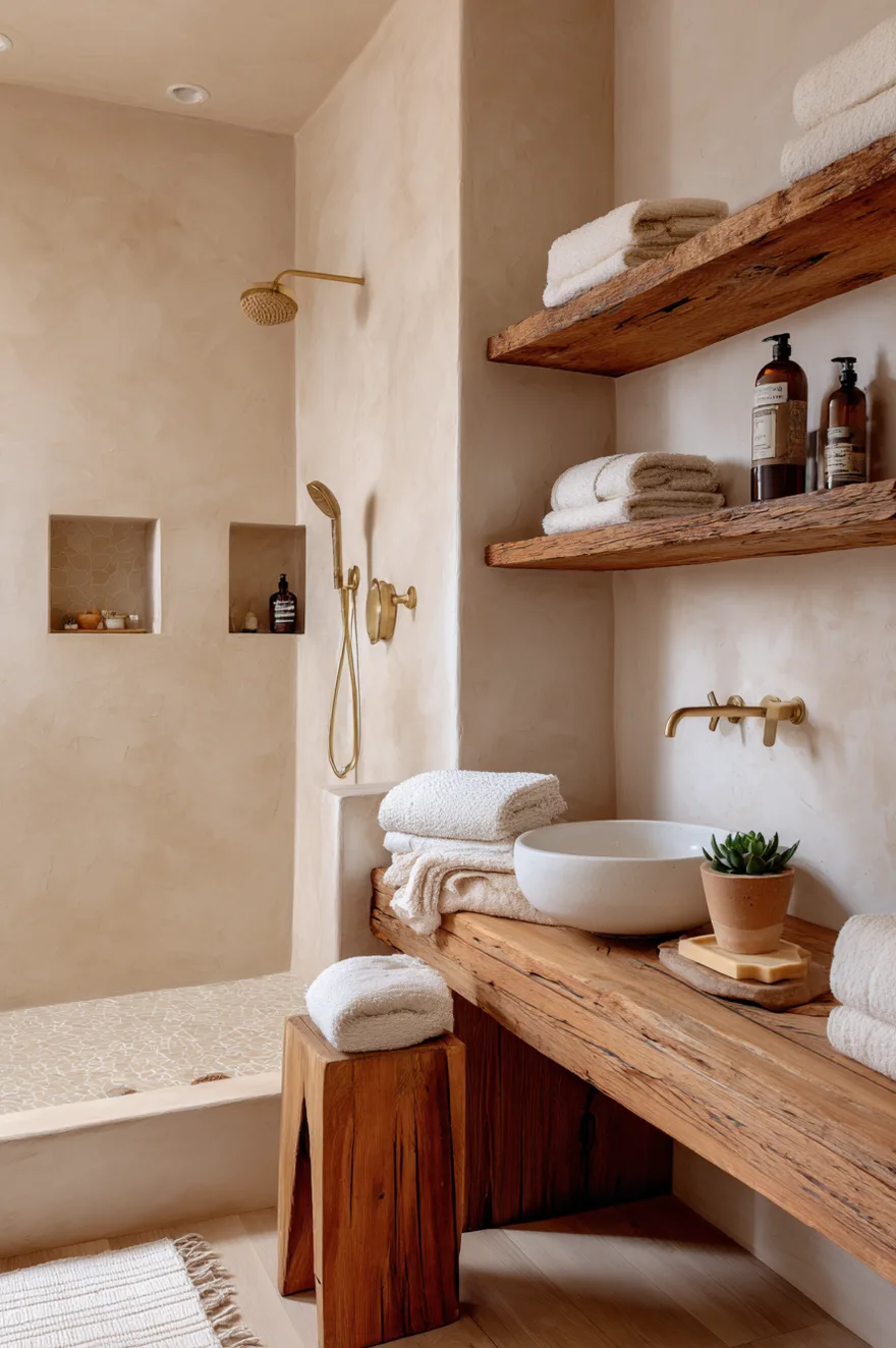
Teak is the only wood I’d use directly in a wet zone without serious hesitation. Its natural oil content means it resists moisture without requiring constant sealing – a teak shower bench looks better after three years of use than it did on day one. Reclaimed pine open shelving works on a dry wall away from the shower, and a cedar soap dish is a small, honest touch that most people overlook.
The point of repeating wood in small doses is that no single piece of furniture needs to carry the whole material story. Three or four small wood touches – bench, shelf, dish – read as intentional pattern without making the room feel like a sauna. Still not sure I’d do the reclaimed pine shelving in a bathroom without good ventilation, though. Moisture and untreated pine is a slow argument you will eventually lose.
11. Warm Minimalist Bathroom Design Without The Chill
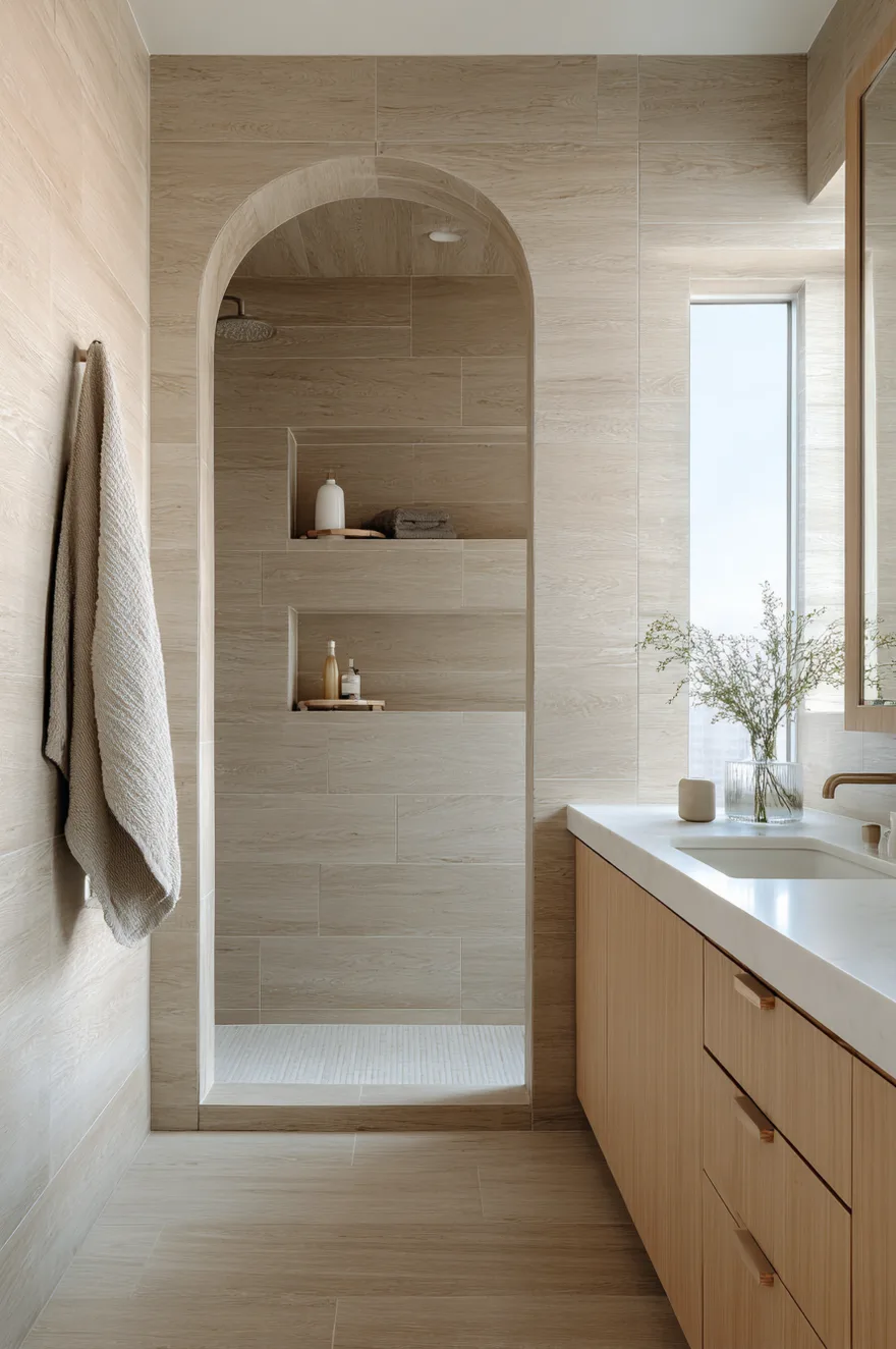
True minimalism in a bathroom almost always reads cold, and the reason is simple: when you strip out accessories and layers, whatever temperature the surfaces carry is the only temperature in the room. White or grey surfaces with no warmth go flat and clinical. The fix is to build warmth into every surface before you remove anything else.
Large-format sand-colored porcelain tile – something in the 32-by-32-inch or larger range, in a wood-look or concrete-look finish with warm undertone – does the work that white subway tile cannot. On both the floor and the walls, it creates a continuous warm envelope where the grout lines nearly disappear. A wall-mount white oak vanity with no hardware keeps the cabinetry from reading as furniture, which is the whole point of the wall-mount format. And a single arched niche in the shower wall, built in at the same tile, gives the eye one considered moment without adding any object to the room.
No art. No accessories beyond a single towel and one ceramic vessel. The restraint is the whole argument. But it only works if the surfaces underneath are genuinely warm – if the tile reads sandy and honest rather than cold and industrial, the empty space feels deliberate rather than unfinished. Get a large physical sample of the tile in the actual room before committing. Tile chips lie.
12. Tan Bathroom Ideas Anchored By Black Grout
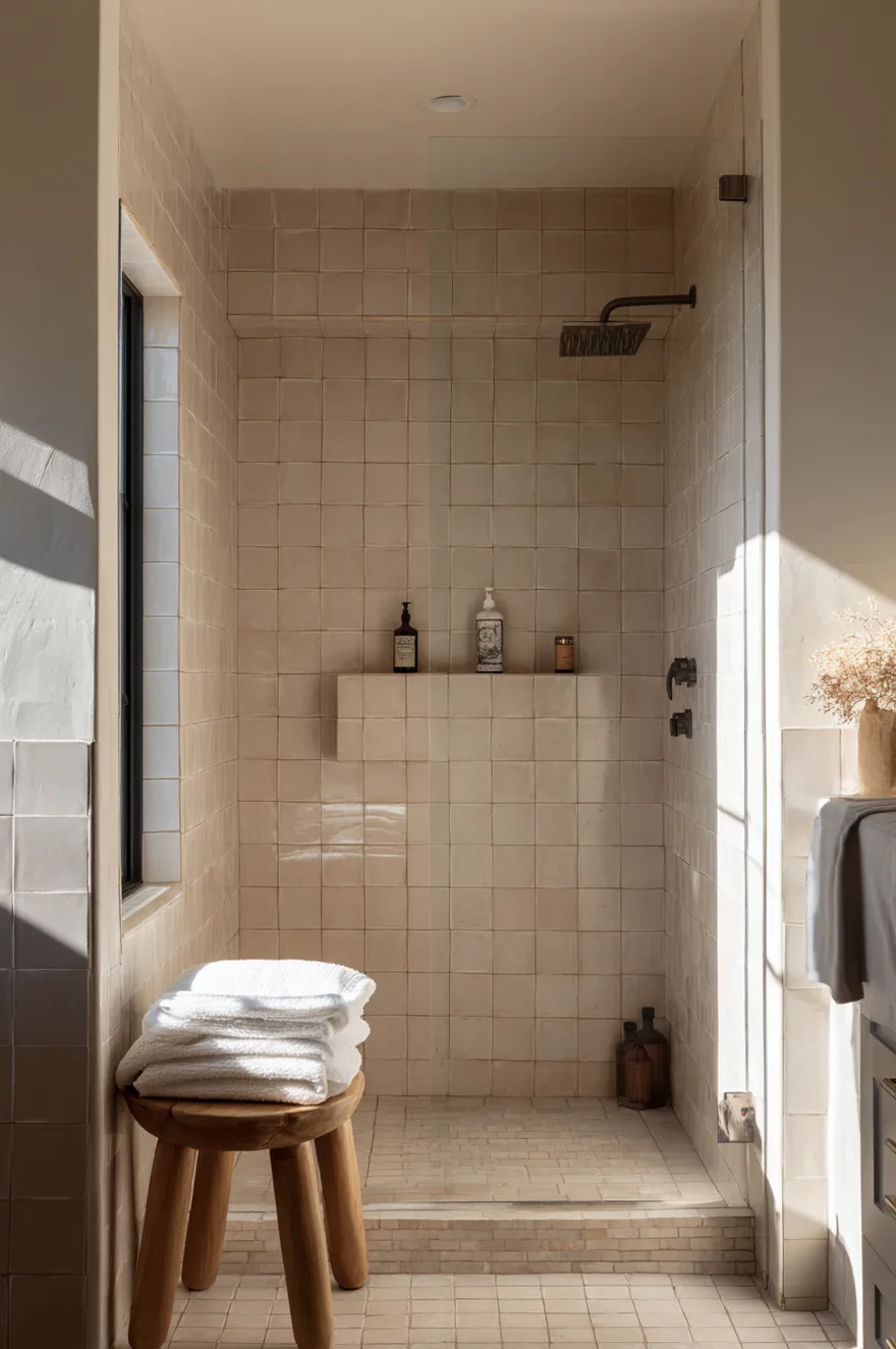
Handmade zellige tile has enough surface variation – the slight waviness, the inconsistent glaze thickness – that it catches light differently across the wall. But if you grout it in a color that’s close to the tile, all of that variation blurs together from more than three feet away and the wall reads as a flat tan plane. Charcoal or graphite grout solves this immediately. The dark line grid makes every individual tile readable from across the room, and the texture that makes zellige worth its price (it runs expensive, roughly $30-50 per square foot for good imported Moroccan zellige) becomes visible.
Keep the rest of the room quiet. A wooden stool with a folded white linen towel is enough. The tile is already doing a lot of work, and adding a patterned rug or busy shelving competes with the surface you spent money on. Let the wall lead.
13. Start With The Sconce, Not The Vanity
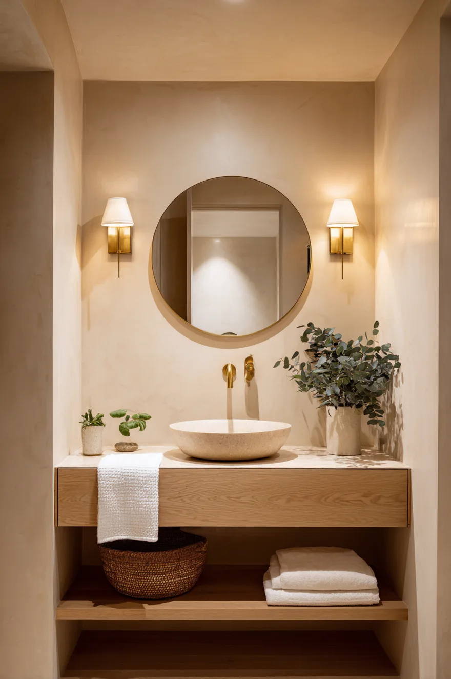
Every bathroom renovation I’ve seen go sideways specified the vanity first, then tried to retrofit lighting around it. But lighting placement in a bathroom is an architectural decision that shapes everything else. A pair of brass wall sconces flanking the mirror at eye level – not above it – eliminates the facial shadows that overhead lighting creates, and also does something unexpected: it visually lowers the ceiling in a tall narrow bathroom, making the proportions feel more considered and less like a corridor.
Determine your sconce position before you hang the mirror, before you mount the vanity, and ideally before you run the electrical rough-in. Moving an outlet costs less than you think at rough-in stage and considerably more after the tile is on the wall.
14. Neutral Earthy Bathroom Built From Tile Up
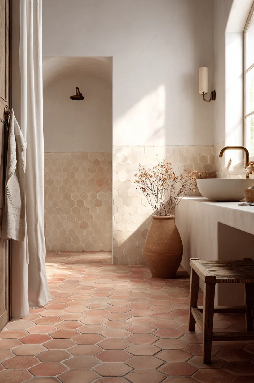
Matte terracotta hex tile on the floor is a familiar enough move. But running the same tile up through the wainscot and into the shower base – and then stopping at a smooth warm-white plaster wall above – creates something more interesting: a room where every horizontal surface shares one earthy material, grounding the space without heaviness, while the walls above stay light enough to reflect whatever natural light the room has.
The floor-to-wall transition is the detail to get right. The hex tile should meet the plaster wall at a simple pencil liner or a thin bullnose edge rather than a cove base, which reads too residential-builder. A 3-by-3-inch or 4-by-4-inch hex tile in matte unglazed terracotta has enough visual weight to carry the wainscot height without looking busy. Keep the grout warm – unsanded grout in an almond or natural tone, not bright white, which would make the tile look like a grid rather than a surface.
15. When David Convinced Me To Try Concrete
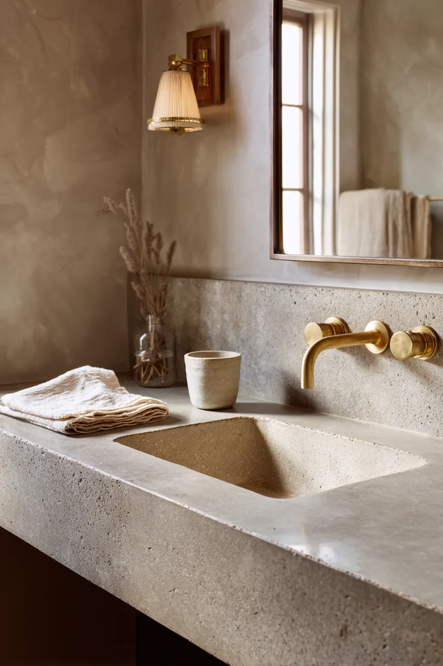
My instinct for the guest bath countertop was always going to be stone – probably a honed limestone or a simple marble. David pushed for polished concrete with a pale sand aggregate, sealed with a matte water-based sealer. I said no twice. He drew a sketch (we are that household). I said yes.
Two years on, the concrete has developed a warm patina around the faucet and along the front edge where hands rest. It’s subtle, a slight darkening of the aggregate, and it looks better than it did the day it was poured. No tile replicates that quality – the way a material records use without looking damaged. The matte sealer matters here: a gloss sealer would make the concrete look coated, which defeats the whole point. We reseal it once a year with the same product. That’s the full maintenance requirement. I still sketch the room by hand first, but I’ve started leaving more space for David’s arguments.
16. Neutral Bathroom Color Ideas For A Powder Room
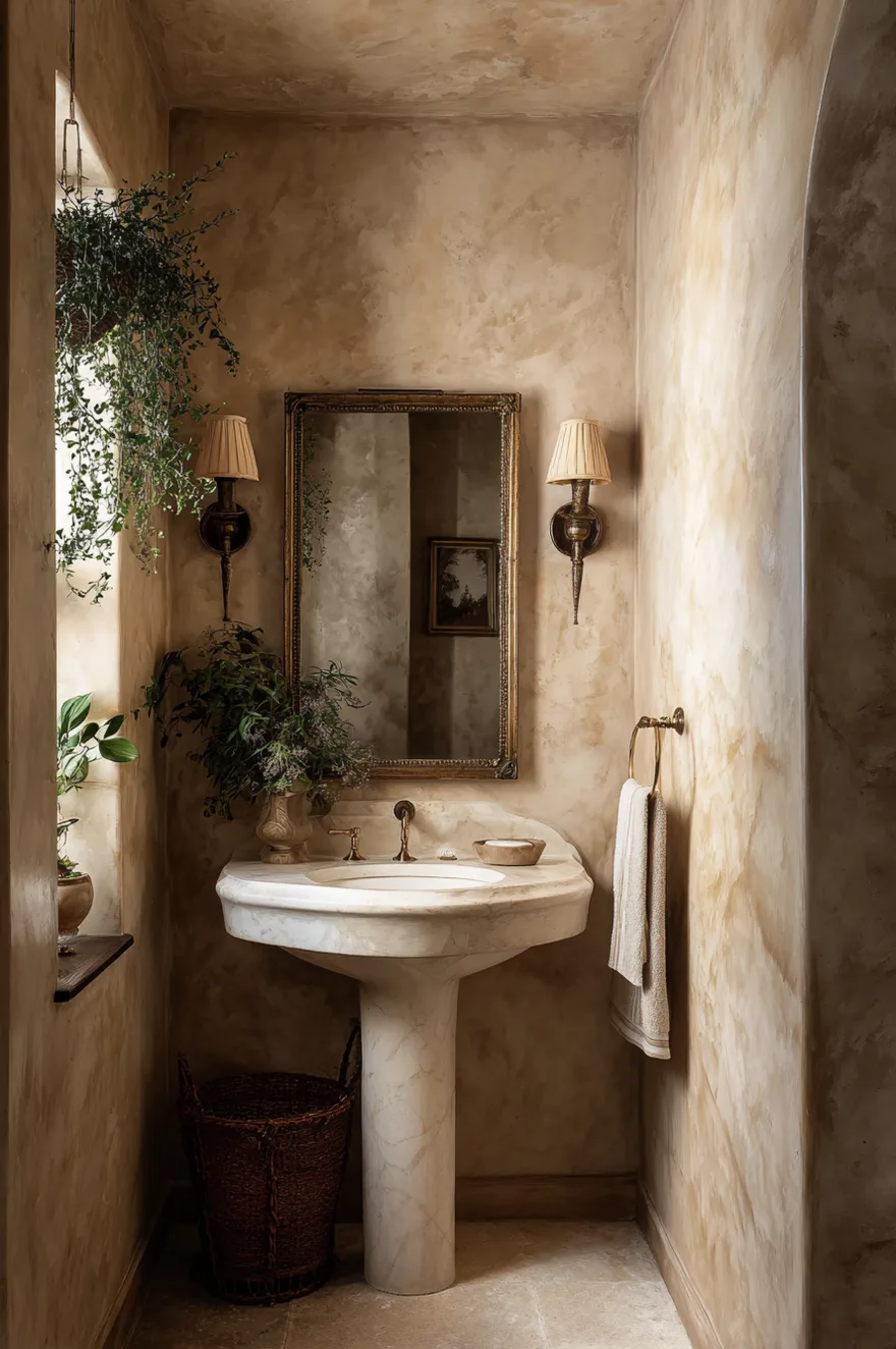
Small rooms allow commitment that would overwhelm a larger space. A powder room wrapped floor-to-ceiling in warm mushroom Venetian plaster – the real trowel-applied kind with a slight burnished sheen – reads as rich and intentional precisely because the room is small. The intimacy makes it work.
A petite bone-white pedestal sink keeps the plumbing fixture from competing with the wall, and an oversized antique brass mirror leaned against the wall (rather than hung flush) introduces a slightly offhand quality that prevents the whole thing from feeling too composed. Go large on the mirror – in a tight room, a generously sized mirror adds perceived depth and reflects the plaster’s tone back at itself beautifully.
17. Warm Neutral Bathroom 2026 Means Softening Stone
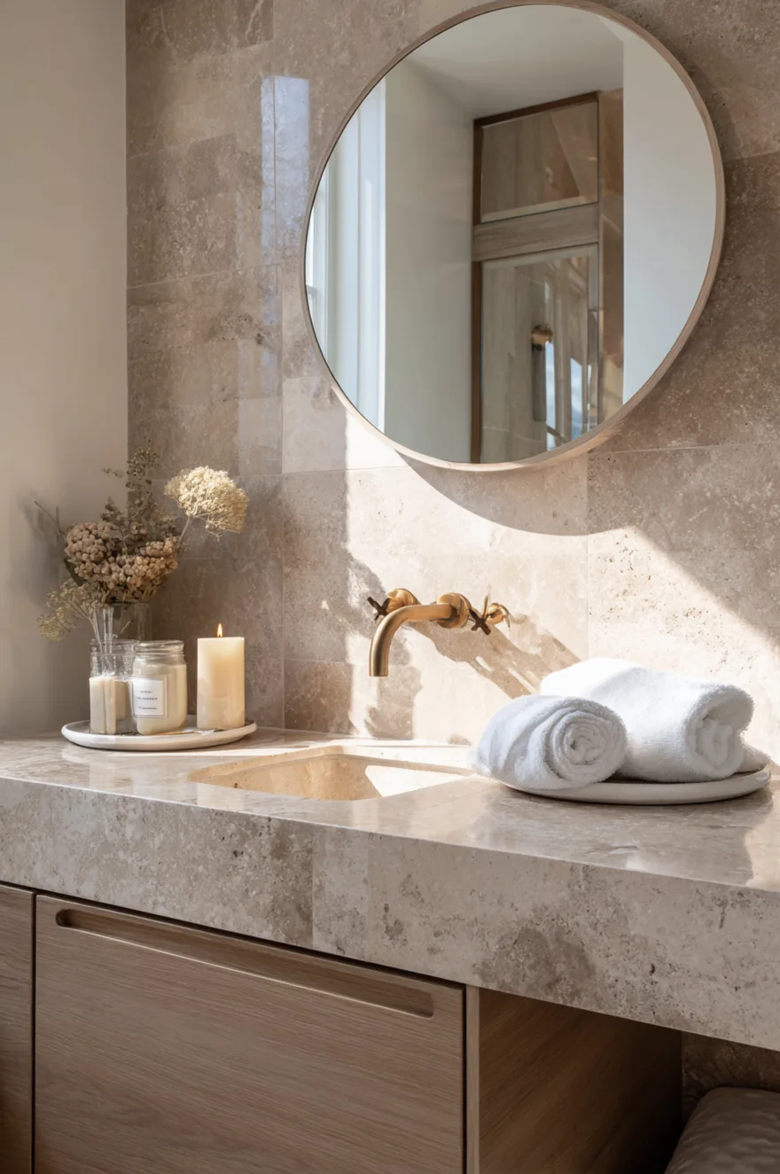
The material shift happening right now is away from the stark white Carrara marble that dominated the last decade and toward stones that carry warmth in their base color. Jura limestone runs from honey to grey-gold. Honed Sunny Beige travertine has a warm buff color with soft void texture that reads natural rather than refined. Brushed Pietra di Luna sits in a taupe-mushroom range with a directional texture that changes color as you move around the room.
What these stones share, besides warmth, is a matte or brushed finish. Honing removes the polished surface and with it the “hotel lobby” read that polished marble carries – the sense that the material is performing rather than just existing. In a warm neutral bathroom, you want stone that looks like it belongs to the house rather than like it was installed to impress. The texture is as much of the choice as the color. Order a 12-by-12-inch honed sample and live with it for a week in the actual room before ordering field tile – the difference between a polished and a honed sample of the same stone is striking enough that they can look like different materials in different light.
18. The Open Shelf That Replaces Upper Cabinets
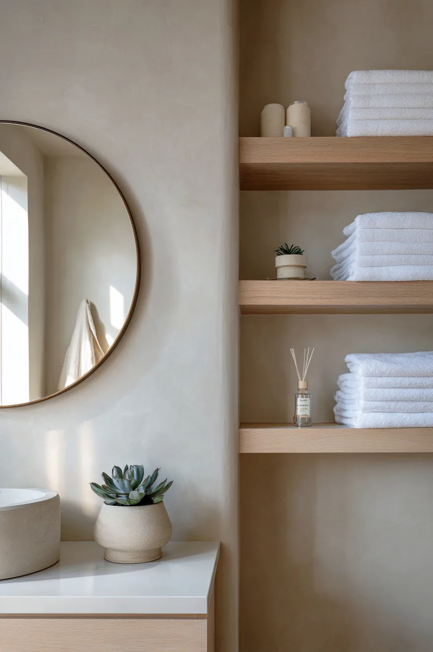
Two floating white oak shelves on a warm greige plaster wall – nothing above them, nothing below except the vanity – make a bathroom feel taller than upper cabinets ever will. The negative space between the top shelf and the ceiling, and between the bottom shelf and the mirror, is doing the visual work. Upper cabinets close that space off and bring the ceiling down psychologically.
Keep the shelves edited: white stacked towels, a clay diffuser, a small succulent. The restraint is the point (which echoes section 11, and intentionally so – the same logic applies here at a smaller scale). Bracket the shelves simply; a floating ledge with a thin steel bracket disappears against the plaster, while a visible decorative bracket competes with the towels.
19. Why Warm Neutrals Make Small Bathrooms Feel Larger
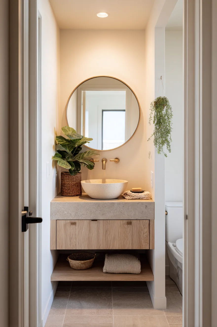
The reason a small bathroom feels chopped-up has less to do with its dimensions than with how many value and temperature contrasts are happening simultaneously. A bright white wall beside a dark wood vanity beside a grey tile floor beside an almond sink creates four distinct visual interruptions in a space that might only be 5 by 8 feet. Your eye has to travel between them, and the room reads smaller than it measures.
Tonal dressing fixes this: keep wall, floor, and vanity within roughly 15-20 LRV (Light Reflectance Value) points of each other, all in the same warm color family. Sherwin-Williams Navajo White on the walls, a warm grey limestone floor tile, and an almond ceramic sink on a simple white oak vanity is a combination I’ve used in a tight bathroom and it reads as one continuous warm surface rather than a collection of separate elements. The room doesn’t look bigger because anything is white or bright – it looks bigger because there’s nothing interrupting the eye. Pick the floor tile first (it’s the hardest to change), match the wall paint to its warmest undertone, and let the vanity sit between them.
You don’t need to do all of these. Pick two that match what your bathroom actually needs – probably the wall finish and the lighting placement – and do those well before worrying about anything else. A warm neutral bathroom is less about accumulating the right objects and more about making each surface do one clear thing in the same temperature direction. Which of these ideas are you working with? Leave a comment and I’ll tell you what I’d sequence first.
Talk soon,
Rachel