Choosing the wrong bathroom color wastes time and money on a renovation you will want to redo in two years. These 2026 bathroom color ideas cover the trending palettes – from sage green and earthy terracotta to moody charcoal, soft blush, and crisp white with black trim – so you can make a confident, informed decision for your small, modern, or farmhouse bathroom.
What 2026 Bathroom Color Trends Are Actually Telling Us
Lately I’ve been noticing a clear and meaningful shift in what people are choosing for bathroom colors – and it goes well beyond individual taste. The collective move away from cool grays and stark whites toward warmer, nature-rooted palettes tells us something specific about how people want to feel in their homes right now. Bathrooms are no longer purely functional spaces. They are personal retreats, and the color choices reflect that directly.
Sherwin-Williams named Universal Khaki as their 2026 Color of the Year – a grounded, mid-tone warm tan that signals exactly where residential design is headed. Earthy tones, warm neutrals, nature-inspired greens, and rich moody darks are the palettes gaining the most traction. The reasoning is functional, not just aesthetic: warm colors behave better under changing light conditions, pair more flexibly with natural materials, and create the spa-like atmosphere homeowners increasingly want from their bathrooms.
This guide covers 20 bathroom color ideas for 2026 with specific pairing recommendations, sizing guidance for small bathrooms, and practical advice for modern and farmhouse styles. The goal is to help you choose with confidence, not just inspiration.
Warm Beige and Taupe Bathroom Color Ideas for Rustic and Natural Designs
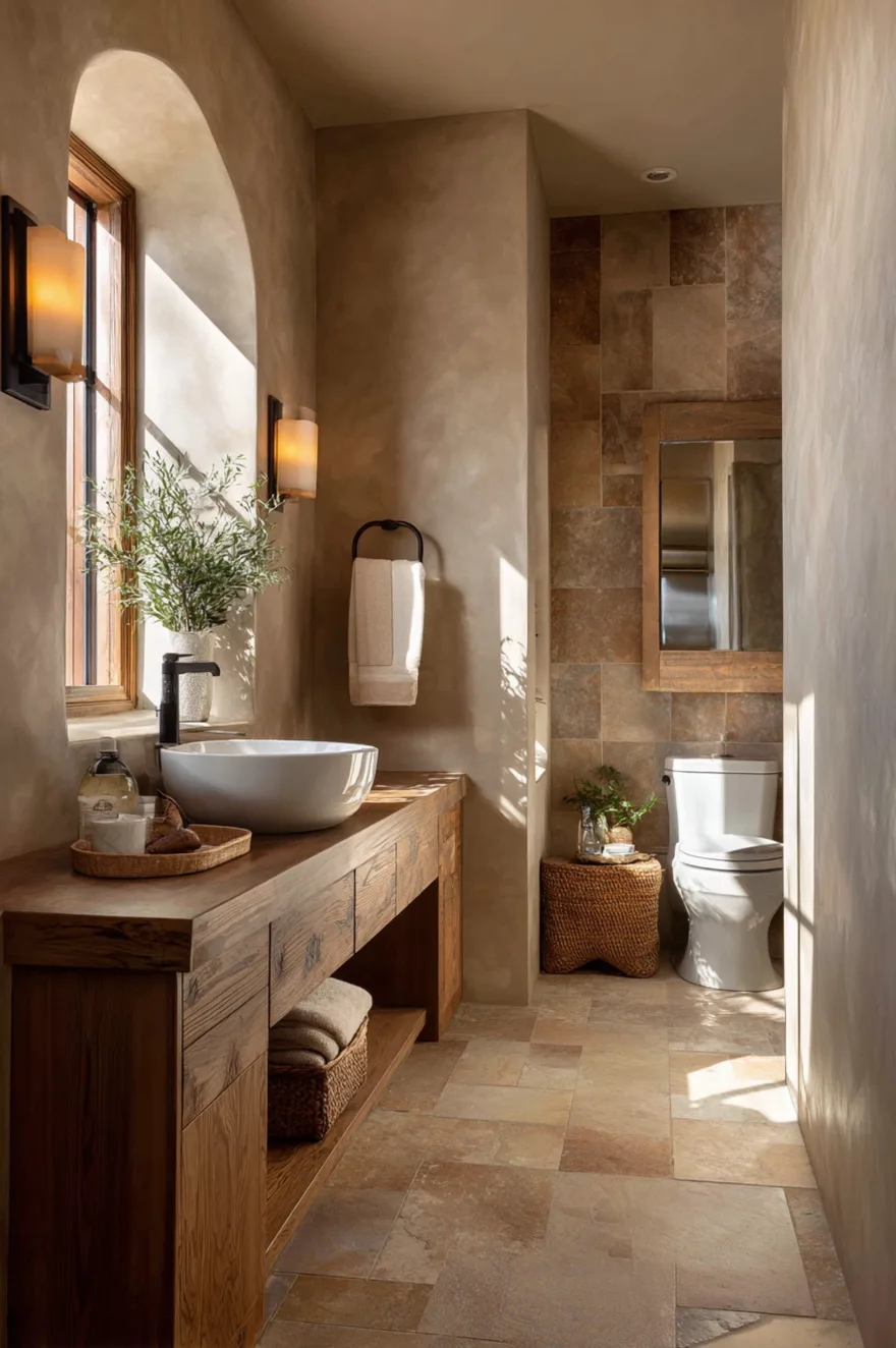
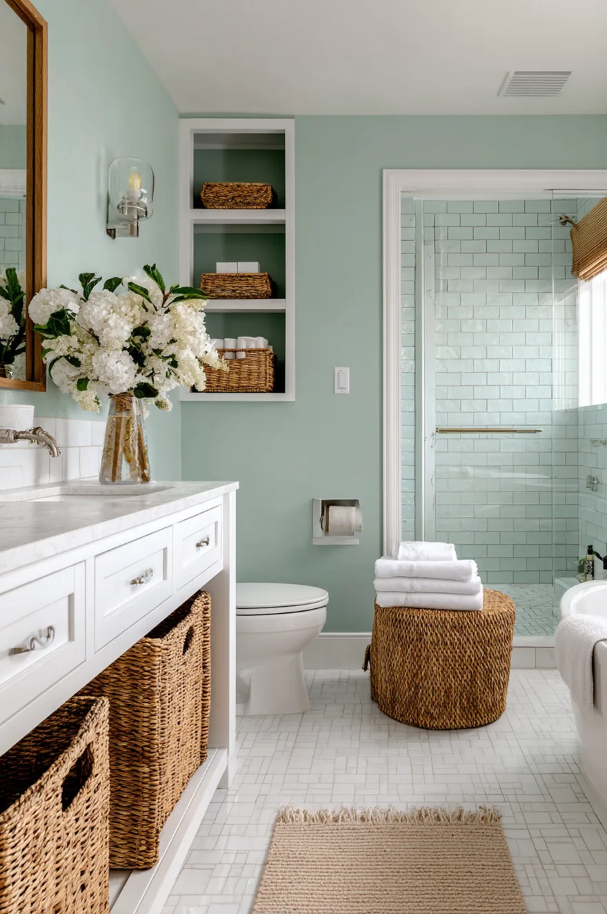
Warm beige and taupe anchor the organic bathroom aesthetic defining 2026 design – the one reaching for natural materials, textured surfaces, and a connection to the outdoors. These colors work because they do not compete with natural materials; they collaborate with them. Stone tile, brown wood cabinets, honed marble, linen textiles – all read more beautifully against a warm beige or taupe wall than against a cool neutral.
The practical distinction between beige and taupe is undertone. Beige pulls warm yellow or pink; taupe pulls toward gray. In a bathroom with warm wood tones and earthy stone, beige is usually the stronger choice because it stays in the same temperature family as the materials. In a bathroom with cooler stone like blue-gray slate or white marble, taupe bridges the gap more effectively. Identifying your existing materials’ undertone before selecting paint prevents the common mistake of choosing a neutral that fights rather than unifies.
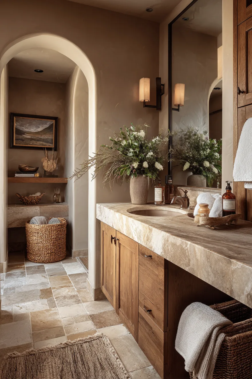
Taupe and beige require adequate natural light to reveal their full depth – in dim conditions they can read flat and slightly muddy. They work best in bathrooms with at least one window or strong layered artificial lighting. For small bathroom color ideas in this family, keep grout lines in a similar warm tone to avoid the broken-grid effect that makes small spaces feel visually busier than they are.
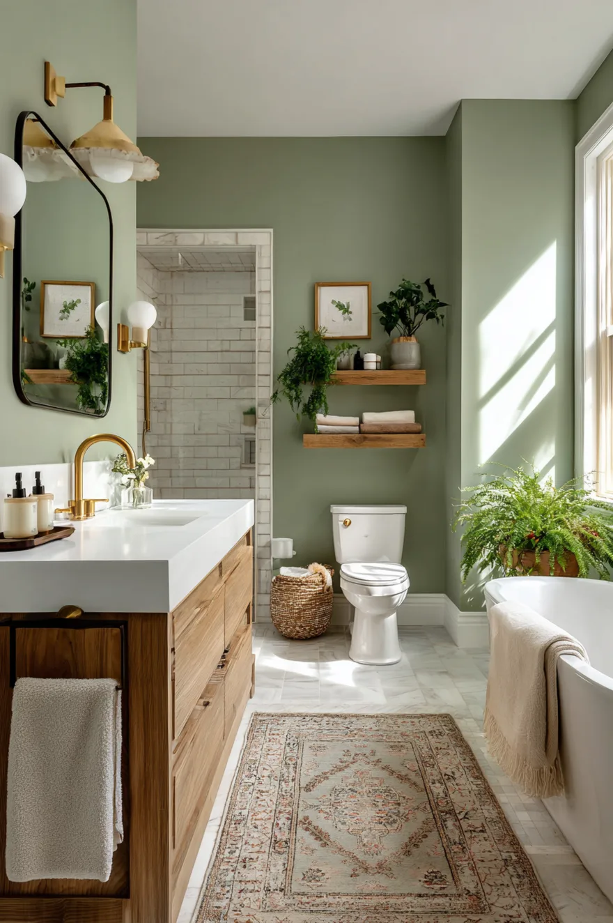
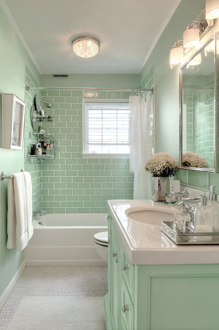
Sage Green Bathroom Color Ideas for a Modern Retreat
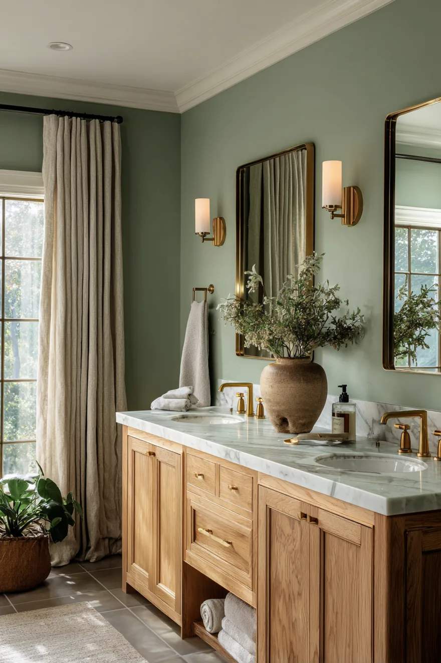
Sage green is the single most dominant bathroom color trend entering 2026, and the reason is straightforward: it creates a direct visual connection to nature without requiring a bold statement. It reads as sophisticated in morning light and warm by evening lamp – a dual quality that very few colors deliver in a bathroom setting.
The key pairing decision with sage green is hardware. Brass is the strongest choice – it warms the green’s cool undertone and creates a palette that feels current without being trendy. White vanities ground the space and stop the green from reading as heavy. Natural wood floating shelves add organic texture that reinforces the nature connection this color is designed to create.
For small bathroom color ideas, sage green is particularly valuable because it shifts throughout the day. In natural light it reads closer to mint; in artificial evening light it settles into a warmer olive. That movement creates visual interest without introducing pattern or additional color. One critical material note: pair sage with white oak, ash, or walnut rather than golden oak. Cooler wood tones complement the green’s gray undertone rather than clashing with it.
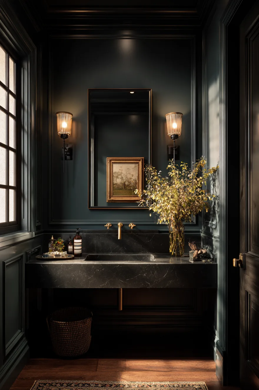
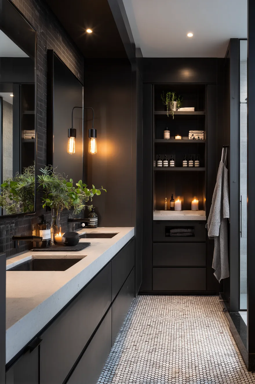
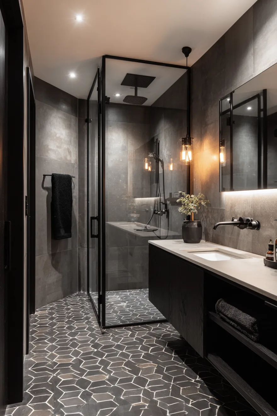
Charcoal and Concrete Gray for Moody Modern Bathrooms
Deep gray is one of the most counterintuitive choices for a small bathroom – and one of the most effective when executed correctly. The instinct is to use light colors in small spaces to create the illusion of size. The reality is that a dark, enveloping color in a tiny bathroom creates an intentionally intimate, cocooning atmosphere that feels deliberate rather than cramped.
The non-negotiable requirement with charcoal gray bathrooms is layered lighting. A single overhead source in a dark bathroom creates a cave. You need ambient ceiling lights, task lighting flanking the mirror at face level, and accent lighting at a lower point. This is where most dark bathroom renovations fail – the color gets blamed, but the lighting is the actual problem.
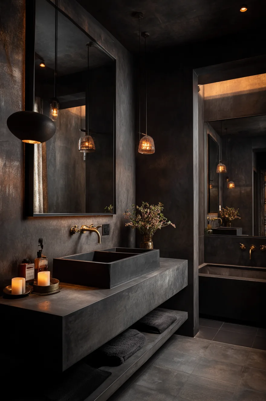
Charcoal gray pairs exceptionally well with black fixtures for a fully committed monochromatic approach, or with warm brass for sophisticated contrast. In concrete-effect finishes, this palette creates the kind of urban spa atmosphere that design-forward homeowners consistently pursue. The practical bonus: dark paint genuinely conceals minor wall imperfections that would be immediately visible under lighter colors.
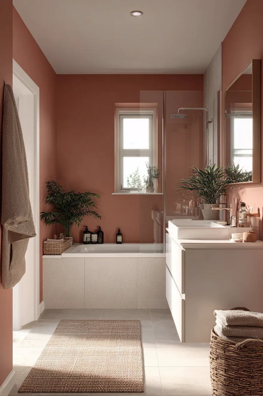
Warm Terracotta Bathroom Color Ideas for Small and Rustic Spaces
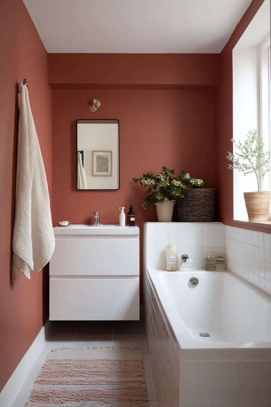
Terracotta and clay-inspired shades are solving a problem that cool gray bathrooms never could – they make the space feel genuinely warm. Not just visually warm, but psychologically warm. Homeowners who switch from stark white to terracotta consistently report using their bathrooms differently – lingering longer, finding morning routines more enjoyable. The color changes the felt experience of the space, not just its appearance.
Terracotta works across bathroom sizes but performs particularly well in smaller spaces where you want warmth without brightness. Unlike yellow, which can feel aggressive in an enclosed space at close range, terracotta’s earthy red-brown tones read as grounded and comfortable. Pair with brown cabinets in rustic or Mediterranean-style homes, natural stone tile, and antique brass or matte copper hardware.
For farmhouse bathroom color ideas, terracotta is one of the most historically appropriate choices available. It connects to the warm, earthy material traditions that define the style and photographs well in all lighting conditions. Keep surrounding materials natural and unprocessed – smooth white porcelain feels slightly at odds with terracotta’s organic character, while a rustic vessel sink or handmade ceramic basin fits the palette far better.
Classic Navy Blue Bathroom Ideas for Modern and Coastal Styles
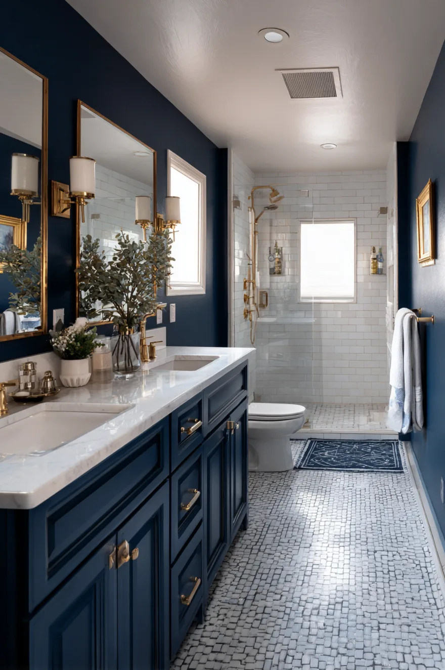
Navy blue has a specific quality that most dark bathroom colors lack – it adds depth and sophistication without overwhelming small spaces. Interior designers consistently recommend it for bathrooms because of this distinction: it creates drama without compression. The psychological association with water and depth makes navy feel expansive rather than enclosing.
The strongest navy bathroom combinations pair deep blue walls with white fixtures and tilework for maximum contrast. This works across both traditional and contemporary settings because the navy-white relationship is fundamentally timeless. Navy also offers unusual flexibility in hardware: it pairs equally well with warm brass and cool chrome, giving you room to evolve the space as fixture trends change.
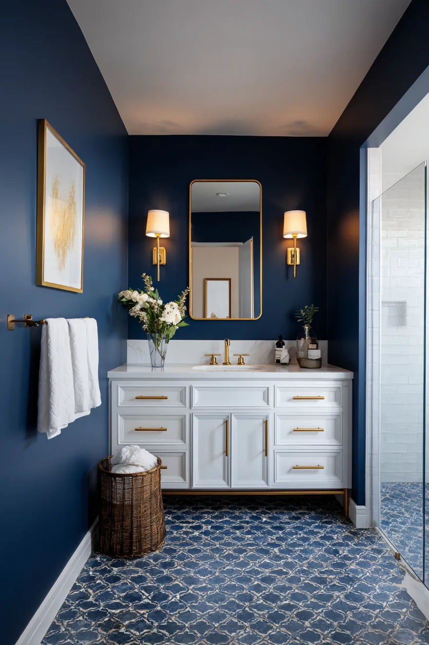
For small bathroom color ideas, navy requires a real investment in layered lighting to avoid feeling oppressive. Sconces flanking the mirror at face level are essential. The style range for navy is broader than most people expect – Hampton’s coastal, urban contemporary, traditional European, and certain farmhouse bathroom interpretations all accommodate it well. It is one of the genuinely cross-style bathroom colors of 2026.
Soft Greige Bathroom Colors That Work in Any Space
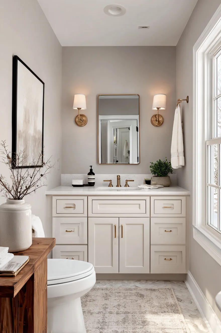
Greige – the precise midpoint between gray and beige – is the bathroom color that real estate agents love and design-forward homeowners sometimes dismiss, which is a mistake. The reason it appeals to the widest demographic is not because it is boring. It is because it solves the fundamental bathroom color problem elegantly: warm enough to feel inviting, cool enough to feel clean, neutral enough to accommodate virtually any accent color direction.
Sherwin-Williams Agreeable Gray and Accessible Beige are the industry benchmarks for this palette family, and they hold that position for good reason. Both have warm undertones that prevent the flatness problem affecting cooler grays in artificial light. In natural morning light, greige reads as composed and calm. In the evening under warm lamp light, it reads as genuinely warm and inviting. That behavioral consistency across lighting conditions is what makes it so reliably successful.
From a practical standpoint, greige is the single most flexible foundation for a bathroom renovation. It works with chrome, brass, nickel, and black hardware without conflict. It accommodates wood-toned vanities and painted cabinetry. It does not fight with tile patterns or natural stone. If your bathroom connects to an open-concept bedroom, greige on both sides reads as cohesive without looking deliberately matched.
Moody Forest Green Bathroom Ideas for Powder Rooms and Half Baths
Deep, saturated forest green is the bathroom color that rewards commitment. Unlike softer greens that read as neutral, forest green makes a deliberate statement – it creates a sense of private sanctuary that is genuinely luxurious when executed correctly. It works especially well in half baths and powder rooms where you can embrace drama without committing an entire ensuite to such intensity.
From a practical standpoint, dark green paint requires quality materials. Premium paints in deep colors cover in two coats where cheaper alternatives need three or four, making the per-gallon cost difference less significant than it appears. The color performs particularly well in bathrooms with no windows, where you are relying on artificial lighting regardless and the dark walls create an intentionally intimate atmosphere. The limitation becomes an asset.
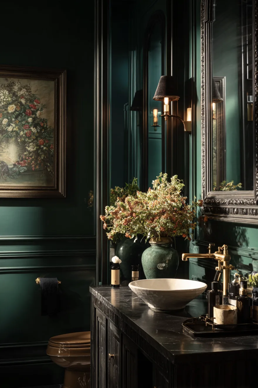
For modern bathroom color ideas, pair forest green with matte black fixtures for a fully saturated, high-drama approach. For a more balanced version, brass hardware and a white vessel sink create beautiful contrast that stops the green from dominating entirely. This color is especially popular with homeowners who understand that personality in a bathroom is not a liability – it is what makes a house feel like a home.
Soft Blush and Dusty Rose Bathroom Color Ideas for Master Suites
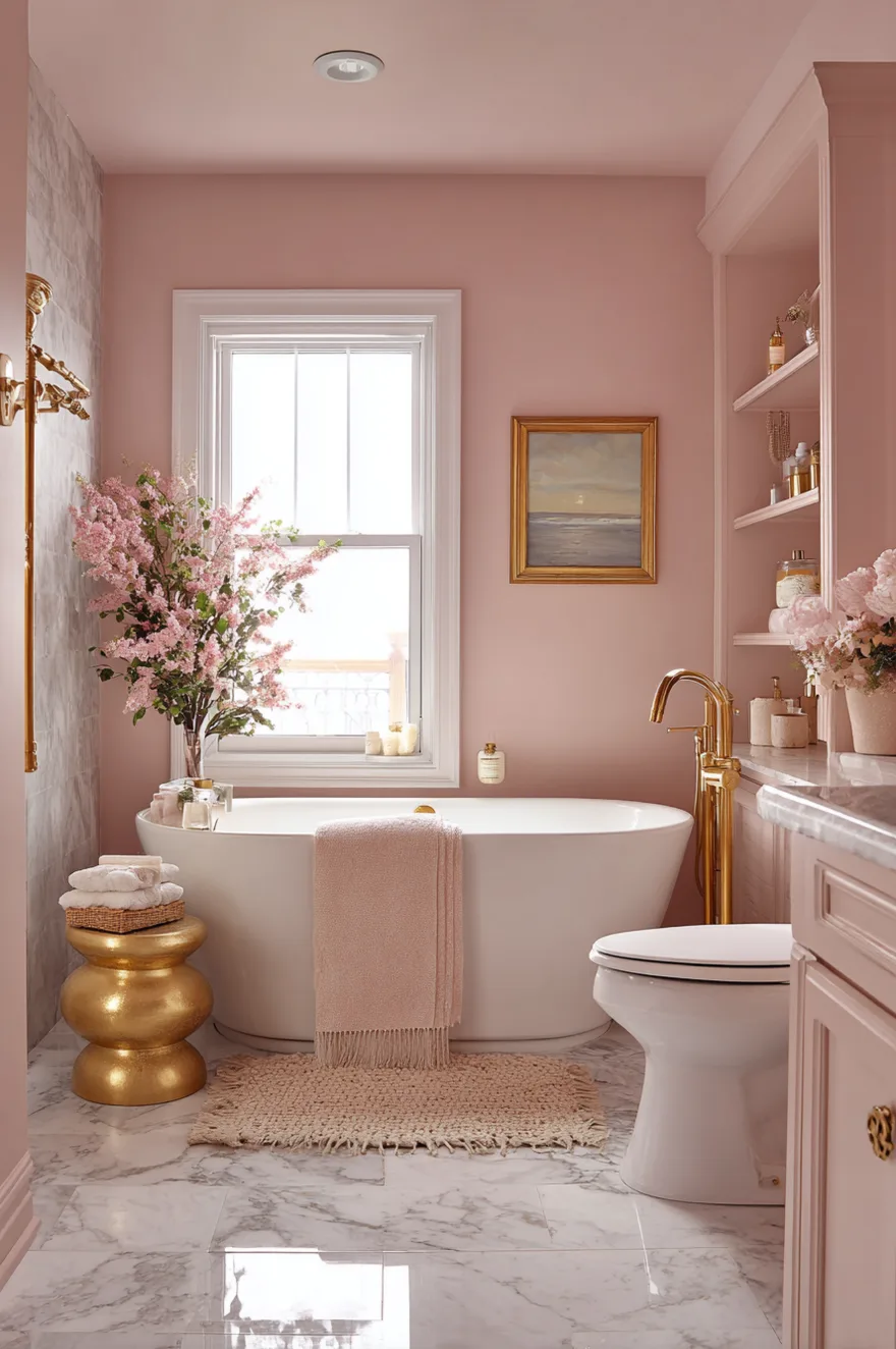
Soft blush and dusty rose consistently surprise people – they assume pink will feel juvenile or dated and then see a correctly executed blush bathroom and revise their position entirely. The key distinction is saturation: true blush is so desaturated that it reads closer to a warm white with a slight color cast than it does to pink. At that saturation level, it creates warmth without any gender association.
The functional argument for blush in a master bathroom is compelling and underappreciated: it flatters skin tones in mirror reflections. In a space where you assess your appearance daily, the wall color visible behind you in the mirror has a measurable effect on how you perceive yourself. Blush’s warm pink undertone is among the most flattering backdrops for a wide range of skin tones – a consideration most bathroom color guides do not address directly.
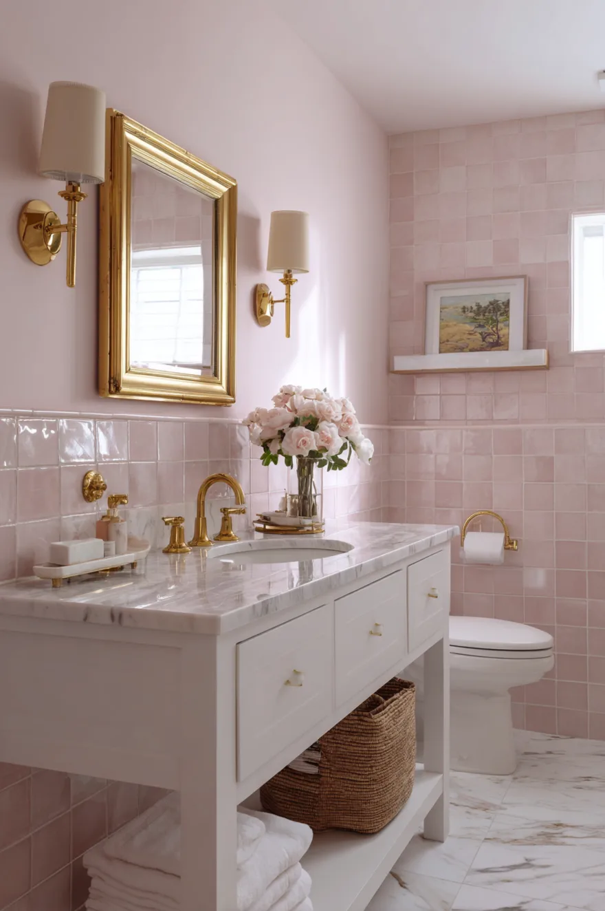
For hardware pairing, brass and gold fixtures are the clear recommendation. They share the warm undertone of blush and create a cohesive palette that feels both current and timeless. Chrome reads slightly cold against blush and creates a tonal disconnect that feels unresolved. In historic homes and Art Deco-inspired spaces, dusty rose is particularly appropriate as it aligns with the period color vocabulary without requiring full period authenticity.
Charcoal and White Contrast Bathroom Colors for Modern Spaces
The charcoal-and-white contrast bathroom is where architectural minimalism meets graphic impact. This approach converts color into structure – the dark and light zones create a sense of architectural definition that small or plain bathrooms often lack. Rather than adding decorative elements to create interest, the color itself does the work. This is efficient, considered design.
The execution matters significantly here. The most successful versions anchor the darker color at the lower portion of the walls – as wainscoting, tile to mid-height, or a painted lower half – which visually grounds the room and makes it feel taller. Full dark walls with white fixtures creates maximum drama appropriate for larger bathrooms and powder rooms. In a small modern bathroom, the lower-dark approach creates definition without enclosing the ceiling plane.
Black fixtures complete this scheme naturally – matte black faucets, towel bars, and hardware create a cohesive monochromatic through-line that ties the charcoal walls and white surfaces into a single resolved palette. This is the bathroom aesthetic that urban professionals consistently gravitate toward because it references boutique hotel design at a residential scale. The practical bonus: high contrast makes cleaning requirements immediately visible on both surfaces.
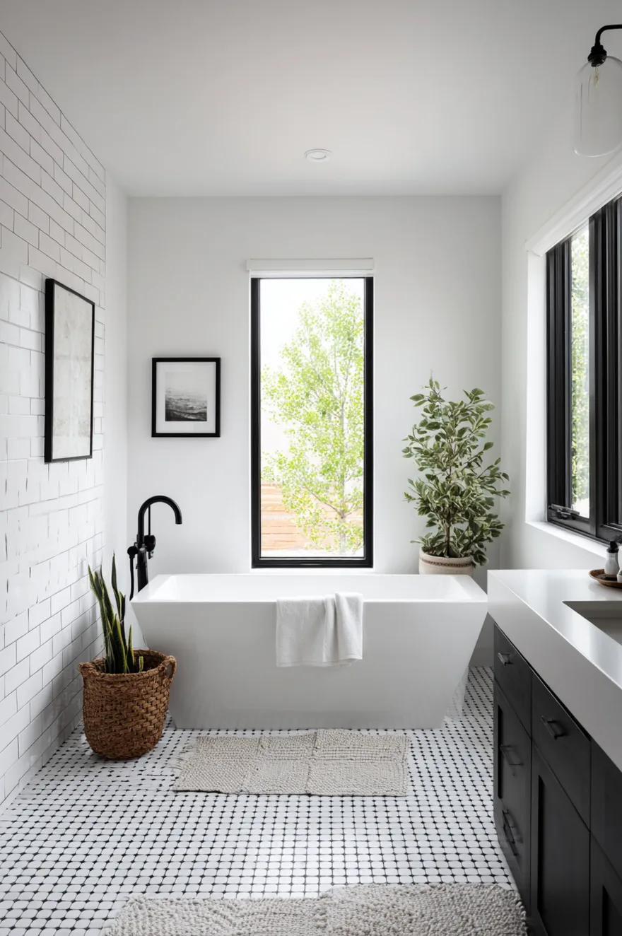
Crisp White Farmhouse Bathroom Colors for Small Spaces
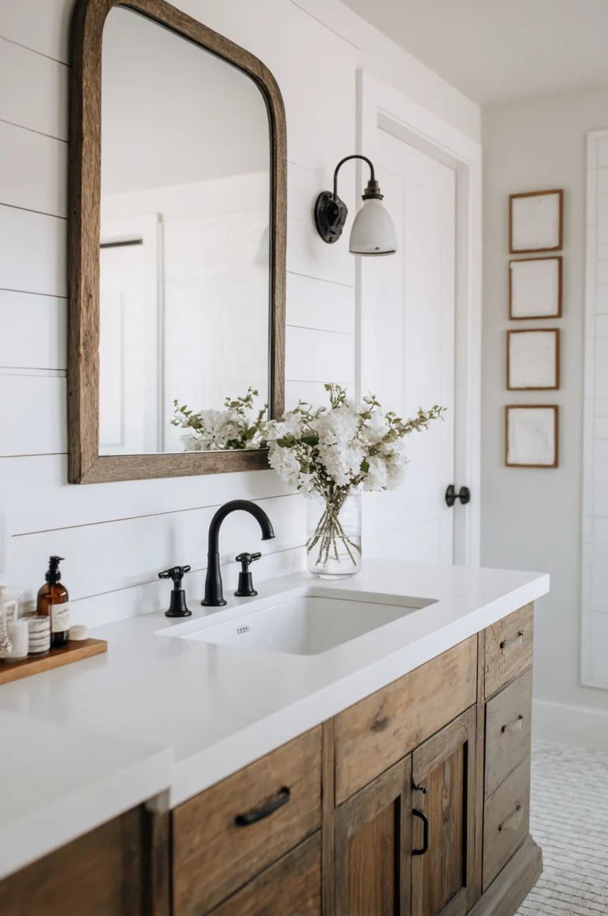
All-white bathrooms remain the most searched and most executed bathroom color choice – and the reason is not lack of imagination. White maximizes the sense of space and cleanliness in a way no other color can match, making it the logical choice for small bathrooms where these two qualities are the primary design goals. The challenge is not whether to use white but how to use it with enough variation to prevent the space from feeling sterile.
The key to an all-white farmhouse bathroom that reads as intentional rather than unfinished is layering different white tones and textures. Warm white shiplap on the walls, cooler white subway tile in the shower, warm cream linen towels, an off-white freestanding tub – these are all technically white, but the variation in tone and texture creates depth that a single flat white cannot. This principle separates a genuinely beautiful white bathroom from a builder-grade one.
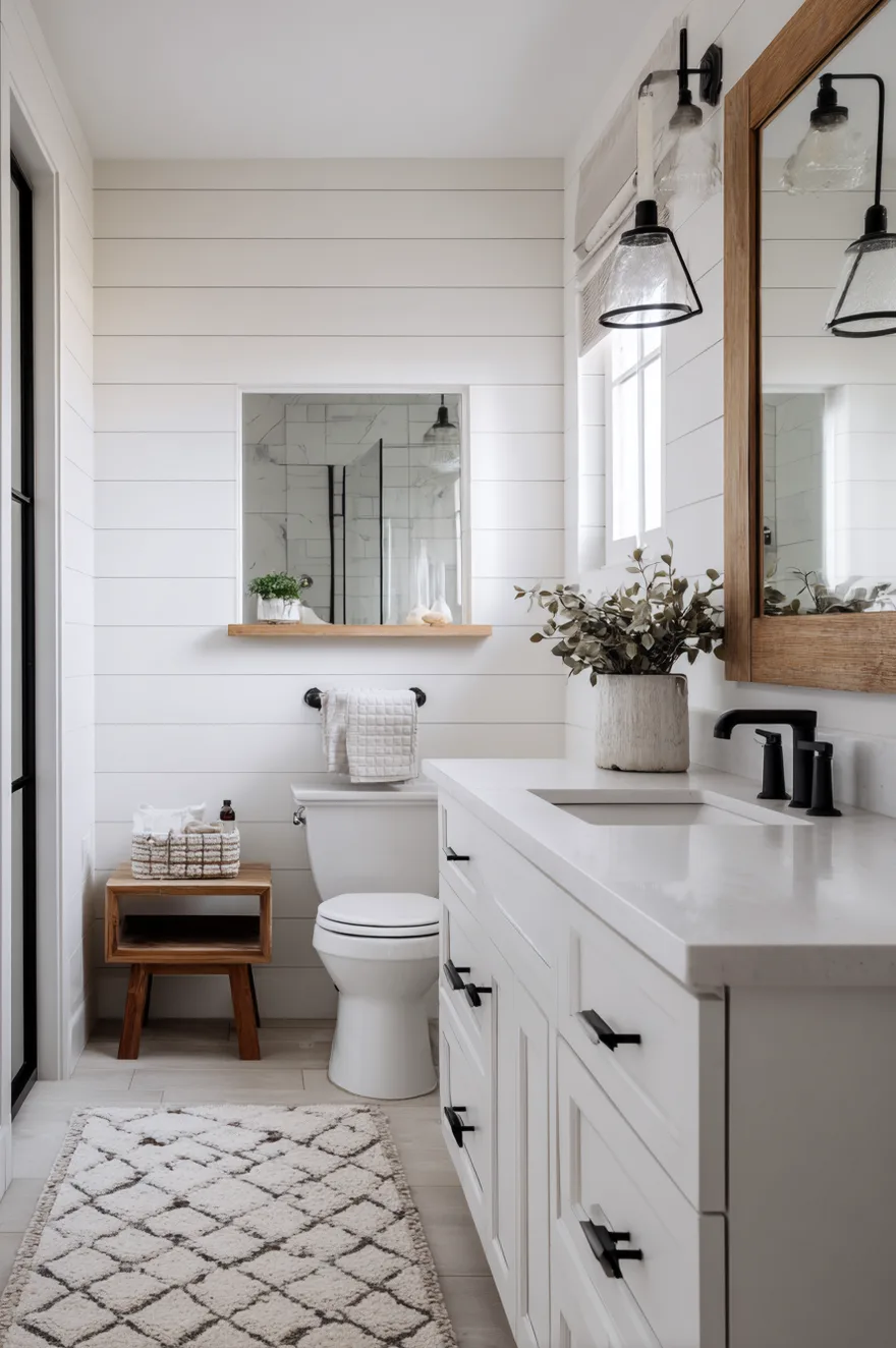
For farmhouse bathroom color ideas specifically, white provides the foundation that allows other farmhouse elements – natural wood, black iron hardware, exposed shiplap, a vintage-style mirror – to read clearly against a clean backdrop. Budget-wise, white paint costs less than custom-mixed colors and white fixtures are available at every price point. Use a satin or semi-gloss finish in wet areas to address the yellowing and marking concerns that a flat finish in white would not handle well.
Slate Blue Bathroom Color Ideas for Main Bathrooms and Master Suites
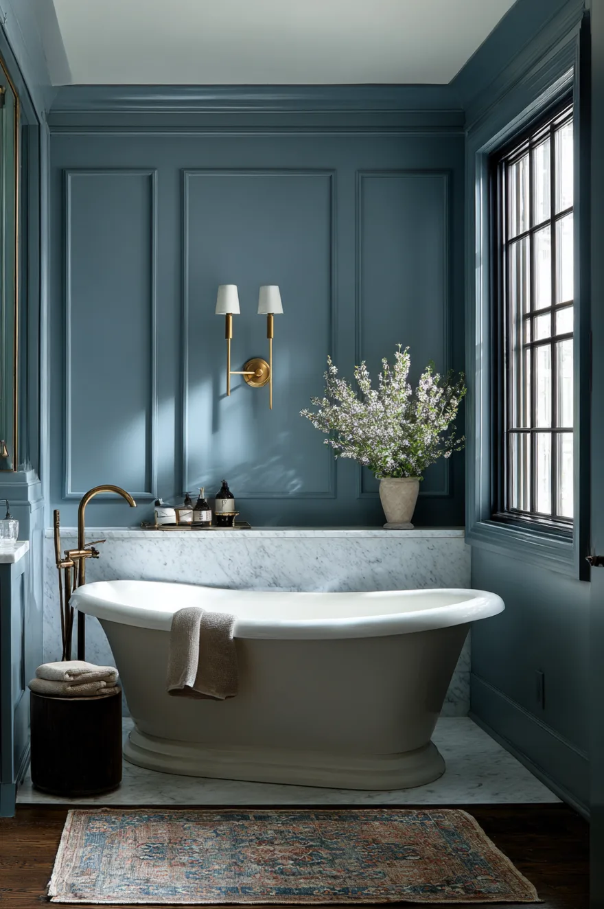
Slate blue occupies a specific and useful position in the 2026 bathroom color landscape: it delivers the sophistication and depth of navy without the full commitment to darkness. For homeowners who want a bathroom that reads as considered and intentional but are hesitant about deep, saturated color, slate blue is the most effective bridge between neutral and statement.
The gray undertones in slate blue are what make it so versatile – they prevent the color from reading as cartoonish or explicitly nautical. In natural light it reads bluer; under artificial light it shifts toward gray. This behavioral shift is something to test before committing: always sample large swatches on multiple walls and observe them at different times of day. A paint chip in a store is an unreliable representation of how a blue-gray will behave in your specific space.
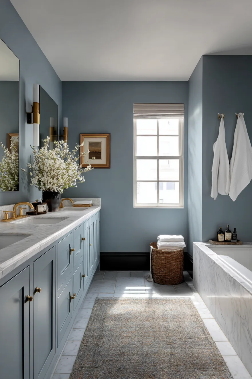
Slate blue pairs with both cool-toned flooring and countertops – white marble, gray stone, light concrete tile – and warm-toned materials. It bridges traditional and contemporary styles in a way that suits a wide range of home architectures. For modern bathroom color ideas, pair with matte black or brushed nickel. For a more traditional interpretation, unlacquered brass and vintage-style mirrors work beautifully. Always request actual paint samples rather than relying on digital color representations, which shift dramatically across different screens.
Warm Honey and Mustard Bathroom Colors for Vintage-Inspired Designs
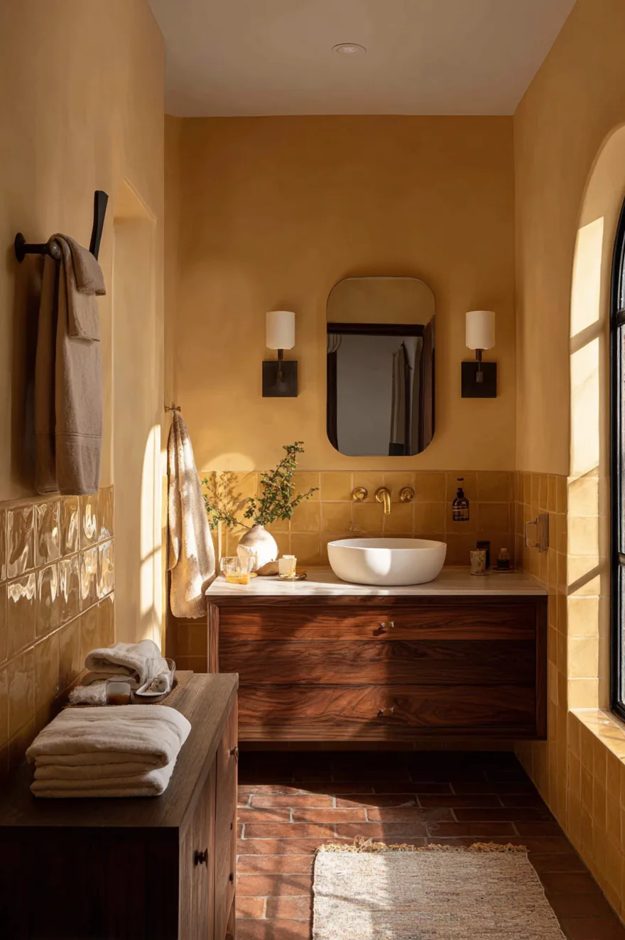
Golden honey and muted mustard tones are solving a specific design problem in 2026: how to bring warmth into a bathroom without the rustic associations of terracotta or the nature references of green. These sophisticated yellows sit at the intersection of retro-modern and contemporary warmth – they reference the mid-century color vocabulary without requiring a fully period-authentic commitment.
The pairing logic for this palette is consistent: walnut and other warm-toned wood cabinets, brown or earth-toned natural stone, and brass or antique gold hardware. These materials share the same warm temperature family as honey and mustard, creating a cohesive room where every element works in the same direction. The mistake to avoid is introducing cool-toned materials – chrome hardware or cool gray tile – which will make the warmth of the walls read as jarring rather than considered.
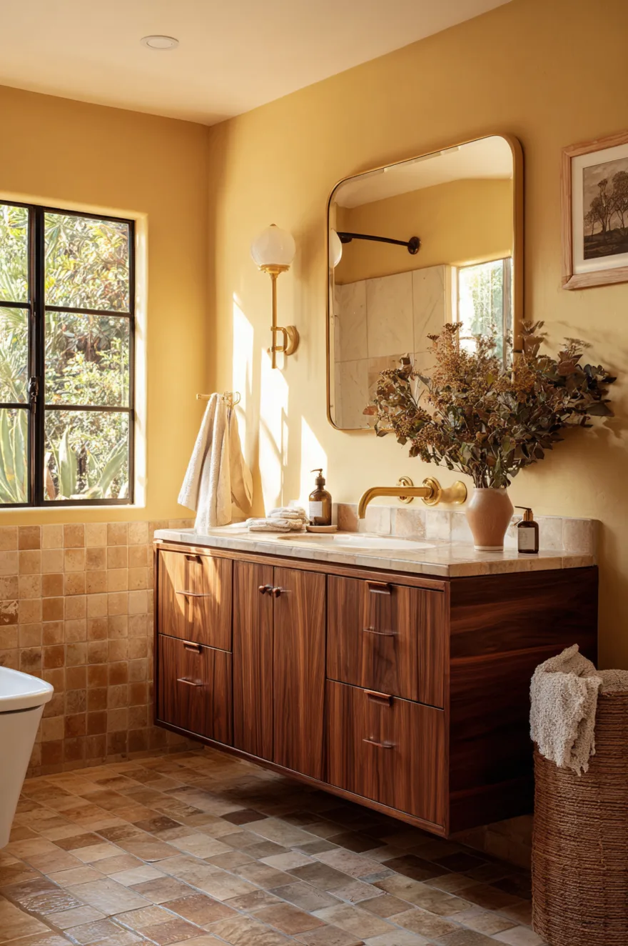
For small bathroom color ideas, muted versions of honey and mustard are the safer choice over saturated ones. A desaturated warm ochre reads as a sophisticated neutral with warmth; a fully saturated mustard can feel energetically high in an enclosed space. This color family works equally well in paint, glazed tile, and wallpaper, giving you flexibility in how you introduce it and at what scale.
Crisp White with Black Trim Bathroom Color Ideas for Farmhouse and Modern
White walls with black trim and fixtures succeed because they respect a fundamental design principle: contrast creates definition. In a small bathroom where you need to make the most of limited space, the graphic clarity of white and black outlines every architectural element – the window, the door frame, the shower enclosure, the mirror – in a way that makes the room read as larger and more intentional.
The reason this combination works across both farmhouse and contemporary bathroom styles is that it does not belong exclusively to either. Black-framed windows and mirrors have deep roots in both industrial loft design and traditional farmhouse architecture. White shiplap or white subway tile accommodates both aesthetic contexts without modification. This cross-style quality also makes it a strong choice from a resale perspective.
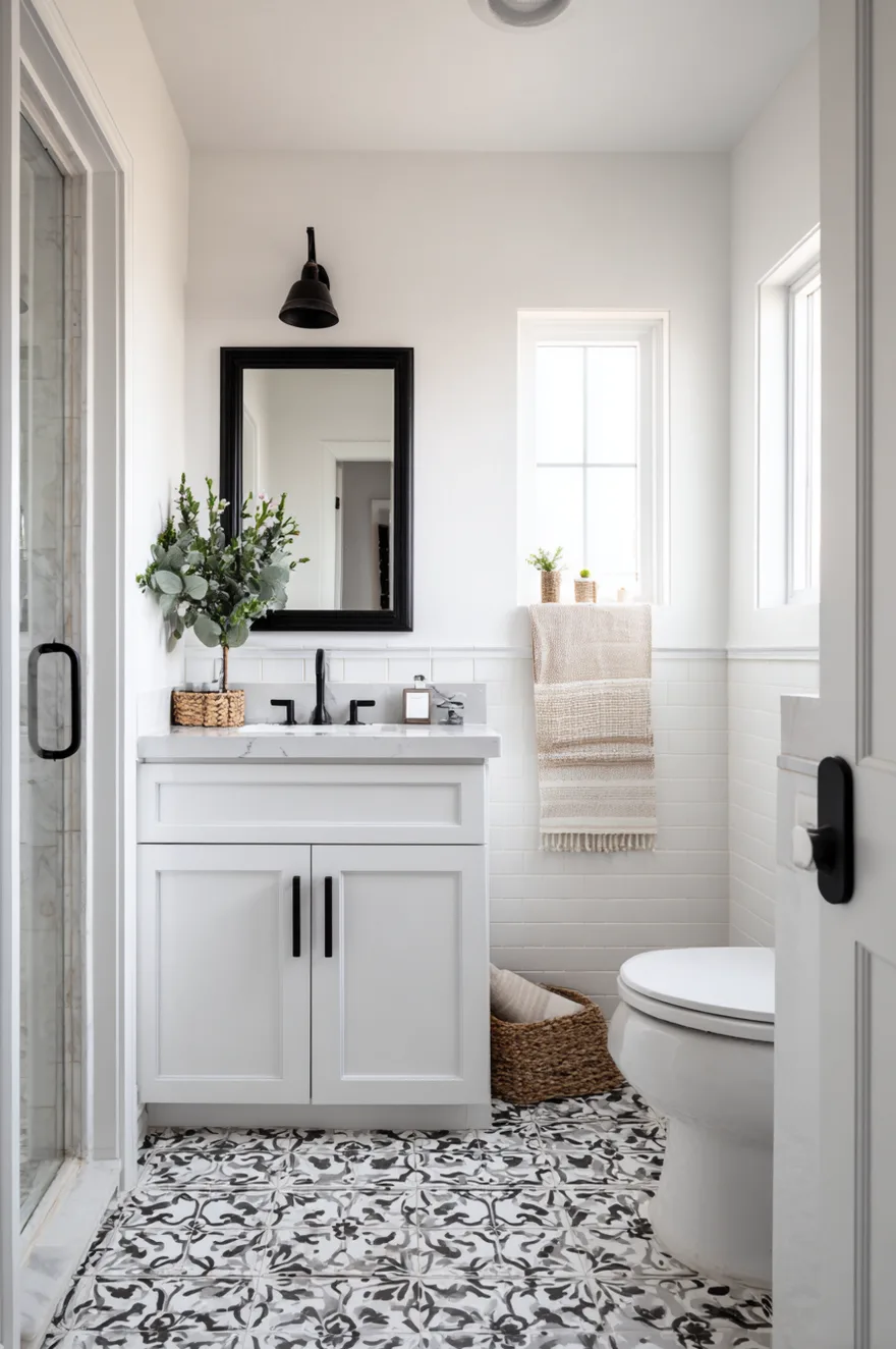
For modern bathroom color ideas in this palette, extend the black to all fixtures – matte black faucets, towel bars, shower fittings, and cabinet hardware create a fully resolved accent system against the white ground. For farmhouse bathroom color ideas, matte black iron hardware and exposed hinges with a black-framed vintage mirror create the same graphic contrast with period-appropriate references. The maintenance advantage: this combination makes cleaning requirements immediately visible against both surfaces.
Soft Lavender and Lilac Bathroom Colors for Relaxing Master Baths
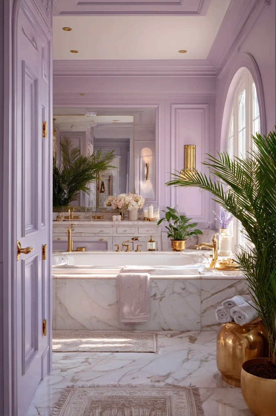
Lavender and lilac are what designers categorize as purple-tinged neutrals – a description that clarifies exactly why they work well in bathroom contexts. At the saturation levels used in residential bathroom design, these tones read as sophisticated alternatives to beige or gray, providing subtle color without the commitment of a statement palette. The functional benefit specific to bathrooms is the established psychological association between lavender and cleanliness, calm, and wellness.
Natural light is essential for lavender and lilac to perform at their best. In dark bathrooms without adequate light, these tones can read as dingy or flat. In bathrooms with generous natural light, they create a gentle luminosity that feels genuinely calming. This is a master bathroom color in the truest sense: it works best in larger spaces where people engage in longer self-care routines and where the color has room to develop.
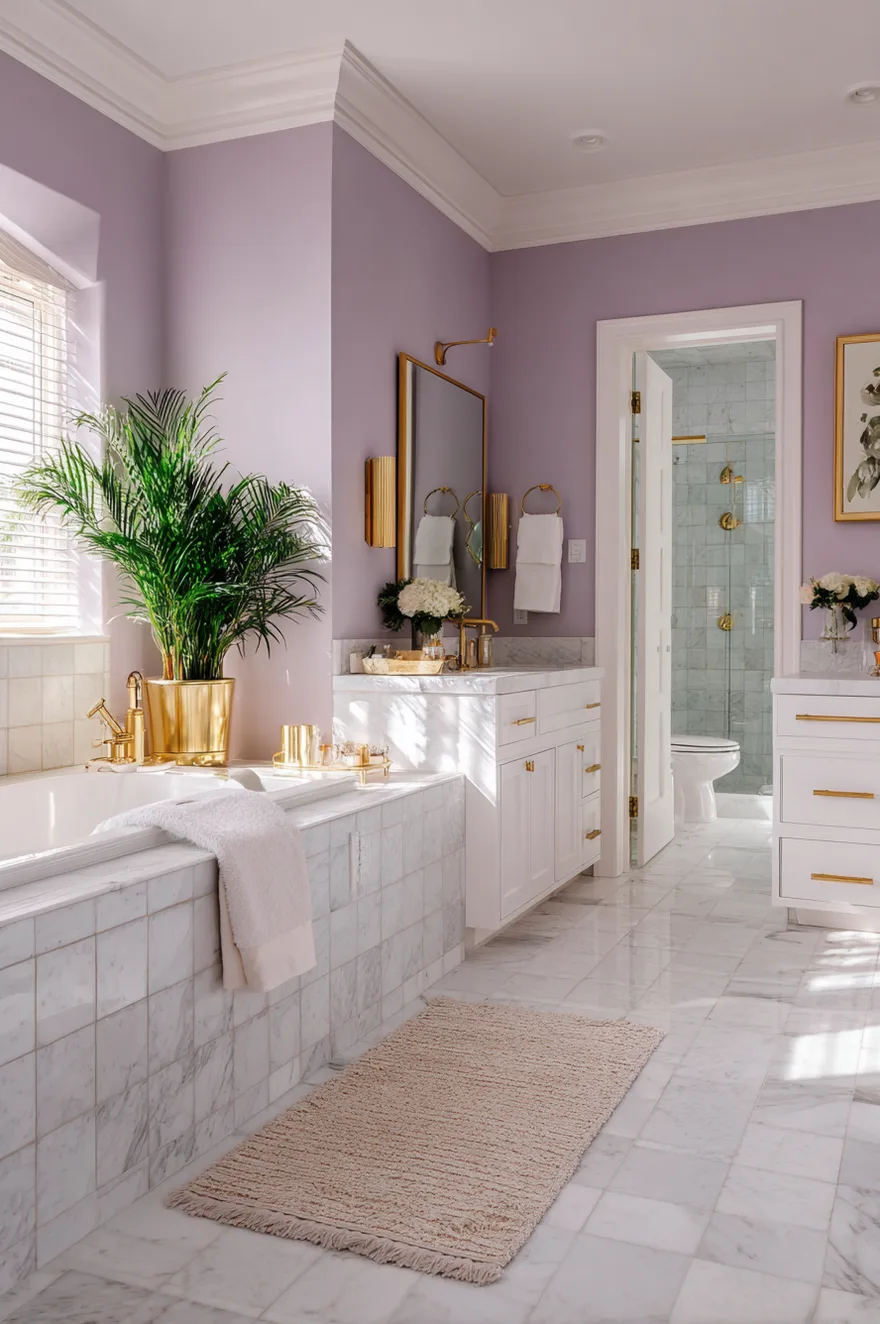
For the material palette around lavender, white subway tile or marble creates a clean, contemporary context. Eucalyptus or mint green accents in plants, towels, or small accessories create a herbaceous scheme that references aromatherapy and organic wellness. Brass and gold fixtures warm the naturally cool undertone of lavender and prevent it from reading as cold. Avoid chrome, which amplifies the coolness and pushes the palette toward clinical rather than spa-like.
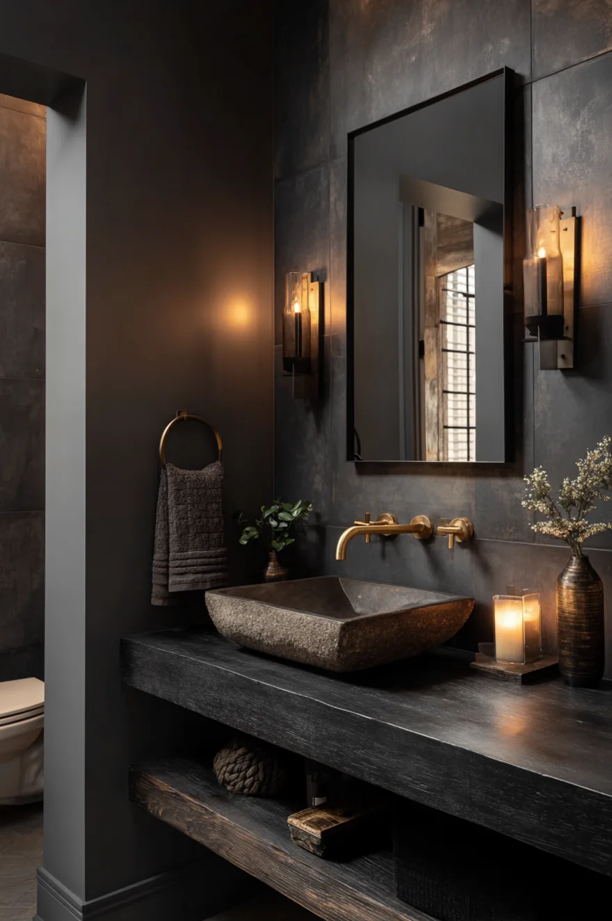
Charcoal and Brass Bathroom Color Combination for Luxury Master Baths
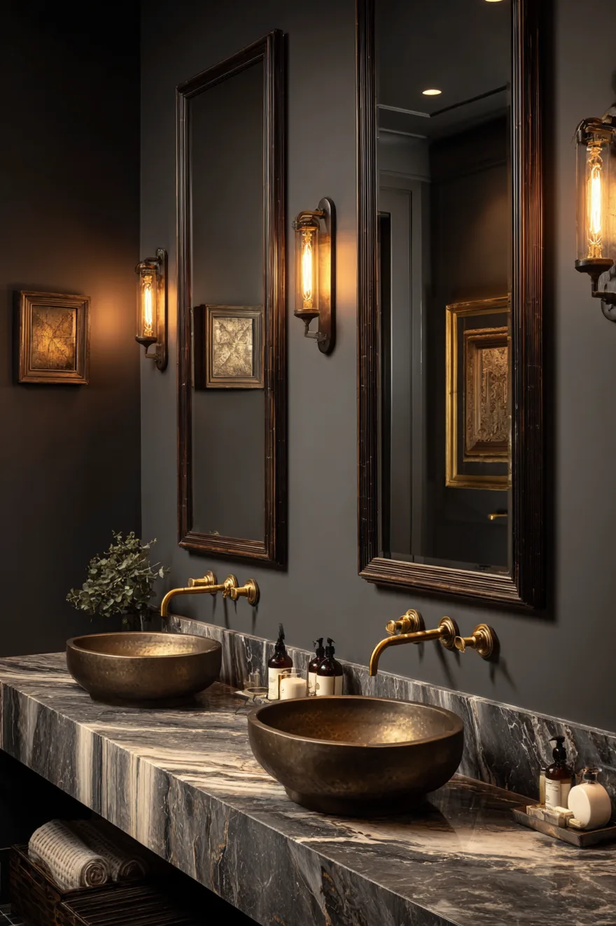
Charcoal gray walls paired with warm brass fixtures is the bathroom combination that consistently photographs as more expensive than it costs to execute. The deep, dark backdrop makes brass hardware and lighting glow against it, creating a warmth and visual richness that neither element creates independently. The contrast works because charcoal and brass occupy opposite positions on the warm-cool spectrum while sharing a quality of weight and substance.
The investment consideration for this palette is real but calculated. Brass fixtures – faucet, towel bars, shower fitting, mirror frame – typically represent a 20-30% budget increase over standard chrome equivalents. However, because the dark walls make these elements the visual centerpiece of the room, the investment is proportionally justified in a way that brass on a neutral wall is not. The brass earns its cost by having a backdrop that makes it impossible to overlook.
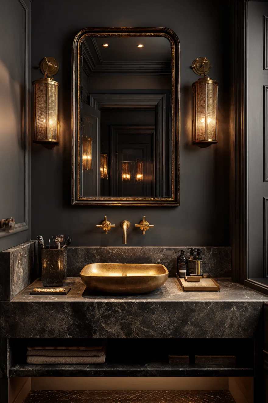
This combination requires strong layered lighting – at minimum, sconces flanking the mirror at face height plus adequate overhead illumination. Dark walls absorb light rather than reflecting it, so the ambient light level needs to be higher than you might expect. Pair with marble or natural stone countertops rather than engineered quartz to maintain the high-end material language this palette establishes.
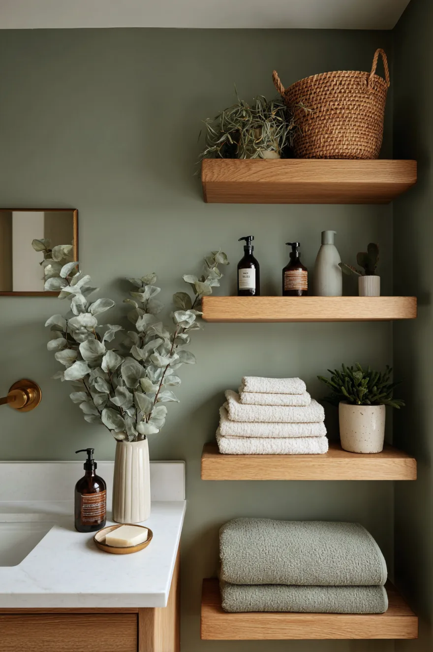
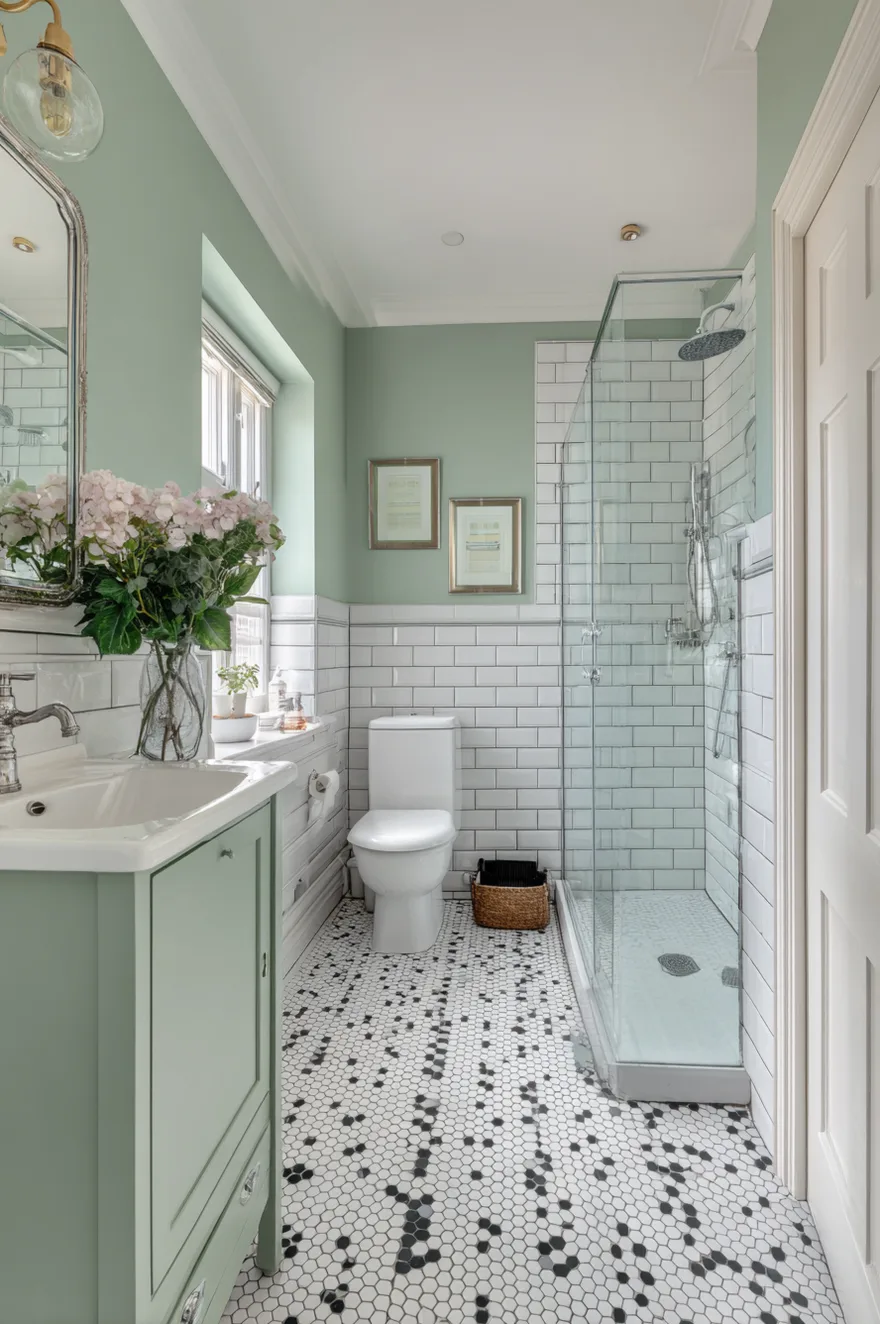
Soft Sage with Natural Wood Bathroom Colors for Farmhouse and Scandinavian Styles
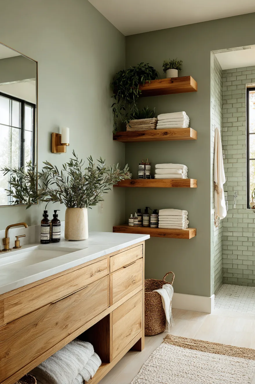
Sage green combined with natural wood is the bathroom palette that is simultaneously the most searched and most successfully executed of 2026 trends – which is unusual, because those two qualities rarely align. The reason it works so consistently is that both elements share the same design logic: organic, quiet, connected to natural processes. They do not compete; they reinforce.
The material selection within this palette requires specificity to work correctly. Sage pairs with cooler-toned woods – white oak, ash, walnut – rather than warm orange-toned woods like golden oak or pine. This distinction matters because sage’s defining quality is its gray undertone, and warmer woods pull against that undertone rather than complementing it. White oak floating shelves beside a sage vanity create harmony; golden oak creates a color tension that makes both elements look worse than they would separately.
For farmhouse bathroom color ideas, this combination is the current leading palette in the category – it has largely replaced the stark white-and-black farmhouse approach that reached saturation point. For Scandinavian-inspired modern bathrooms, sage and natural wood creates the hygge quality of warmth and connection to nature that defines the aesthetic. The combination ages exceptionally well, making it an excellent investment for long-term homeowners.
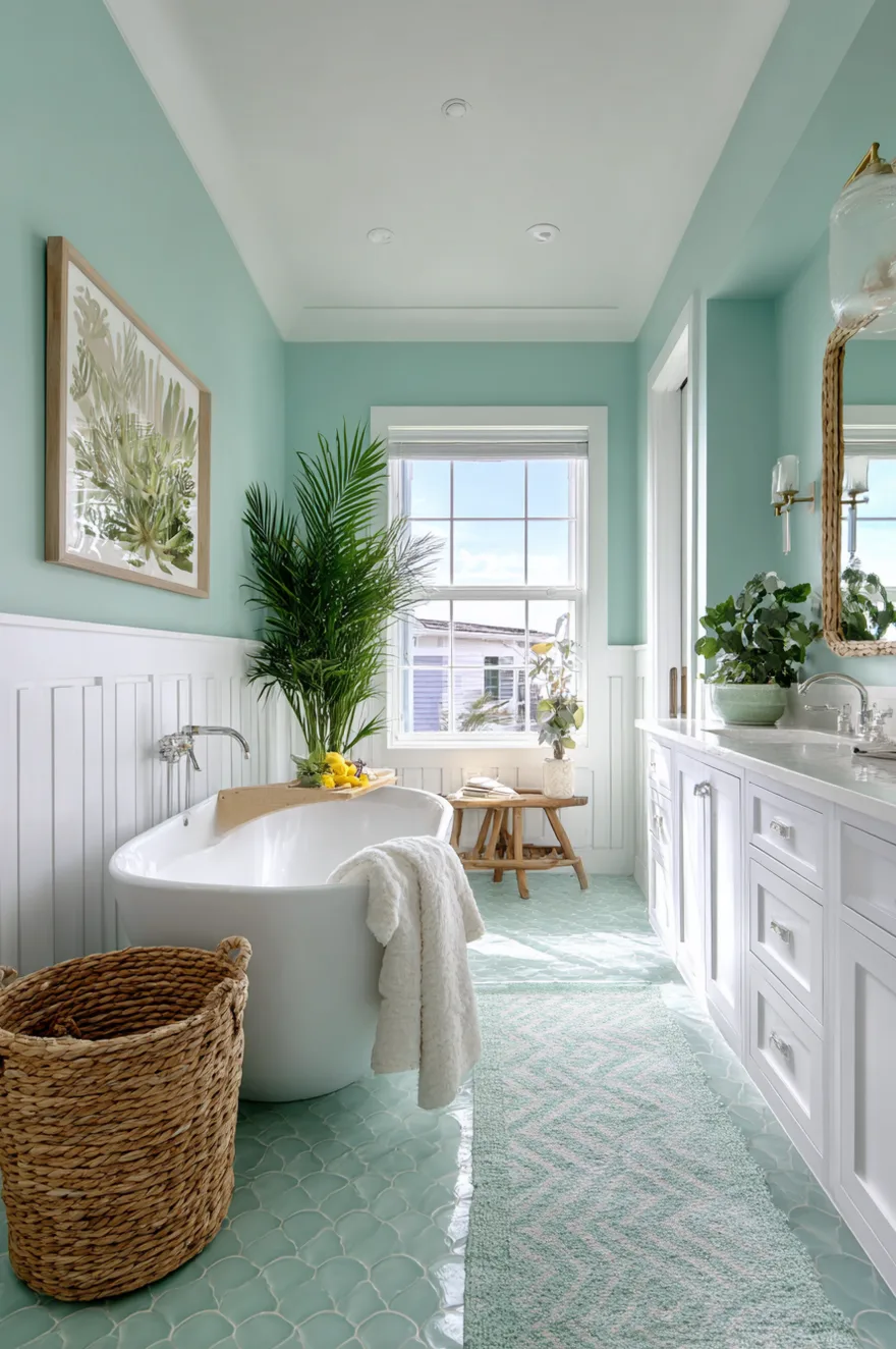
Cool Mint and Pale Green Bathroom Color Ideas for Tiny and Small Bathrooms
Mint and pale green occupy a specific functional niche in bathroom color: they are the lightest members of the green family, which means they deliver the nature-connection that greens create while maximizing the sense of space that small bathrooms require. In a very small bathroom where sage might feel too weighted, mint creates visual expansion while keeping the palette in the nature-inspired family defining 2026 bathroom trends.
The retro quality of mint is a genuine asset in today’s design context. There is a broad renovation movement toward vintage-inspired bathrooms that feel authentically aged rather than aggressively new, and mint green has deep mid-century roots that it wears naturally. Pair with white subway tile in a classic brick pattern, chrome fixtures in a vintage profile, and black and white hexagonal floor tile for a cohesive period-adjacent approach that reads as considered rather than costume.
For modern bathroom color ideas, mint with chrome hardware and large-format white tile creates a clean, contemporary version that retains the color’s space-expanding quality without the vintage references. The practical advantages are consistently cited: mint transforms a space dramatically with paint alone, pairs with affordable white fixtures without looking cheap, and accommodates accent color pivots over time. It also flatters a wide range of complexions in mirror reflections – a functional benefit most color guides overlook.
Coastal Aqua and Seafoam Bathroom Color Ideas for Guest Bathrooms
Aqua and seafoam are having a broader resurgence in 2026 as homeowners move away from the gray-dominant palette of the last decade and toward color with genuine emotional resonance. The psychological association of these watery hues with cleanliness, calm, and the ocean is well-established – and in a bathroom, where water is the defining functional element, that association works as functional reinforcement, not just aesthetic decoration.
For guest bathrooms specifically, these tones create an instant vacation-like atmosphere that makes visitors feel welcomed. The palette pairs naturally with white vanity units and natural textures – rope, rattan, and weathered wood all connect to the coastal vocabulary without requiring explicit nautical references. The result is a bathroom that feels refreshing rather than themed, which is the distinction that separates a successfully executed coastal palette from a clichéd one.
Small bathroom color ideas in the aqua and seafoam family benefit from the inherent lightness of these hues – they are bright without the energy of yellow or the sharpness of stark white. For modern interpretations, pair with chrome or brushed nickel hardware. For a more organic approach, aged brass or unlacquered brass creates a warmer, less literal coastal reference. Budget-conscious renovators consistently identify this color family as high-impact because the transformation requires only paint – the fixtures do not need to change.
Rich Burgundy and Wine Bathroom Colors for Dramatic Powder Rooms
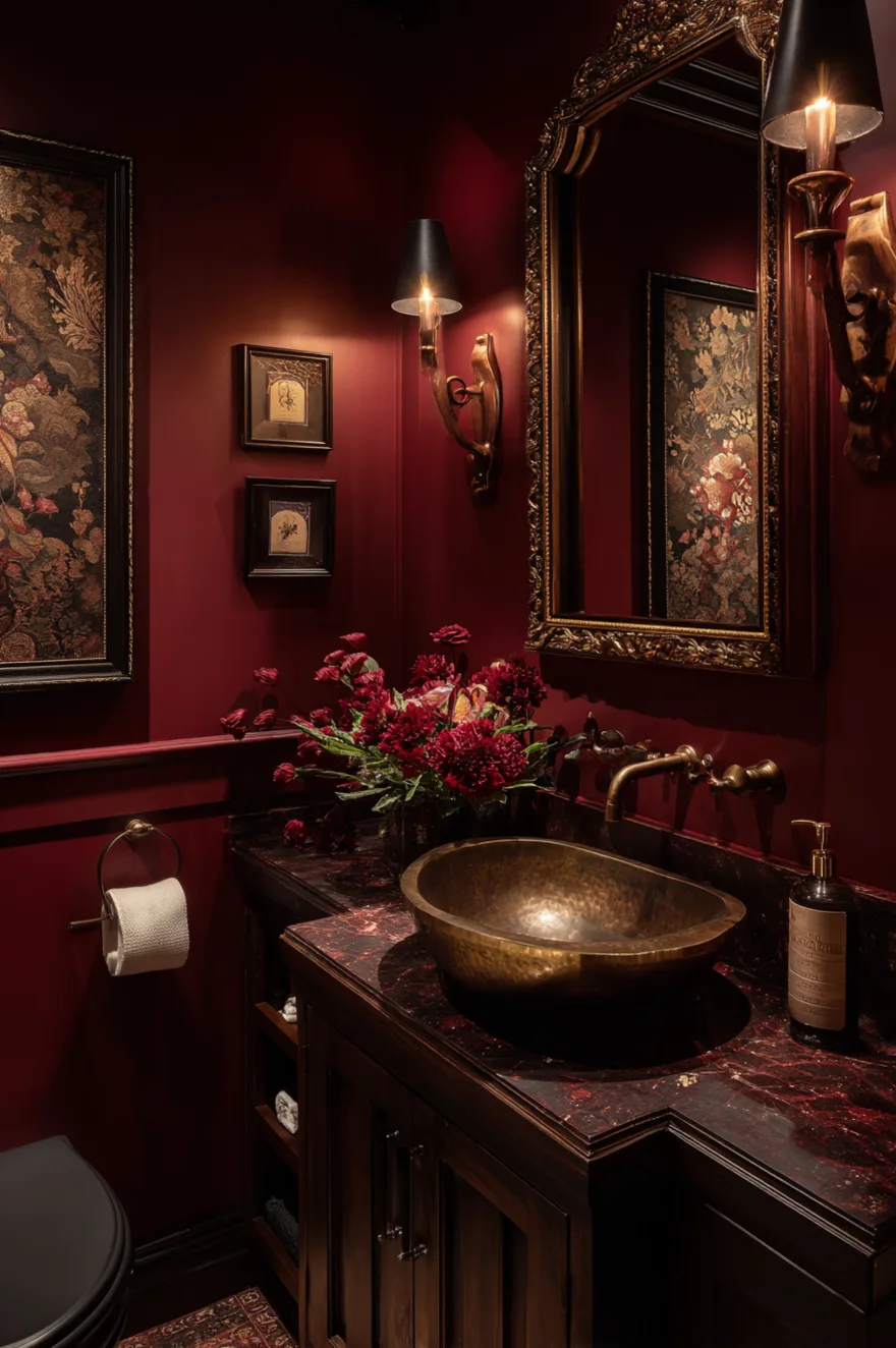
Burgundy and wine tones create what designers call a jewel-box effect – a space where the richness of the color makes every element inside it feel more valuable. This is the principle behind museum wall color choices applied to a residential bathroom context. When the walls are rich and deep, even simple white fixtures and basic hardware appear elevated by contrast.
The lighting requirement for this palette is the most specific of any color in this guide. Dimmers are not optional – they are structural. In the morning when you need functional brightness, burgundy needs to be properly lit or it will read as oppressive. In the evening when you want atmosphere, lowering the intensity allows the depth of the color to create the intimate, candlelit quality that makes this palette so compelling. Without dimmer control, you only ever access one version of this bathroom.
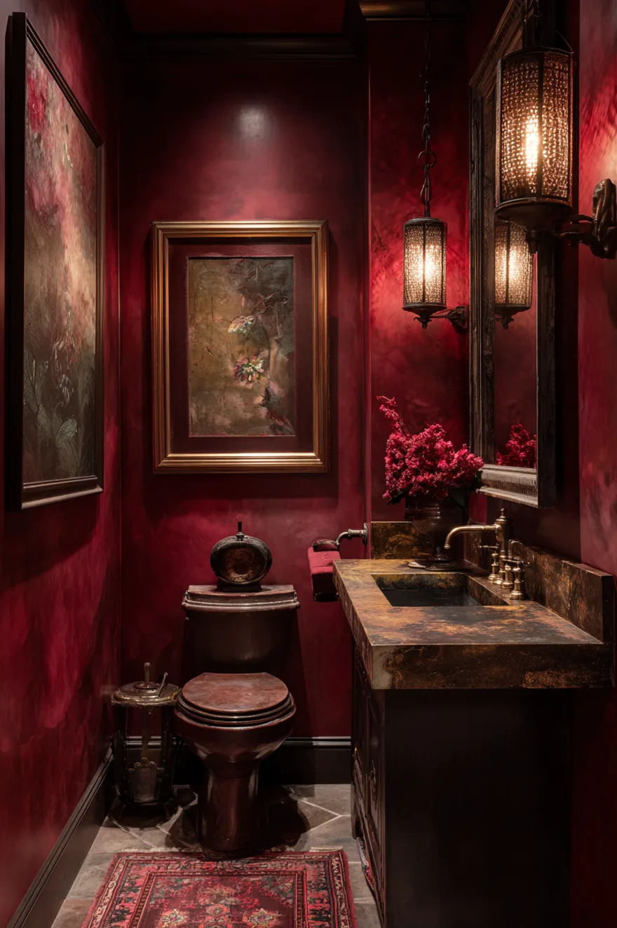
Victorian-era homes, traditional properties with crown molding, and formal powder rooms that receive guests during entertaining are the ideal applications. Burgundy photographs exceptionally well and creates the kind of space guests remember and comment on, making it a strong choice for shared or guest bathrooms where impression matters. Antique brass or oil-rubbed bronze hardware reinforces the richness of the palette without competing with it.
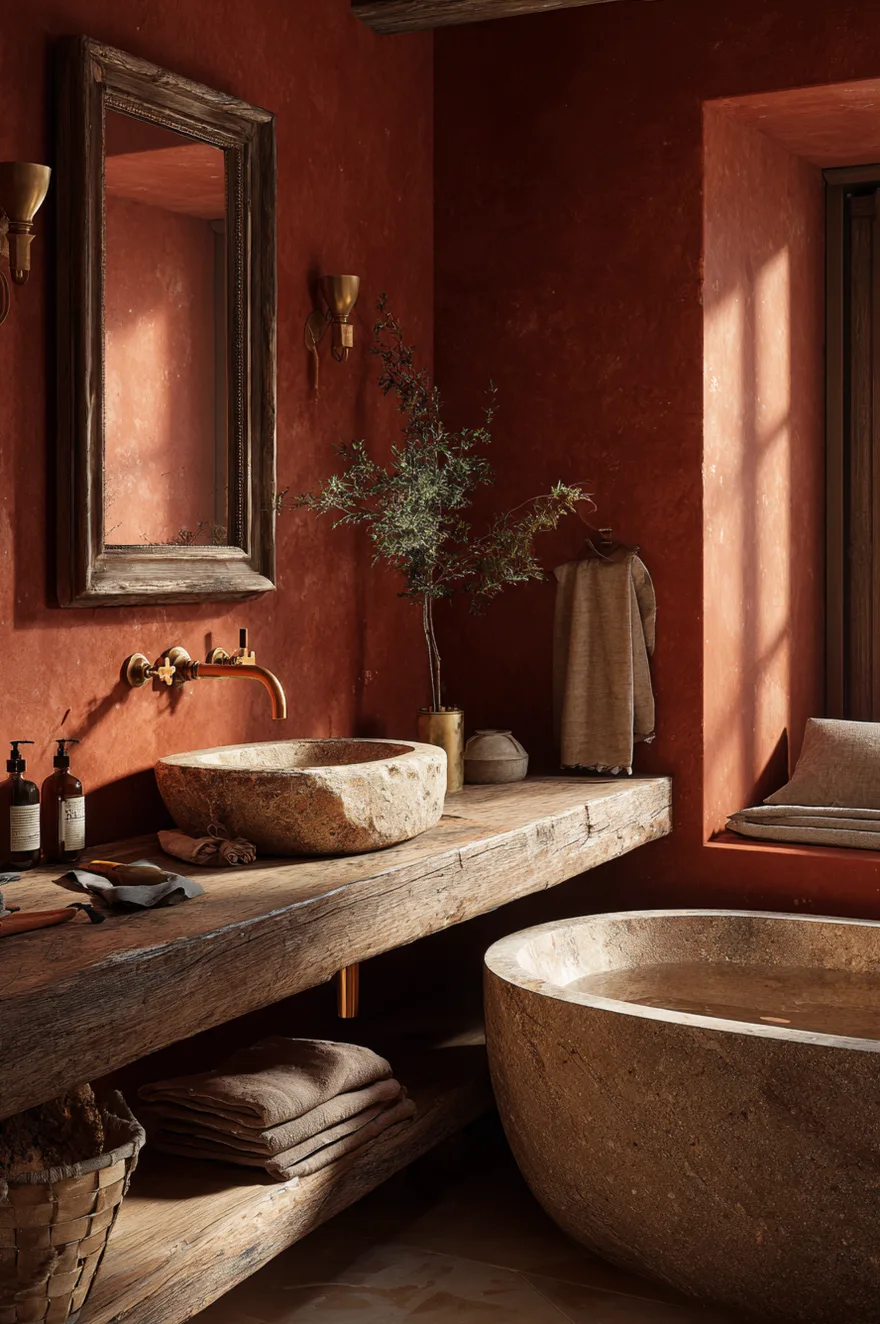
Terracotta and Clay Red Bathroom Colors for Rustic and Mediterranean Bathrooms
Terracotta and clay red are the bathroom colors that connect interior space to landscape most directly. In regions where the natural environment features these tones, the connection is literal. But this palette is gaining significant traction nationally as homeowners seek warmth and character that the gray decade did not provide. The shift is not regional – it is cultural.
The functional argument for terracotta is practical as well as aesthetic: earthy tones at mid-saturation conceal the minor water spots, marks, and surface variations that inevitably appear in high-use bathroom environments. The color also allows imperfect surfaces and hand-applied finishes to read as intentional rather than sloppy – a quality that can meaningfully reduce renovation costs by tolerating less-than-perfect plaster or tile installation.
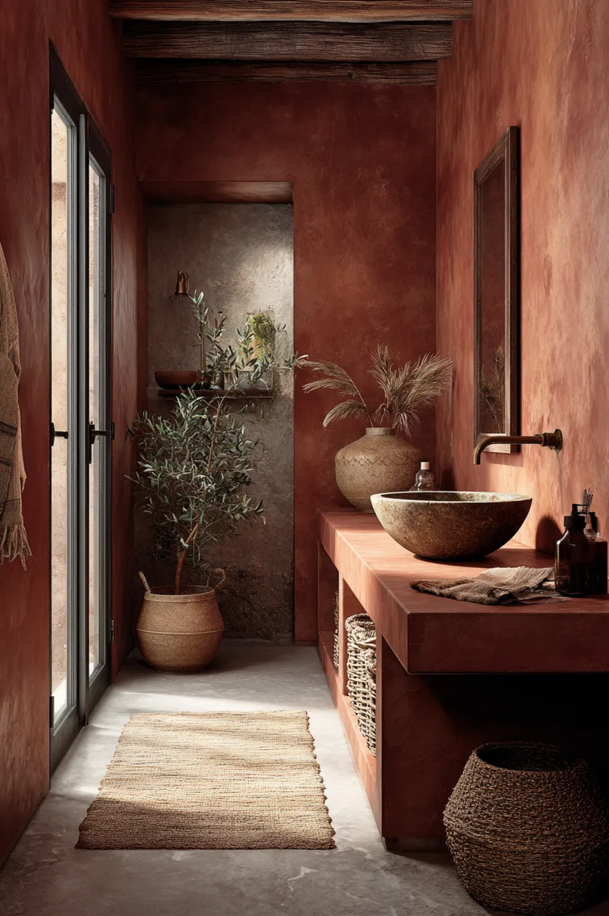
For rustic bathroom color ideas, terracotta pairs with rough-hewn natural stone floors, a clay or ceramic vessel sink, and copper or unlacquered brass fixtures that will develop a natural patina over time. For a more modern interpretation, smooth terracotta limewash on a single feature wall with white concrete tile and matte black fixtures creates the warmth of the palette with contemporary restraint. Renovation experts consistently report that terracotta bathrooms generate strong positive responses at open houses – distinctive and warm without being polarizing.
Choosing the Right Bathroom Color for Your Space in 2026
The consistent thread running through every successful 2026 bathroom color palette is intentionality. The colors that work are not simply the ones trending – they are the ones chosen for specific, logical reasons: the quality of light in the room, the material language of existing fixtures and tile, the size and proportion of the space, and the experience you want the bathroom to create.
The practical decision framework: start with your existing fixed elements – floor tile, fixtures, hardware – and identify their undertone. Warm or cool. Then select a wall color that shares that undertone or deliberately contrasts it with clear purpose. Test large samples on multiple walls. Assess in both natural and artificial light at different times of day. The sample pot investment is the most reliable way to avoid an expensive mistake.
Which of these 2026 bathroom color ideas fits your space? The organic warmth of sage and natural wood, the dramatic intimacy of charcoal and brass, the timeless graphic clarity of white and black trim, or the grounded earthiness of terracotta and clay?
See you soon,
Rachel