The shower is often the last thing people think about when planning a bathroom remodel – and the first thing they regret skimping on. Whether you’re working with a tight footprint, an awkward corner, or a full gut renovation, these walk in shower ideas cover the decisions that matter: tile choice, enclosure type, the case for going doorless, and why one well-placed bench changes how you use the room every single morning.
Last spring, David finished a white oak floating vanity for our main bathroom – the kind of piece that makes everything around it look either considered or chaotic. Standing there, I realized the shower we’d been ignoring for three years was now the problem. Original builder glass, chrome hinges that didn’t fully close, a threshold you had to step over like it was an obstacle course. We’d been tolerating it the way you tolerate a drawer that sticks: not broken enough to fix, but wrong enough to notice every day.
We stripped it down to the studs in February. And the decisions we made in there – the tile format, the grout color, the choice to go frameless and doorless – taught me more about what makes a shower feel designed versus merely functional than a decade of drawing bathrooms on paper ever had. These ideas come from that project, from client bathrooms I’ve obsessed over for years, and from the kind of scroll-stopping images that are worth actually unpacking rather than just saving and forgetting.
1. The Dark Moody Tile Shower That Stops The Scroll
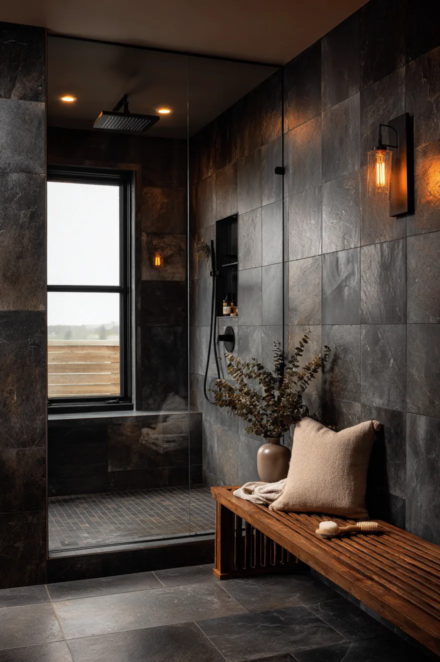
Deep charcoal tile reads completely differently at 7am than it does at 9pm, and that range is what makes it worth committing to. A floor-to-ceiling application in a slate-look porcelain – something with surface variation, not a flat matte field – absorbs the morning light softly and turns warm and almost luminous under a single wall sconce in the evening. The texture is doing the heavy lifting that color alone can’t.
The matte black rain head is the right fixture for this treatment. Polished chrome would fight the surface; matte black reads as the same family of material, which is why the whole enclosure feels resolved rather than assembled from separate decisions. Dark grout is non-negotiable here – light grout on dark tile turns the grid into the loudest thing in the room, and you want the wall to read as a surface, not a pattern.
The teak bench in the corner earns its place on two levels. Practically, it handles seated shaving, towel staging, and the general choreography of a morning routine. Visually, the warm wood interrupts the dark envelope in a way that keeps the space from tipping into cold. One frameless glass panel on the entry side is all the enclosure this setup needs – it suggests containment without cutting the room in half. Start there: pick the grout before anything else, because it commits you to the whole atmosphere.
2. Why A Half Wall Changes Everything
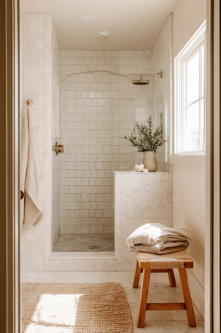
A knee-high honed marble half wall does something a full glass panel cannot: it creates genuine privacy at the level where you actually need it, while leaving the upper half of the room visually open. No hinges. No squeegee obligation. Morning light moves through the space the way it would in a room without a shower in it at all.
I was skeptical of this approach for years – I assumed the splash zone would be a problem. It mostly isn’t, provided the floor slopes correctly toward the drain and the half wall sits at least 36 inches high. Framed from the doorway, a bathroom with a half-wall shower reads as one coherent room rather than a wet zone and a dry zone that happen to share square footage. That continuity is worth more than most people realize before they experience it.
3. Black Framed Walk In Shower For A Modern Bathroom
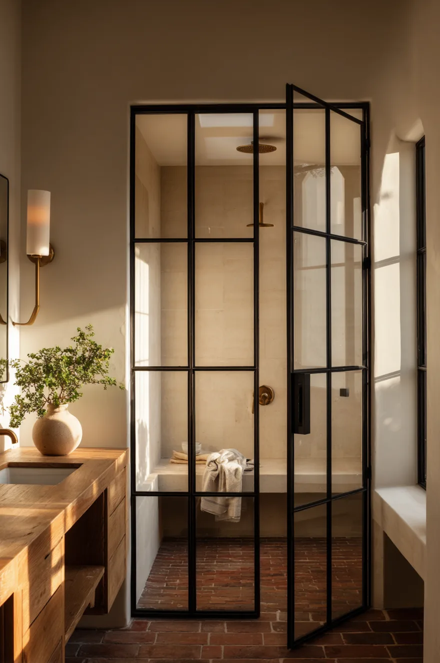
The frame is the detail. A slim matte black steel frame on clear glass does what a thick aluminum extrusion in chrome never can: it reads as a line drawing around the shower rather than a hardware product installed in a room. The frame is thin enough that your eye moves through it to the zellige tile inside, which is where it should land.
Warm cream zellige behind the glass paired with unlacquered brass fixtures is a combination that ages well because neither material is static. The zellige picks up the variation of handmade clay. The brass shifts slightly as it oxidizes. And a floating white oak vanity on the opposite wall keeps the room from sliding into anything too precious – it’s grounded, functional, and honest about what it’s made of. The heated terracotta floor tile underneath is one of those investments that feels absurd until the first cold morning in February, after which it feels completely rational.
If you’re choosing a frame color, commit to matte black only if the rest of your fixtures can follow. One brushed nickel faucet in a matte black bathroom reads as a mistake, not an accent.
4. Rustic Stone Walk In Shower With Timber Warmth
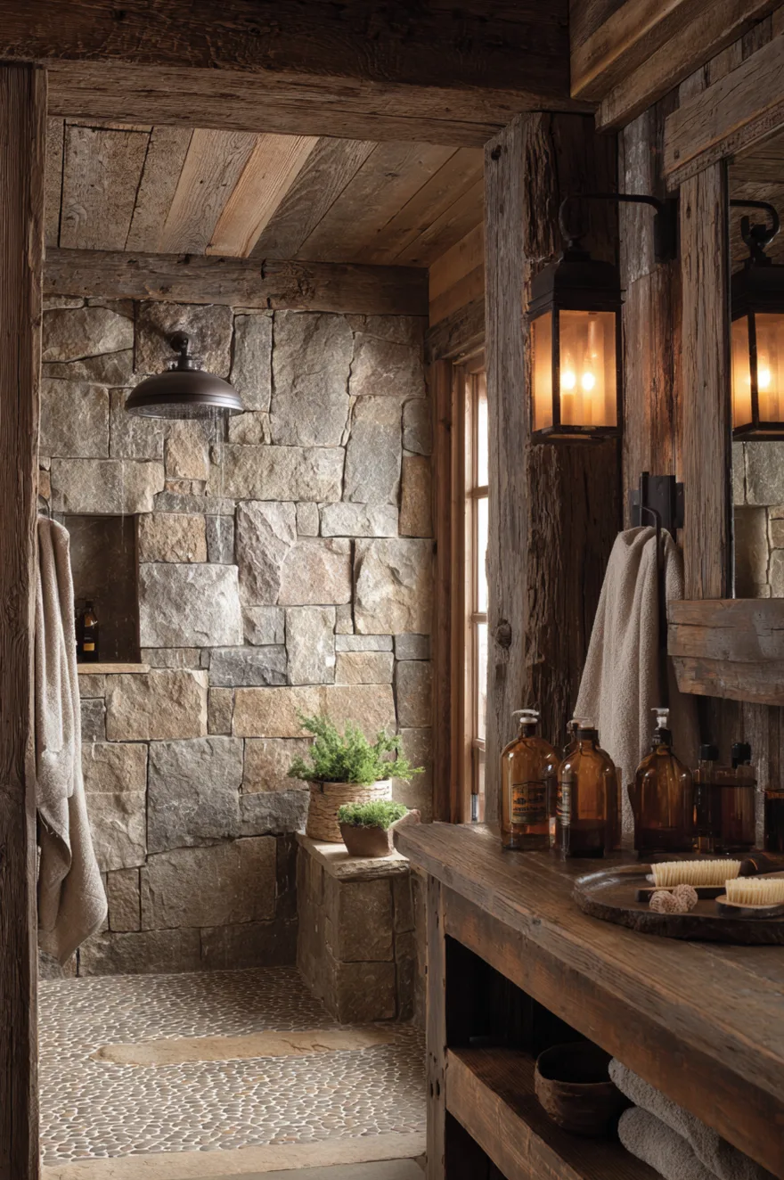
The first time a client showed me a stacked ledger stone shower, I told her it would feel like a ski lodge in a way that dates badly. I was wrong. The version that works isn’t about theme – it’s about material honesty. Real stacked stone on one wall, rough-hewn cedar overhead, and a river-pebble floor insert that actually massages your feet rather than just gesturing at nature. The difference between a stone shower that reads as a spa and one that reads as a Halloween haunted house is whether the materials are in proportion to the room.
Oil-rubbed bronze is the correct finish here. Polished chrome would read like a contractor’s afterthought against this much texture. The warm amber light from a wall-mounted fixture is what pulls the space together after dark – by 8pm, with steam and that lamplight, the room feels like it belongs somewhere with a view of mountains, even if it’s in a Seattle bungalow. A reclaimed wood open vanity visible through the frameless entry is enough to carry the material story into the rest of the bathroom without overdoing it.
Budget note: ledger stone panels are available at most tile suppliers for $8 to $15 per square foot – significantly less than custom stone work, and they install like large-format tile if the wall is properly waterproofed first.
5. Small Bathroom Walk In Shower Without The Sacrifice
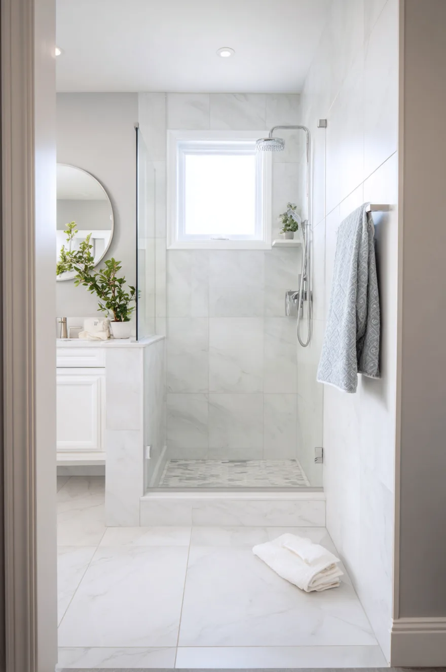
The move in a compact bathroom is counterintuitive: give the shower the full end wall and use large-format white tile on both the floor and the walls, running continuously across the threshold. The curbless entry and the continuous tile plane trick the eye into reading the shower floor as part of the room floor rather than a separate wet zone.
A recessed niche eliminates the wire rack or tension-rod caddy that makes small showers feel cramped – product storage built into the wall takes up zero floor space and zero visual space. A chrome linear drain at the entry rather than a center drain lets the floor tile run in one direction, which reinforces the sense of length rather than interrupting it. One clear glass panel is genuinely all you need; the second panel you’re tempted to add will shrink the shower by making the boundary visible from two directions instead of one.
6. Blue Tile Accent Shower For A Spa-Like Bathroom
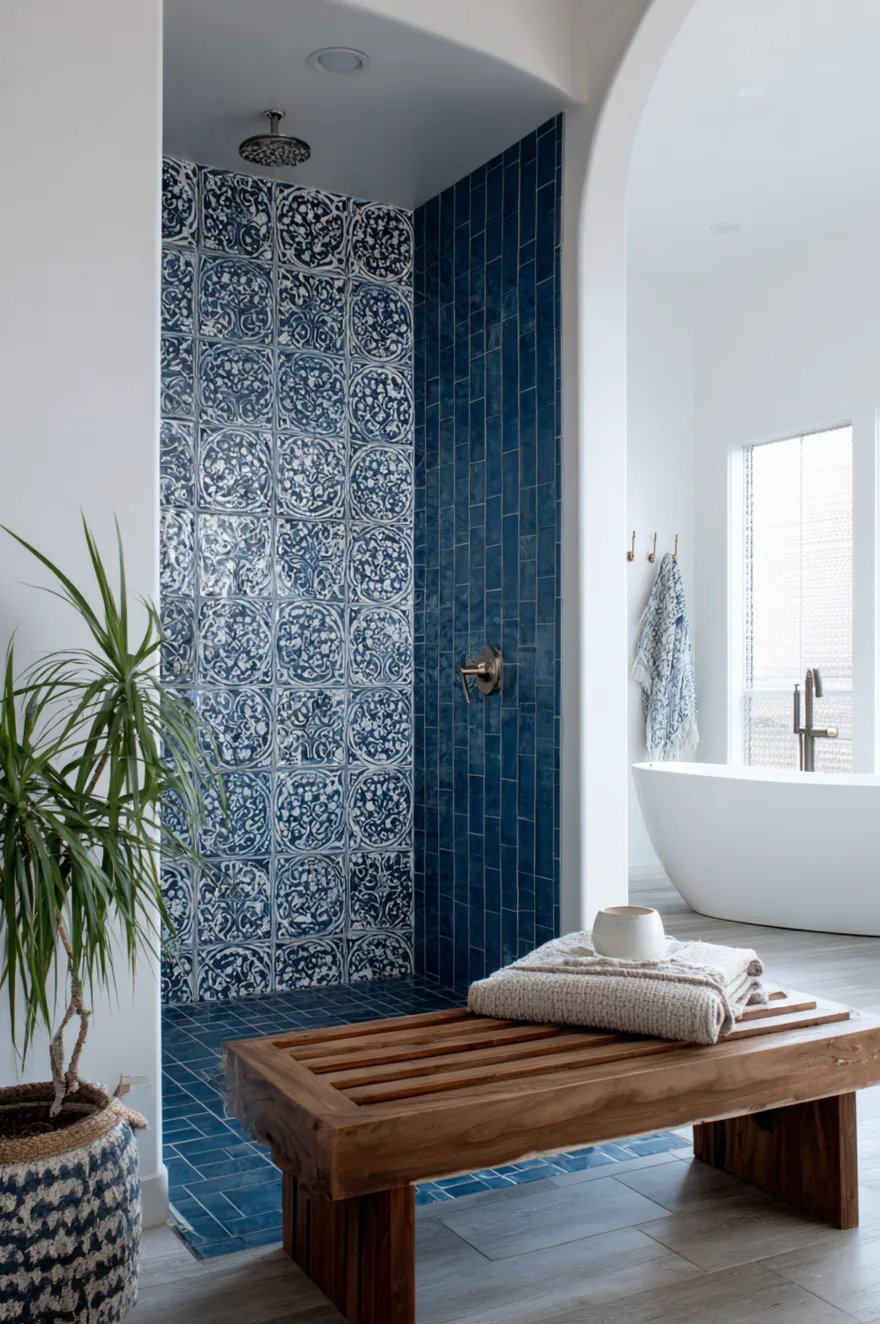
A single accent wall of handmade cobalt and ocean-blue zellige behind the fixtures anchors the whole room without requiring you to tile every surface in a color that commits you to a decade of the same mood. The white plaster on the remaining shower walls is intentional contrast, not a budget compromise – it lets the blue read as a choice rather than a default.
What makes cobalt zellige work where painted-on blue would feel flat is the glaze variation. Each tile catches light differently, which means the wall shifts slightly as the morning light moves across it. Frame this straight-on rather than at an angle so the back wall fills the composition. The teak fold-down bench, stored flat when not in use, keeps the sightline clean while earning its keep during actual showers. And if you can position a freestanding tub in view of that accent wall, the whole room starts to feel larger than its square footage.
7. The Tub To Shower Conversion That Reclaimed The Room
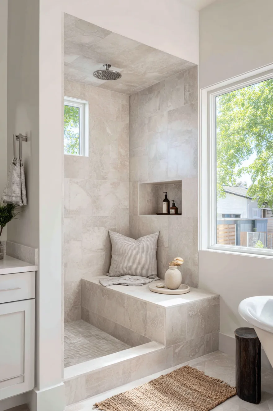
We had a client in Ballard who used her tub maybe three times a year – and had to turn sideways to get into her shower. The tub wasn’t a luxury, it was a real estate holdover from 1987. Converting that alcove into a full doorless walk in shower with a built-in niche bench gave her a shower she actually wanted to be in and a bathroom that finally felt like it belonged to her life rather than a previous owner’s idea of one.
The material choice for a tub-to-shower conversion matters more than people expect, because you’re working with an existing footprint that isn’t going to change. Warm greige large-format porcelain – something in the 24×48 range – minimizes grout lines in a fixed space and reads as a single warm surface rather than a grid. A window above the shower head is the detail that most people overlook and most regret missing: natural daylight inside a shower changes how the tile reads, how the steam moves, and how long you actually want to stay in there.
The gained floor space is real. Without the tub deck eating 18 to 20 inches of the room’s width, the bathroom suddenly has circulation space that never existed before.
8. White Subway Tile Walk In Shower Done Right
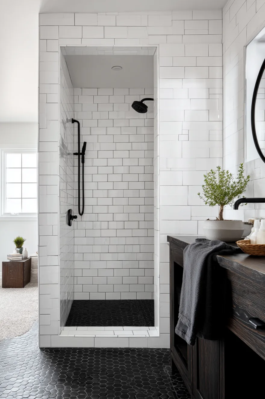
Vertical stack bond instead of running bond is not a small decision. Stack bond reads formal and graphic; running bond reads casual and expected. Set three-by-six white subway tile on the vertical stack with charcoal grout and you have something that looks considered rather than contractor-default – and it costs exactly the same amount.
The charcoal grout carries the whole thing. It makes the grid intentional, turns the tile into a pattern, and works with a matte black handheld fixture and a black hex mosaic floor in a way that running bond with white grout simply doesn’t. (I still think white grout in a shower is optimistic. Charcoal hides the reality of daily use without hiding anything about what the tile is doing.) Pair this with a dark-stained oak vanity opposite and you have a bathroom that reads as designed for almost no premium over a standard tile package.
9. Walk In Shower With Bench Built For Real Life
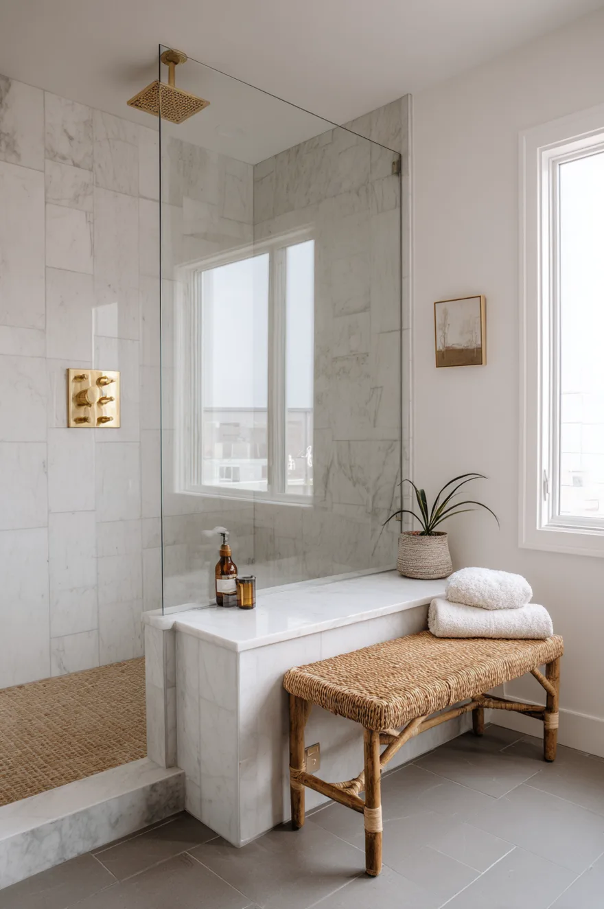
A full-width Carrara marble bench running one wall of a walk in shower sounds like a luxury detail, but it’s really a spatial decision. When the bench runs the full length – not a corner seat, not a small inset ledge – it becomes the organizing element of the shower. Everything else arranges itself around it.
Honed rather than polished marble matters here because polished marble in a wet shower is genuinely dangerous and visually at odds with a room that should feel functional. Honed has a matte, almost stone-quarry quality that reads honest. Oversized warm gray porcelain on the walls and floor (something in the 12×24 range) lets the marble bench be the moment without competing with it. Frameless glass on two sides and a brushed gold thermostatic panel give you the fixture experience without adding visual weight. A rattan stool just outside the glass is the kind of object that costs almost nothing and makes the room look like someone thought about it – which, in fact, someone did.
Thermostatic valves are genuinely worth the upgrade if you shower at the same temperature every day, which most people do. You set it once and never wait for warm water again.
10. Why Doorless Walk In Showers Feel Bigger Than They Are
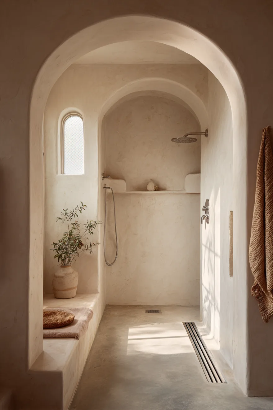
No door means no swing clearance. That’s 24 to 30 inches of floor that belongs to the shower in a hinged door layout and disappears entirely in a doorless one. The spatial gain is real, but the visual gain is equally significant – a curbless entry with no interruption reads as a continuation of the room rather than a separate compartment.
Sand-toned linen plaster on the walls and a concrete floor with a linear drain treat the wet and dry zones as part of the same material world. The arched window above is the detail that makes the room feel considered rather than simply unfinished – a doorless shower without a focal point risks looking like a building site. That soft morning light through the arch does the work a pendant or sconce cannot.
11. Corner Glass Walk In Shower For An Awkward Layout
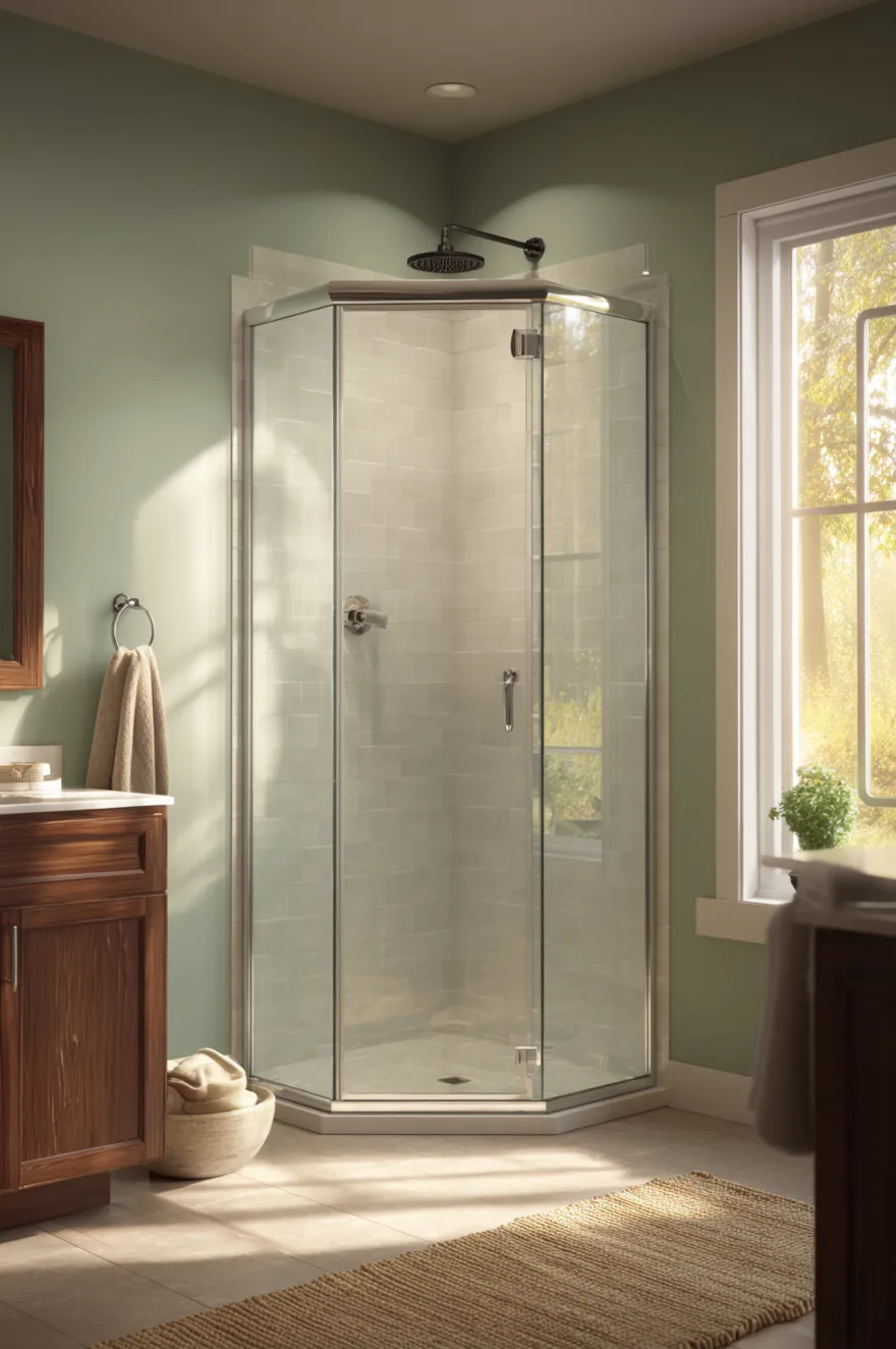
The corner shower is almost always the answer to an irregular footprint, and almost always executed badly. The version that works has two full glass panels meeting at a 90-degree corner with the smallest possible frame – a minimal chrome extrusion rather than a chunky aluminum channel. The frame disappears into the composition and you’re left with the tile and the light.
Warm white elongated tile inside – something in the four-by-twelve or four-by-sixteen range, set horizontally – gives the interior of a corner shower more perceived width than it actually has. A matte black rainfall head overhead is the one fixture that reads correctly in a corner layout because it doesn’t require you to stand in a specific spot to use it; the water comes from directly above regardless of where you’re standing.
Sage green painted walls and a walnut double vanity in the rest of the bathroom do something important: they make the glass enclosure feel like a window into a different surface world rather than a box inserted into the room. That contrast between the interior tile and the exterior palette is what makes corner showers feel architectural rather than utilitarian. The slight angle shot that captures both the glass corner and the room beyond is how you see this correctly – straight-on, you lose the dimension entirely.
If the corner is truly irregular – say, one wall at 87 degrees – a custom glass panel is worth the cost. Standard panels don’t seal properly in a non-right-angle corner, and a chronic leak will cost you far more than the custom fabrication.
12. Earthy Terracotta And Plaster For A Warm Shower
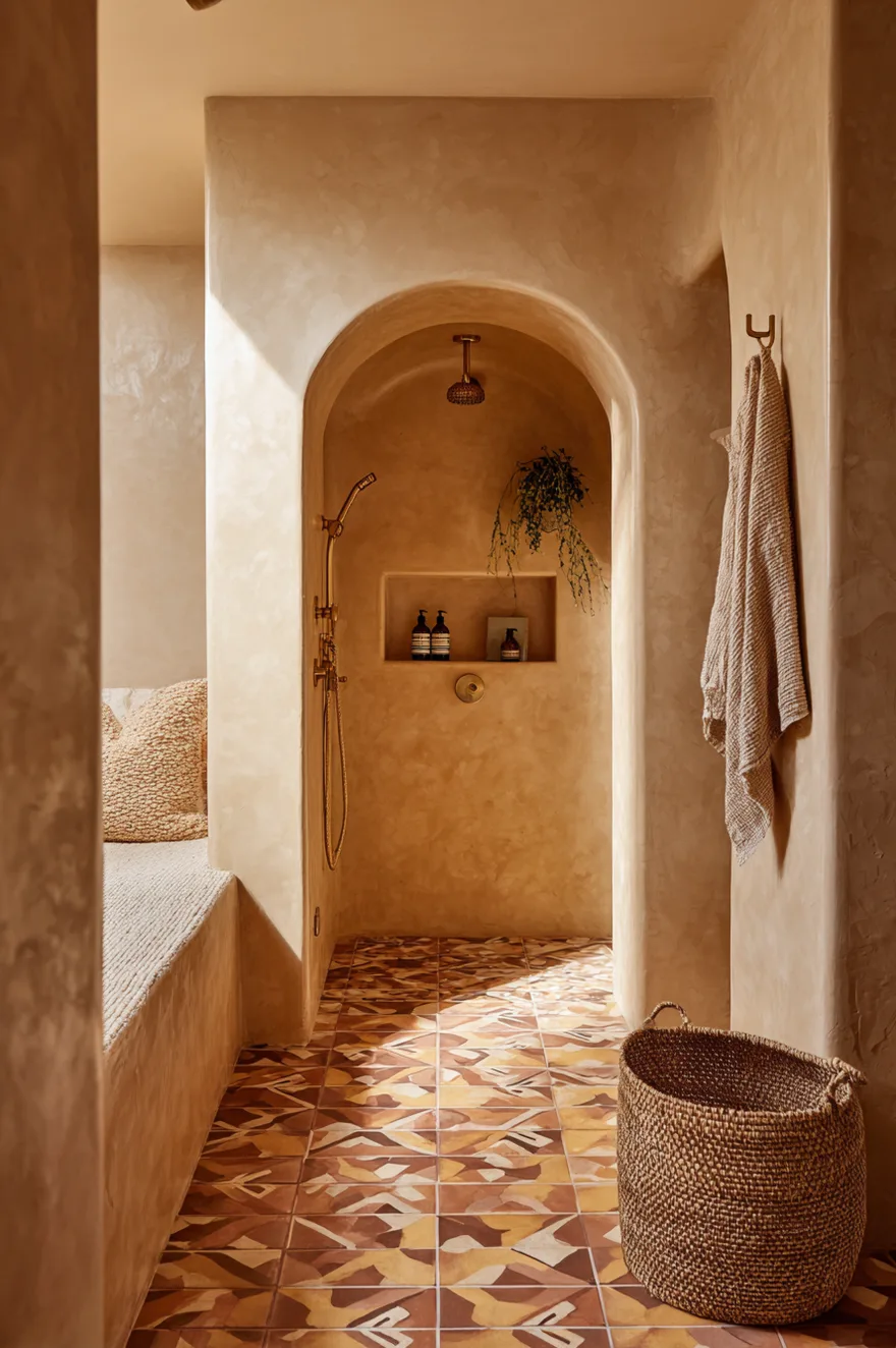
Tadelakt plaster on shower walls is one of those materials that makes no rational sense until you touch it. It’s a Moroccan lime plaster, burnished smooth and made water-resistant through the application of black soap – no tile required, no grout to maintain. The surface reads warm and slightly irregular in a way no manufactured tile can replicate.
Paired with a handmade terracotta encaustic tile floor and unlacquered brass fixtures, this is a shower that improves visually as it ages. The plaster deepens, the brass shifts. An arched niche at shoulder height and a woven seagrass basket outside the curbless entry are the two moves that place this in a real bathroom rather than a catalog render. Find a tadelakt applicator who has done wet rooms before – this is not a DIY material.
13. Walk In Shower On A Budget That Still Looks Designed
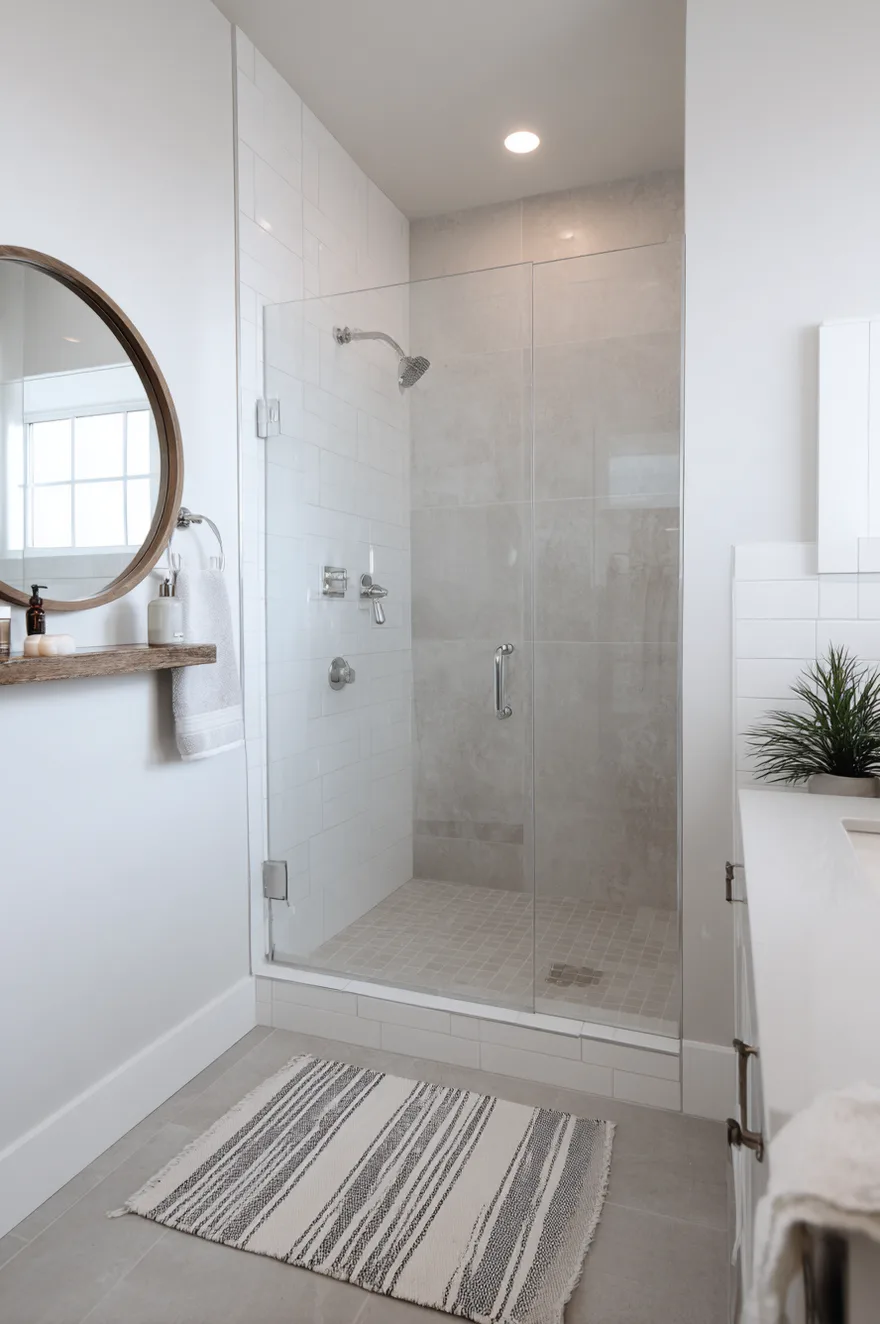
One high-impact choice beats ten moderate ones. In a budget shower build, that choice is a single cement-look large-format porcelain accent wall – the kind of 24×48 panel that reads almost like poured concrete from across the room, without the waterproofing complexity of actual concrete. Put it on the wall that faces you when you enter. Builder-grade white tile on the three remaining walls isn’t a compromise; it’s a foil that makes the accent wall read better.
A frameless glass panel from a big-box store – the kind that comes in standard 36-inch and 48-inch widths – is genuinely sufficient for a single-panel enclosure and runs a fraction of the cost of custom glass. Chrome pressure-balance valve rather than a thermostatic system saves several hundred dollars with no perceptible difference in daily use. The rest of the bathroom: white painted walls, a simple round wood-framed mirror, and a striped cotton rug. The restraint is the design. Spend on the accent tile and the glass; hold everything else to its most honest version.
14. Master Bathroom Walk In Shower With A View
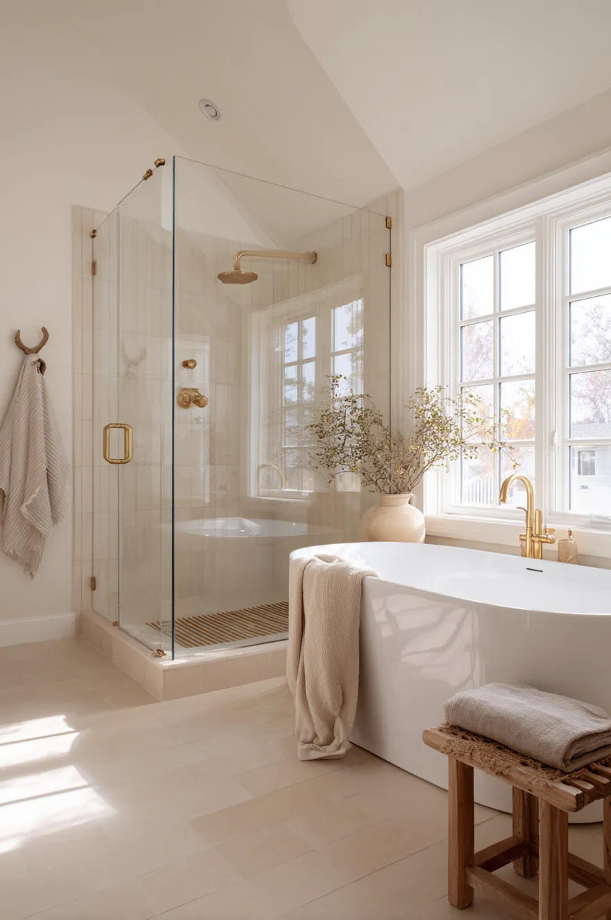
Floor-to-ceiling privacy glass on two sides of a corner shower is the kind of detail that appears in the highest-budget projects for a reason that has nothing to do with showing off: natural light inside a shower changes the entire experience of the room. Privacy glass diffuses and scatters the light rather than admitting a direct view, so the room reads as connected to the outside without the exposure.
Warm cream large-format porcelain on the floor and the one solid wall keeps the palette grounded while the glass does the visual work. A brushed gold linear drain and a rainfall head flush with the ceiling are details that read as resolved rather than added-on. Still not sure I’d recommend this configuration in a bathroom that shares a wall with a neighbor – acoustics get complicated – but in a freestanding house with a favorable orientation, this is a genuinely good reason to rethink where the shower goes.
15. Green Zellige Tile And The Forest Bathroom
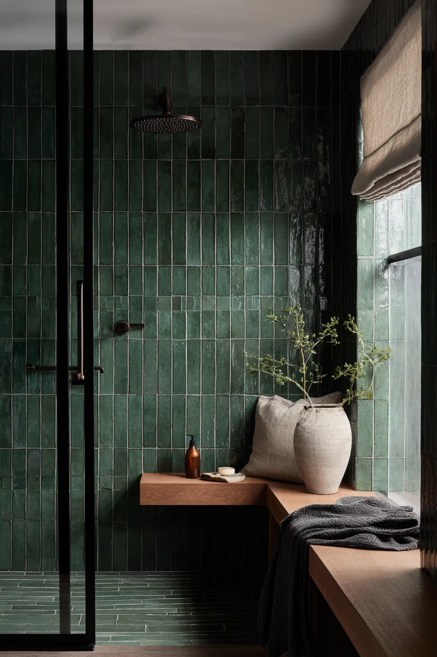
Forest green zellige from floor to ceiling is a commitment, and it’s the right one. The glaze variation across handmade tiles means the wall is never a flat field – at 7am it reads deep and quiet, at noon it picks up the daylight and turns almost luminous, and under lamplight in the evening it goes dark and rich in a way that feels genuinely different from any other tile material. That range across a single day is why people who do this never regret it.
A matte black overhead rain head and frameless glass on the entry side are the correct supporting decisions – nothing reflective, nothing that competes with the surface variation. The white oak floating bench inside is the counterweight that keeps the room from tipping into a space that feels decorative rather than functional. A linen roman shade on a frosted window is preferable to clear glass here: direct sun on zellige washes out the glaze variation that justifies the tile’s entire existence. Diffused morning light is what you want, and a linen shade delivers exactly that.
The back wall is where the zellige reads best, which is why a slight-angle shot is mandatory for photographing this setup – straight-on, you lose the depth of the glaze entirely.
16. Walk In Shower With Half Wall And Open Shelf
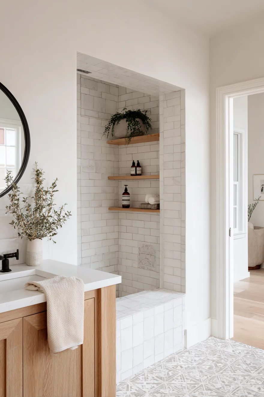
The half wall that does double duty is a better architectural move than either function alone. On the shower side, a recessed shelf built into the thickness of the wall eliminates the need for a niche on a wet wall (which requires waterproofing at every edge). On the bathroom side, the top of the wall becomes a ledge for plants, a candle, whatever the room needs – without requiring a separate shelf installation.
White oak for the wall structure and a honed soapstone cap is a material combination that holds up in a humid environment better than most people expect from wood, provided the oak is properly sealed and the soapstone is set with a slight overhang that drips water away from the wood rather than pooling against it. White large-format tile inside the shower and warm patterned cement tile in the rest of the bathroom make the two zones feel related without being identical. The wall is the hinge point between them, which is exactly what good architectural detail does: it solves two problems with one move.
17. Why Dark Grout Earns Its Keep
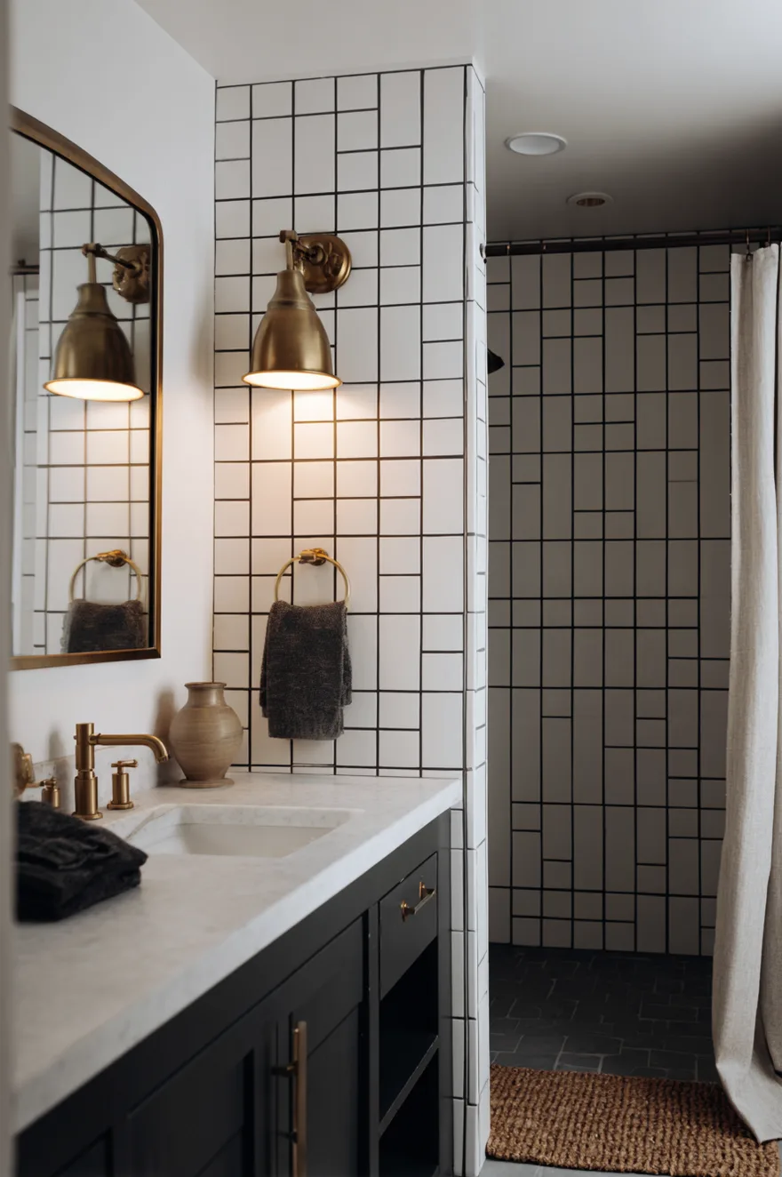
Classic white four-by-four tile with charcoal unsanded grout isn’t a new idea. It’s a 1920s bathroom idea, which is partly why it still reads correctly. The charcoal grid makes the tile look intentional – like someone specified the layout rather than chose the cheapest available SKU and had it installed the obvious way.
The practical case is equally strong: charcoal grout in a shower maintains its appearance with normal cleaning, while white grout requires either aggressive chemical maintenance or the quiet acceptance of a gray-ish grid that reads dirty regardless of its actual cleanliness. (I’ve specified white grout in bathrooms exactly twice since switching to interiors. Both times I told myself it would be fine. Both times the client called me within a year.) Dark grout is the honest choice that happens to also be the better-looking one. Order a sample board before committing – the color shifts noticeably from wet to dry, and you want to approve the dry version.
18. Concrete And Steel Walk In Shower For Industrial Lofts
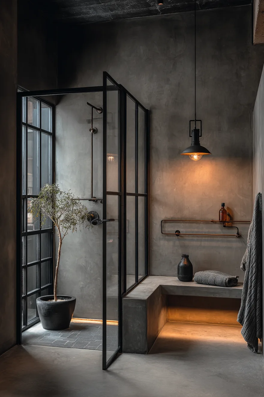
Micro-cement on shower walls requires an applicator who has done wet rooms specifically. Regular micro-cement installations – countertops, floors – use a different sealing protocol than a vertical surface that takes direct water contact daily. When it’s done correctly, the result is a surface with no grout lines, no joints, and a depth of color that poured concrete can’t achieve in a residential application because of weight and formwork constraints.
A black steel and glass partition framing the entry is structurally straightforward – standard steel tube with a standard glass channel – and it reads as an industrial detail that belongs to the same material family as the micro-cement rather than being imported from a different design language. Exposed-pipe matte black fixtures are the right complement: they make the plumbing a visible part of the room rather than something to be hidden. An industrial pendant overhead, casting warm focused light downward, is the one warm element in an otherwise cool, material-led room. The raw steel towel bar just outside the enclosure costs almost nothing at a metalworking shop and reads better than any store-bought option in this context.
19. The Niche That Makes A Shower Feel Finished
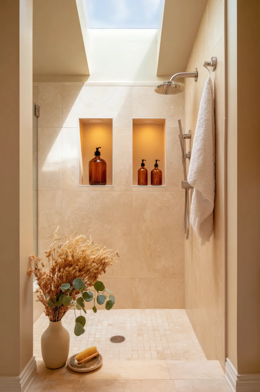
A recessed double niche with a small LED strip inside is the detail that separates a shower that was designed from one that was merely tiled. The warm light inside the niche turns product storage into a moment – amber glass bottles and a eucalyptus bundle read as considered rather than practical when they’re lit from within.
Frame the niche in the same porcelain as the surrounding wall so the border disappears. The recess itself does the visual work. Build it between studs, confirm with your tile contractor that the depth clears the waterproofing membrane, and make it at least six inches deep or it won’t hold a standard shampoo bottle upright.
20. Doorless Walk In Shower In A Narrow Bathroom
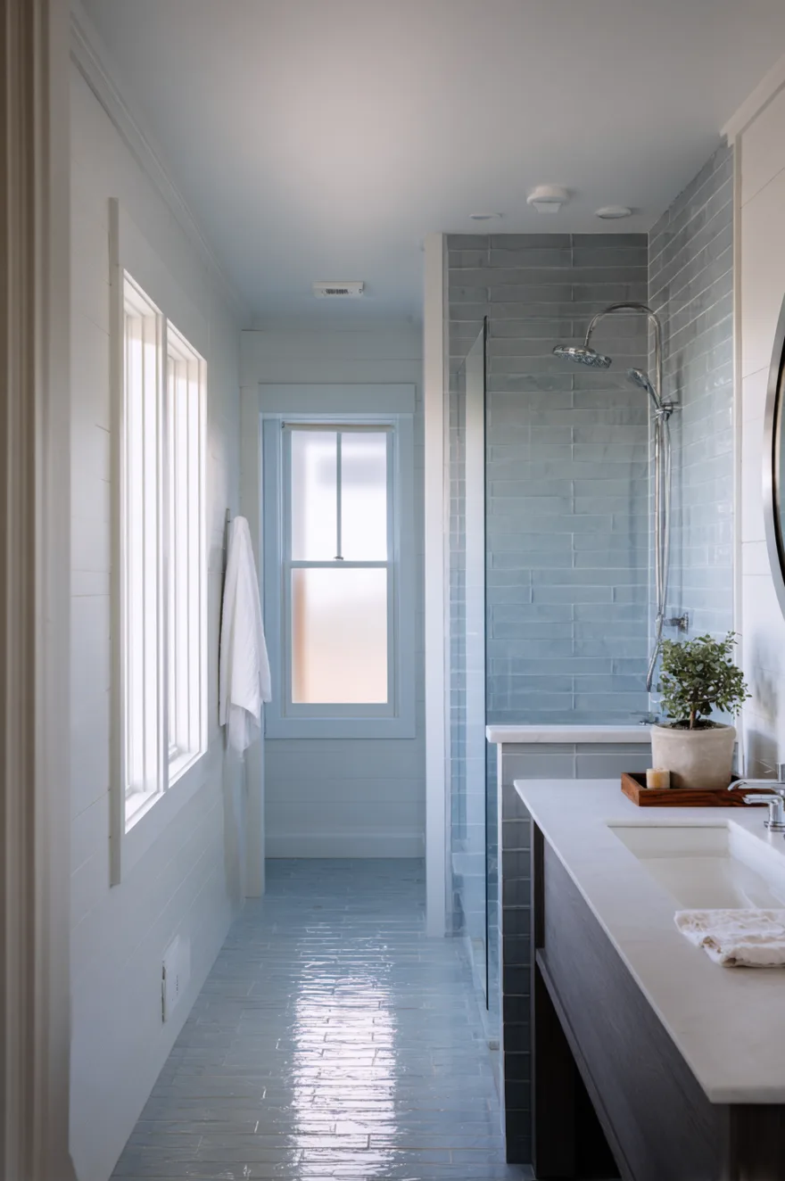
A galley bathroom with a doorless shower at the far end is a visual trick that actually works. The shower becomes the terminus that pulls the eye down the length of the room, making the corridor feel purposeful rather than tight. Cool pale blue-gray elongated tile in the shower reads as slightly receded, which reinforces the sense of depth rather than filling the far wall with something that visually advances.
White painted shiplap on the long side of the bathroom keeps the room light without requiring tile on every surface – it’s also the kind of material that a competent DIYer can install without a tile contractor, which matters in a narrow bathroom where labor costs are disproportionately high relative to material costs. A dark-stained narrow vanity along one wall provides contrast without projecting far enough into the corridor to reduce circulation. And a frosted window at the shower end is both the practical solution to privacy and the light source that makes the blue-gray tile look its best – diffused daylight on a cool-toned surface is always the correct answer.
21. Walk In Shower Ideas Worth Saving For Later
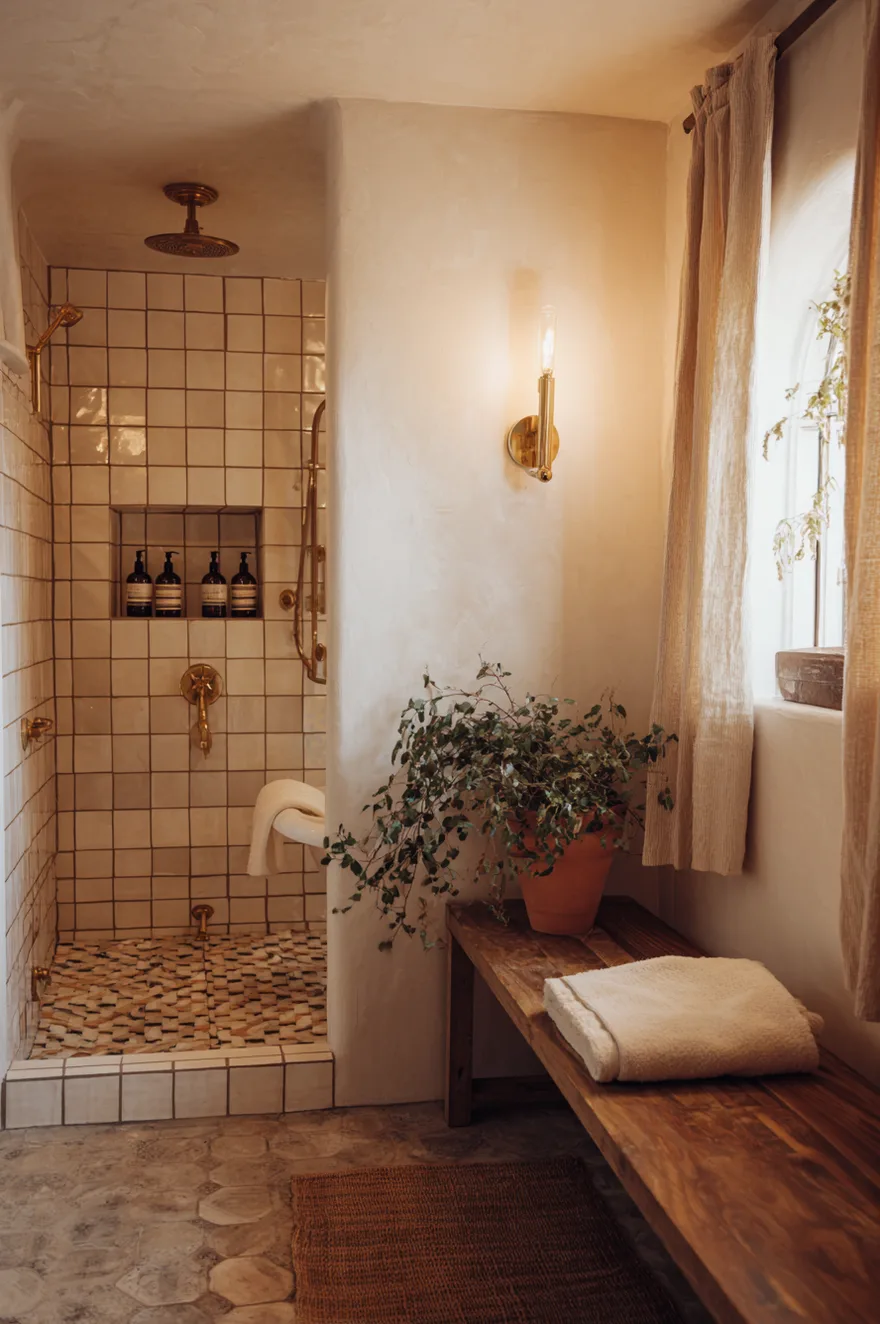
The layered, mixed-reference bathroom – antique brass next to Moroccan mosaic next to white plaster next to a clawfoot tub – is the version that looks most like a room someone actually lives in. And it’s the hardest to pull off, because every element has to be genuinely good on its own before the combination reads as eclectic rather than chaotic.
A vintage-style lever thermostatic valve and handmade tile are the two anchors. Get those right and the rest of the room can breathe. A fold-down teak bench and a linen curtain at the window are the kind of textile-and-natural-material details that keep a heavily materialed room from reading as a showroom. Warm evening lamplight from a wall-mounted sconce is what makes this bathroom feel like it’s been lived in for twenty years – which is, in the end, what the best walk in shower ideas all have in common: they look like they belong to someone’s real life, not a project with a deadline.
Pick two or three of these ideas that match where you actually are – your budget, your footprint, your existing fixtures – rather than the room you’d build with no constraints. The dark grout choice and the half-wall entry are both free decisions that change everything about how a shower reads, and either one is a reasonable place to start. Which of these directions is closest to what you’re working toward? Let me know in the comments – I read them all and I’m happy to think through the specifics with you.
Talk soon,
Rachel