Yellow living room ideas have a reputation problem – too loud in the wrong tone, too safe in the wrong shade, and somehow both at once when executed without a plan. This is a room-by-room look at how yellow actually behaves: how it shifts with the light, which colors hold it in place, and where to start if you want the warmth without the chaos.
Most rooms I walk into are afraid of yellow. Not of color in general – people will commit to a charcoal wall, a black-painted ceiling, even an oxblood sofa without much hesitation. But yellow makes people nervous. I think it is because the failures are so visible. A lemon-yellow room that missed the mark in 1994 is burned into a whole generation’s memory, and nobody wants to repeat that particular mistake in their living room.
Here is what I keep noticing, though: the rooms that feel genuinely warm and alive – the ones you walk into and immediately want to sit down in – almost always have yellow somewhere in them. Not necessarily on the walls. Sometimes it is a rug, a single velvet chair, a set of amber pendants. The tone is almost always in the ochre-to-mustard range rather than the lemon-to-canary range, and it is almost always grounded by something that ages well: real oak, wool, plaster, stone. That is the pattern I have watched across a decade of interiors work, and it is what every idea here comes back to.
1. Mustard Yellow Velvet Furniture That Anchors A Room
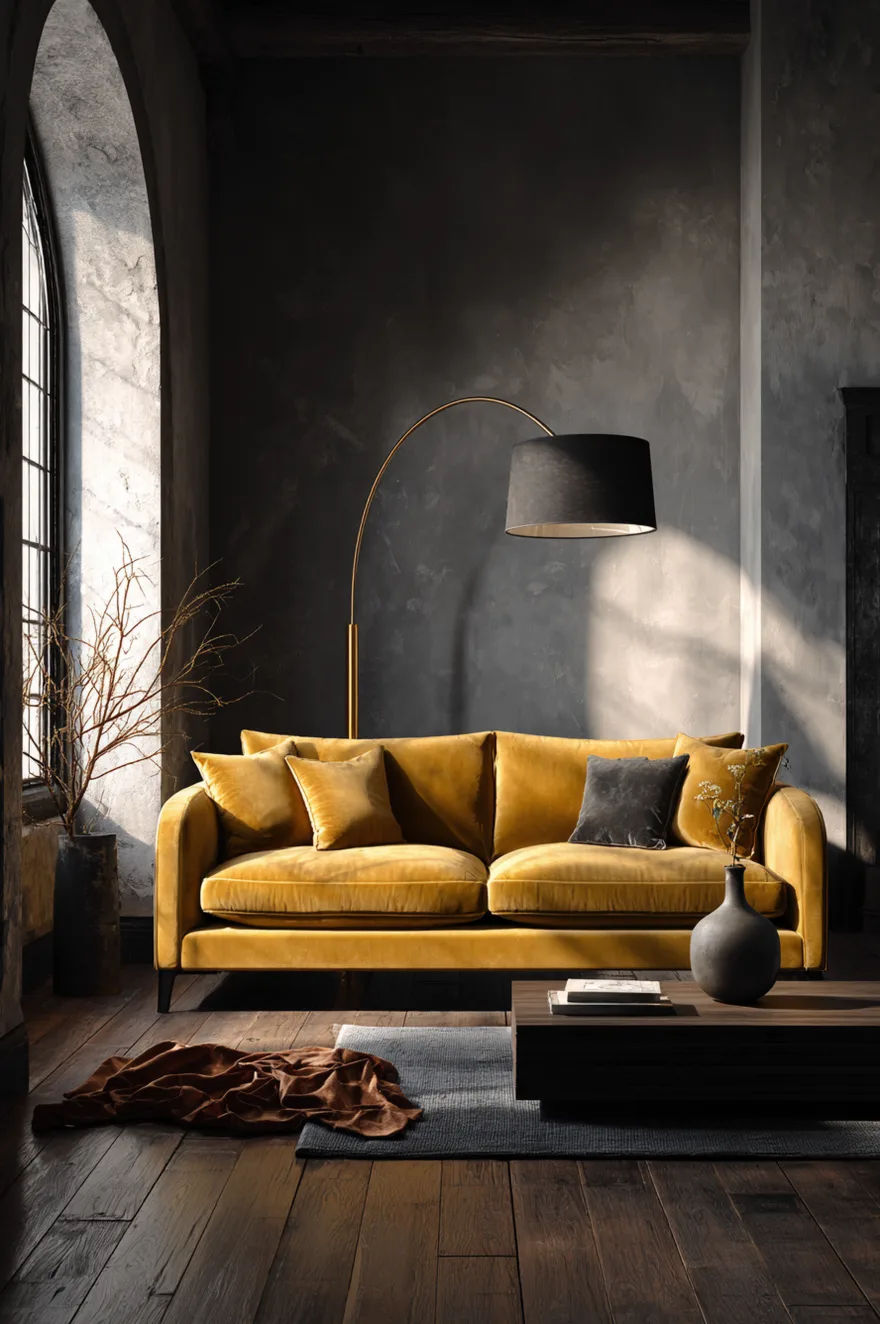
A deep mustard velvet sofa is one of the few furniture choices that works harder the quieter you keep everything around it. The logic is simple: velvet at this saturation reads as a surface, not just an upholstery choice, and if the wall behind it has equal visual weight, both compete and neither wins. Put it against a charcoal limewash plaster wall – rough texture, no sheen – and the relationship inverts. The wall recedes, the sofa lands, and the room has a focal point that did not require a piece of art or a fireplace to achieve it.
Dark-stained oak underfoot holds the palette at the moody end without tipping the room cold. The material that does the most work here, though, is the brass arc floor lamp. One piece, positioned to arc over the far end of the sofa, pulls the whole arrangement into a coherent reading corner. The warmth of the brass and the warmth of the mustard are close enough in undertone to read as intentional. Keep accessories sparse – a single ceramic vase, a wool throw in burnt sienna, a stack of three books maximum – because the upholstery has already made the argument. Adding more is how this kind of room starts to look styled rather than lived in.
For the velvet itself, look for a pile that reads slightly antiqued rather than shiny-new. Brand-new high-sheen velvet in mustard is where this concept most often goes wrong. An antiqued or crushed velvet in the 2700K lamplight of an evening room will look like it has been there for a decade in the best possible way. If you are starting from scratch, a Schoolhouse brass arc floor lamp and a vintage Marketplace find for the sofa is a combination that consistently outperforms buying both new.
2. Butter Yellow Walls Change Everything At Golden Hour
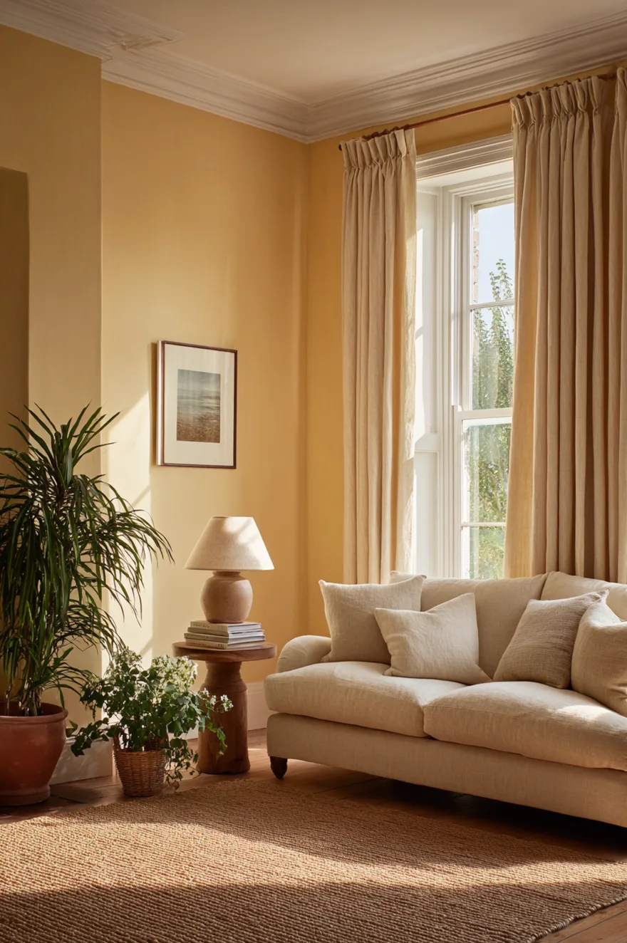
Butter yellow walls do something that almost no other paint color manages: they look like two different colors depending on the time of day. At noon in good light they read soft cream with a whisper of warmth. By 5pm in Seattle in November, they are a full amber glow – the room is doing the golden-hour work the sky is not. I have recommended this shade to clients who swore they did not want yellow and called me afterward because they could not stop looking at their own living room after dark.
The grounding materials matter. Linen curtains in undyed oatmeal, a white plaster ceiling, and a jute rug keep the palette from reading sugary. The curtains especially – anything with a blue or cool undertone will fight the walls by evening. Stay warm, stay natural, and let the light do the work. Pick a matte or eggshell finish; any sheen will make the color shift unpredictably across the day.
3. Yellow And Navy Living Room Done Right
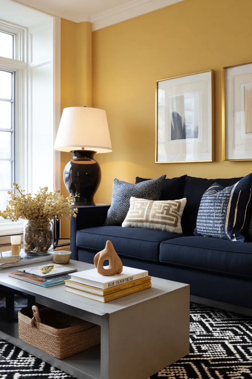
Navy and yellow is one of those combinations that fails in a specific, predictable way: it tips nautical. Rope accents, anchor motifs, and a coastal theme nobody actually asked for. The fix is in the materials and the proportions. A navy linen sofa (not velvet, not cotton twill – linen specifically, because it has enough texture to read as furniture rather than costume) against a single golden-yellow painted wall keeps the contrast in the grown-up register.
A graphic black-and-cream wool rug is what holds the room from tipping either too beachy or too bold. The black in the rug echoes the dark brass fixtures, which do quiet connective work throughout the space. And the single oversized ceramic lamp in a warm brown tone – not matching navy, not matching yellow – is what prevents the room from reading like a mood board. That lamp is the thing I would invest in. A large ceramic base with a linen shade in warm off-white runs $200–$400 at CB2 or West Elm and does the visual anchoring that a metal lamp simply cannot.
A word on the yellow wall: it needs to be warm-toned, not greenish. A golden or honey yellow, not a school-bus yellow. Swatch it in the room before committing, with the navy present, in the room’s actual light.
4. Why Yellow And Teal Work Better Than You Think
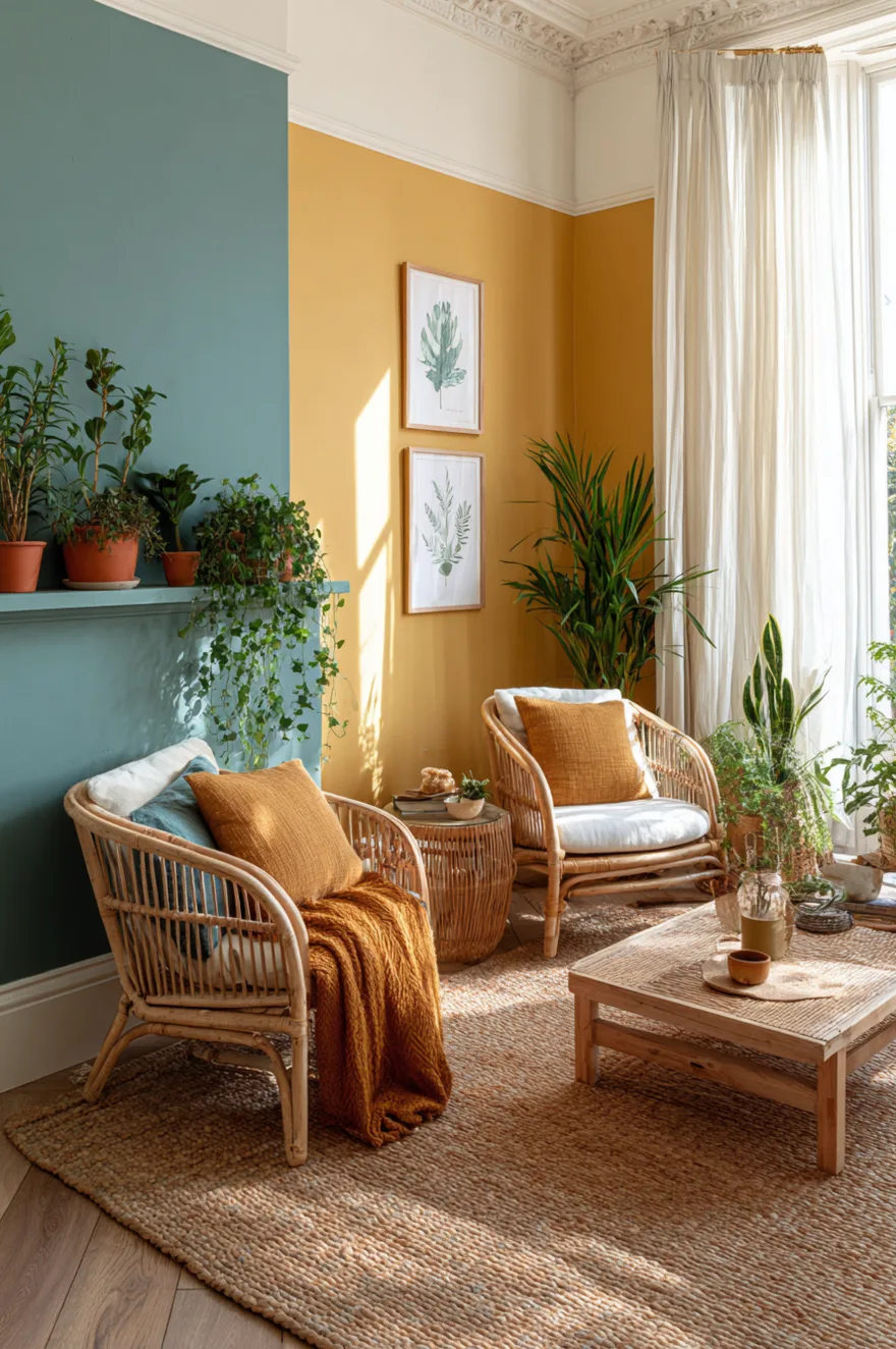
Muted teal – not turquoise, not the bright seafoam that reads 2011 bathroom renovation – is warm marigold’s most underrated partner. The pairing works because teal at low saturation sits close to gray-green, which is a neutral, while marigold yellow sits close to orange, which is warm. They do not fight. They define each other without yelling.
On opposite walls in a light-filled room, the combination reads almost earthy. Rattan furniture is not a cliché here – the warm honey of natural rattan sits between the two tones and keeps the palette anchored. A woven sisal rug and a few terracotta pots do the same job. The rule I keep coming back to: when you are using two non-neutral wall colors, everything between them needs to be natural material in a natural tone. Anything synthetic or too saturated will make the walls look like a paint chart.
5. Monochromatic Yellow Living Room For 2026
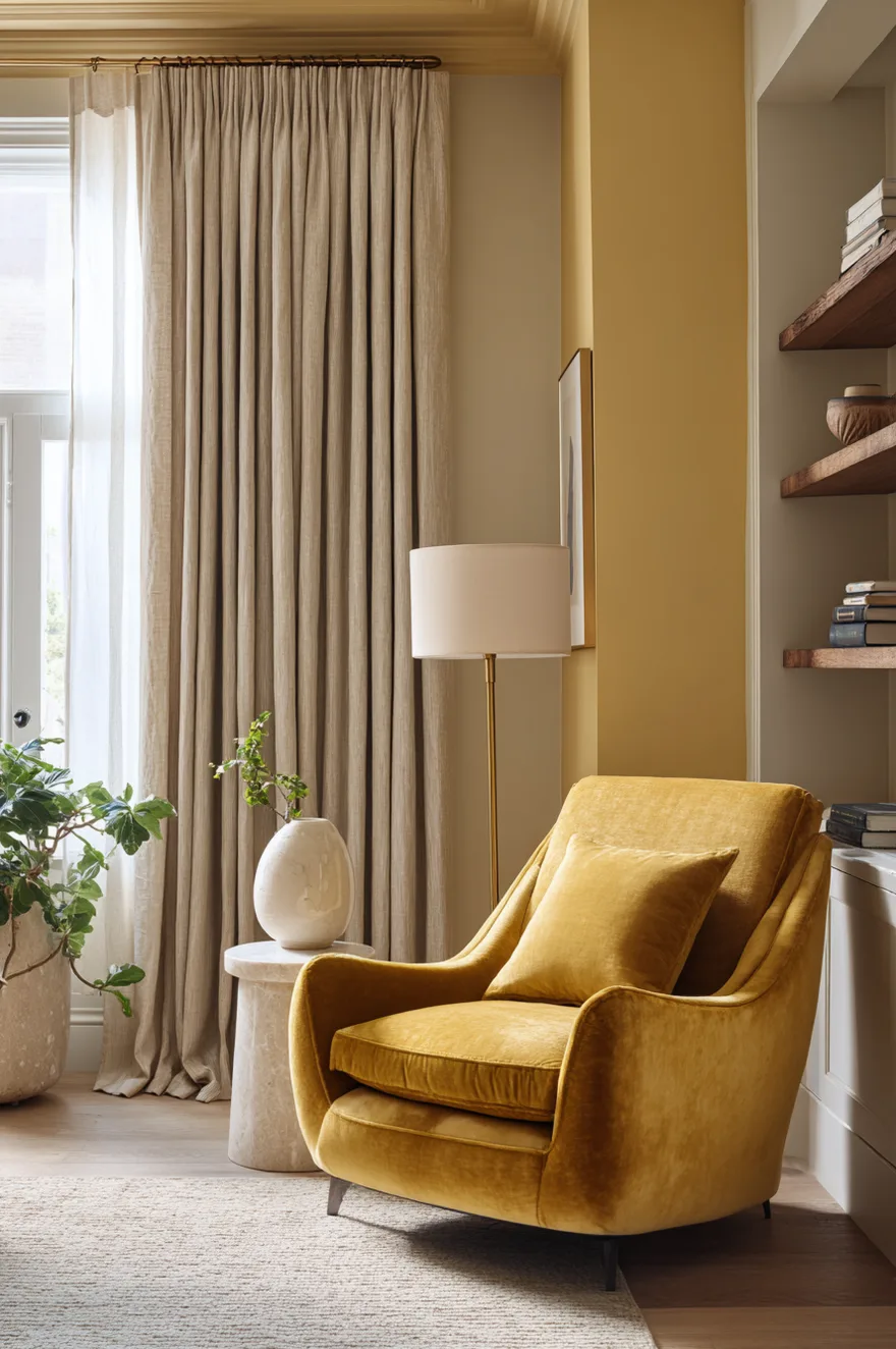
Stacking three yellow tones in one room sounds like a commitment most people would not make. I was genuinely uncertain the first time I sketched this out. But a pale lemon ceiling, a mid-tone citrine wall, and a deep ochre velvet chair are so far apart in value that they read as a considered gradient rather than a repetition. The ceiling trick alone is worth stealing even if you stop there – a lemon ceiling against white walls will warm an entire room without a single additional yellow element.
What prevents this from going cloying is material choice, not restraint on the yellow. White oak flooring is essential – it has a yellow-green undertone that bridges the tones without adding another hue. Raw linen curtains in a warm undyed state bring down the saturation of the room visually. And the furniture between the chair and the curtains should be as neutral as possible: a concrete or stone coffee table, a white oak side table, nothing that asks for more attention than it needs. The ochre velvet chair earns its drama precisely because nothing around it competes.
6. The Yellow Accent Wall That Earns Its Place
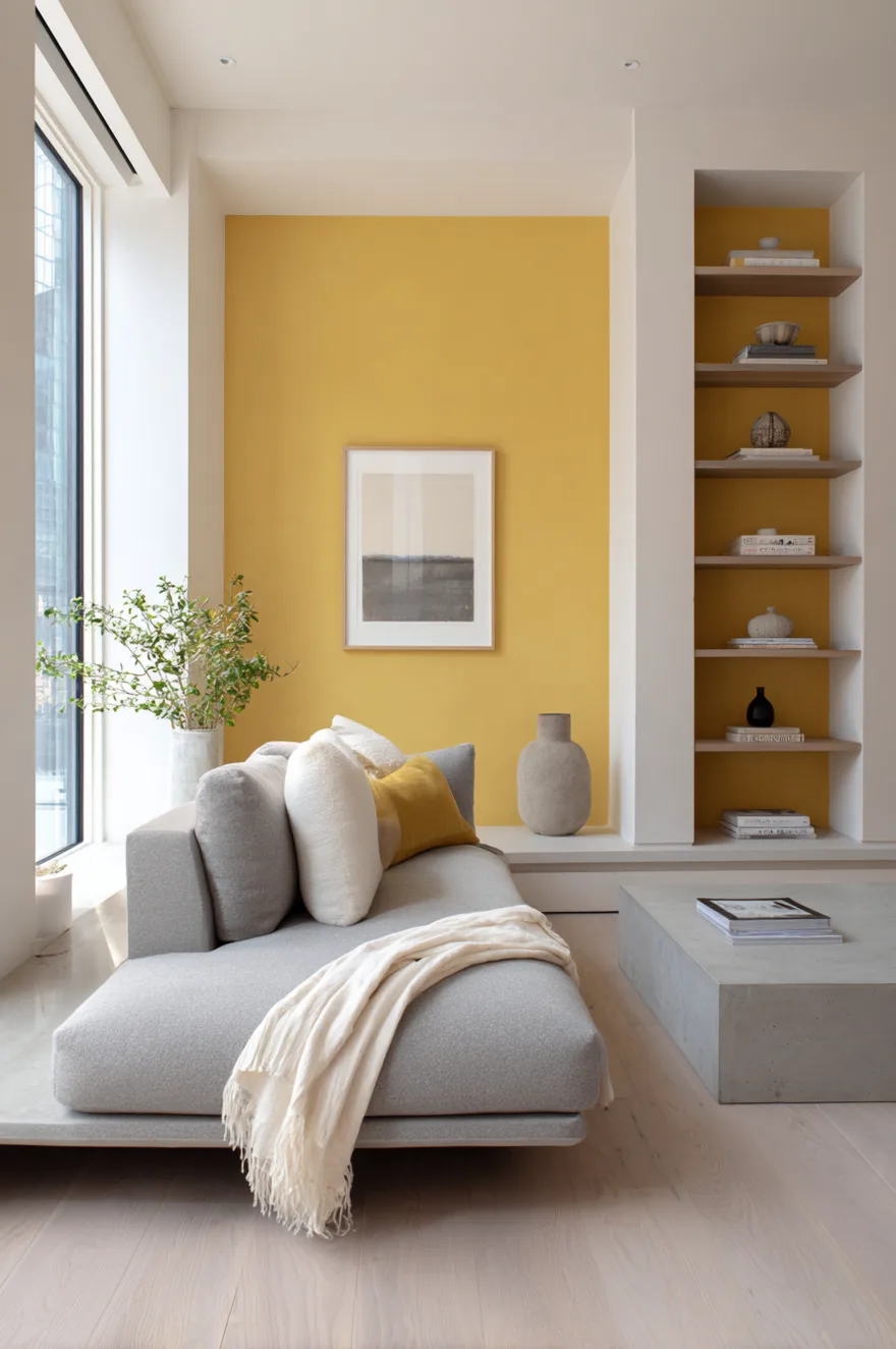
An accent wall only earns its place when every other decision in the room actively steps back. One saturated chrome-yellow limewash wall – rough, handmade-looking, slightly uneven – behind a low-profile gray sofa works because the limewash texture makes the color feel material rather than decorative. The wall looks like it belongs to the room’s architecture, not like a coat of paint someone got excited about on a Saturday.
Every other surface has to stay deliberately plain. White oak open shelving with a few objects, a smooth concrete coffee table, bare windows. The moment you add patterned cushions, a printed rug, or a gallery wall on the adjacent surface, the yellow accent wall starts to look competitive rather than confident. Let it be the only decision the room makes.
7. Yellow And Green Living Room Ideas Worth Stealing
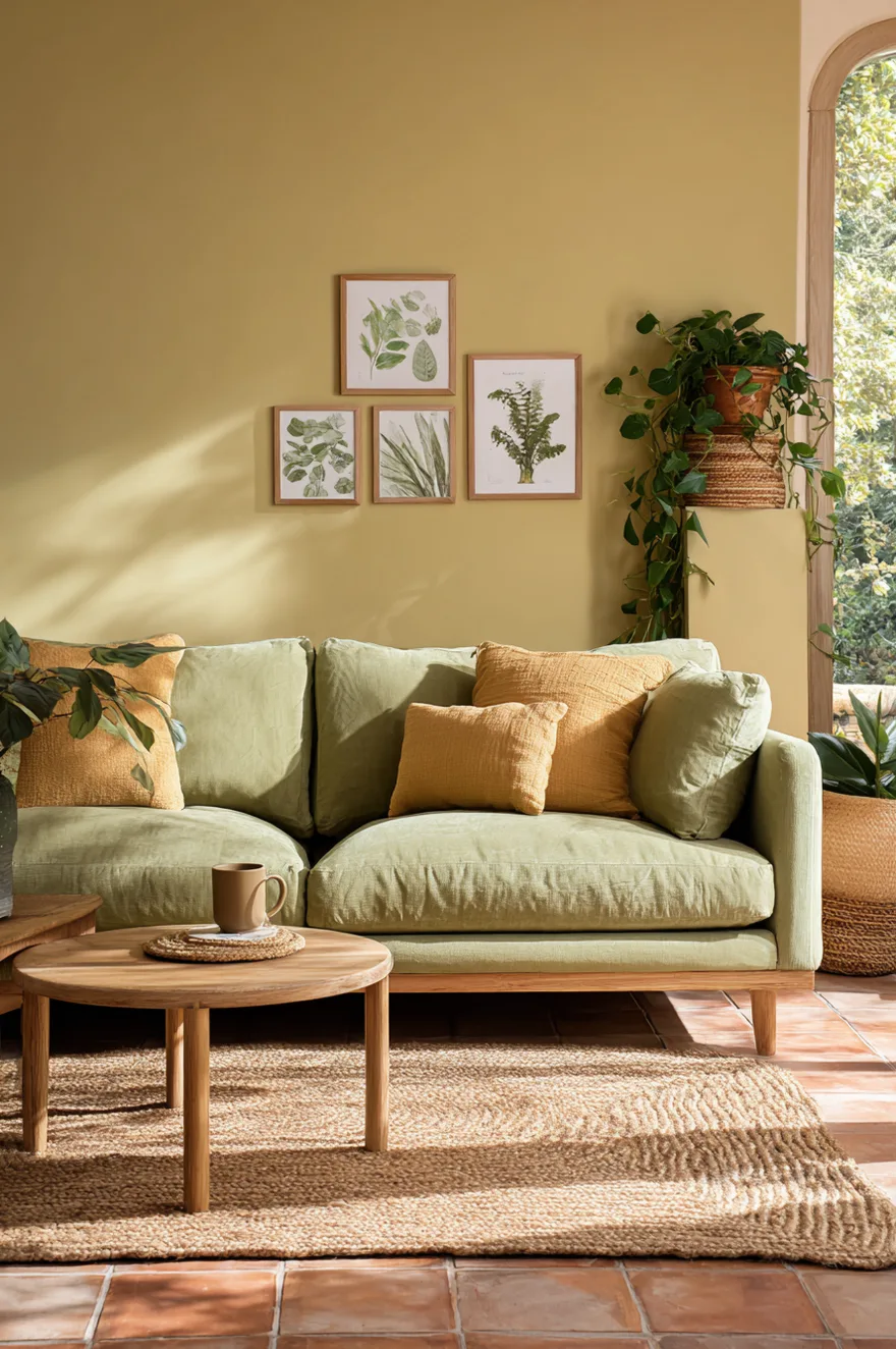
A client of mine – early in my interiors work, when I was still overcorrecting away from the “too safe” rooms I had spent a decade designing in commercial architecture – asked for something that felt like a garden without any of the literal garden stuff. No leaf prints, no wicker everything, no moss-green walls. I put a warm sage-green sofa against a soft golden-yellow wall and she stood in the doorway for a full thirty seconds without saying anything.
The sofa color and the wall color are close enough in warmth that the room reads cohesive rather than contrasted. Botanical prints in simple light wood frames – nothing fussy, nothing oversized – give the garden reference without announcing it. A terracotta tile floor holds the whole palette in the warm register so neither the sage nor the yellow drifts toward anything cool or clinical. And two plants: a trailing pothos on a high shelf and a fiddle-leaf fig in a terracotta pot on the floor. Not a collection, not a jungle. Two plants with purpose.
If you are starting the room from a green sofa, the yellow wall shade needs to be warm enough to contain a green undertone itself. A yellow that pulls blue will make sage green look dingy. Test Benjamin Moore Hawthorne Yellow or similar warm-side shades before committing.
8. Yellow And Grey Living Room With Real Staying Power
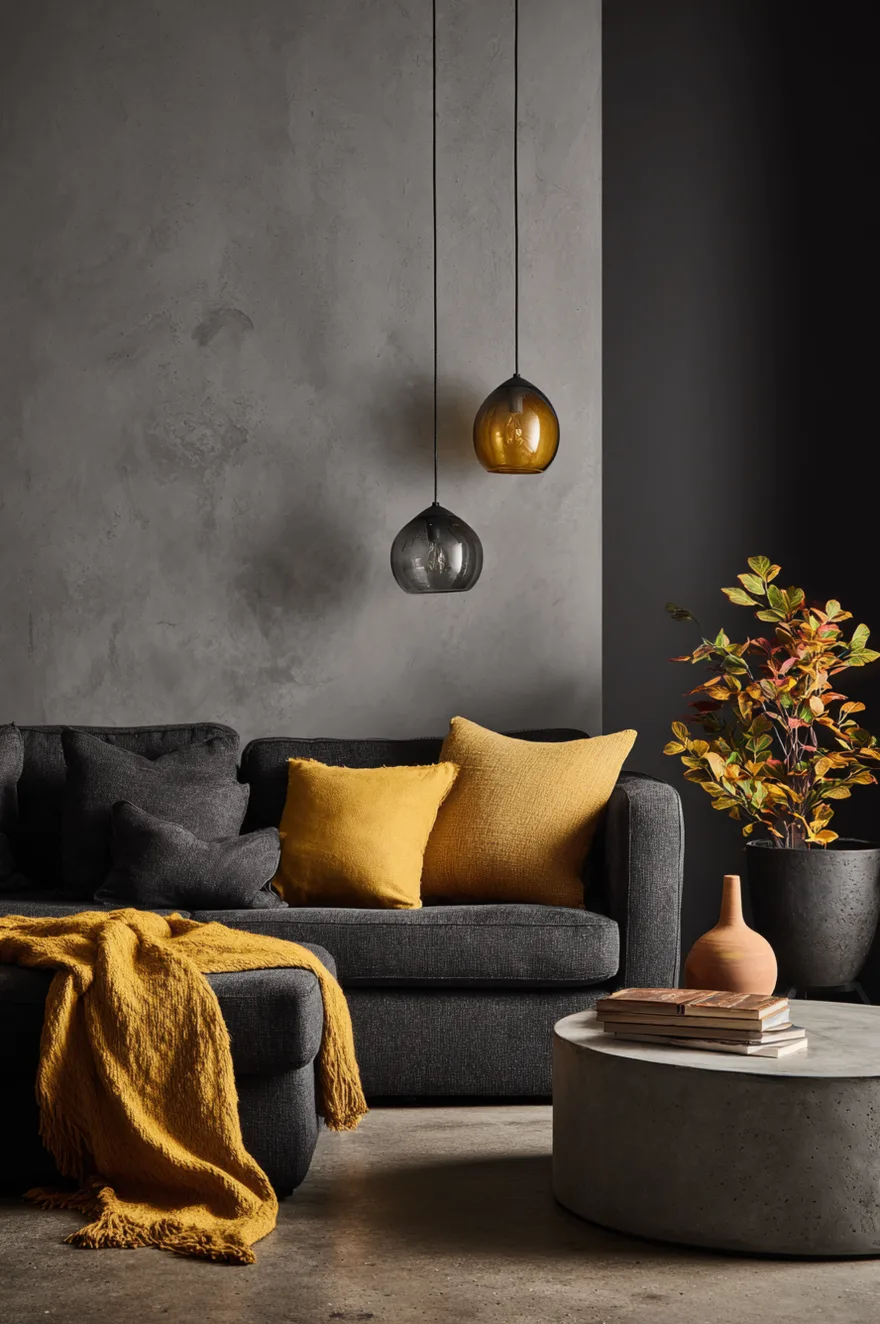
Cool gray walls have a well-earned reputation for going cold after dark, and most attempts to fix that involve adding too many things: warm-toned textiles, orange accents, wood everywhere. A more precise fix is to work with amber rather than full yellow. A turmeric-toned wool throw draped over a charcoal linen sofa and a pair of amber glass pendants hanging low over a concrete coffee table will pull the golden undertone out of the gray without changing the room’s palette.
The amber glass is doing specific optical work here – it filters the light source itself, so every beam of light that hits the floor and walls is already warm. That is not something a yellow cushion can do. The smooth concrete flooring keeps the room grounded and honest-feeling; it also prevents the warm accents from making the space read cottage or rustic when the bones are more contemporary. Source the pendants in blown amber glass and keep the bulbs at 2700K without exception.
9. Small Spaces Need Yellow More Than Big Ones
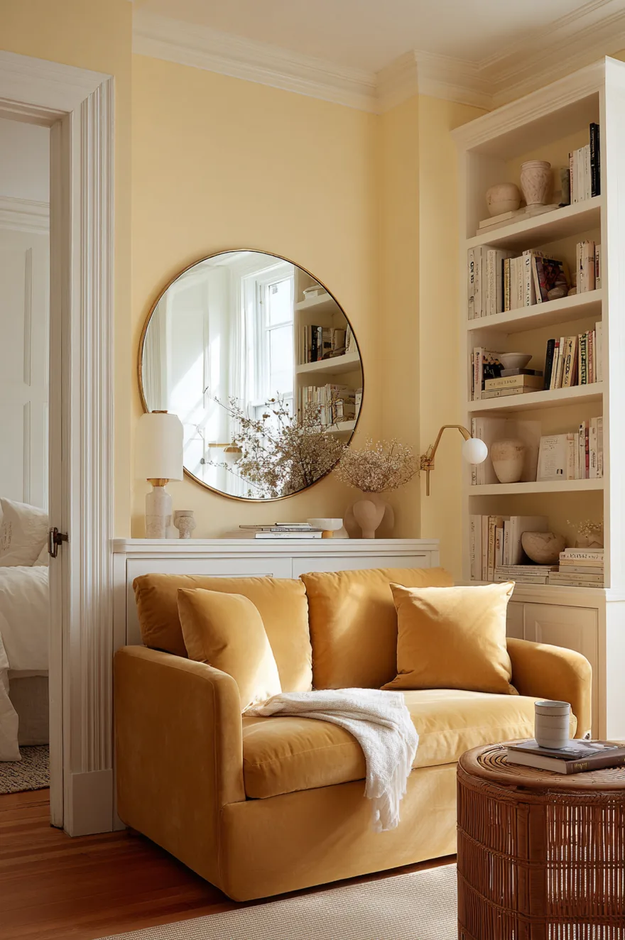
White walls in a small living room are the default, and I understand the logic. But white in a north-facing or artificially lit small room often reads slightly blue-gray – clinical, flat, and somehow smaller than a warmer tone would feel. A pale butter yellow does what white cannot: it appears light because the eye reads it as warm, and warm reads as present and lit rather than empty and cold.
A compact mustard velvet loveseat works here because the color is deep enough to read as furniture rather than blending into the walls. Wall-mounted white oak shelving keeps the floor clear and the room feeling open. And one large round mirror on the wall opposite the window is still the most reliable space-expanding tool I know – not because it “makes the room bigger” in some abstract sense, but because it doubles whatever light the window is actually delivering. That combination of pale warm walls, a clear floor, and reflected light will outperform any white-and-minimalist version of the same room.
10. Yellow And Black Living Room Without The Drama
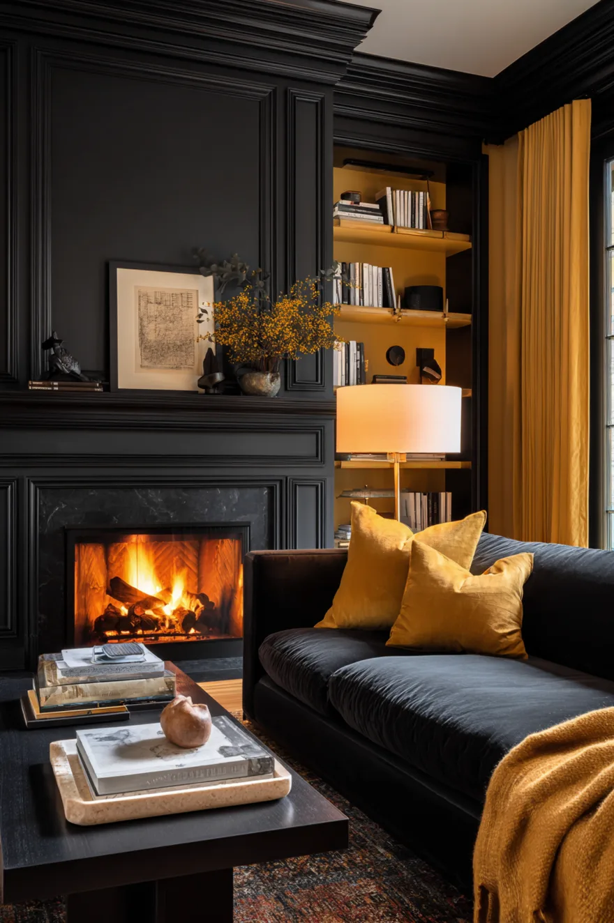
Black and yellow together has an aggression problem. The contrast is maximum – in color theory terms, the two sit at opposite ends of the value scale – and most rooms that attempt it end up looking like they were designed to make a statement rather than to be a room. The version that avoids that outcome is precise about both tones and both finishes.
A matte black plaster fireplace wall is what makes the yellow side of this pairing work. Matte black absorbs light rather than throwing it back, which means the wall reads as depth rather than drama. It recedes instead of advancing, and the room feels like it has a background and a foreground. The yellow in this context needs to be a soft goldenrod – warm, earthy, slightly desaturated – not a bright chrome or pure chrome yellow. Applied to millwork and built-in shelving rather than the whole wall, the yellow sits in the architecture of the room. It reads as part of the structure.
The finish on the yellow is also non-negotiable: an eggshell or satin on the millwork is appropriate because woodwork takes sheen naturally. But the plaster wall must stay flat. Any gloss on the black surface will reverse the logic entirely – it will start to reflect and advance, and the goldenrod will have nowhere to breathe. I have seen this combination done in both directions and the matte-black version is the only one that holds its composure across a full day of changing light.
11. Yellow And Blue Living Room Ideas That Feel Fresh
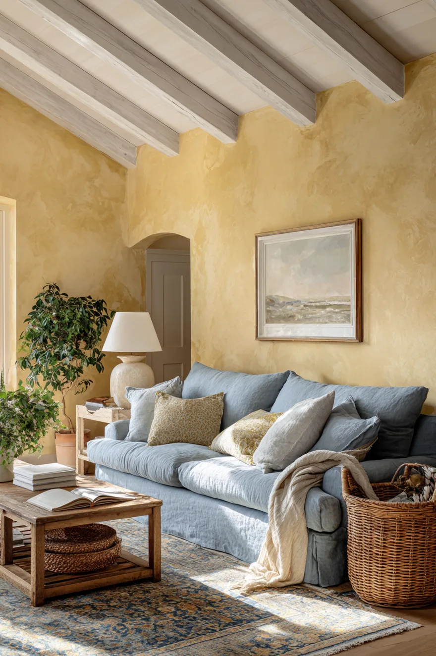
Dusty powder blue and warm yellow is the combination I would reach for if someone told me they wanted the room to feel like it had always been there – like it came with the house rather than arriving from a design decision. The specific blue matters: powder blue with a slight gray in it, not a bright or mid-tone blue, which would tip the combination toward preppy or bold. The dusty version reads almost like a faded thing, a worn thing, and that quality is exactly what keeps it from being loud.
A warm yellow limewash wall behind the sofa gives the blue something to lean against without competing. The texture of the limewash is doing half the work – it breaks up the color across its surface, so the wall reads warm-and-varied rather than flat-and-saturated. White-painted exposed ceiling beams tie in with the window trim and ceiling, keeping the upper half of the room light. And a faded Persian rug that carries both tones is the piece that makes the combination feel resolved rather than assembled – it demonstrates that the two colors have already been living together for decades, which is the most convincing argument any room can make.
12. The Corner Nobody Knows What To Do With
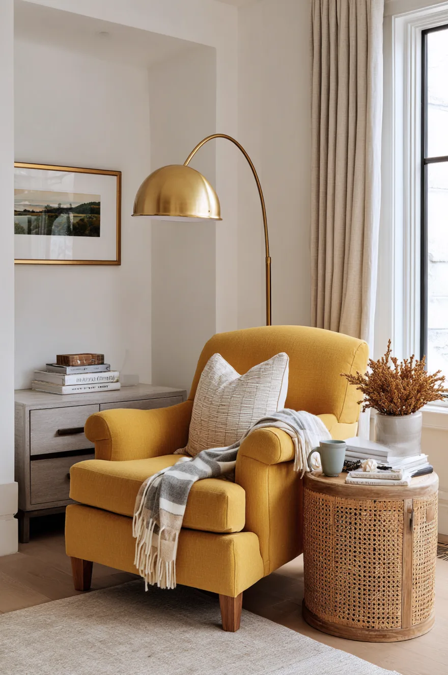
Every living room has one: the corner that is too small for a sofa, too awkward for a bookcase, and too visible to ignore. I have solved more of these with a single upholstered chair than with any other strategy. A yellow-upholstered reading chair – something tight-armed and slightly low-slung, not an oversized armchair that will block the room’s circulation – turns the corner into the most intentional seat in the house.
Add a slender brass floor lamp positioned over the shoulder of the chair and a small cane side table at the right height for a mug. That is the complete prescription. No built-ins, no gallery wall, no floating shelf above it trying to justify the space. The chair earns the corner by itself. (And yes – Frank and Mies will claim it within forty-eight hours, which is, honestly, a good sign. The cats have never been wrong about the best seat in a room.)
13. Yellow And Pink Living Room Ideas For 2026
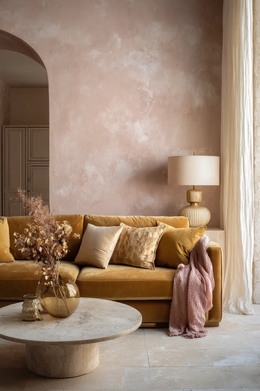
I used to put blush pink and yellow together only in children’s rooms. I was half wrong about that – the combination is genuinely sophisticated when the pink is a limewash rather than a paint, when the yellow is a deep marigold velvet rather than anything pastel, and when the room’s supporting materials are explicitly adult: natural stone tile, aged brass hardware, raw silk.
The reason this pairing reads sweet when it fails is almost always a material problem, not a color problem. Blush pink in a flat eggshell finish next to a yellow cushion in a synthetic fabric is a nursery. Blush pink in a limewash – textured, slightly uneven, aged-looking – next to a marigold velvet sofa on a warm stone floor is a room I would genuinely want to eat dinner in. The raw silk curtains in warm ivory are what keeps the palette from going saccharine; silk has enough luminosity to make the whole room feel considered rather than decorated.
Aged brass hardware is the metal here, not polished brass and certainly not chrome. The slight patina on aged brass sits in the same warm-earthy register as the marigold and the stone, and it ties the room’s metal moments together without making them precious.
14. Start With The Rug, Not The Wall Color
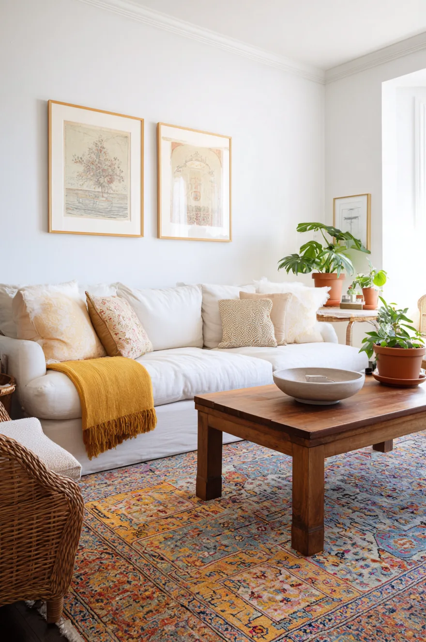
If you want yellow in a room but are not ready to repaint, a multicolor vintage rug with at least one warm yellow or ochre tone does the color-mixing work so the walls do not have to. A good vintage rug – Persian, Turkish, or a flat-weave kilim with amber in it – introduces yellow as something aged and settled rather than something decided last weekend. The room absorbs it differently.
The other advantage: a rug with yellow in it alongside blues, reds, or greens gives you a ready-made palette to pull from when you do eventually want to add a throw, a lamp, or repaint. The rug has already pre-approved the combination. Facebook Marketplace and estate sales are where I find these consistently; a worn vintage rug in the $80–$200 range will do more for a living room than a new rug at three times the price.
15. Butter Yellow Walls In A Room With No Natural Light
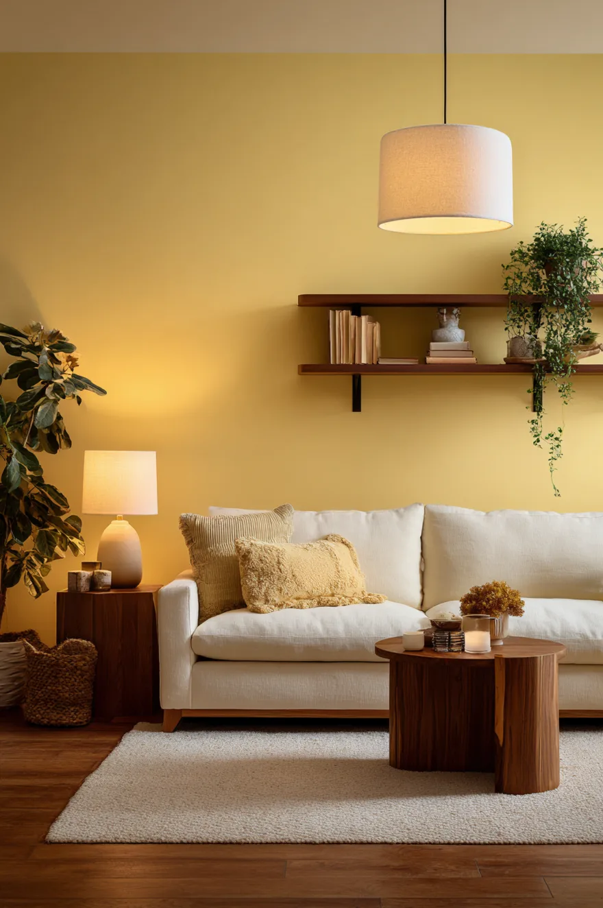
Butter yellow without natural light is a test the color does not always pass – but the failures are almost always a lighting or finish problem, not a color problem. Under cool 4000K overhead light, butter yellow turns slightly greenish and flat. Under warm 2700K bulbs, the same wall reads like the color was designed to be there after dark.
The bulb temperature is genuinely non-negotiable here. Warm 2700K lamps on dimmers are the only appropriate light source for a butter yellow room with no daylight. The finish matters equally: any semi-gloss or gloss finish will catch the artificial light and reflect it in uneven patches, making the color look inconsistent across the wall’s surface. A flat or matte finish absorbs the light and the color reads as intended. Pairing the yellow walls with warm wood tones – walnut side tables, an oak shelf, even a honey-toned wood floor – prevents the yellow from going sallow under artificial light, because the wood confirms the warm register the wall is trying to occupy.
16. What A Yellow Living Room Looks Like By Lamplight
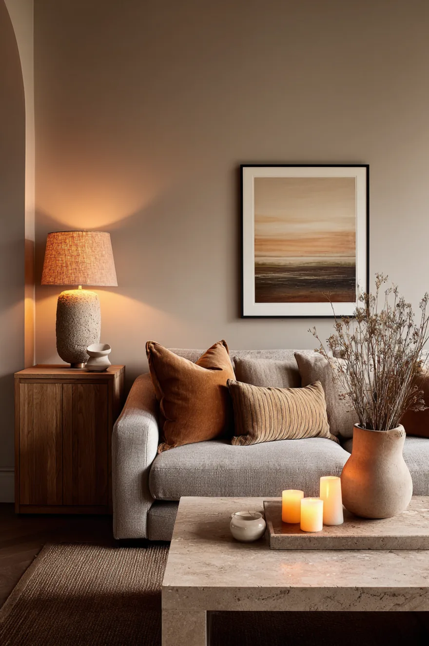
By evening, a room does not need yellow walls to read yellow. A honey-toned white oak media unit, a travertine coffee table, and ochre linen cushions on an otherwise neutral sofa will come forward after dark in a way they do not during the day. Add two warm amber table lamps – the kind with a ceramic base in a warm brown and a linen shade – and the lamplight pulls the golden undertones out of every surface in the room simultaneously.
Two candles on the travertine coffee table are the last element. Not for ambiance in the lifestyle-magazine sense – but because the moving flame at 1800K is even warmer than the lamps, and that temperature range is what gives a room its slowest, most settled quality after 8pm. (David built a low media unit in white oak last winter that behaves exactly this way. I was skeptical of the proportions at first. By lamplight, it is the best piece of furniture in our living room.)
17. Why Yellow Living Room Ideas Keep Coming Back
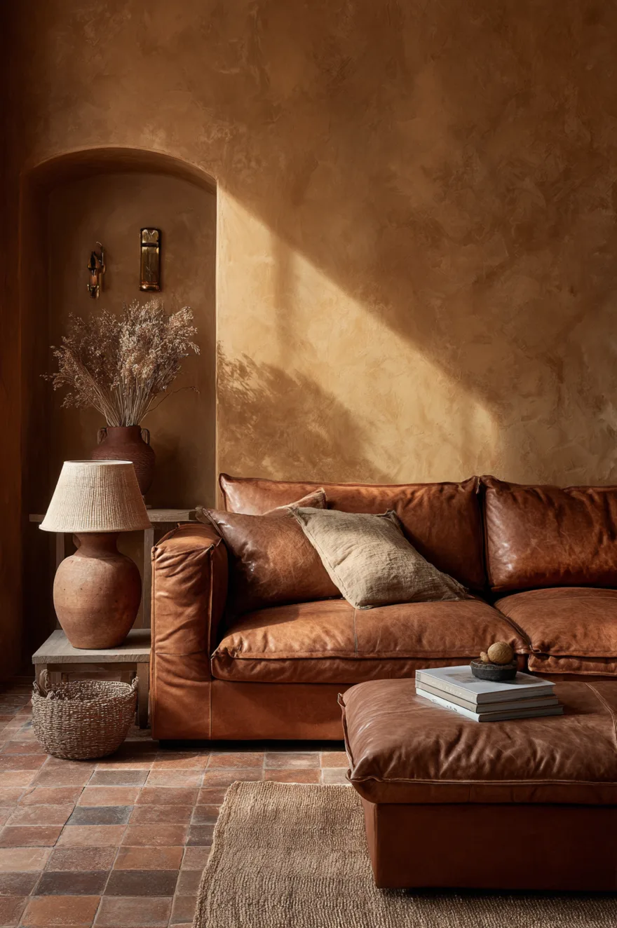
Yellow has cycled through design history with different identities each time. Harvest gold in the 1970s was about abundance, a saturated statement on shag carpet. Lemon yellow in the 1990s was cheerful and clean, the optimistic little sibling of white. Mustard in the 2010s arrived with the mid-century revival and attached itself to credenza legs and geometric wallpaper. Each version was a product of its moment.
The 2026 version is slower and more material. The yellows I am watching are ochre, turmeric, aged honey – tones that look like they were mixed from the earth rather than a paint formula. They are consistently paired with materials that show age gracefully: limewash plaster, unlacquered brass, worn stone, real oak. That combination is what separates this cycle from the previous ones. The color is not performing. It is just holding the room in the warmth it was always going to be.
Pick two of these and try them – not all seventeen at once, which is the fastest way to end up with a room that looks like a Pinterest board rather than a place to live. If you are genuinely uncertain where to begin, start with the rug idea in section 14 or the corner chair in section 12. Neither requires repainting anything, and both will tell you immediately whether yellow is the direction your room wants to go.
Which of these ideas are you actually considering? I would love to know which direction you are leaning – and if you have already done something with yellow that worked or spectacularly did not, the comments are exactly the right place for that.
Talk soon,
Rachel