The floor is the largest surface in your kitchen, and most people choose it last – after the cabinets, the countertops, the hardware – which means it’s often an afterthought in a room where it should be the first decision. These kitchen floor ideas cover the full range, from classic black and white checkered tile to moody honed marble, with practical notes on what each actually costs you in maintenance, proportion, and the way the room reads once everything is installed.
Every kitchen project I’ve taken on starts with a floor problem. Not always a bad floor – sometimes it’s a builder-grade beige tile that’s technically fine but so visually quiet it drags the whole room toward beige too, even when the cabinets are painted a good color. The floor competes with nothing, which means it adds nothing. And the room feels unresolved in a way that’s hard to name until you pull up the tile and replace it.
I’ve sketched probably sixty kitchen floors by hand at this point. There’s something about drawing the pattern in plan view – watching a herringbone shift direction, seeing how a checkered grid reads at different scales – that shows you whether the idea is working before a single tile gets ordered. The hand sketch also forces you to think about grout color, which most people leave as an afterthought and which changes the character of the floor more than almost any other single decision.
What follows is a list of kitchen floor ideas I’ve actually specified, considered, argued about with clients, or installed in my own home. Some I love unreservedly. A couple I’ve changed my mind about. I’ll tell you which is which.
1. The Checkered Kitchen Floor That Steals The Room
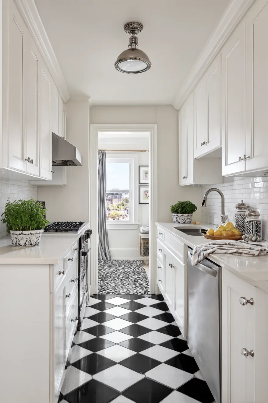
A black and white checkered floor is one of those ideas that looks obvious on a mood board and then completely commands a room once it’s down. Done in a 12-inch ceramic tile (glossy on the white, matte on the black, or both matte if you prefer – I prefer), it reads sharp in a galley layout because your eye follows the diagonal lines straight down the length of the kitchen. The pattern does the spatial work a rug can’t do in a kitchen, because it never moves and it never bunches up under the refrigerator.
The thing people worry about is cleaning. The grout lines in a two-color floor show exactly where the grout lines are, which is a different problem from a single-color floor where dirty grout is a slow surprise. But with a dark grout (charcoal, not black) on the dark tiles and a mid-gray grout on the white, you’re managing the contrast rather than fighting it. Epoxy grout is worth the extra cost here – it’s harder to apply, but it doesn’t stain and it doesn’t need sealing.
In a galley kitchen with gloss white cabinets and brushed nickel hardware, this floor is genuinely the hero. The cabinets become the background. If your kitchen has a strong architectural element – a good window, a run of open shelving – the floor amplifies it rather than competing with it. Start by deciding on the tile size: in a kitchen under 10 feet wide, a 6-inch or 8-inch tile reads more balanced than a 12-inch, which can look like you paved a diner floor.
2. Terrazzo Kitchen Floor For Vintage Lovers
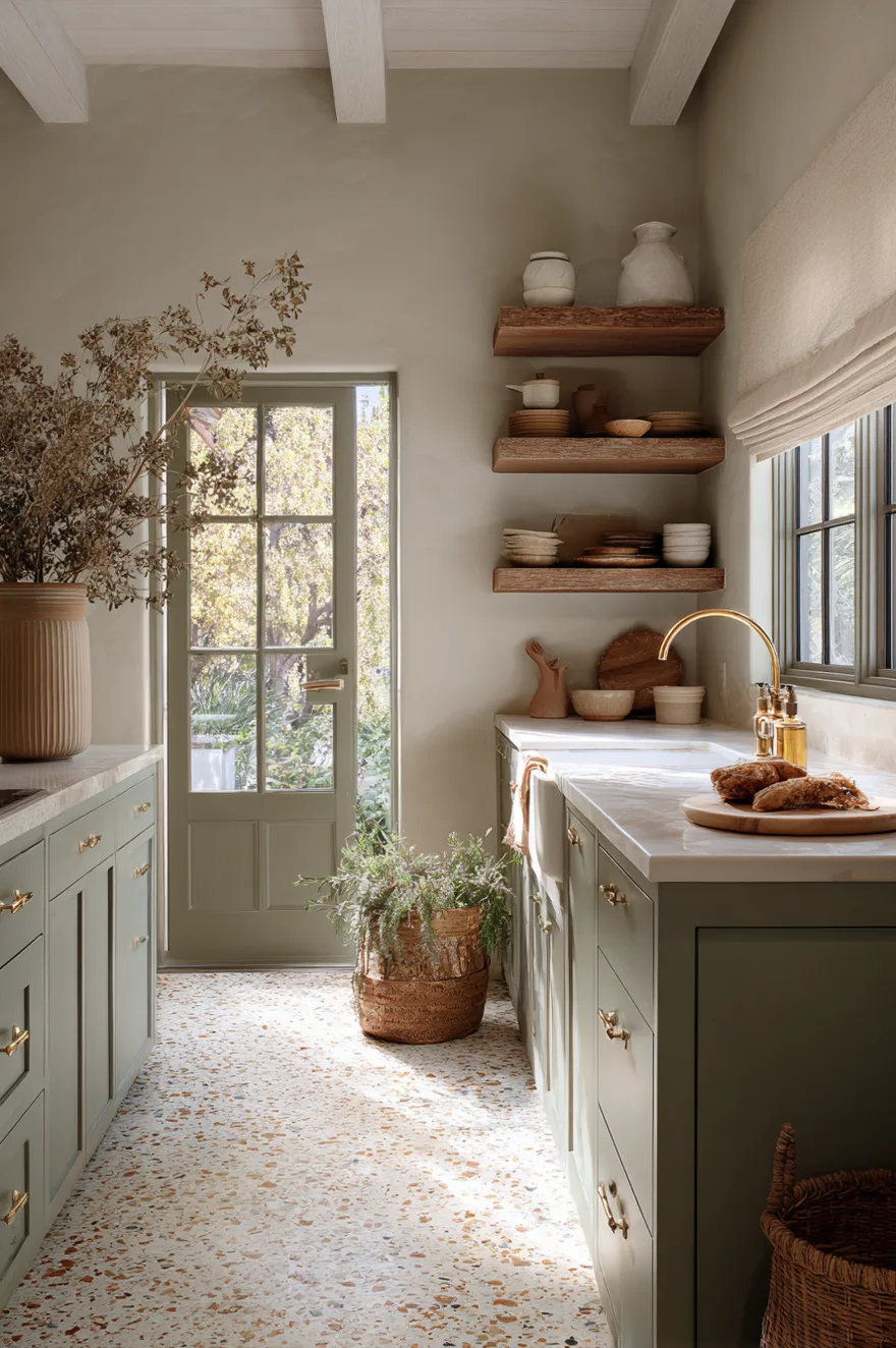
Terrazzo has been having its moment for about five years now, which means it’s also starting to be done badly. The version worth doing is either genuine poured-in-place (expensive, heavy, requires a structural conversation) or a large-format terrazzo tile – 24 inches or larger – in a cream base with warm chips. The chips are where you make the decision: rust and sage chips read warm and 1960s Italian, while white and gray chips read cooler and more contemporary. For a kitchen, I’d choose rust and sage every time.
Paired with sage green lower cabinets, warm brass fixtures, and a linen Roman shade, the floor doesn’t fight for attention – it just confirms the palette. The key physical move is grout color: match it as closely as possible to the lightest tone in the tile base. A visible grout grid competes with the pattern in the terrazzo itself, and you lose the effect. Buy a couple of extra tiles and test three grout colors on them before you commit.
3. Why Terracotta Floors Feel Warmer Every Year
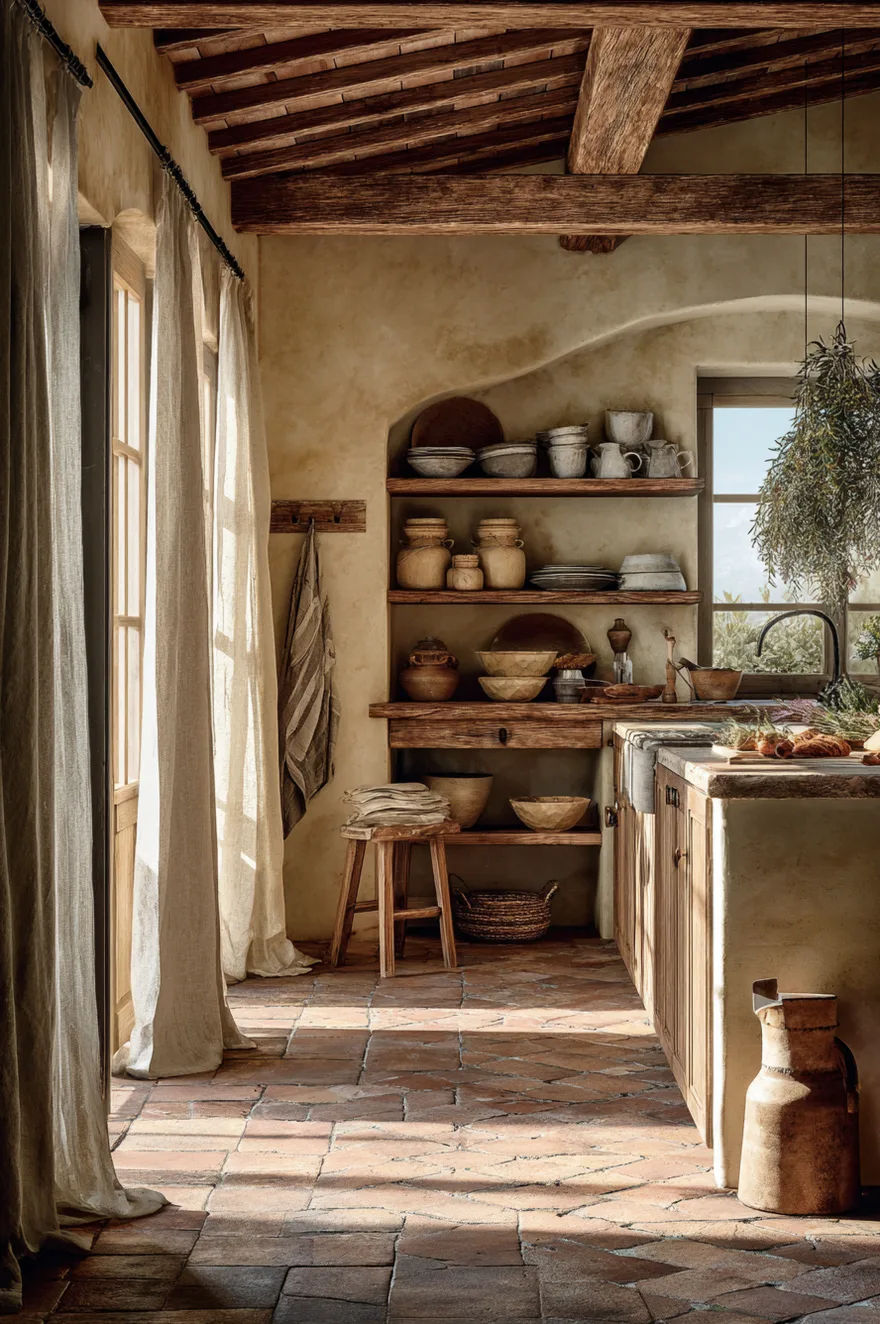
Terracotta is one of the few materials that actually improves with use. An unsealed terracotta tile absorbs cooking oils and foot traffic over years into a patina that no manufactured product can replicate – the color deepens unevenly, and that unevenness is the point. I used to specify only sealed terracotta in kitchens because I was worried about staining, and I was half wrong. A light penetrating sealer (not a topcoat) gives you reasonable protection while still letting the tile breathe and age.
The practical argument for terracotta is also thermal: in a kitchen with morning sun, it stores heat in a way that makes the room feel genuinely different at 7am versus noon. With warm ochre walls, open timber shelves, and ceramic canisters, it reads honest rather than rustic-costume. Seal with a water-based penetrating sealer annually, and reseal after any deep clean.
4. Herringbone Kitchen Floor, Done Right
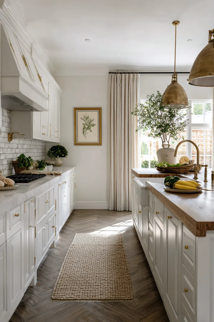
Herringbone works because it’s directional – and in a kitchen, you can use that directionality deliberately. Laid so the point of the pattern runs toward the far wall, a herringbone floor pulls a short kitchen visually longer. This is particularly useful in a closed kitchen under 12 feet deep, where you want to suggest more room than you have. The tile format matters: a narrow brick-format porcelain (something close to 3×12 inches) gives you a more pronounced chevron effect than a square tile, which tends to flatten the pattern into a tweed texture.
In a warm greige colorway, herringbone reads quiet enough to support almost any cabinet color. White shaker cabinets and butcher-block countertops are the obvious pairing because they let the floor pattern remain the interesting element without any one surface shouting over the others. A pendant in aged brass overhead bridges the warm wood counter and the cooler greige tile in a single material. Set the herringbone on a 45-degree diagonal relative to the walls – not parallel – to maximize the lengthening effect.
5. Dark Tile Kitchen Floor That Actually Works
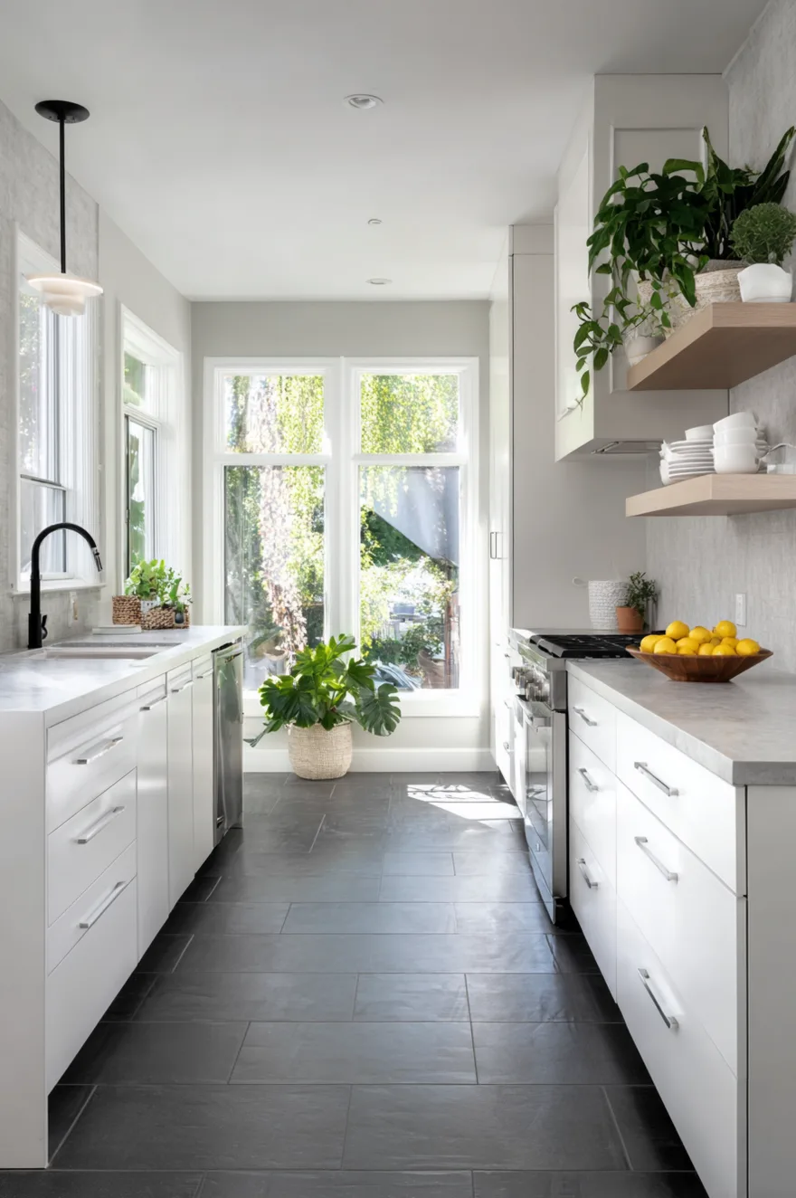
The concern people have about dark floors in kitchens is that they’ll make the room feel heavy. And they will – if the ceiling is dark, or the cabinets are dark, or the countertops are dark. But a matte charcoal large-format tile (24×24 with rectified edges, so the grout joint can be reduced to 1/16 inch) against white upper cabinets and a pale quartzite countertop reads as a sharp, graphic contrast rather than a dim room. The matte finish is doing important work here: a polished dark tile shows every footprint and water mark, while a matte surface hides them well.
The light source is also critical. With bright natural daylight, the charcoal floor reads as a strong design choice. In a kitchen that gets no direct sun, the same floor can feel like a basement. Assess your light before you commit. If the room is north-facing or has small windows, drop down to a warm dark gray rather than true charcoal, and keep the grout near-matching so the floor reads as one continuous surface.
6. The Marble Kitchen Floor Conversation
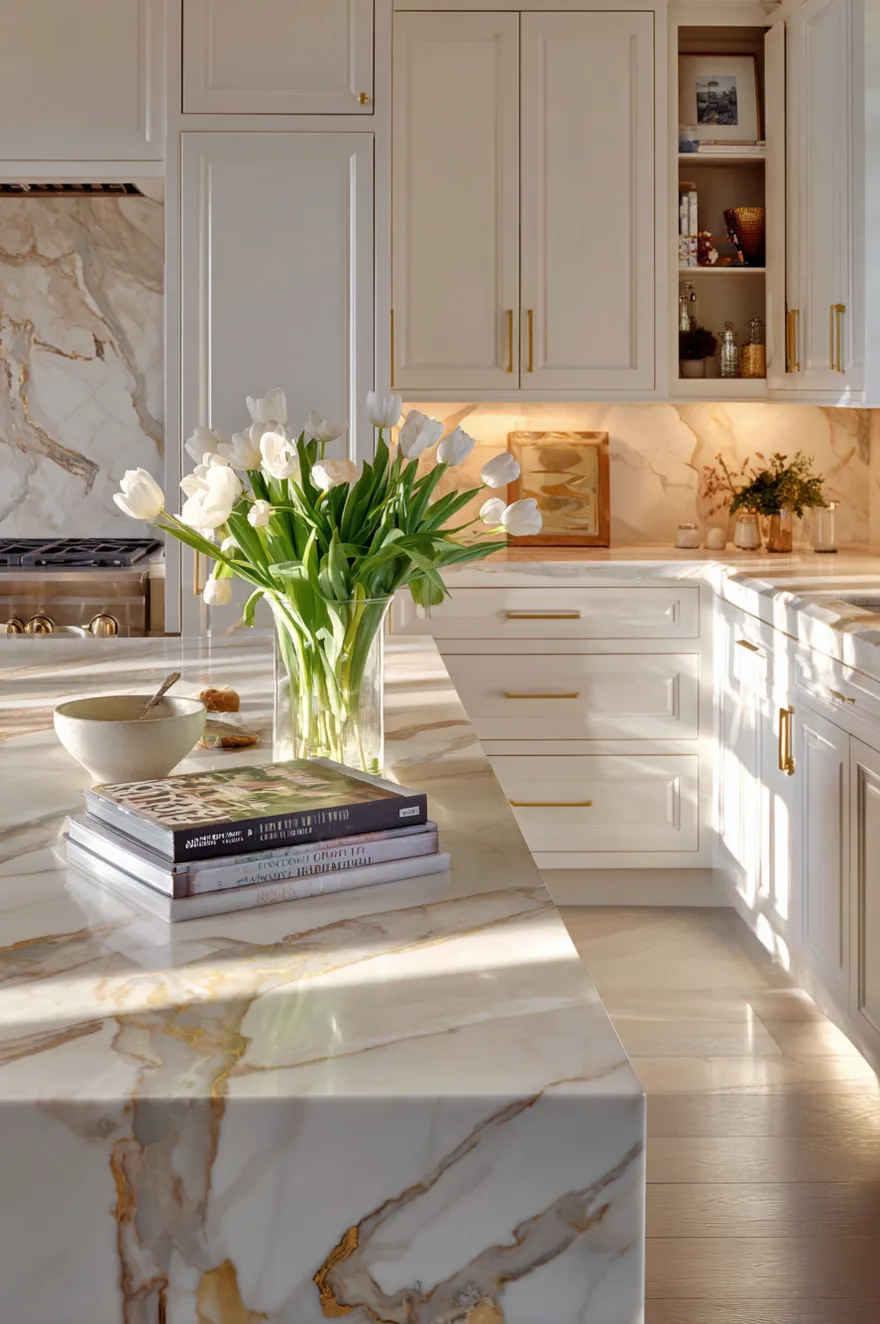
I had a client three years ago who came in with a clear brief: honed Calacatta marble tile on the kitchen floor, no discussion. We had the discussion anyway. I showed her the sealing schedule (penetrating sealer twice a year, more if she cooked acidic things regularly), the scratch reality (honed marble scratches more visibly than polished because the surface is already matte and a scratch changes the sheen locally), and the fact that a marble-look porcelain at the same price point per square foot would perform better in every practical category.
She already knew all of it. She chose the real marble. And honestly – standing in her kitchen now, looking at the way the Calacatta veining moves across the floor and connects to the marble island, I understand it completely. The porcelain version I showed her was good. But real Calacatta has a translucency when light hits it at a low angle that no digital print has managed to replicate yet. The scratches are there. They look like the floor has been used.
If you go this route, budget for a professional sealer application on install day, not after. And use a pH-neutral floor cleaner – no vinegar, no lemon, nothing acidic anywhere near it.
7. Geometric Tile Kitchen Floor For A Bold Backsplash Alternative
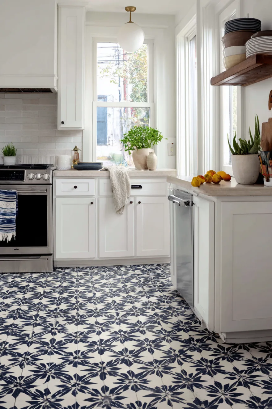
Most people put their boldest tile on the wall, which means the cabinets have to fight the backsplash for visual authority. Flipping the logic – putting the geometric pattern on the floor and keeping the cabinets flat and calm – gives you the graphic interest without the visual noise at eye level. A star-and-cross encaustic cement tile in deep navy and white is one of the strongest versions of this move. The pattern repeat is complex enough to read as intentional from across the room, but because it’s underfoot, you absorb it gradually rather than confronting it.
Flat white Shaker cabinets are the right cabinet here – not bright white, flat white, which has a slightly chalky quality that doesn’t compete with the tile pattern below it. Honed stone countertops in a warm gray or beige keep the whole room from swinging too cold. Cement tile needs sealing before grouting and again after installation; this is not optional, or the grout will stain the surface permanently. A matte penetrating sealer, reapplied every two years.
8. Concrete Kitchen Floor Without The Cracks
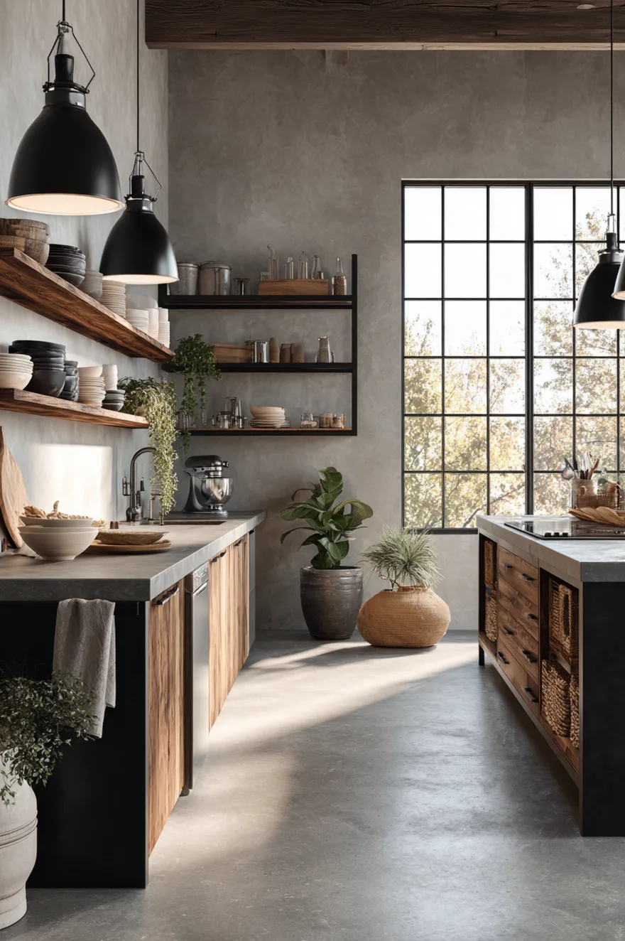
Poured concrete floors are visually compelling and practically difficult. A concrete slab poured over an existing subfloor will crack – not if, when – because it shrinks as it cures, and any flex in the subfloor telegraphs through. Control joints help, but they’re visible lines in your floor, and they require planning. The other option is microtopping: a very thin cement-based coating applied over existing tile or concrete that gives you the same visual result with far less structural commitment. Microtopping runs around $8-$14 per square foot professionally applied, and a good applicator can feather it over existing grout lines.
But the option most people should actually use is a large-format concrete-look porcelain tile. The best versions now are genuinely hard to distinguish from the real thing, particularly in a matte finish with subtle aggregate texture. A 24×48 rectified tile with a minimal grout joint reads as near-smooth from standing height, which is the whole point of the concrete aesthetic. Performance near a sink is also far superior to any real concrete surface – porcelain is non-absorbent, unaffected by acidic spills, and doesn’t require sealing.
The one place I’d still argue for real microtopping is a small kitchen where you’re doing a broader renovation and can control the subfloor preparation properly. The organic surface variation of a hand-applied finish – slightly uneven, with trowel marks – has a quality the porcelain doesn’t replicate. You can see the hand in it. Pair it with open steel shelving and industrial pendants, and the material logic of the room holds together.
9. Natural Stone Kitchen Floor, Worn And Honest
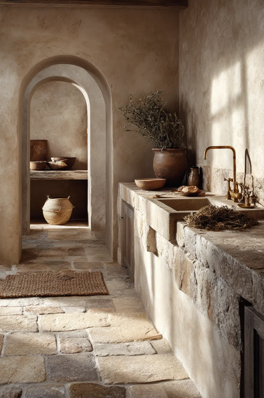
Tumbled limestone or honed slate in an irregular flagstone lay is the floor that camouflages mess better than anything else I’ve ever specified. The natural color variation across each stone – the small pits, the tonal shifts, the slightly uneven surface – means crumbs, scuffs, and water marks read as part of the texture rather than against it. Frank and Mies would destroy a polished floor; on tumbled limestone, their paw prints don’t show at all.
The irregular lay means you need a more skilled tile setter, and the mortar bed needs to be thicker to accommodate the variation in stone depth. Budget accordingly. An aged brass tap and terracotta plaster walls are natural companions – materials that share the same philosophy of honest aging. Seal with a penetrating stone sealer annually, and accept that the floor will look better at five years than it does on install day.
10. Grey Tile Kitchen Floor That Earns Its Keep
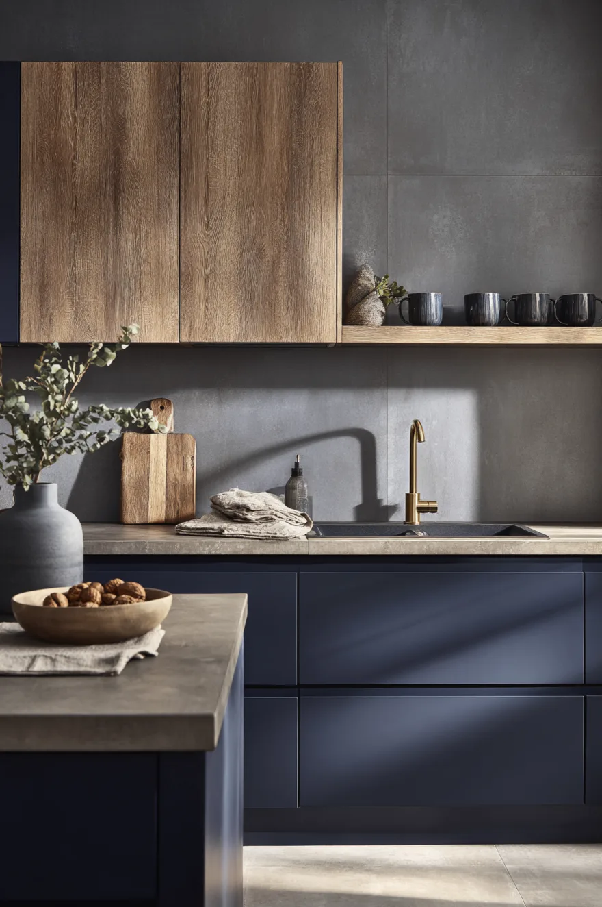
Most gray tile fails because it’s the wrong gray. A blue-gray porcelain reads cold in morning light and colder in the afternoon, and it flattens every warm material in the room – the wood, the brass, the warm white paint. A warm gray (with yellow and brown undertones rather than blue) does the opposite: it bridges disparate palette elements without dominating any of them. In a 32×32 format with a subtle surface texture – not smooth, not heavily textured, something in between – it reads as a considered neutral rather than a default.
The specific application I keep coming back to is a kitchen with deep navy lower cabinets and raw oak uppers. Cool below, warm above, and the warm gray floor splits the difference in a way that neither a light wood floor nor a dark tile would manage. Warm afternoon light makes this combination genuinely good. Test any gray tile sample in your actual kitchen light before ordering – a tile that reads warm in the showroom can flip completely under north-facing windows.
11. Black And White Kitchen Floor With Color Above
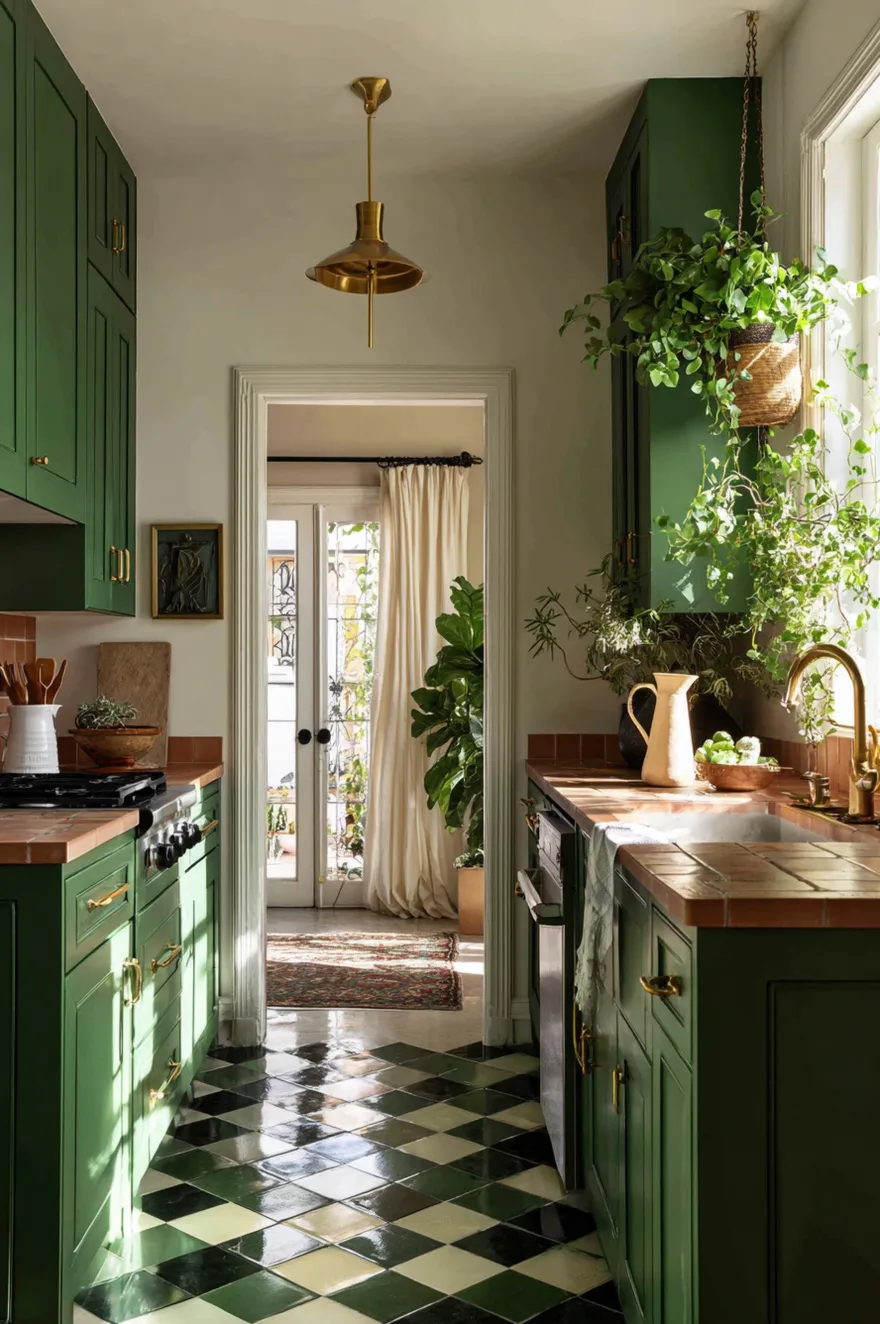
A graphic black and white floor functions as the room’s neutral when you use it this way. Because the floor is already doing something visually strong, the cabinets and walls are free to carry color without the room tipping into chaos. Deep forest green cabinets with unlacquered brass hardware read confident over a black and white checkered floor in a way they wouldn’t over a natural wood floor, where the warm tones of the wood and the warm tones of the green compete quietly.
But the detail that makes this combination actually work is the backsplash. A terracotta backsplash tile above forest green cabinets introduces a warm earth tone that connects the brass hardware to the warmer chips in the floor’s white tile (white tiles often have a cream or warm cast). Without that bridge, the room can read a little cold. Frame the whole thing from a doorway and the floor and cabinet color read as a unified decision, not two separate ones that happened to share a room.
12. Peel And Stick Kitchen Floor Worth Taking Seriously
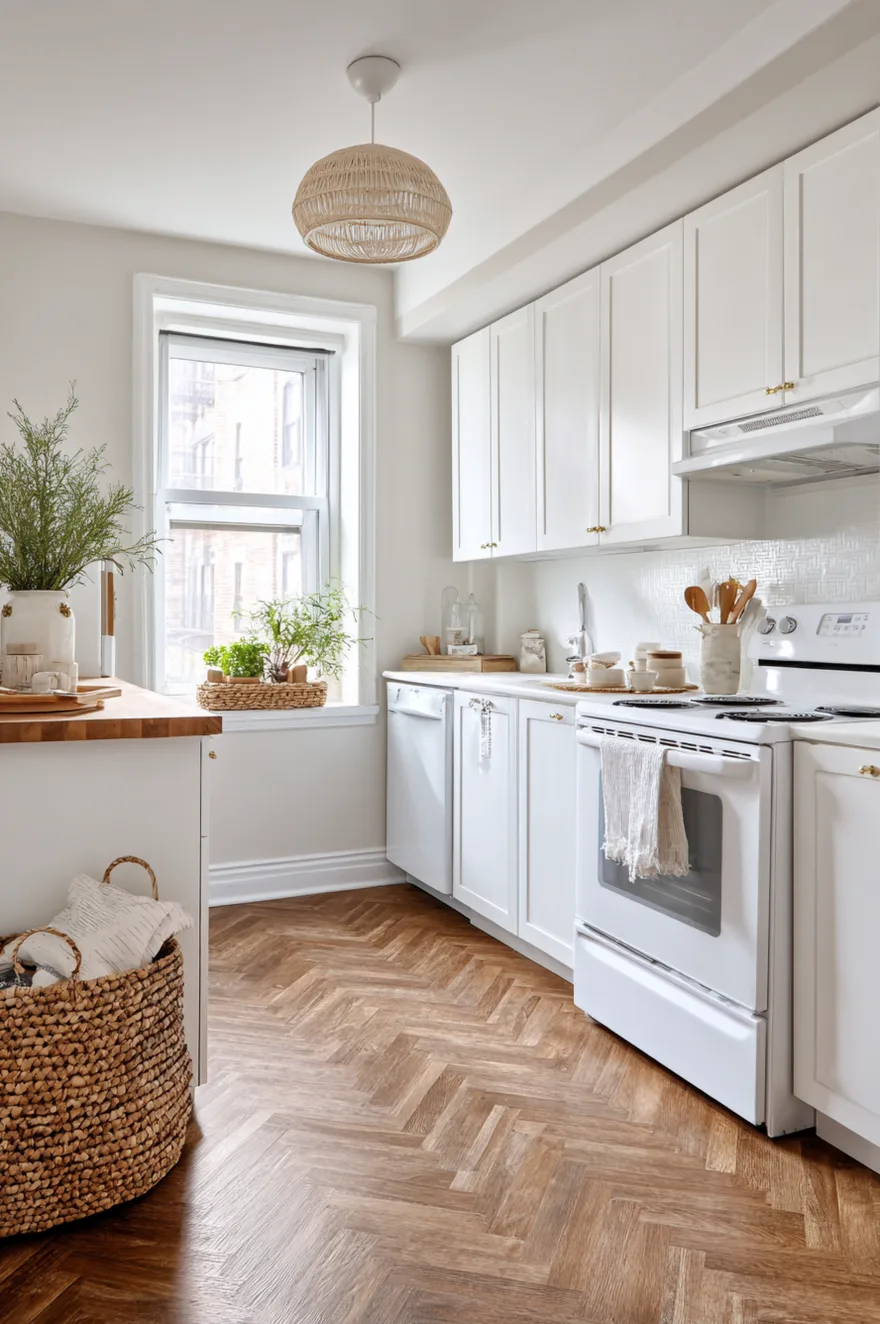
I used to dismiss peel-and-stick tile entirely. The product I knew ten years ago was thin, the edges curled within a season, and the pattern looked like a photograph of a floor rather than an actual floor. The current generation of luxury vinyl tile – particularly the thicker formats at 4mm or 6mm with a rigid core – is a meaningfully different product. The stone-look formats now have embossed surface texture that aligns with the printed pattern, which is the detail that separates them from the cheap versions at a distance.
Surface prep is the part nobody talks about enough. A peel-and-stick tile over an uneven, dirty, or porous subfloor will fail – the adhesive releases at the low points and the tiles shift. Sand down any high spots, fill any low spots with floor leveling compound, clean the surface completely, and prime with a compatible adhesive primer if the manufacturer recommends it. For pattern, a herringbone plank format photographs the best of any peel-and-stick layout because the diagonal lines read as intentional in a way that a straight-lay plank doesn’t always manage. Finish the edges with a matching threshold strip – improvised transitions show immediately.
13. The Renter’s Fix Nobody Talks About
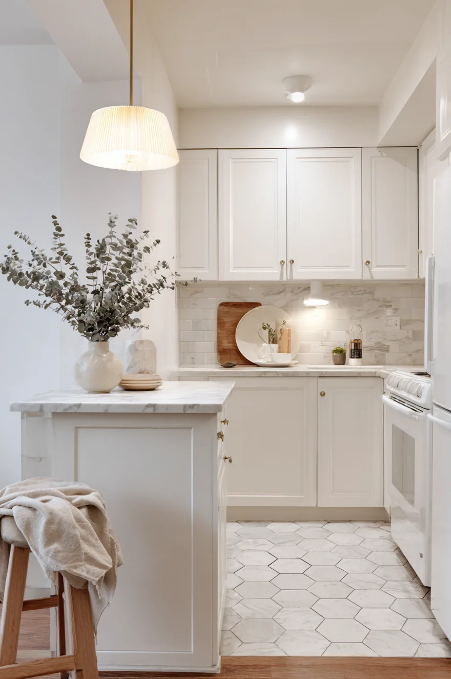
A few years back I was working with a renter in a small Seattle apartment – a kitchen about 8 feet by 10, with builder-grade beige vinyl that was buckled at every seam and impossible to clean. She had a landlord who was technically responsive but would absolutely not approve any flooring change. We specced a marble hex peel-and-stick tile in a small 1-inch format on a mesh backing, laid over a thoroughly cleaned and primed subfloor.
The prep took an afternoon. The install took another. The result looked intentional – genuinely good, the kind of floor that reads as a considered design choice rather than a rental workaround. She lived there for three years. The floor never lifted, never buckled, and when she moved out, she pulled it up in an hour with a heat gun and a plastic scraper, leaving the original vinyl intact underneath. The landlord never noticed it had been there.
The specific product she used was a thicker luxury vinyl tile with a peel-and-stick backing – not the thinnest available option. And the marble hex pattern, in a warm gray-and-white colorway, was the right call for a small kitchen because the small-scale geometry made the floor feel intentional without adding visual weight. A warm pendant light at 2700K finished the room.
14. Vinyl Tile Kitchen Floor For High-Traffic Homes
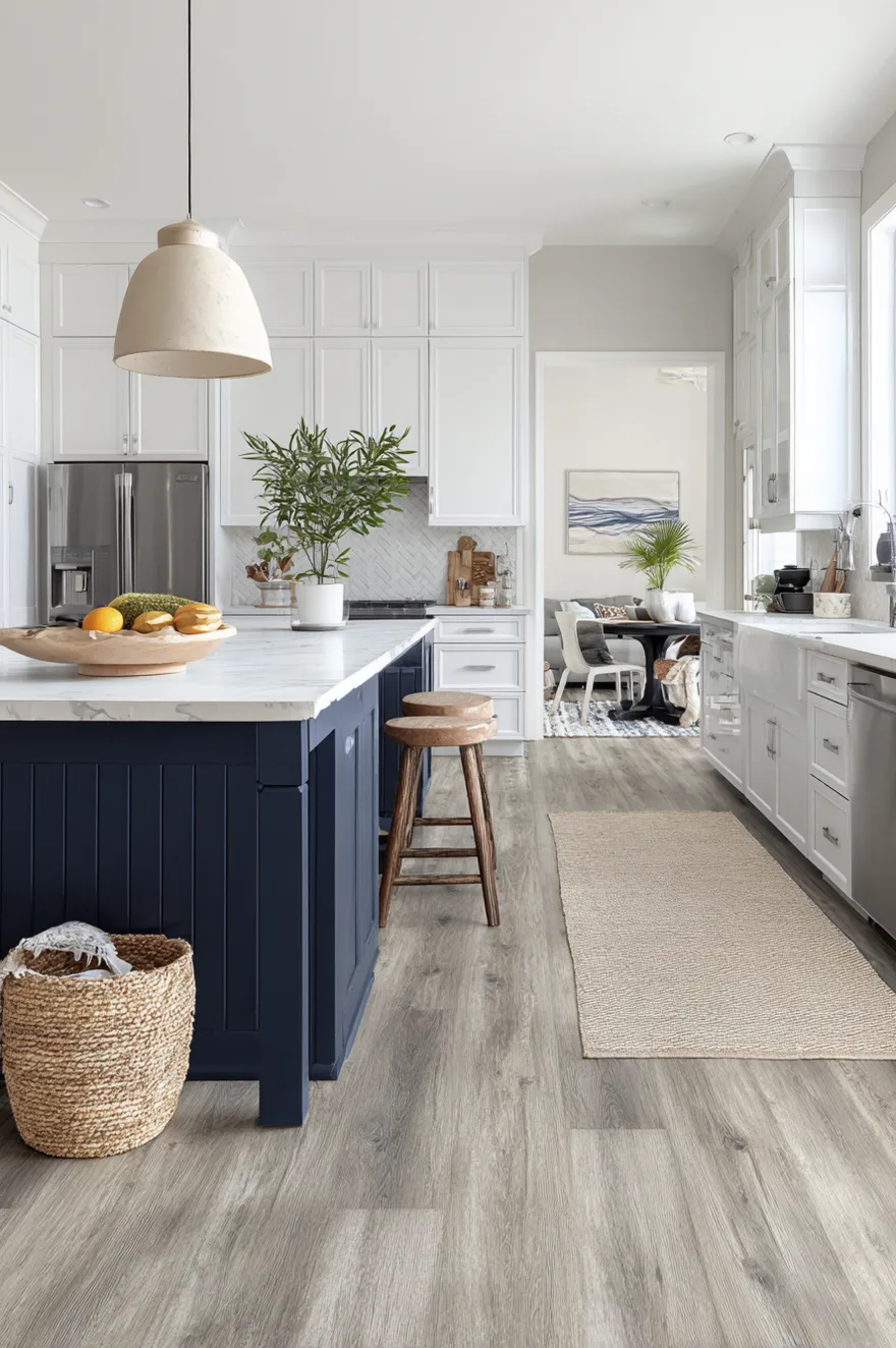
Sheet vinyl is cheaper to install and smooth, which matters near a sink. But for a family with dogs – or with kids who drag chairs across the floor – a click-lock luxury vinyl tile in a plank format is the better call, because individual planks can be replaced when one gets damaged without redoing the whole floor. A smoked oak plank LVT at 9 inches wide and 6mm thick with a waterproof rigid core performs well in every practical category: scratch-resistant surface layer, completely waterproof, dimensionally stable in temperature swings.
Paired with painted white cabinets and a deep navy island, smoked oak LVT reads warm without being yellow – it has enough gray in it to work with cooler cabinet colors. The install is genuinely DIY-able if the subfloor is flat. Check for high spots with a straightedge before you start – a click-lock floor telegraphs subfloor irregularities through the planks as a slight hollow sound underfoot, which is maddening once you notice it.
15. Why Grout Width Changes Everything
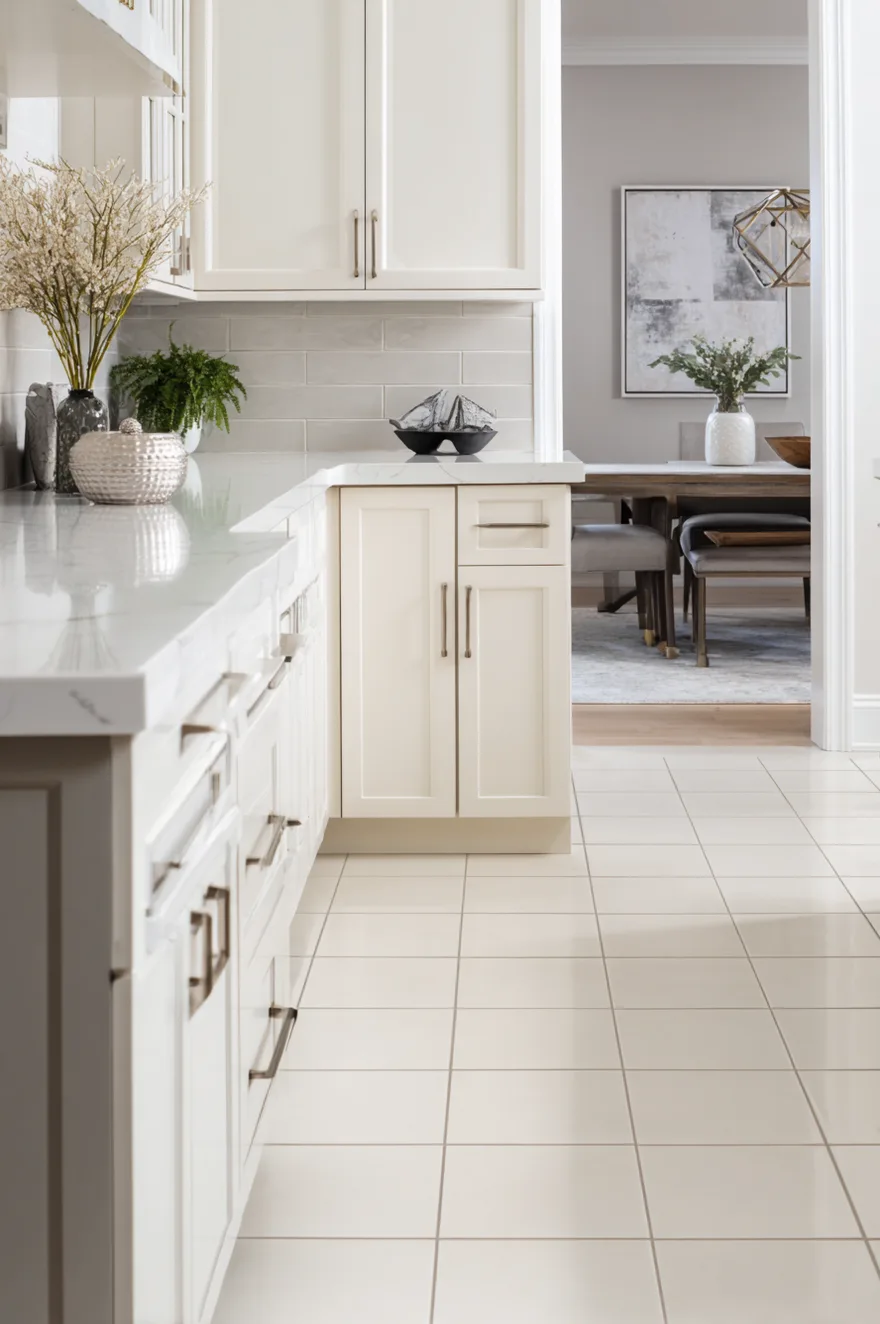
Take the same 6×6 ceramic tile. Set it with a 1/16-inch grout joint and a matching grout color, and the floor reads as one continuous surface – modern, refined, almost like a slab. Set the same tile with a 3/8-inch joint in a contrasting grout, and the grid becomes a graphic element, the floor reads handmade, and the room gains a completely different character.
This is a decision most people hand to their tile setter without specifying it, and then they wonder why the floor doesn’t look like the photograph. Write the grout joint width and the grout color on the tile order. It matters more than almost any other single variable, including the tile itself.
16. Geometric Tile Kitchen Floor In Earthy Tones
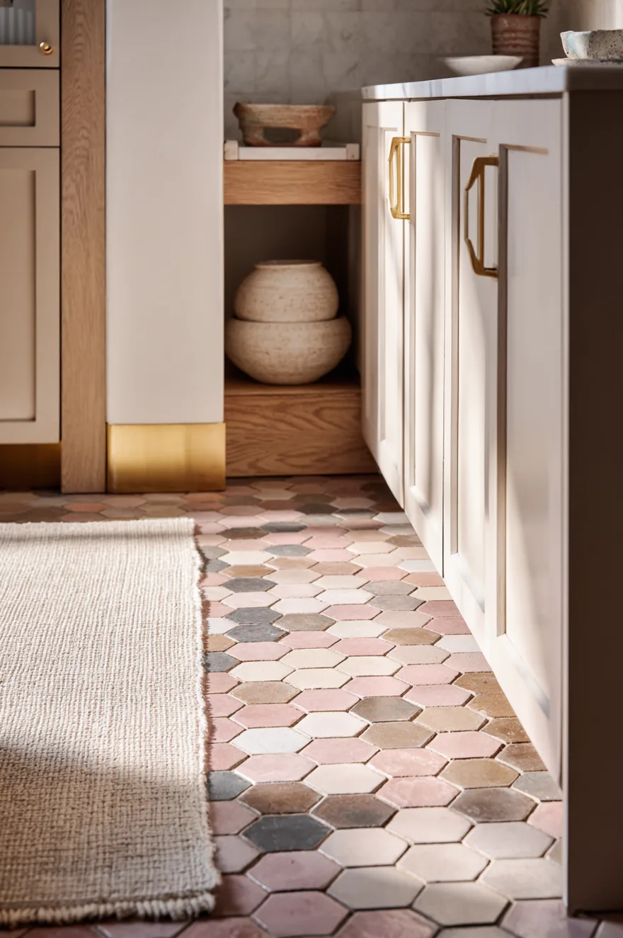
The classic encaustic geometric in navy and white is a strong statement. But a zellige-influenced hexagon or diamond tile in a warm mixed-earth palette – dusty rose, sand, mushroom – is a different kind of interesting. The color contrast between tiles is low, so the pattern reads as texture at a distance and resolves into geometry up close. It suits a cream-and-warm-wood kitchen without competing with it, which the navy version absolutely would.
The detail I find most satisfying about this combination is where the floor meets the toe kick. A raw oak toe kick against a dusty-rose-and-sand floor is a quiet moment that rewards attention. Still not sure I’d do this in a very large kitchen, where you need the pattern to carry across more square footage – but in a kitchen under 150 square feet, the earthy geometric reads confident and warm. Seal the cement tile well before grouting.
17. Stone Tile Versus Stone-Look Porcelain
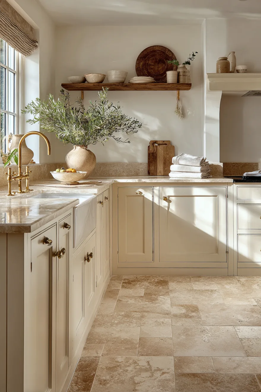
The honest comparison: honed travertine tile and a high-resolution travertine-look porcelain at a comparable price point per square foot. The porcelain performs better in every practical category – no sealing, harder surface, no natural voids that catch grout or grime. The travertine has something the camera picks up and the porcelain doesn’t, and it’s not easily described except to say it’s the difference between depth and surface. Real travertine has a slight translucency in the cross-cut face, and the variation between tiles is genuinely random in a way digital printing approximates but doesn’t match.
Under cool morning light with cream cabinets and a straight-on view, both look good in photographs. In person, standing in the room at different times of day, the real stone shifts. The porcelain is consistent. Whether that difference justifies the maintenance trade-off is a question only you can answer – but go look at both in person before you decide, under natural light, not showroom lighting.
18. The Unloved Mud-Entry Kitchen Floor
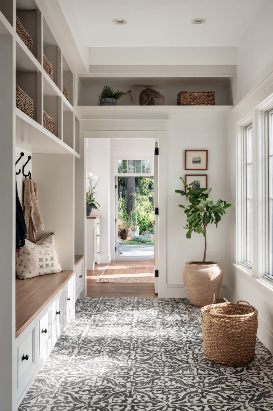
One project I think about often was a row house in Capitol Hill where the kitchen connected directly to a mudroom through a wide doorway – no door between them. The owners wanted the kitchen floor to be warm and the mudroom floor to be durable, which meant they were instinctively planning two different floors. Running two different floors through an open connection is a design decision that almost always looks like an accident rather than a choice.
We used a single encaustic-look cement tile in black and terracotta throughout both zones. The kitchen portion read warm and considered. The mudroom portion read intentional rather than purely utilitarian. And the continuous floor, seen through the doorway, read as a single designed space. The terracotta tone also hid the mud entry’s actual workload – dirt, water, tracked-in debris – far better than any light-colored floor would have.
The practical move is to use the same tile format and grout color in both spaces, even if you vary the pattern orientation slightly. A 45-degree shift in the pattern direction across the threshold gives each zone its own character while maintaining the material connection. And choose a tile rated for heavy foot traffic in the mudroom zone specifically – not all encaustic cement tiles are equal in hardness.
19. Dark Tile Kitchen Floor In A Small Kitchen
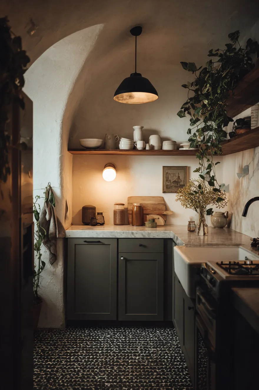
The conventional wisdom says small rooms need light floors. I disagree with it specifically in kitchens where the cabinets are light and the ceiling is bright white. A matte black penny tile floor in a small kitchen with white plaster walls and open shelves holding white ceramics reads sharp rather than small – the contrast is doing spatial work that a mid-tone floor never would. The penny tile scale is important: larger format dark tile in a small kitchen can feel like the floor is trying to swallow the room.
A trailing pothos on an open shelf at mid-height, and a warm 2700K pendant over the sink, turn the corner after 4pm without making the floor feel heavier. And the grout color here is non-negotiable: dark gray grout with black tile, not white. White grout with black penny tile is a different, higher-contrast look that reads more graphic and less quiet – decide which you want before you order.
20. Marble Kitchen Floor In A Moody Palette
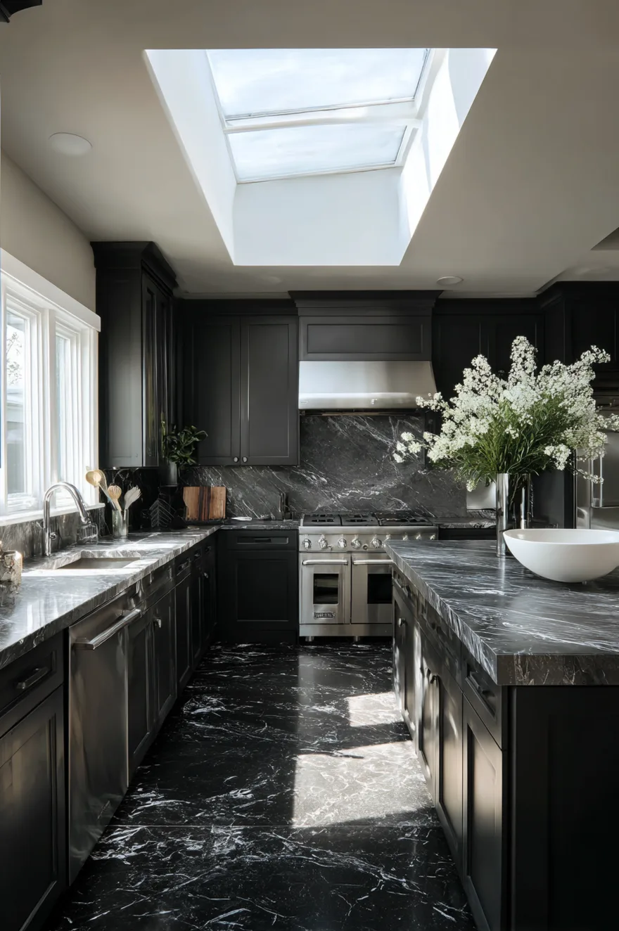
Honed Nero Marquina is the marble that changes the conversation. White marble floors read classical, Calacatta reads luxe-neutral, but black marble with white veining under charcoal cabinets reads like something else entirely – something between a professional kitchen and a gallery space, expensive in a way that doesn’t announce itself loudly.
The specific combination that works is deep charcoal lower and upper cabinets, a brushed steel range, and a single large skylight as the primary light source. The skylight does what no other fixture can: it sends a column of natural light directly onto the Nero Marquina surface, where the white veining catches it and glows against the black ground. Lamplight can’t replicate this effect. If your kitchen has no natural overhead light, this combination will work less well than it should.
The practical note: Nero Marquina is dense and hard for a marble, which makes it more durable than white marbles underfoot. It still needs sealing and still scratches – but the dark ground makes scratches essentially invisible until you’re looking for them. Honed finish only; polished Nero Marquina shows every footprint.
21. The Floor Decides The Room
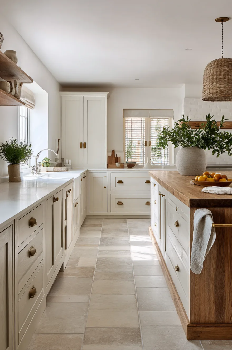
Here’s the problem with the way most kitchen renovations work: the floor gets chosen last. Cabinets first, then countertops, then hardware, then backsplash, and finally – with a limited budget and limited patience – whatever floor tile is left over from the decision tree. The floor is the largest uninterrupted surface in the room. It should be the first decision, not the final compromise.
The framework I use has three variables, and they interact. Pattern scale: a small-scale pattern (penny tile, small hex, narrow herringbone) reads well in small kitchens and adds texture without demanding attention; a large-format tile or big pattern repeat (wide herringbone, 24×24 slab) suits larger rooms where you need the floor to feel resolved rather than busy. Grout value: light grout emphasizes the individual tile, dark or matching grout reads as a continuous surface – a decision that shifts the character of the floor more than the tile color does. Finish sheen: matte finishes hide daily wear and read casual; polished or satin finishes catch light and read refined but show every footprint and every spill.
Run these three variables against your kitchen’s light conditions – not showroom light, your actual kitchen at 8am and 3pm – and most of the options on this list will sort themselves into yes, no, and maybe. The maybe pile is where the interesting decisions live. And getting those decisions right before the cabinets go in, rather than after, is the move that makes the whole room hold together.
Pick two or three of these that match your kitchen’s actual constraints – light, size, budget, and how much maintenance you’re genuinely willing to do – and live with the samples for a week before you commit. I’d love to know which direction you’re leaning. Drop a comment below with your kitchen situation and the floor you’re considering, and I’ll tell you what I’d actually do.
Talk soon,
Rachel