TV console decorating ideas are everywhere online, yet most living rooms still look like the console lost an argument with the television. The trouble is usually not the console itself – it’s the logic behind what goes on it, above it, and around it. These 23 approaches cover organic modern, coastal, boho, mid-century, and minimal directions, with the reasoning behind each one so you can adapt the idea to your actual room.
A few years ago I was finishing up a client project in Capitol Hill – compact condo, nine-foot ceilings, a 65-inch TV the client had bought before we started working together, and a perfectly good walnut console that was somehow invisible. The TV was winning. Every week the client would send me a new photo she’d found and ask, “Why doesn’t mine look like this?” The answer was almost always the same: whoever staged the photo had thought about the wall, the light, the objects, and the proportions as a single system. The console alone wasn’t the problem. We fixed hers by raising the TV four inches, pulling the console two inches from the wall to give it shadow, and replacing five small accessories with two larger ones and one tall stem. She texted me a photo the same evening. It looked completely different. It looked like a room.
That pattern shows up constantly. So here’s what I actually think about, in roughly the order I’d think about it.
1. Floating Console Organic Modern Statement
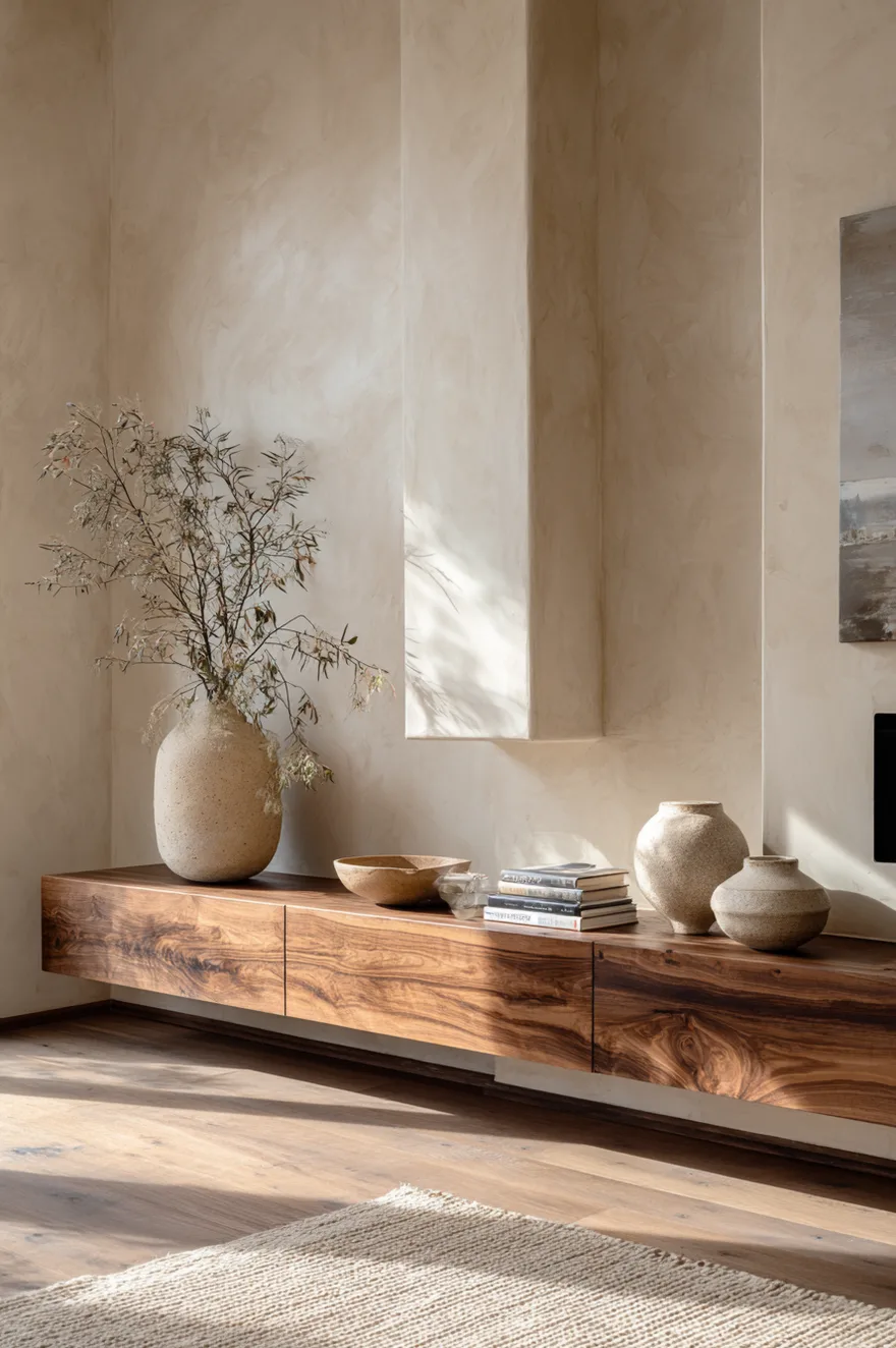
Wall-mounting a console is a commitment, which is exactly why it pays off. When there are no legs touching the floor, the eye reads the space beneath as part of the room – the floor runs uninterrupted, the console becomes almost architectural, and the whole arrangement looks considered rather than assembled. For an organic modern living room, I’d specify walnut with a raw or live edge, mounted around 18 inches off the floor, with a continuous piano-wire hanger hidden behind the piece so no brackets show on the wall face.
The objects earn their place here by doing real visual work. Two or three sculptural ceramic vessels in matte finishes – a wide-shouldered vase, a low open bowl, something with an irregular rim – hold the eye without competing with each other. A linen panel behind the TV, floor to ceiling, softens the screen’s hard rectangle and echoes the warmth of wide-plank white oak underfoot. Warm plaster walls do the rest: they shift color through the day in a way paint can’t, moving from cream at noon to a soft amber by late afternoon when the light drops. Skip the gallery of small objects entirely. The raw edge of the shelf is the texture.
Start by deciding the exact mounting height before you order anything – measure from your seated eye line to the center of where the TV will sit, then position the console surface so the TV bottom clears it by at least 4 inches.
2. Why Black Console Moody Lighting Works
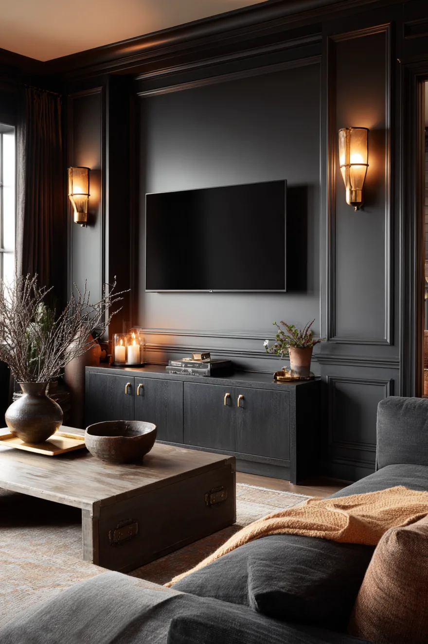
Dark-on-dark gets dismissed as gloomy by people who’ve only seen it done wrong. A matte black console against a charcoal wall actually creates depth – the eye reads layers rather than a flat surface – and the contrast you’d normally get from a light console gets replaced by something more interesting: material texture. Matte against matte requires both surfaces to be good, which raises the stakes and usually raises the result.
The piece that keeps it from feeling heavy is a single brass tray, maybe 12 by 16 inches, sitting off-center on the console surface. Brass at 2700K sconce light does something warm plaster and charcoal cannot do on their own. Two low amber sconces flanking the TV, set on a dimmer, and that tray becomes the brightest object in the room. Pull the eye, hold it, done.
3. Open Shelves Above TV Console
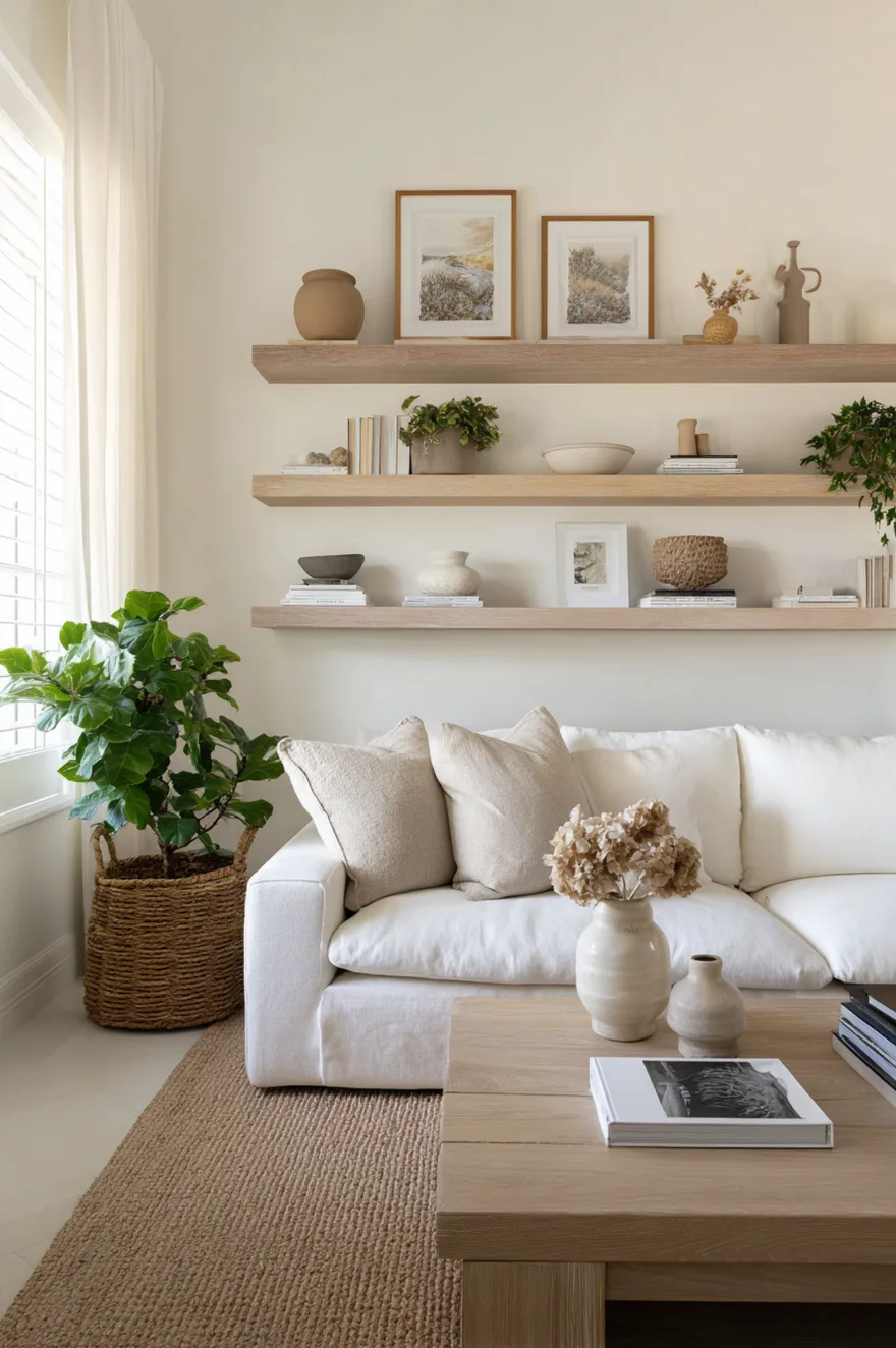
I used to think open shelving above a TV was a mistake. I was half wrong. The problem isn’t the shelves – it’s treating them like storage instead of composition. Once you commit to the idea that the shelf is a curated (sorry – a considered) surface and not a landing zone for whatever, it works.
Staggering object heights is non-negotiable. Put something tall on one end – a handthrown pitcher, a slim vase at around 14 inches – then drop to something mid-height, then let the shelf end with a horizontal stack of art books or nothing at all. Leave at least one-third of the shelf as open wall. That negative space is not empty; it’s breathing room, and it’s what makes the objects you do place read as deliberate. Mix one ceramic piece, one paper or textile object (a small folded print, a book with a linen cover), and one plant trailing over the edge.
Bracket choice matters more than people expect: a slim floating bracket in oak or black steel disappears, while an ornate bracket fights everything around it. Keep the bracket honest about what it is.
4. The Console Nobody Knows How To Style
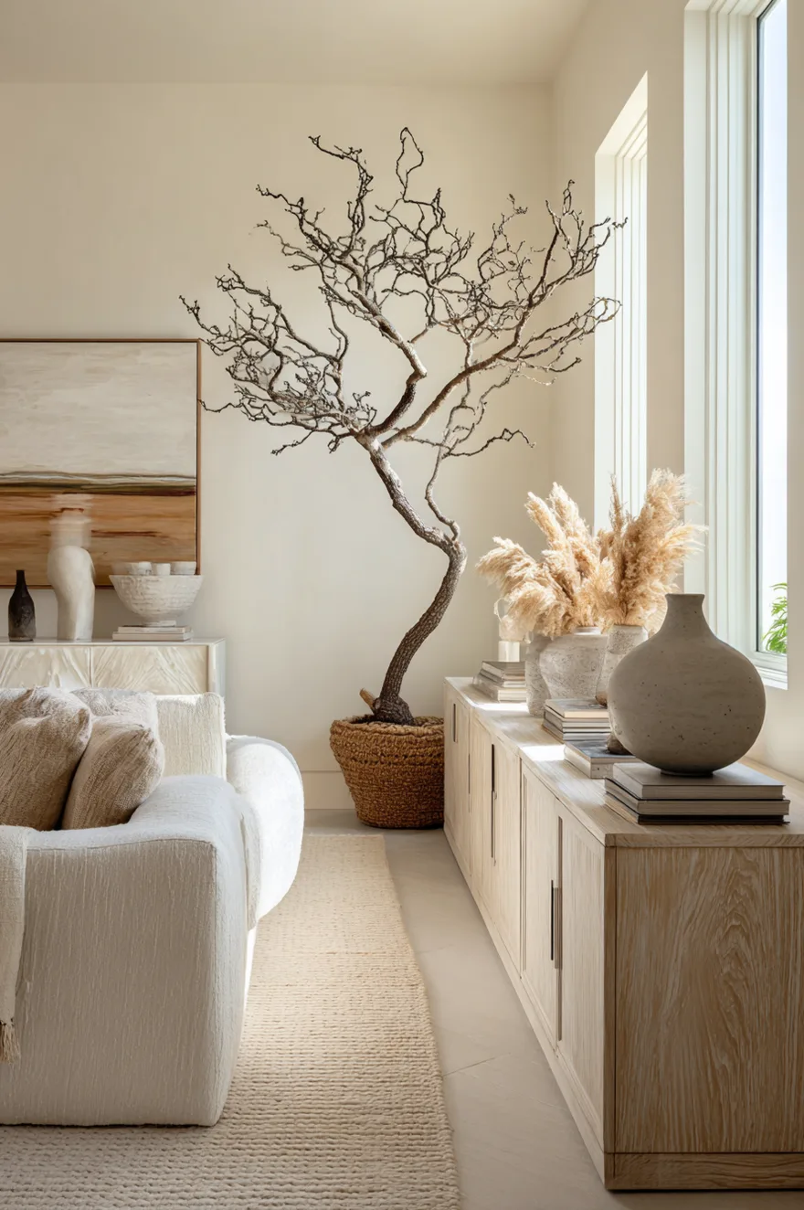
A client came to me with a credenza that was six feet wide in a room that was only eleven feet across. She’d tried matching lamps on each end, a mirror in the middle, two plants. It looked like a hotel corridor, symmetrical and lifeless. The scale of the piece demanded that she stop trying to decorate it like a normal console and start treating it like a landscape.
What finally worked was radical asymmetry: one very tall sculptural branch – dried, almost graphic – in a concrete floor vessel at the far left end, standing nearly four feet. Then nothing for about eighteen inches. Then a low, wide stack of linen-wrapped books in the center. Then at the right end, one oversized shallow bowl in a warm ocher glaze, about 14 inches across. Nothing was matched to anything else. The proportions of the credenza suddenly made sense because we’d stopped fighting its width and started using it.
The rule, if there is one: on a very long surface, anchor one end with height, leave a generous gap, place your lowest element near center, and let the other end rest. Asymmetry at this scale reads as intent, not accident.
5. Coastal Console Natural Textures Done Right
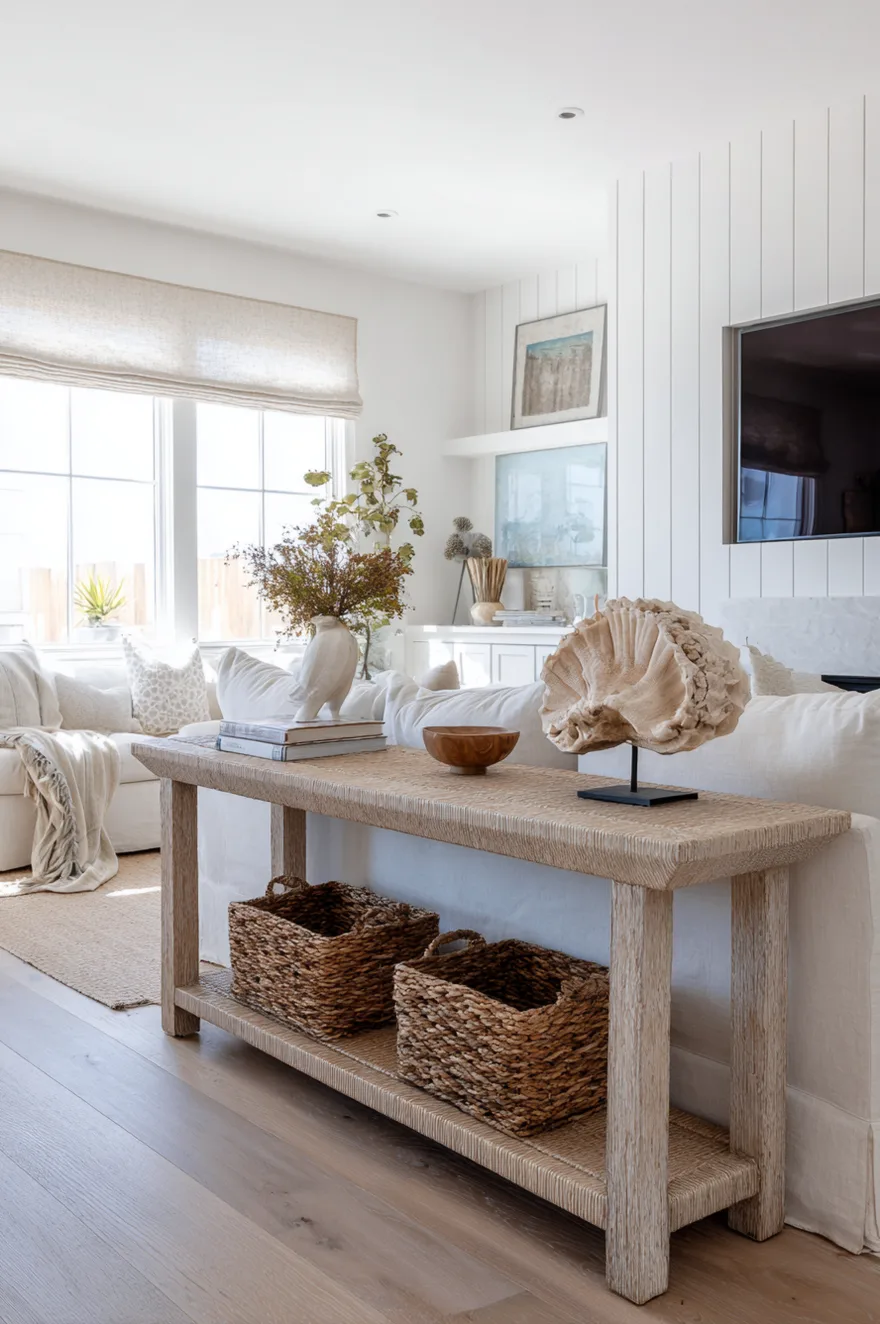
Coastal done badly smells like a souvenir shop – rope everywhere, shells in a jar, a sign that says “BEACH.” Coastal done well is just a room with honest natural materials that happen to feel appropriate to a light-filled house near water.
A bleached rattan console gets this right because rattan is structurally what it is – no veneers, no finishes pretending to be something else. On the lower shelf, woven grass baskets with lids pull double duty as storage and texture. On the surface, one driftwood sculpture (a single piece, not a cluster of six tiny ones) and nothing else except maybe a low stack of books with cream and sand-toned spines. The shiplap wall behind the TV should be painted in a clean warm white rather than the blue-gray that every coastal renovation defaulted to for fifteen years. A linen Roman shade beside the TV softens the window light to something diffused rather than harsh. Let the whitewashed oak floor do the rest – that material carries the palette without needing reinforcement from above.
6. Low Console Plants Earthy Tones
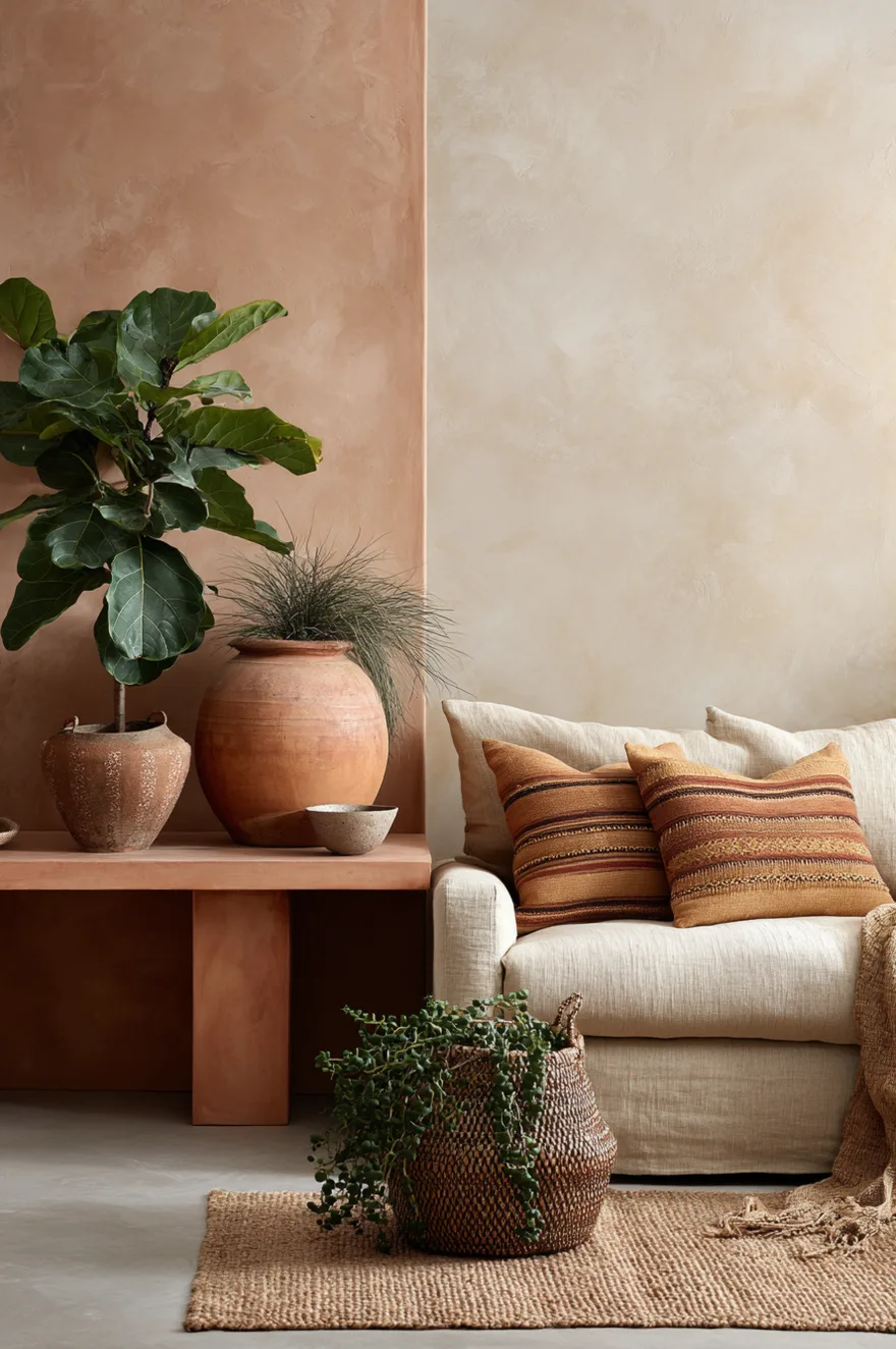
A terracotta-finished console against a limewash sage wall is already doing most of the work before a single plant arrives. The color relationship between the two – warm oxide orange and soft gray-green – is about as grounded as a palette gets. Add a fiddle leaf in a full terracotta pot at one end, a trailing pothos spilling over the other, and the console starts to read less like furniture and more like something the room grew around.
This approach only works if you actually maintain the plants (Frank and Mies have destroyed enough of ours to teach me that lesson). But when it works, the line between the object and the living thing gets usefully blurry. One small handthrown ceramic bowl on the surface, just to hold the eye at the center, keeps the whole arrangement from going fully feral.
7. Mid-Century Modern Console Tapered Legs
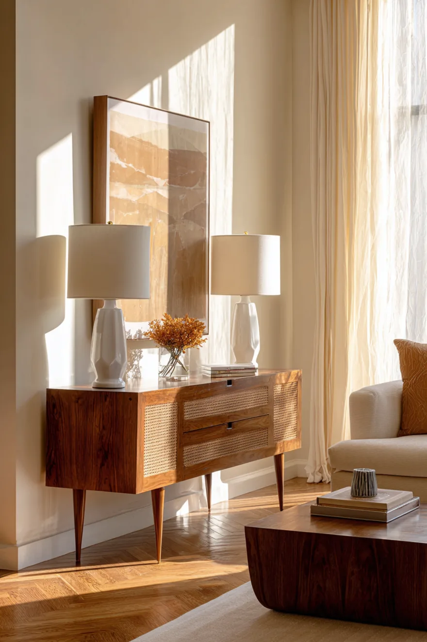
The splayed tapered leg is one of those details that’s so correct it became a cliché, and then became correct again. On a walnut console around 54 inches wide, splayed legs in a warm walnut or blackened finish give the piece a visual lightness that a straight-leg version simply doesn’t have – the splay creates a subtle tension, like the piece is about to move.
Two tulip-shade table lamps in off-white – globe or dome, not drum – sit on each end without competing with a cane-front drawer that already has its own texture going. The real decision here is the art: one large abstract print leaning against the wall above the TV, rather than hung, keeps the composition feeling relaxed instead of installed. Herringbone parquet underfoot locks the mid-century read without needing much else. Afternoon light through sheer curtains at 2700K is the only other thing required.
Size the lamps to the console: a lamp that’s less than a third of the console’s height reads as an afterthought.
8. Symmetry Is Overrated Here
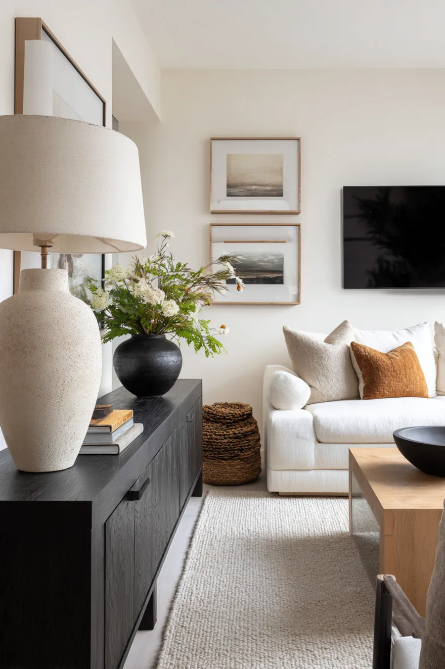
Perfectly mirrored TV console styling – two matching lamps, two matching vases, a centered object between them – is the interior equivalent of a corporate presentation. Every element is accounted for, nothing is surprising, and the room reads as assembled rather than inhabited. It’s not that symmetry is wrong. It’s that symmetry requires zero decisions, which is why it usually produces zero personality.
One asymmetric move fixes this immediately. Place a taller object on one side – a lamp with a shade that reaches maybe 22 inches, or a single tall stem in a slim vase – and leave the other side empty, or nearly so. The visual tension that creates is the whole point. The eye travels from the weighted side to the open side and back, which is what “feels designed” actually means in practice. And the best part: it’s one decision, not a complete overhaul.
9. Farmhouse Console Shiplap Styling
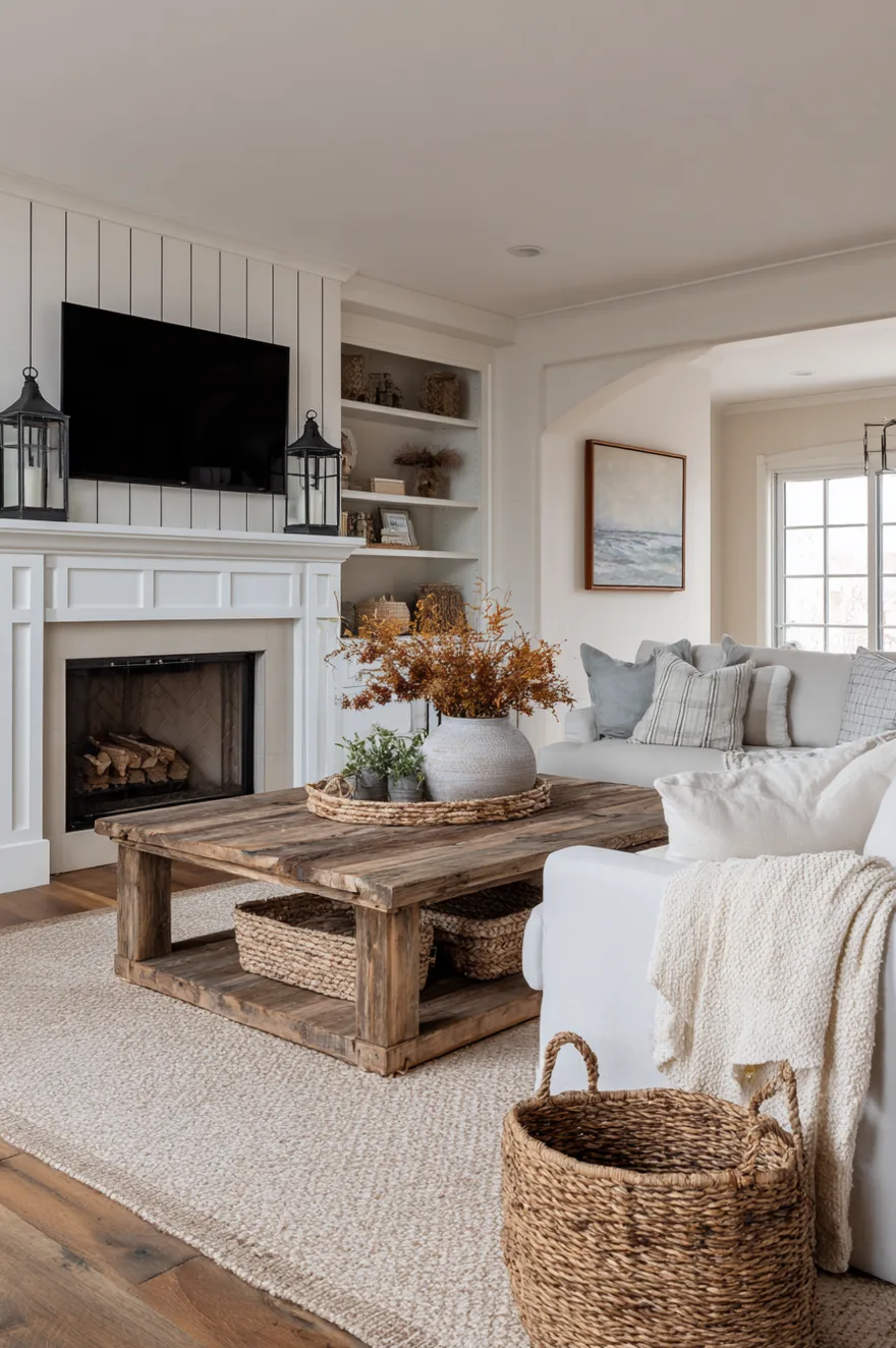
Board-and-batten paneling behind the TV is one of those moves that commits you to a direction, so commit fully. A chunky white-painted console – not distressed, not weathered, just a solid painted piece with honest weight to it – reads correctly against the vertical rhythm of board-and-batten.
Galvanized metal lanterns on the console surface are the right kind of industrial-farmhouse crossover: the material is honest (actually galvanized, not chrome pretending to be galvanized), and the lantern shape is traditional without being precious. A woven seagrass basket at one end stores remotes, and a cotton-knit throw draped casually over the corner of the console adds a lived-in quality that no amount of careful object placement can replicate. Recessed overhead lighting on a dimmer matters here more than in other styles – dial it down to about 60 percent and the whole room softens.
10. Organic Modern Console Sculptural Objects
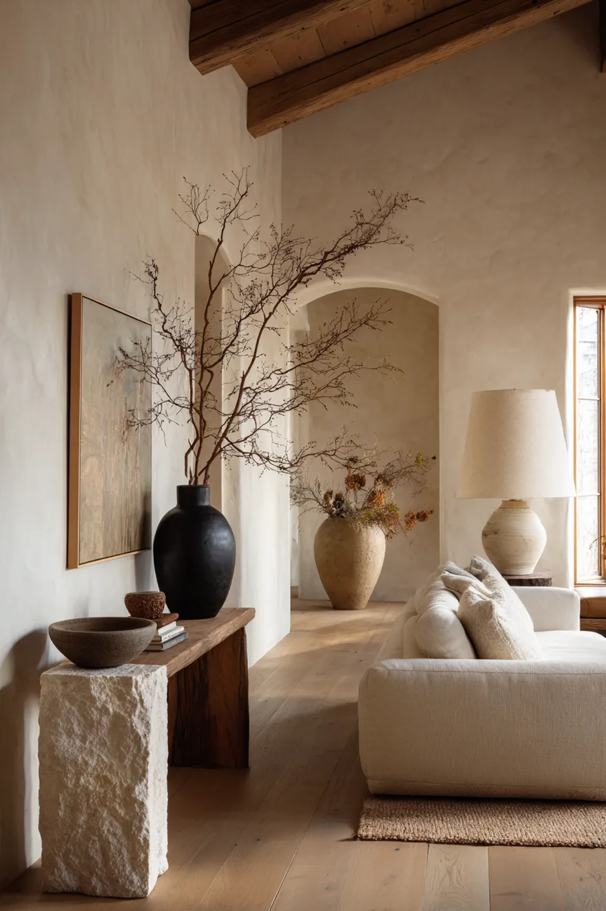
Sourcing sculptural objects for an organic modern console is where people spend too much money or too little thought, and sometimes both. The objects that work best have one thing in common: they look like a process was involved in making them. A rough travertine bookend, for instance, has visible cuts and natural veining – it reads as material, not decor. A hand-coiled clay bowl has the fingertip marks of whoever made it still faintly visible in the surface. A twisted branch in a concrete vessel is literally a thing that grew. None of these require a gallery price point.
The proportion rule I use every time: one tall, one wide, one small with texture, and that’s it. The tall piece sets the vertical anchor – a twisted branch at around 24 to 30 inches, or a slim stone sculpture. The wide piece holds the horizontal spread – a low open bowl, roughly 12 to 14 inches across, nothing too deep. The small textured piece does the close-up work: a small rough-surface ceramic, a piece of coral, a chunk of raw quartz. Put the tall piece off-center toward one end, the wide piece nearby but not symmetrically placed, and the small piece at some distance from both.
For sourcing without gallery prices: estate sales for travertine and stone objects, Facebook Marketplace for handmade ceramics (search “pottery” and “stoneware” by location), and dried branch arrangements you can make yourself if you have thirty minutes and a hardware store bucket of quick-set concrete.
11. Minimalist White Console That Earns It
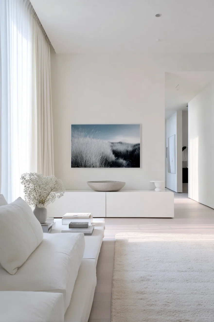
A matte white lacquer console in an all-white room is a high-stakes choice, because it has nowhere to hide. The proportions have to be exactly right – meaning the console’s height, depth, and length need to relate to the wall space around it with the same precision an architect uses to detail a window. Too short and it looks like it shrank. Too long and it fights the room’s width. I’d want the console to span roughly 60 to 70 percent of the wall it sits on, and nothing else.
One large-scale photograph above the TV – black and white, or a near-monochrome image – provides the only contrast the room needs. One shallow concrete bowl on the console surface, nothing else. Restraint at this level is genuinely difficult to execute, but when the proportions are right, the room reads with a clarity that a busier arrangement never quite achieves.
12. Boho Console Layered Textiles
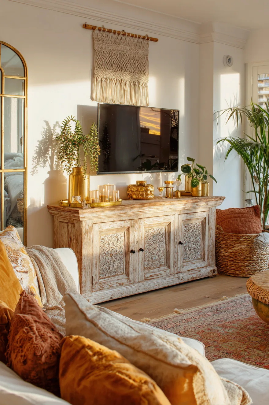
A distressed mango-wood console carries a lot of personality before anything lands on it – the wood has movement, variation, and a patina that reads as genuinely used rather than artificially aged. That’s the right starting material for a boho layering approach, because everything you add needs to compete slightly with the piece itself.
A macramé wall hanging above the TV works when it’s large enough to anchor the wall – something at least 24 inches wide and 36 inches long, so it reads as a textile art piece rather than a craft project. A Moroccan rug runner layered over sisal on the floor does more for the room than almost any object on the console surface. On the console: candles in brass holders at three different heights, a trailing string-of-pearls plant at one end, and nothing that matches anything else exactly. Golden-hour light from the side – a warm floor lamp at 2700K, set low – pulls the brass and the wood tones together after 4pm.
13. When The TV Becomes Part Of The Wall
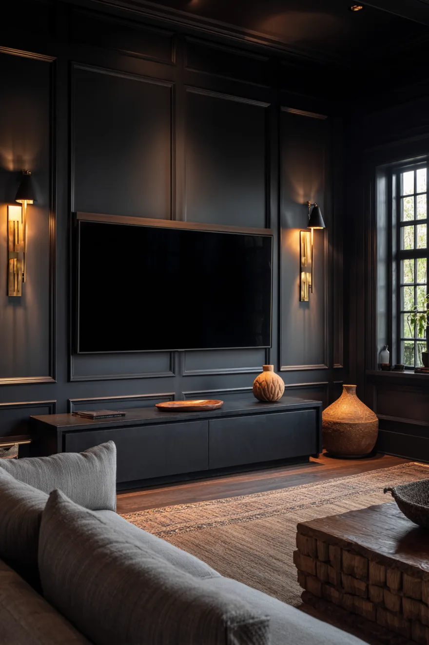
I had a client who spent two years trying to minimize a 75-inch television in her living room. Floating shelf above it, large art flanking it, a giant plant beside it. The TV kept winning – because a 75-inch black rectangle in a cream room will always win. We stopped trying to minimize it and integrated it instead.
The wall behind the TV went deep charcoal – the same shade as the TV’s bezel when it’s off. We replaced the existing console with a low ebonized oak piece that sat only 16 inches off the floor, which lowered the visual center of gravity and made the wall feel taller. When the TV is off, it nearly disappears into the dark wall, and the console – with a single raw-edge travertine object and two matte black sconces – becomes the actual focal point. When the TV is on, the room just works, because there’s no awkward contrast between the screen and the wall around it. She called it the best decision we made on the project. (I still think the lighting was.)
14. Modern Boho Console Living Room
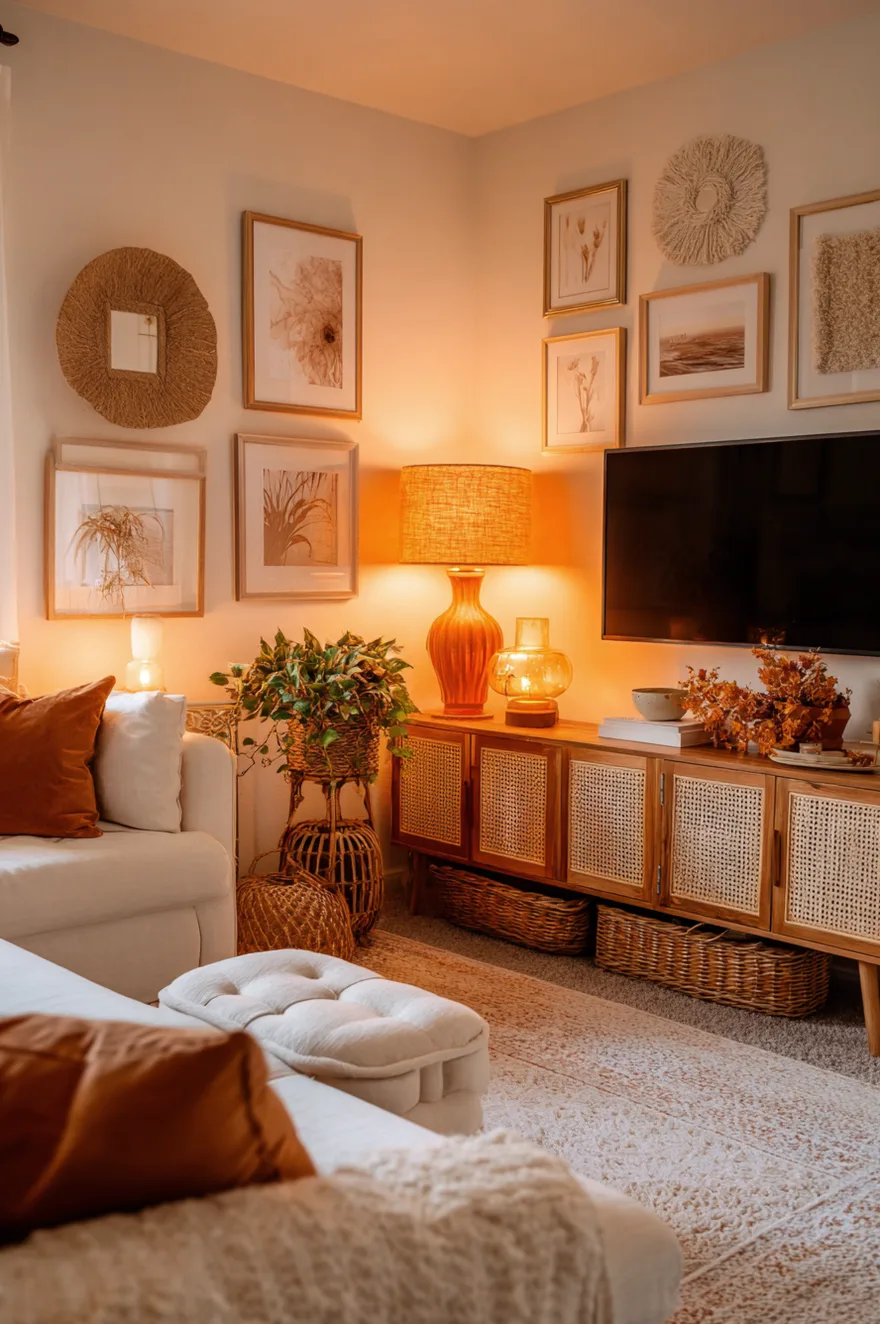
A vintage rattan sideboard found on Facebook Marketplace – the kind with the original brass pulls still intact – repurposed as a TV console brings exactly the right kind of imperfection to a modern boho living room. The piece has history, and that reads in a room full of new things.
Warm amber lamps on each end, with shades in a natural linen or a dried-grass texture, give the console symmetry without making it feel formal – the warmth of the material overrides the matching placement. Above the TV, a gallery arrangement of woven fiber art pieces (look for these at local craft fairs or Etsy shops that specialize in wall fiber) reads as textile wallcovering from a distance and as individual artworks up close. Open rattan baskets on the lower shelf of the sideboard keep cords out of sight in a material that fits the whole palette. Terracotta and cream throughout – in the cushions, the rug, the lamp shades – keeps the warm amber and the rattan from sliding into something too rustic.
15. Fall Console Warm Harvest Tones
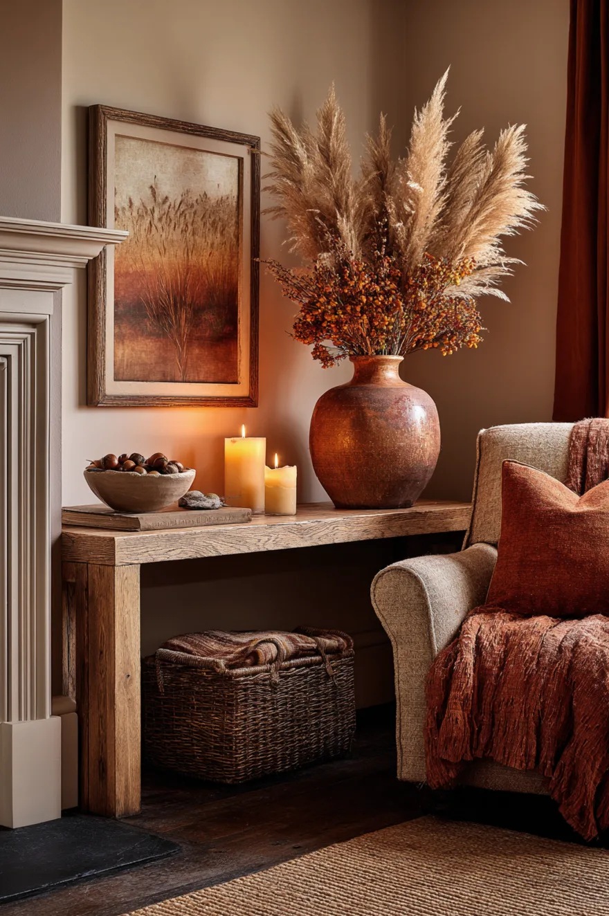
Seasonal updates on a console work best when you’re swapping three or four objects rather than buying a whole new set of themed decor. For fall specifically, the palette does the heavy lifting: a rust-glazed ceramic vase with dried pampas stems (the kind that stay put for months, not the fluffy white ones that shed everywhere), a chunky beeswax candle in a natural honeycomb color, and a small low bowl with acorns or smooth stones gathered from outside. That’s the entire update.
A wool throw in a rust or ochre tone draped over a nearby chair extends the palette without adding more objects to the console itself. And a dimmed amber lamp – the one you maybe haven’t touched since winter – pulled back into service at 2700K makes the whole arrangement feel like October without a single plastic pumpkin in sight.
16. The Case For Cords You Can’t See
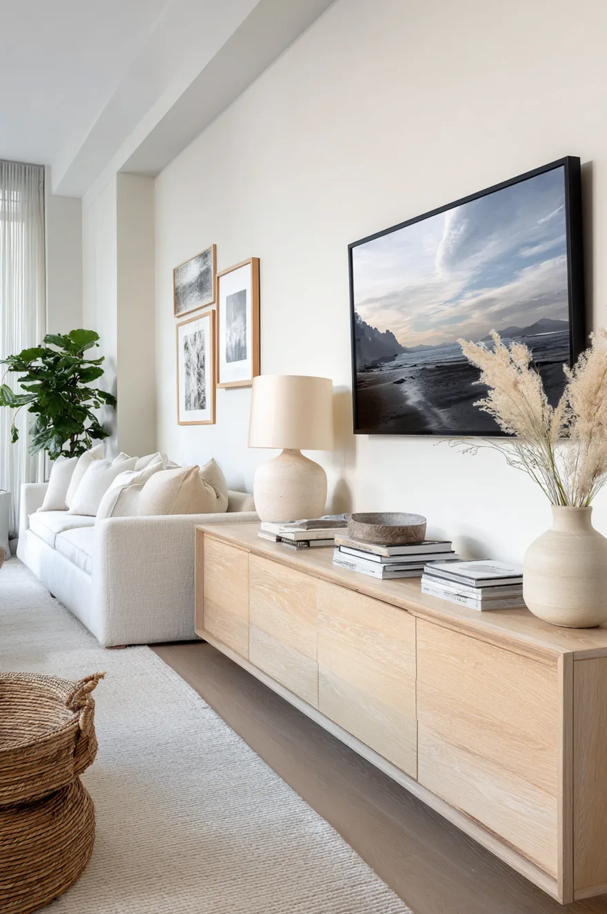
Cord management is not a tech problem. It’s a design decision that most people make by default – which means they don’t make it at all, and then wonder why the console looks worse in person than in the photo they liked on Pinterest. A dangling HDMI bundle behind an otherwise well-styled surface is the visual equivalent of a great outfit with broken shoes. You stop seeing the outfit.
But here’s what’s actually worth doing: a recessed outlet kit installed inside the wall behind the console (a licensed electrician, a Saturday, roughly $150 in parts) eliminates the visible power cord entirely. A cable raceway – a slim plastic channel that runs vertically down the wall – painted to match the wall color disappears at normal viewing distance. These are not glamorous solutions, and neither is especially difficult. What they do is let everything else you’ve done on the console surface actually register. Fix the cords first, then style the surface.
17. Christmas Console Cozy Layers
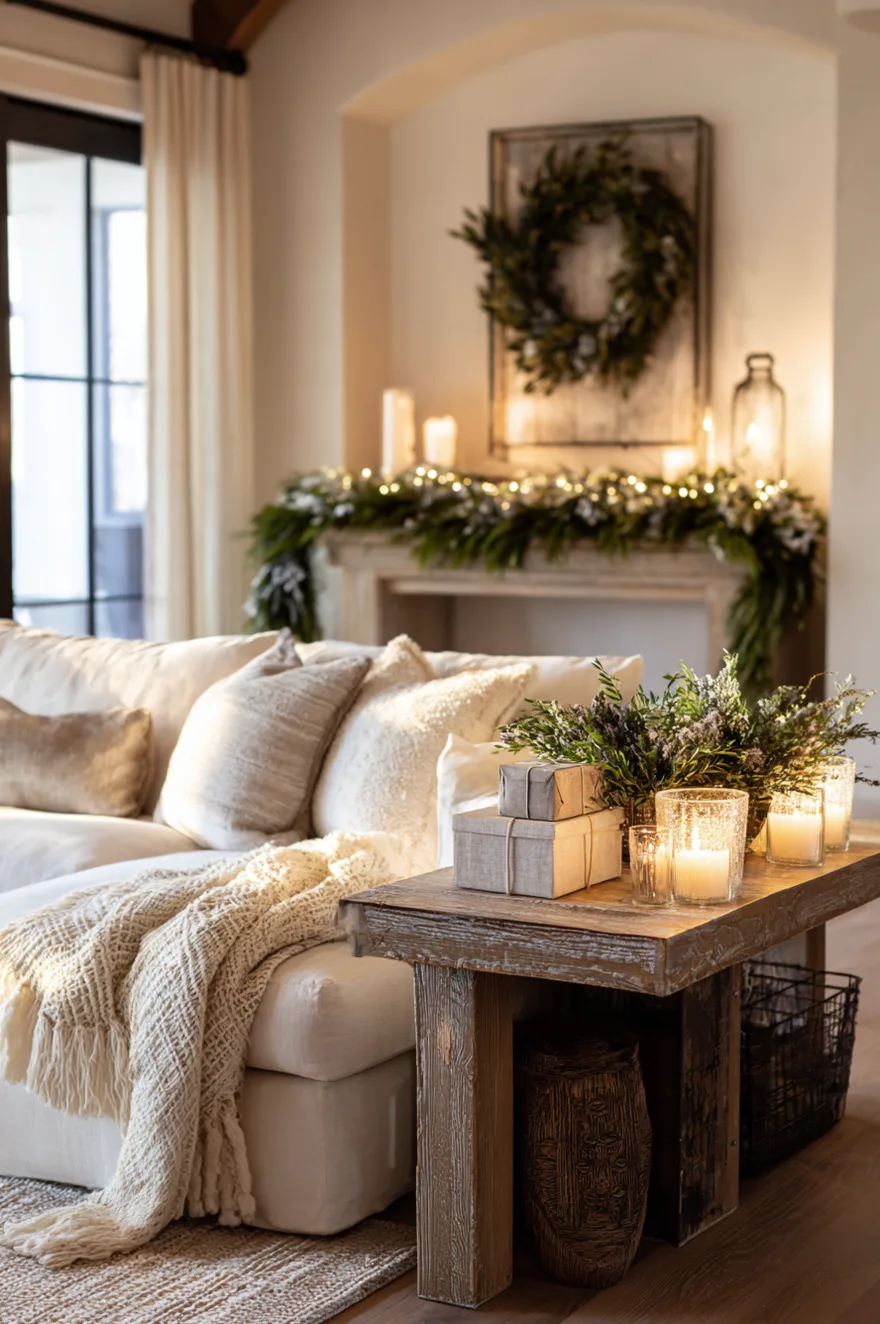
Holiday console styling goes wrong in one of two directions: too sparse (a single candle and nothing else) or too much (blinking lights, every surface covered, a theme that requires explanation). The middle ground is a natural garland as the base layer, built from eucalyptus and white berry stems for a palette that’s seasonal without being literal.
Mercury glass votives in two or three sizes clustered at one end of the console give candlelight at dusk without committing to full candle maintenance every evening – a battery tea light inside a mercury glass votive reads exactly the same from six feet away. A small stack of linen-wrapped gift boxes used as a styling prop (not actual gifts, just shapes) adds height and horizontal interest without any holiday branding. Keep the console surface itself visible in the center – negative space applies in December the same as in August. The whole arrangement should look like it took fifteen minutes, because fifteen thoughtful minutes is exactly right.
18. Floating Console In A Small Living Room
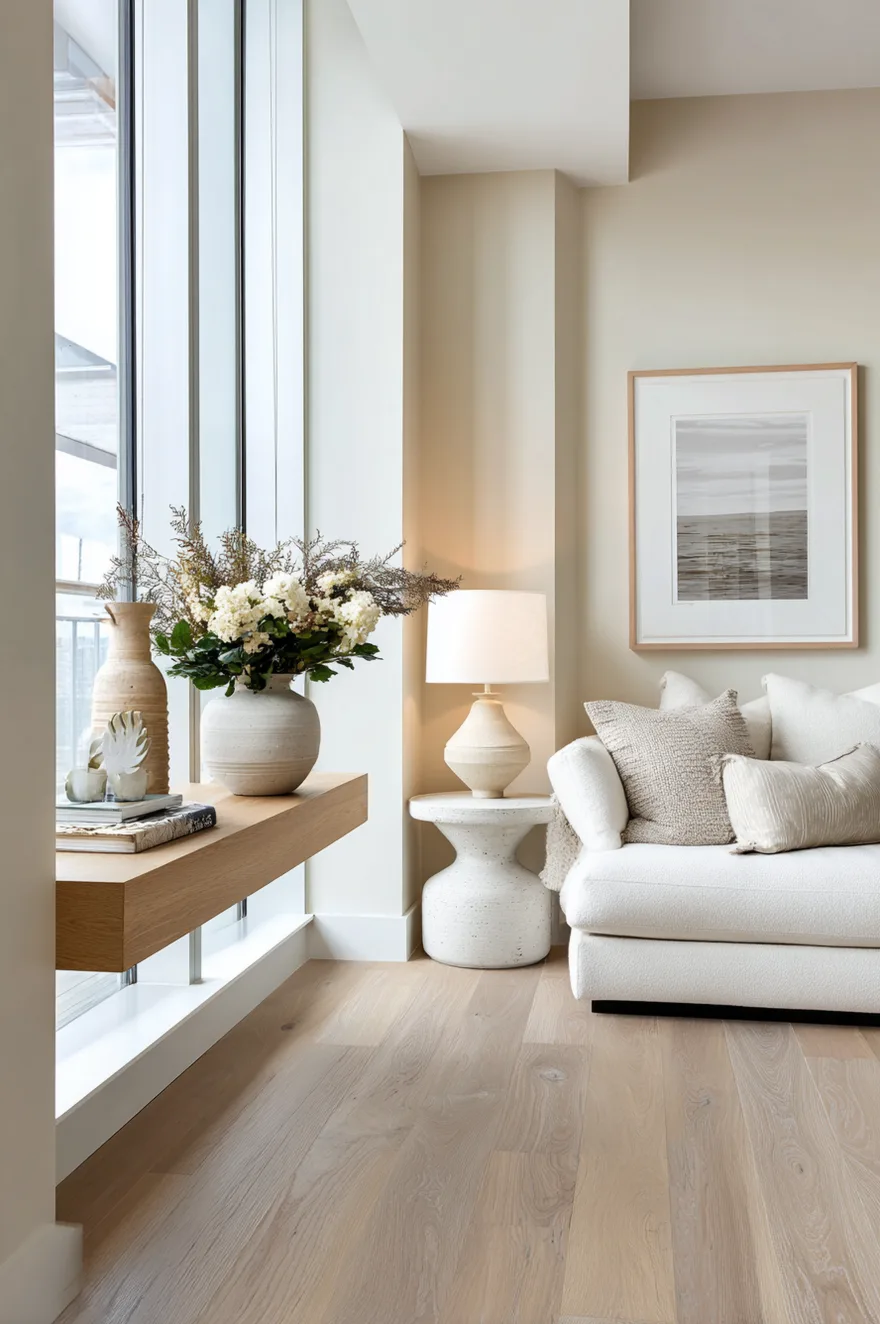
In a room under 12 feet wide – which describes a significant percentage of Seattle condos, including the one I worked in before David and I moved – a wall-mounted console at 16 inches deep is not a style choice, it’s a spatial calculation. When no legs touch the floor, the baseboard stays visible, the floor reads as continuous, and the room measures the same but feels taller and less compressed.
I still am not entirely sure I’d do this in a room with very high ceilings, where the floating effect can read as slightly odd – the visual mass of the console wants some relationship to the ground in a tall space. But in a standard 8- to 9-foot-ceiling room under 12 feet wide, it’s the right call almost every time. Mount it between 16 and 18 inches off the floor, keep the console itself shallow, and watch the room open up.
19. Stone And Steel Console Industrial Edge
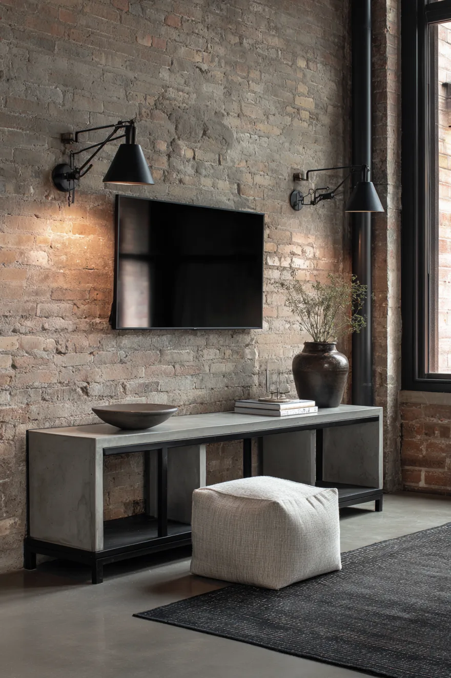
A honed concrete top on a blackened-steel frame is a pairing that makes no apologies. Both materials are what they are – no coating pretending to be something warmer, no edge softening – and that honesty is the whole aesthetic point. Against a raw brick wall with a wall-mounted TV, polished cement floors, and two articulating matte black wall-mount lamps (the kind that extend and pivot on an arm), the room commits fully to its hard-material palette.
The one softening element is a single linen-upholstered pouf placed about three feet from the console – enough distance to feel separate from the console composition, close enough to read as belonging to the room. It introduces one textile, one warm tone, and one object at floor level, which gives the eye somewhere to rest after all that concrete and steel. Nothing on the console surface except one low concrete bowl, roughly 8 inches across. Anything more would be noise.
20. Why Console Height Changes Everything
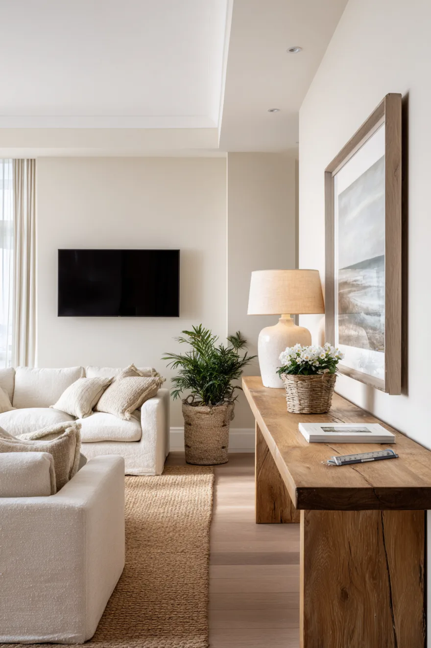
On every set of drawings I produce for a living room with a wall-mounted TV, I specify the console height at 18 to 22 inches. Most off-the-shelf consoles land at 14 to 16 inches, which forces the TV to sit lower than comfortable – and when you’re watching from a sofa at seated eye level, that neck angle compounds over two hours in a way that isn’t dramatic in the moment but is definitely why you feel vague and stiff afterward.
The relationship between the bottom of the TV and the top of the console matters too: you want at least 4 to 6 inches of clear wall visible between them, so the TV doesn’t appear to be resting on the console surface. Measure your seated eye level first. Then work outward from that number. The console height follows from the TV height, not the other way around.
21. Soft Green Console Earthy Living Room
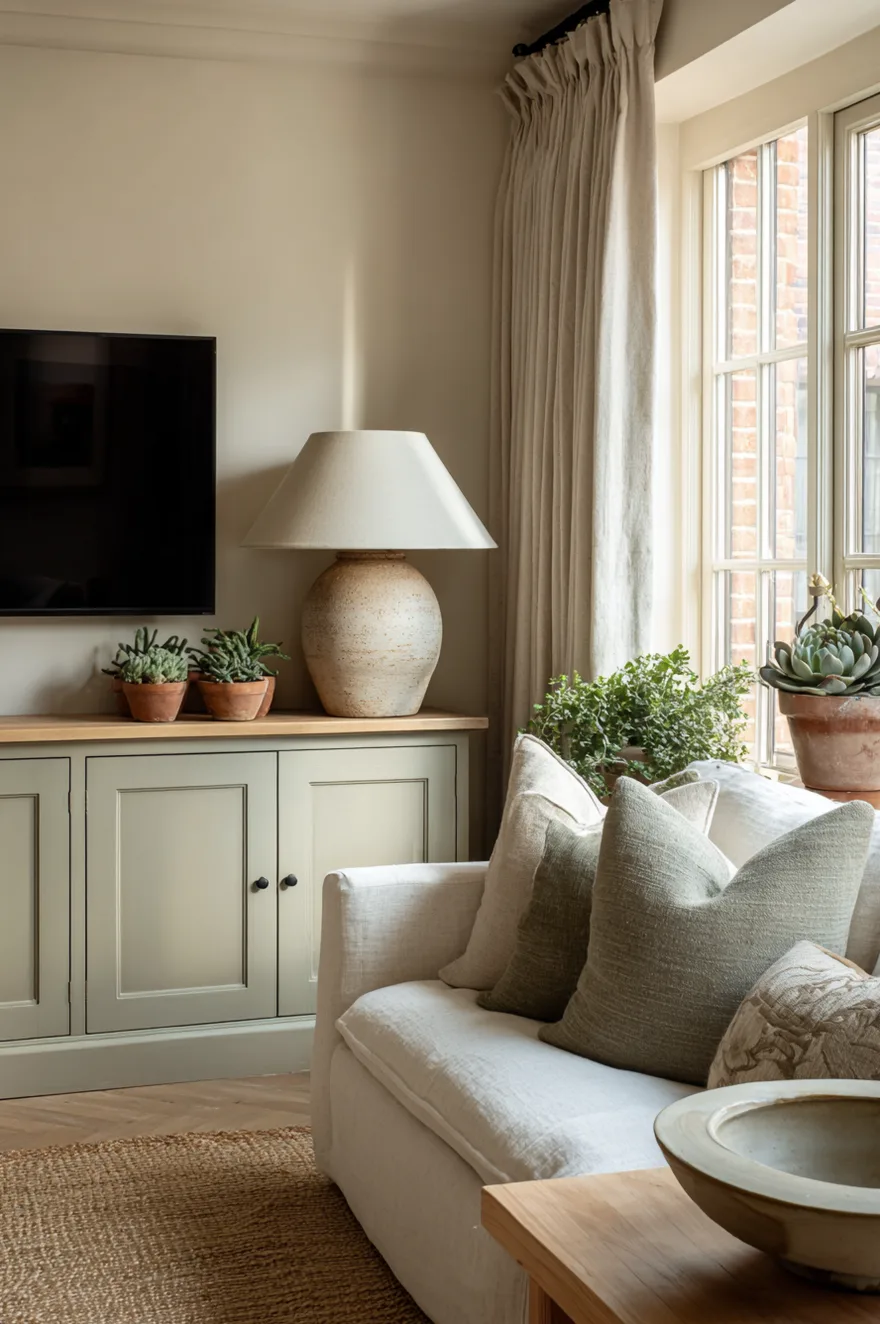
Sage-painted furniture is easy to get wrong – it slides toward mint if the formula runs cool, toward khaki if it runs too warm, and only hits the right gray-green in a narrow band that looks different under every light source. Test three samples on the actual piece before committing, viewed in morning light and again after 4pm.
When the tone is right, a sage console in a warm cream room does something quiet and grounded that neutral furniture never quite manages. A large stoneware lamp on one end – something with real weight, a thrown base in a similar earthy range – anchors the taller end of the composition. Small terracotta pots with succulents on the opposite end keep the scale varied. A linen panel curtain framing the TV wall adds a soft vertical that connects the ceiling to the console. The natural jute rug underfoot picks up the green-earth palette without introducing a new color. Soft diffused daylight makes all of it work; direct sun at noon will push the sage into a different tone entirely, which is either interesting or annoying depending on your patience for color.
22. TV Console Decorating Ideas For Renters
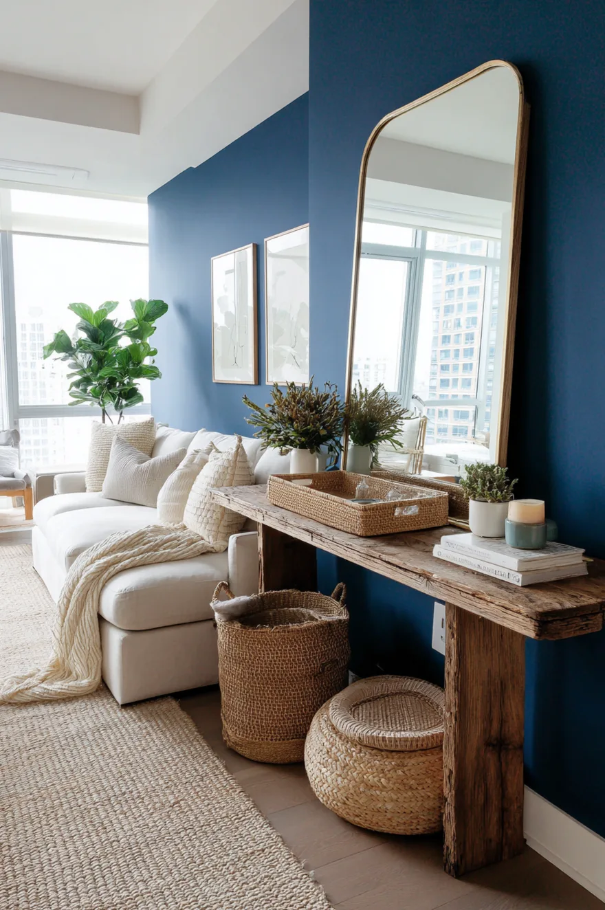
A builder-grade laminate console is genuinely hard to style around – the surface reads cheap because it is, and no amount of clever object placement changes that reading entirely. But the console is rarely what the eye actually sees first. It’s the wall behind it.
Paint the wall a saturated deep blue – a navy or indigo, something with real pigment – and the laminate console in front of it immediately becomes a shadow rather than a feature. The eye goes to the color. Then lean a large mirror on one end of the console (leaning, not mounted, because you’re a renter) to extend the sense of space and add a reflective surface that the laminate cannot provide. A woven tray on the console surface clusters your small objects so the surface reads as a vignette rather than clutter. And just like that, the console you couldn’t replace is the one element of the room that nobody mentions.
23. The Object That Does All The Work
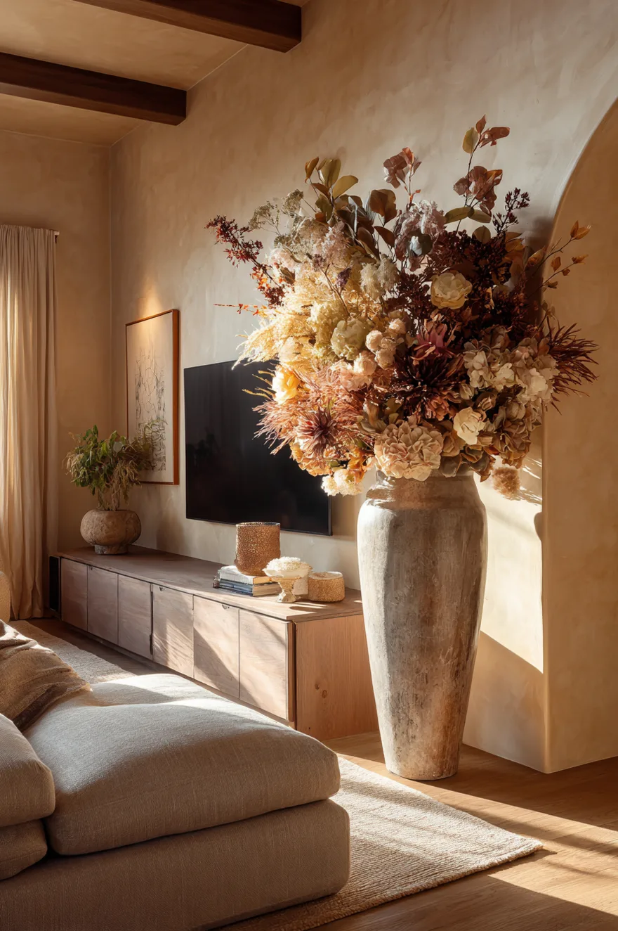
Ten small accessories never add up to one large one. I’ve watched this play out on console after console – a row of small ceramics, a cluster of little candles, a trio of mini frames – and the effect is always the same: busy at a glance, forgettable at a distance. One large-scale anchor object, by contrast, reads from across the room and holds the eye without requiring effort.
A dried floral arrangement near a meter tall in an oversized ceramic vessel, a sculptural lamp with a shade wide enough to cast a wide circle of light, a floor vase you’re slightly embarrassed to admit you paid for – these are the objects worth saving up for. And the good news is that scale doesn’t require gallery prices. Estate sales reliably turn up large ceramic vessels in the $30 to $80 range. A large branch arrangement in a concrete base costs materials and an afternoon. The investment is attention, not money – figuring out what one large object says about the room, and then finding it.
Try two or three of these, not fifteen. Pick the one that fixes the actual problem in your room – whether that’s cord chaos, a too-low console, an awkward long surface, or just a collection of small objects that aren’t adding up to anything – and solve that first. Then see what else needs attention. I’d love to know which approach you’re working with, or what your specific console situation looks like. Leave a comment below and I’ll weigh in.
Talk soon,
Rachel