Most bedroom shelf decor fails the same way – too many objects, not enough intention. Whether you’re working with floating shelves, a bedroom built-in, or a ladder shelf propped against a rental wall, what you place on it and how you space it determines whether the room reads as considered or cluttered. Here are nineteen approaches that actually work, drawn from real projects and a lot of trial and error.
Last spring I was reworking our own bedroom – David had just finished building a low platform bed in white oak, and we had this wide expanse of wall above it that felt completely unresolved. I sketched four different shelf arrangements before I landed on the right one. My first instinct was a gallery wall. I talked myself out of it after about ten minutes, mostly because I’ve installed enough gallery walls to know they look effortless only when they aren’t, and I was tired. What I wanted was something that would feel like part of the room’s architecture – a single shelf that sat low enough to be in relationship with the bed, not floating in space somewhere near the ceiling.
That’s the distinction that runs through all of these ideas. Bedroom shelf styling isn’t about filling surfaces. It’s about understanding how a shelf relates to the things around it – the wall, the light, the height of the furniture below. Get that right first, and the objects almost style themselves.
1. Above Bed Shelf Decor That Anchors The Room
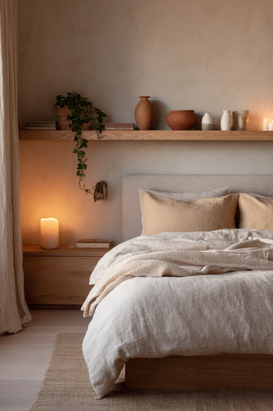
A shelf above a bed should behave like a crown on the headboard, not like a separate event happening six inches higher. That means installing it low – I’d say no more than eight inches above the top of the headboard, maybe less if the headboard is substantial. The shelf I ended up using in our room was a two-inch-thick white oak slab, twelve inches deep, and I mounted it so the bottom face of the shelf sat maybe five inches above where the linen headboard ended. The visual read is that they belong to each other.
For objects: three ceramic vessels in cream and terracotta (one taller, two lower and different widths), a trailing pothos allowed to drape over the front edge, and a small brass reading light clipped to the right side of the shelf. The clip light is practical and looks deliberate. Mies, our more ambitious cat, has knocked the pothos off twice, so I’ve since switched to a small brass planter with a drainage tray that sits flush to the shelf surface. Same visual result, less cleanup.
Keep the object count to three or four maximum. Above a bed, your eye is close to these things when you’re lying down – clutter reads louder from that angle than it does standing up. Odd numbers work because they naturally cluster into a rhythm rather than a lineup.
2. Built-in Bedroom Shelves Done The Right Way
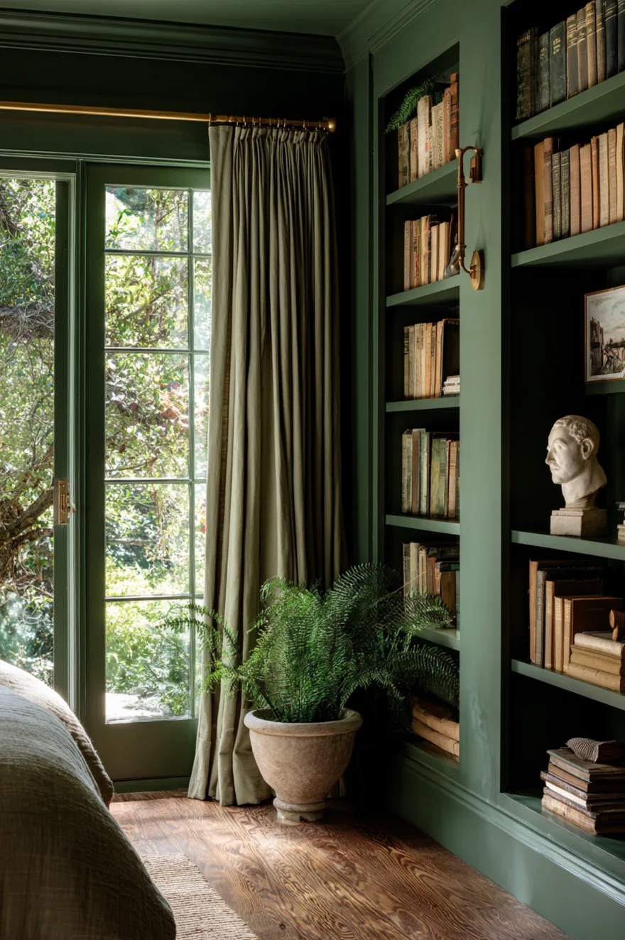
Paint them. That’s the whole argument. When built-in shelves share their color with the wall, or go a shade deeper, they stop reading as furniture and start reading as architecture. I did a project a few years ago – a narrow Seattle bedroom with a window centered on one wall – where we flanked the window with floor-to-ceiling built-ins in deep forest green, with warm white oak shelves dropped in as the horizontal surfaces. The green made the room feel like it had structure. The oak kept it from going cold.
For styling: books turned spine-out in linen and cream on two-thirds of the shelves, a sculptural plaster bust on one shelf at roughly seated eye level (lower than most people would guess – about 48 inches from the floor), and a trailing fern in a stone pot in the corner where the shelf meets the wall. The fern does what plants always do in a built-in: it softens the hard geometry without undoing it. If you’re planning built-ins, budget for paint-grade MDF over solid wood – the surface will be painted anyway, and it takes paint more evenly.
3. The Shelf Nobody Styles Right
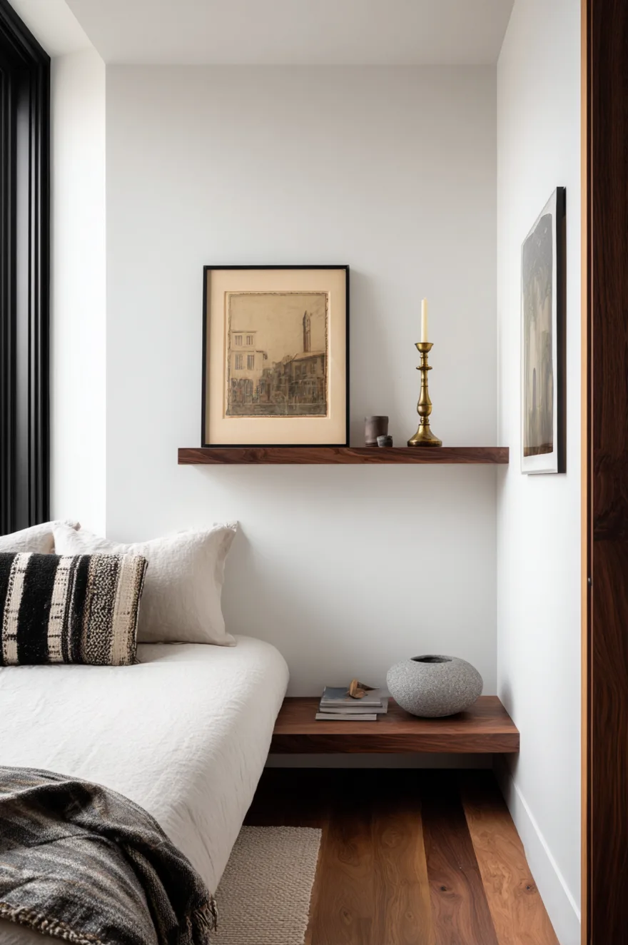
Every room has that narrow wall between the door and the corner – maybe fourteen inches wide, maybe twenty. A gallery wall there becomes a game of Tetris nobody wins. One 10-inch-deep floating shelf in black walnut, installed at about fifty-two inches high, with three objects only: a tall brass candlestick at one end, a small framed print leaning against the wall rather than hung, and a round stone bowl at the other end. Done.
The leaning print is the move. It gives the shelf a back plane without requiring a nail in that awkward spot. And three objects on a narrow shelf with space between them reads as deliberate. The same three objects touching each other reads as nowhere to put things down. If you have this wall in your bedroom, resist adding a fourth object for at least two weeks. You’ll see why.
4. Minimalist Bedroom Shelves With Maximum Impact
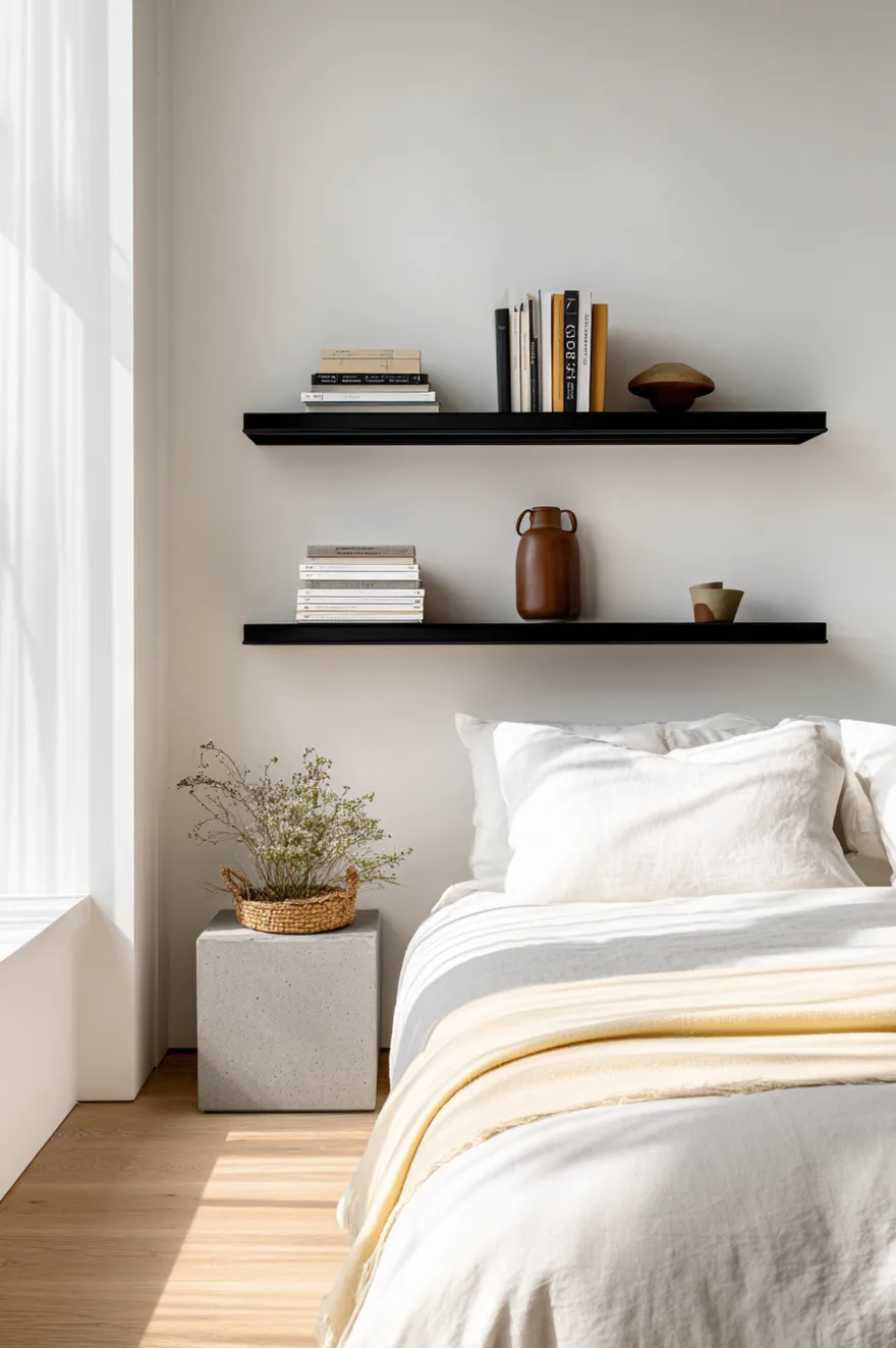
Two thin powder-coated steel shelves in matte black. Five objects total. A stack of two art books on the left shelf, one geometric concrete planter next to them, and then – nothing. On the lower shelf: one small woven basket on the right side, open space to the left. That’s the whole composition.
I used to think restraint like this was a starting point that people would eventually fill in. I was wrong. The negative space is the styling decision. It gives the eye a place to rest and makes each object read with more weight than it would in a crowd. Matte black powder coat on steel is honest – it doesn’t try to look like something else, and it holds up. These two shelves on a white plaster wall cost less than a gallery wall and photograph better every time. Try placing just four objects first, then add one more only if the shelf feels empty rather than calm.
5. Corner Plant Shelves That Actually Work
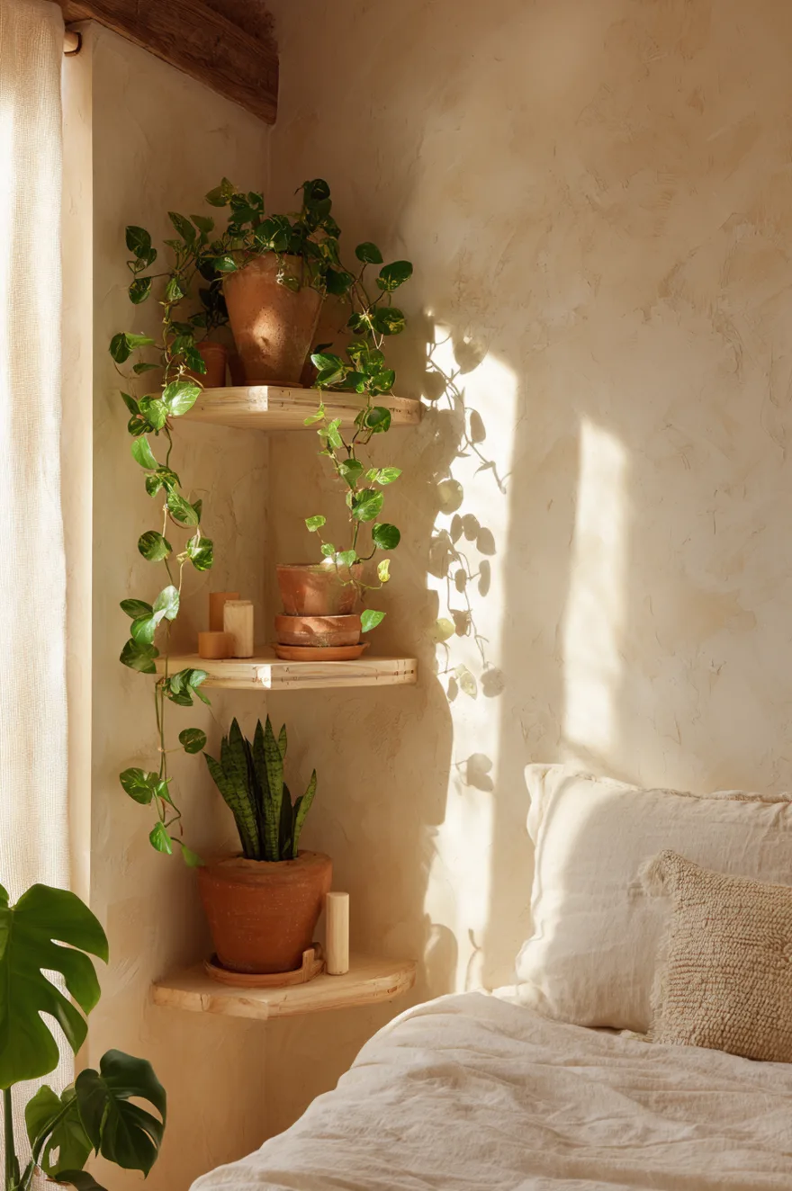
Dead bedroom corners usually get a floor lamp or a chair that doesn’t quite fit. A tiered corner shelf in pale birch solves the corner better than either, especially if you want plants. The key – actually, let me just say it plainly: the reason staggered heights work in a corner is that your eye needs somewhere to travel. A flat row of three plants at the same level turns into a lineup. Stagger them by eight to twelve inches per tier and the corner starts to feel like a small ecosystem rather than a plant storage unit.
String of pearls on the top tier (let it trail), a snake plant on the middle tier for vertical contrast, a small monstera below. All three in terracotta pots against a warm white limewash wall – the orange clay against that chalky plaster is one of those pairings that holds up across every room I’ve used it in. The limewash wall matters here: its natural variation makes the corner feel like it’s been considered, not just filled. Position the whole thing within reach of a window, because string of pearls in low light gets sparse and sad within a month.
6. Rattan Changes Everything
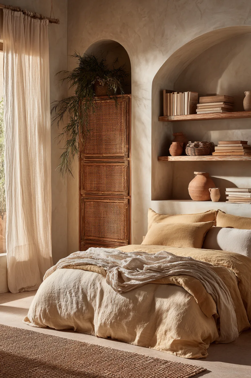
A few years back I was finishing up a client’s bedroom – a small room in a 1970s house, good bones, zero character. She had two white laminate floating shelves on the main wall, same dimensions as the wall, same height as every shelf I’d seen that year. The room looked like a showroom that hadn’t been committed to. We swapped them for open rattan-wrapped shelves – same bracket positions, same wall, same objects placed back on them afterward. The room looked like a different place.
What rattan does is introduce texture at eye level where most rooms only have paint and glass. The weave catches light differently through the day – in the morning it’s warm and golden; by afternoon the shadows in the weave make the surface look deeper. Nothing about the room’s palette changed. The ceiling height didn’t change. The furniture didn’t move. But the shelves stopped reading as storage and started reading as a material choice, which is what made the whole room feel considered. If you’re replacing existing shelves, check whether your current brackets are compatible before you order – most rattan units use standard hardware and you can often reuse what’s there.
7. Ladder Shelf Decor For Small Bedrooms
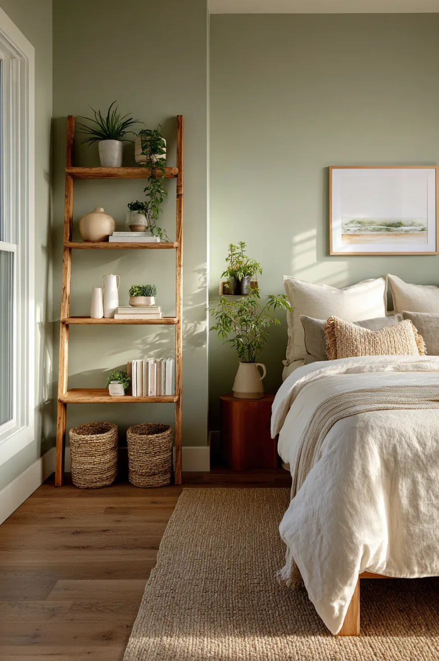
Ladder shelves work in small bedrooms because they taper toward the top, which means they don’t take up visual floor space the way a bookcase does. A raw pine version leaning against sage green paint is one of those combinations that shouldn’t be as good as it is – the yellow in the pine against the gray-green of the sage keeps it from going too rustic.
Style it with weight at the bottom and lightness at the top: woven baskets on the lower two rungs (they’re heavy-looking and anchor the piece), medium ceramic vases at mid-height in a muted cream or stone color, then a single air plant and one small framed watercolor at the very top. Visual weight should travel upward – not because any design rule says so, but because a ladder shelf loaded at the top looks like it might fall forward, and your eye knows it. Move the heaviest object to the lowest rung first, then work up from there.
8. Floating Shelves Bedroom In Deep Jewel Tones
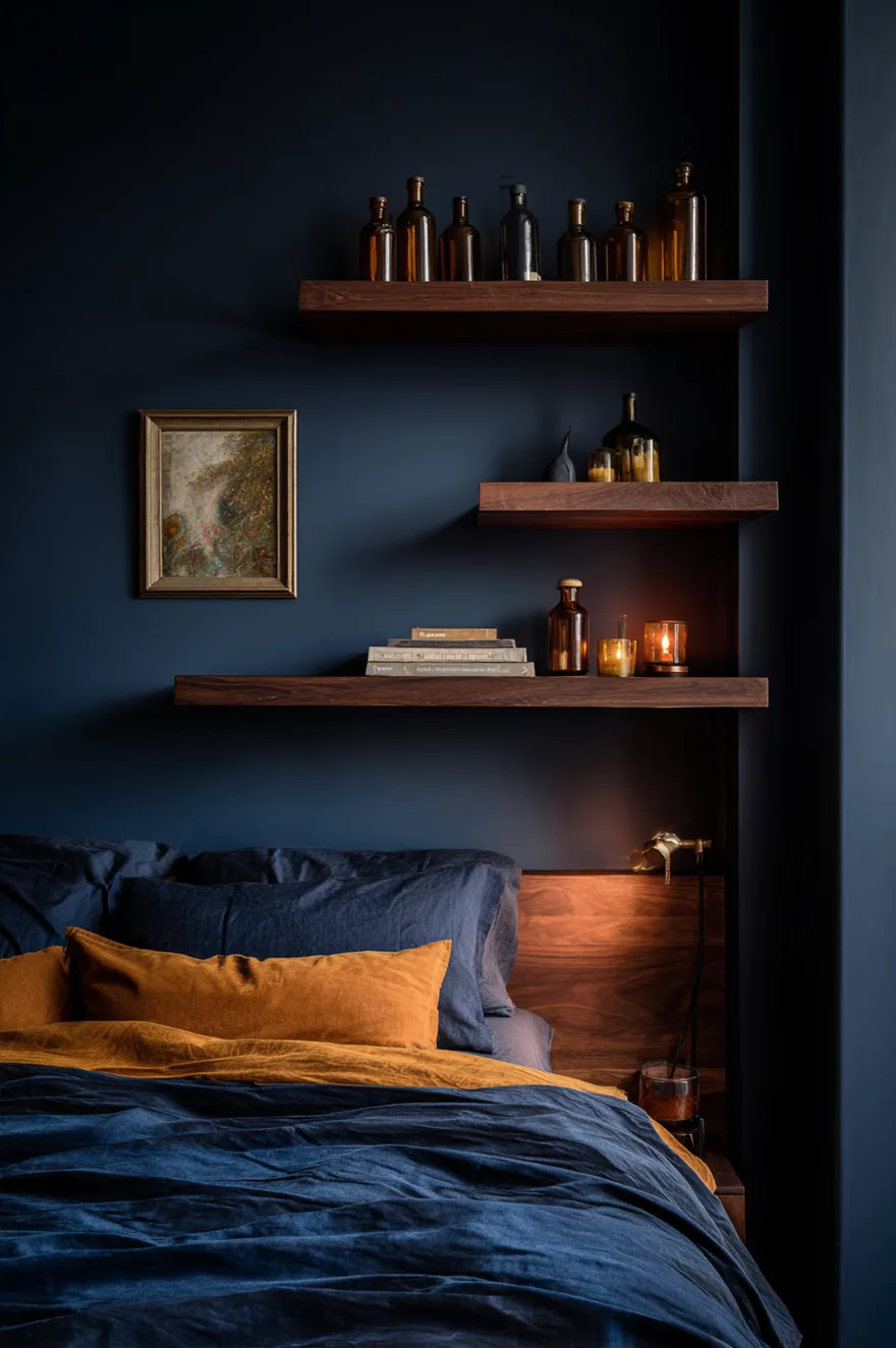
Dark walls do something specific to shelf objects: they make them glow. Three staggered walnut floating shelves on an inky navy wall, styled with amber glass bottles that catch the low evening lamplight – those bottles become luminous in a way they simply aren’t against white paint. One small oil painting propped on the middle shelf, and brass brackets left visible because hiding them would have been a mistake. The bracket is part of the material story.
This is the styling approach I’d use in a bedroom where you want the room to read well after 5pm rather than in full daylight. A single lamp at 2700K positioned below and to the side of the shelves is all the lighting you need. The dark wall absorbs enough ambient light that the lit objects carry the whole composition. Don’t use cool bulbs here – they’ll kill the amber in the glass and the warmth in the walnut simultaneously.
9. Symmetry Is Overrated
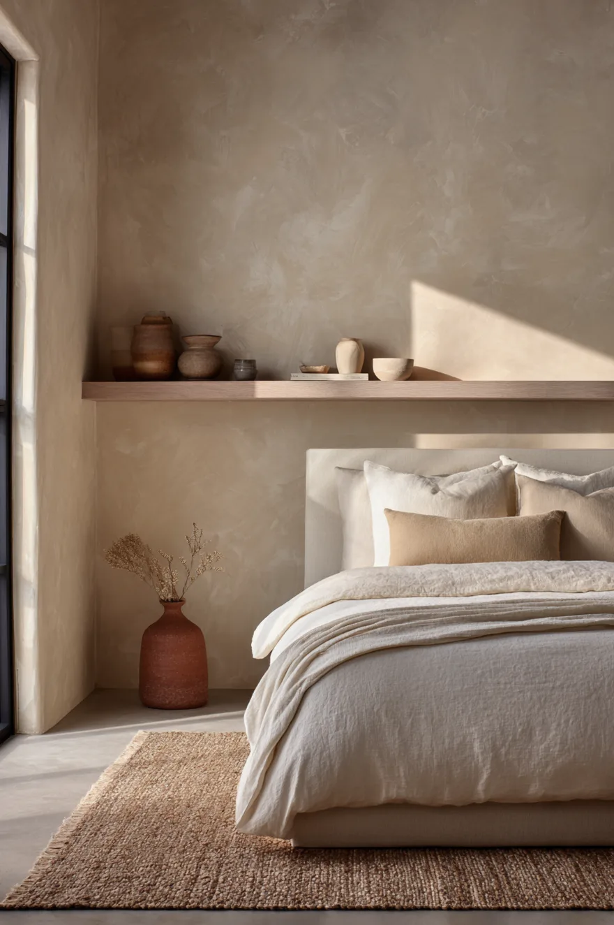
Two matching shelves flanking a bed is the default bedroom shelf move, and I understand why – it feels balanced before you’ve placed a single object. But symmetry and balance aren’t the same thing, and the default approach often produces a room that looks like a catalog page rather than somewhere a real person sleeps.
One longer shelf, offset to one side of the bed by about a foot, styled with a small cluster of objects on the left and generous open space on the right – that arrangement has more tension, and tension is what makes a room interesting to be in. Against a warm sand limewash wall with a sisal rug below, the asymmetry reads as confident rather than careless. And practically: one shelf is easier to style than two, because you’re not trying to match or deliberately mismatch anything. Start with the cluster at one end, then stop well before you reach the other end. The gap is doing work.
10. Rustic Bedroom Shelving With Live-Edge Wood
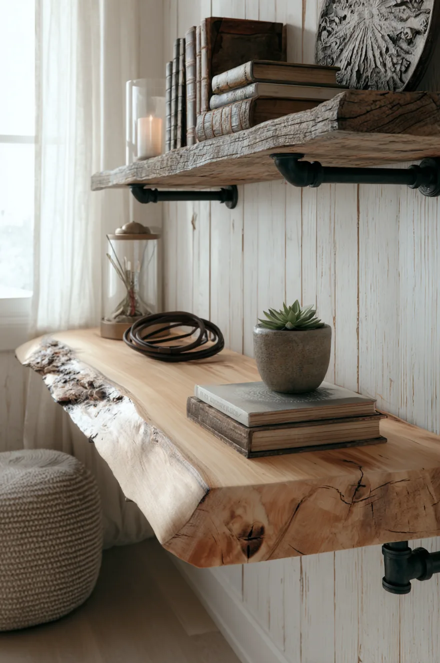
A live-edge maple slab on black iron pipe brackets is the shelf you buy once and keep forever. The raw edge grain does the decorating – three objects maximum (vintage hardcovers, a small succulent in a handmade clay pot, one coiled leather strap), because the shelf itself is already the event.
Against whitewashed shiplap, the maple reads warm rather than rugged. The iron pipe brackets are visible and should be – painted-over brackets on a piece like this would be a waste. If you’re sourcing a live-edge slab, local lumber yards and estate sales are better than retail for this – you’ll find more interesting grain and the price is usually more honest. Seal the top surface with a hard wax oil rather than polyurethane if you want it to age well without looking plastic.
11. Aesthetic Shelf Decor Starts With The Wall
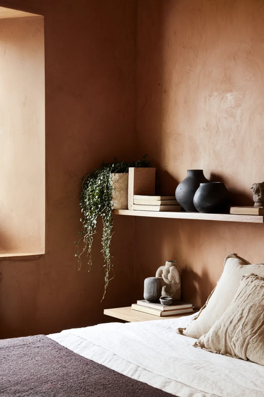
The wall behind a shelf is doing at least half the work, and most people skip it entirely. Four wall treatments that change how shelf objects read – plaster, limewash, painted shiplap, and wallpaper – each ask for different objects in front of them.
Dark ceramics against limewash is one of the pairings I come back to most. The limewash surface has natural variation and depth, and the dark glaze of a ceramic jug or bowl reads clearly against it without competing. The limewash does the background work so the object doesn’t have to shout. Linen-spined books (the ones where you can’t read the title from across the room) work beautifully against deep, patterned wallpaper – the neutral spines calm the pattern rather than adding to it. Raw wood objects – a turned bowl, a carved block, a simple vessel – read most honestly against flat matte paint because there’s nothing in the background pulling attention away from the grain.
Painted shiplap is the most forgiving background because the horizontal lines give the wall its own texture while still reading as a fairly neutral surface. I’ve put everything in front of shiplap and almost all of it has worked. If you’re starting from scratch on a room, decide on the wall treatment before you buy a single shelf object – it will determine your palette more reliably than any mood board.
12. The Guest Room Shelf That Has To Work Harder
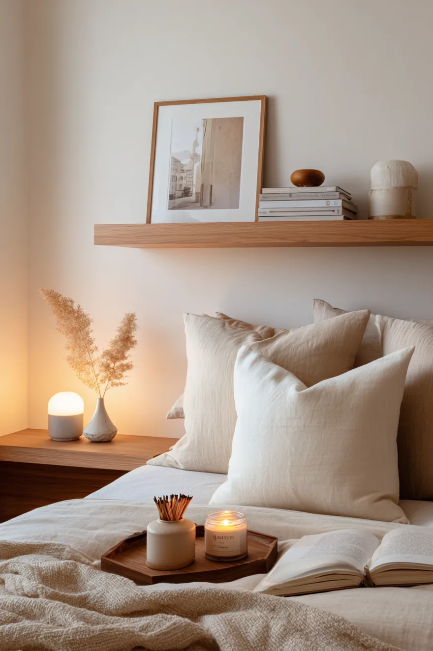
Guest rooms are strange design problems. The shelf has to look like intentional decor when no one is visiting, and also function as a bedside surface the moment someone arrives. For a project a couple of years ago – a client’s second bedroom that doubled as a home office about half the time – I installed a shallow oak floating shelf, nine inches deep, at about twenty-eight inches from the floor, positioned where a nightstand would go.
The styling that made it work: a small wooden tray placed on the shelf and holding a candle and a small box of matches, one framed print leaning against the wall behind the tray, and one bud vase with a single dried stem. The tray is the trick. When a guest arrives, the tray becomes their surface – they set their phone on it, their glass of water, their book. When they leave, you replace the candle and matches and it goes back to looking like it was always just decor. A tray on a shelf says “this is a place to put things down” without requiring a whole piece of furniture. And it contains the guest clutter so the shelf never looks messy, even mid-stay.
13. Bedroom Shelf Styling With Mixed Metals
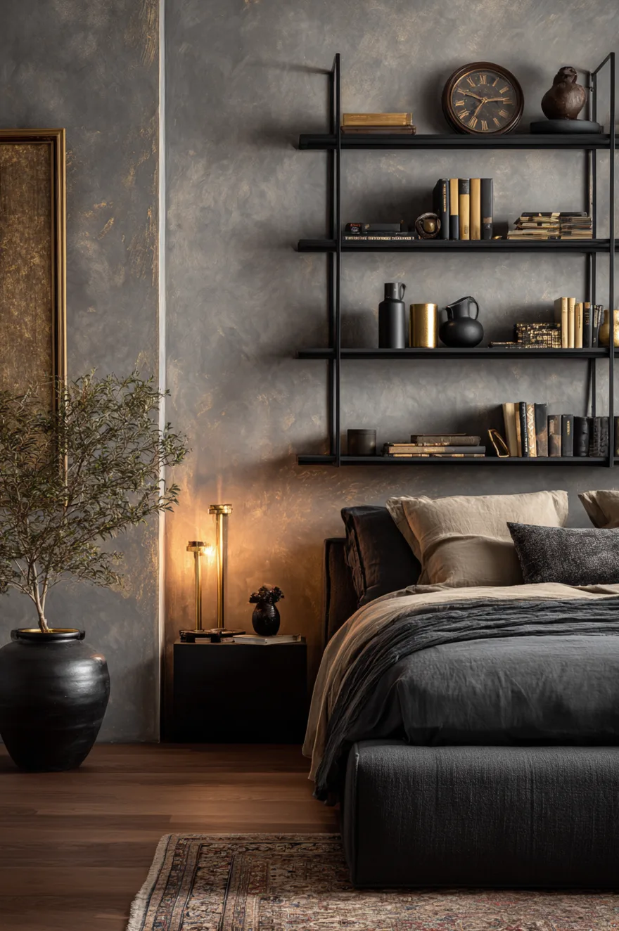
Brass, unlacquered bronze, and matte black on the same shelf – this works because all three share a warm undertone rather than a cool one. Unlacquered brass has orange in it; bronze has brown and gold; matte black absorbs warmth from the room rather than reflecting cool light. Against a warm grey Venetian plaster wall, these three finishes sit together without arguing.
On a grid of thin steel shelves: an aged brass clock (not polished, the kind that’s gone slightly greenish at the edges), a small bronze sculpture in an abstract form, and a black ceramic jug with a rough textured glaze. The ceramic jug is doing the anchoring work – it’s the darkest and heaviest-looking object, so place it lower and toward the center. The clock is mid-height. The sculpture can go anywhere because its form carries enough interest to hold its own. What breaks mixed-metal styling isn’t mixing too many – it’s mixing warm and cool in the same composition (brass and chrome, for instance). Keep all your metals on the same temperature side and the combination settles.
14. Height Is A Styling Tool
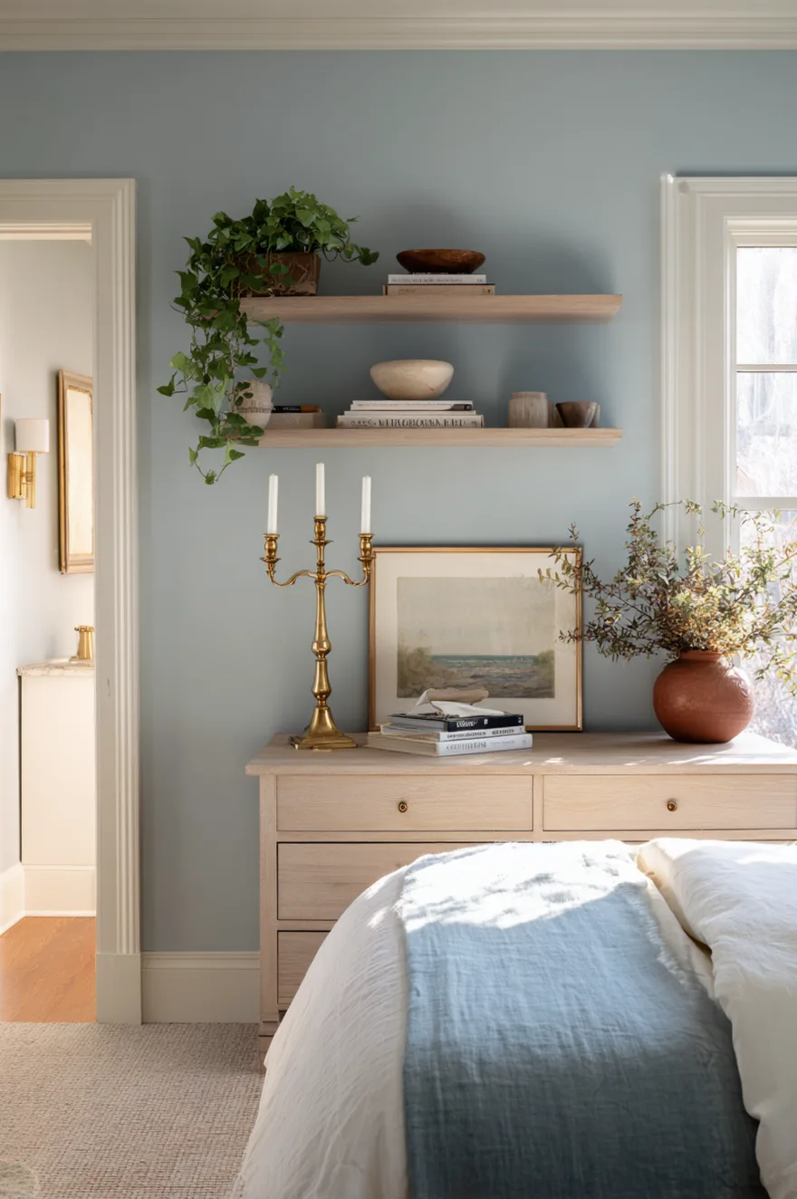
Every shelf needs one tall vertical object. Without it, the eye reads the whole surface as a flat plane and moves on. One candlestick, one tall vase, or a stack of books stood upright at a significant height – that vertical moment stops the eye and gives the shelf a hierarchy.
On a low whitewashed wood shelf above a dresser in a soft blue bedroom, one brass candlestick at about eleven inches tall does exactly this. Everything else on the shelf – a ceramic bowl, a small trailing plant, a leaning print – can stay low, because the candlestick has already established that the composition has range. Place the tall object slightly off-center, not at the exact midpoint. Center placement creates symmetry; slightly off-center creates composition.
15. Shelf Decor Bedroom Ideas For Renters
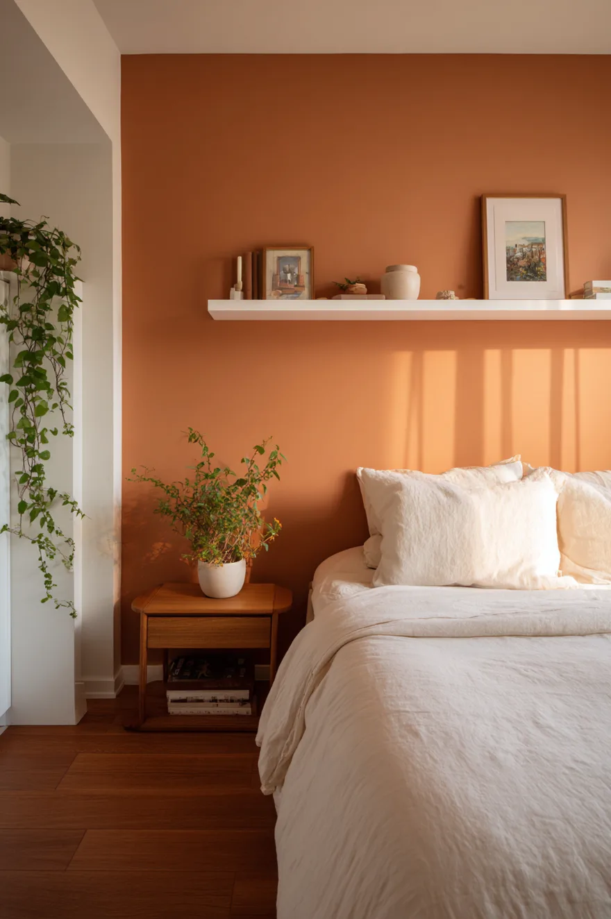
Command strip shelves get dismissed because people use them wrong – two small white shelves on a blank white wall, holding a candle and some crystals, will never look like anything more than an afterthought. But two small powder-coated white shelves on a warm terracotta accent wall? That’s a different room entirely.
The wall color is doing what a large shelf cannot. A ceramic incense holder, one small framed photo leaning against the wall surface, one trailing ivy in a white pot – these objects on a terracotta background read with intention because the backdrop has already committed to something. Small shelves on a bold wall outperform large shelves on a neutral one in rental bedrooms every time, because the wall is the design decision and the shelves are supporting it. Paint one wall (most rental agreements allow it, especially if you repaint before leaving) and the shelf styling takes care of itself.
16. Tile As A Shelf Backdrop
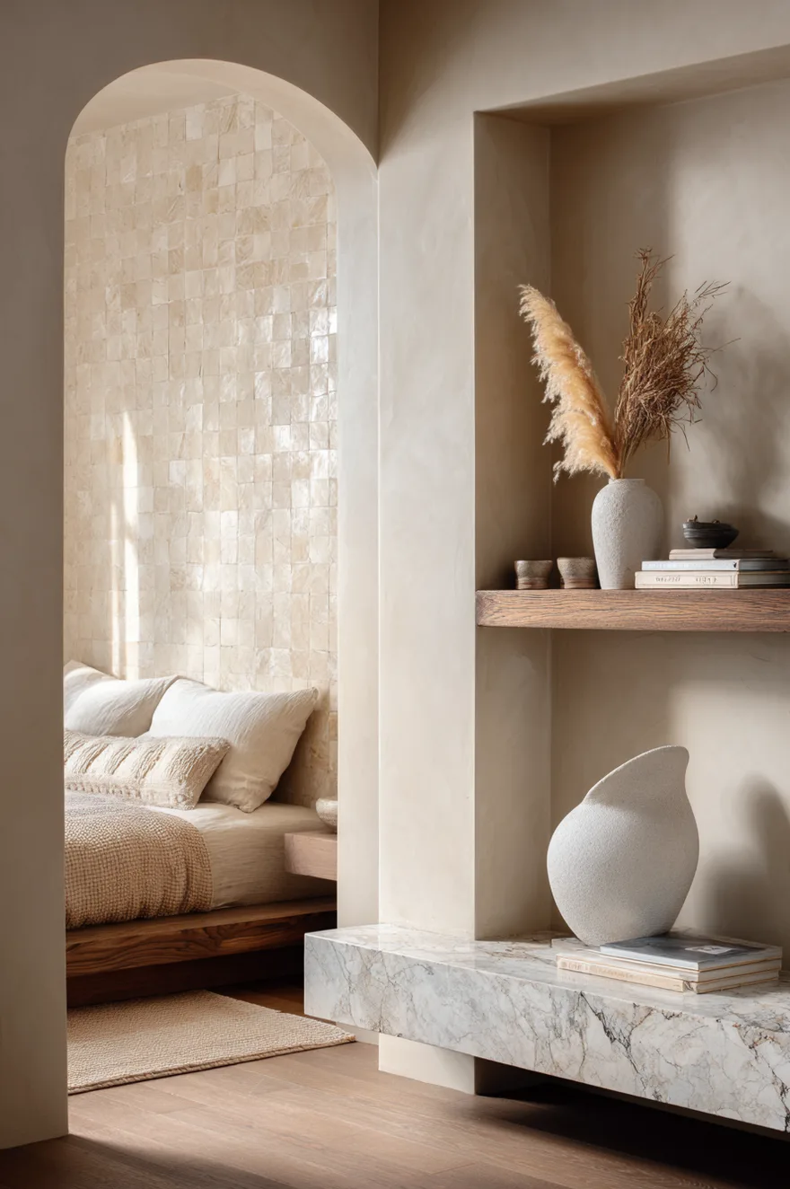
Zellige tile belongs in a bedroom. I’ll say it plainly because most people only think of it for kitchens and bathrooms. A panel of handmade Moroccan tile in warm ivory – the kind with natural variation in the glaze, not the perfectly uniform machine-cut version – installed behind a thick marble floating shelf in a bedroom alcove makes the alcove read as a considered architectural moment rather than a leftover space.
One sculptural white plaster vase and a single dried pampas stem on the marble shelf. That’s all. The tile has enough going on that it needs very little in front of it. What makes this move confident is that you’re bringing a material from a different room entirely into a space where people don’t expect it – and when unexpected materials show up in the right proportion, they read as specific rather than strange. The marble shelf and ivory tile share enough warmth in their tones that they settle together. Still not sure I’d do this in a very small bedroom without a window – the texture can feel heavy without natural light to lift it.
17. Minimalist Bedroom Shelves In Soft Blue
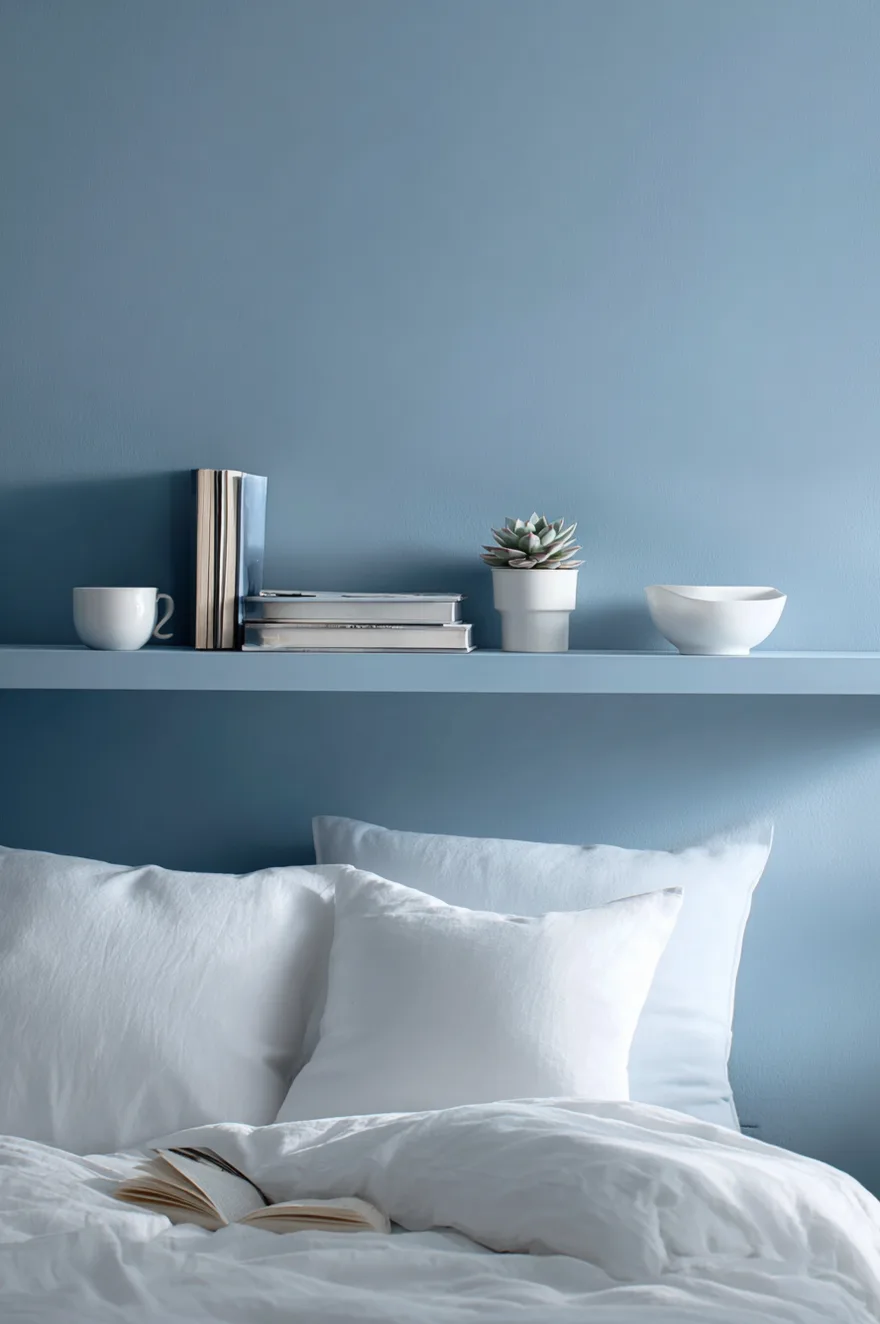
Paint the shelves the same color as the wall. This is the quietest trick in minimalist styling, and it works because the shelf almost disappears – what you’re left with is objects appearing to float in mid-air at different heights, unattached to any visible surface.
Two slim MDF shelves painted in the same dusty blue as the wall behind them, holding a white ceramic bowl, a small succulent, and one dog-eared paperback. The white bowl reads clearly against the blue. The paperback with its bent cover adds the only imperfect note. Cut your shelves from MDF and prime them before painting – the paint adhesion is better and the finish looks more intentional than wood grain showing through. Sand lightly between coats.
18. Why Built-In Shelves Beat Freestanding Every Time
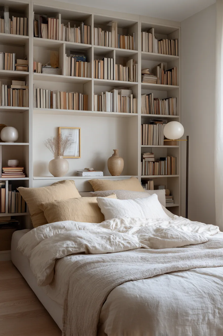
Every freestanding bookcase leaves a gap between its back panel and the wall – sometimes half an inch, sometimes more. That gap collects dust, yes, but more importantly it signals to your eye that the furniture is sitting in the room rather than belonging to it. A built-in shelf eliminates the gap entirely, and a small bedroom reads immediately taller and more resolved because of it.
Shelf depth matters more in a bedroom than people think. Nine to ten inches is the right depth for a bedroom built-in – deep enough for most books and ceramics, shallow enough that the shelf doesn’t project into the room and steal floor space. Most freestanding bookshelves run twelve to fourteen inches deep, which is fine for a living room but excessive for a bedroom. If you’re building from scratch, specify nine-and-a-half inches and you’ll find the room breathes better around the furniture.
19. Ladder Shelf Decor With Warm Stone Tones
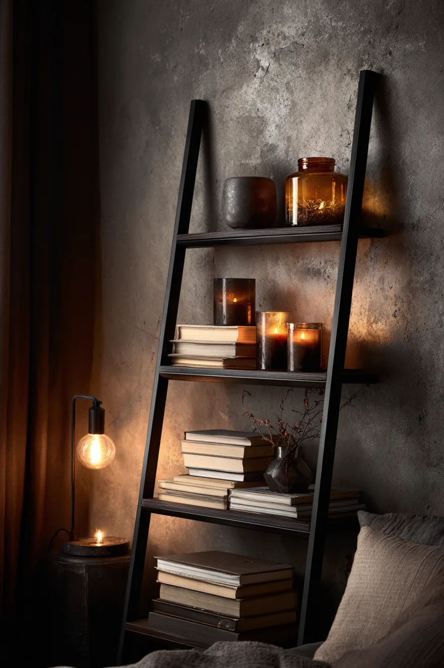
A black iron ladder shelf against a raw concrete-look wall is a nighttime composition. It’s not a morning room – it’s a room that earns its keep after the light drops and the lamps come on. Chunky beeswax candles on the lower rungs (the kind that are almost architectural in their scale, four to five inches in diameter), a stack of art books with linen spines at mid-height, and one small amber glass terrarium on an upper rung to catch the lamplight.
At 2700K, the amber glass becomes its own light source – it glows rather than just sitting there. The raw concrete wall texture absorbs light rather than bouncing it, which means the warm objects on the shelf carry more visual presence in the room than they would against a white wall. This is the shelf to photograph at around 9pm with a single lamp positioned low and to the left. It will look better in that shot than almost anything you could do in full daylight. Style the candles unlit for the photo – the matte wax surface reads more quietly than a flame, and the amber glass does the warm work on its own.
You don’t need to do all of these. Pick two or three that fit the wall you’re actually looking at, think about what the wall behind the shelf is doing, and remember that negative space is as much a decision as what you place down. If one of these ideas clicks for your bedroom, I’d genuinely like to hear which one – and if you try the tray trick from the guest room section in a non-guest bedroom, tell me how it goes, because I’ve been recommending it everywhere lately.
Talk soon,
Rachel