Most spa bathroom ideas look breathtaking on Pinterest and land flat in real life – too cold, too hotel-ish, or too dependent on a remodel budget most people don’t have. This piece covers 21 approaches to spa bathroom design, from a freestanding soaking tub done properly to a no-demo makeover that works on any rental timeline, with the real reasoning behind each material and lighting choice.
Most people walk into a bathroom that isn’t working and start reaching for new tile. It’s almost never the tile. I spent years designing commercial interiors before switching to residential, and the single thing I took from that decade is that atmosphere is mostly light and proportion, not finish selection. A bathroom with one overhead fixture at 4000K will feel like a changing room no matter what you put on the walls. I’ve watched homeowners spend thirty thousand dollars on marble and still feel vaguely anxious in the room every morning, because nobody thought about where the shadows fall.
The good news: several of these spa bathroom ideas cost almost nothing to try. A few cost real money but are worth every dollar. I’ll tell you which is which.
1. The Freestanding Soaking Tub Is The Room
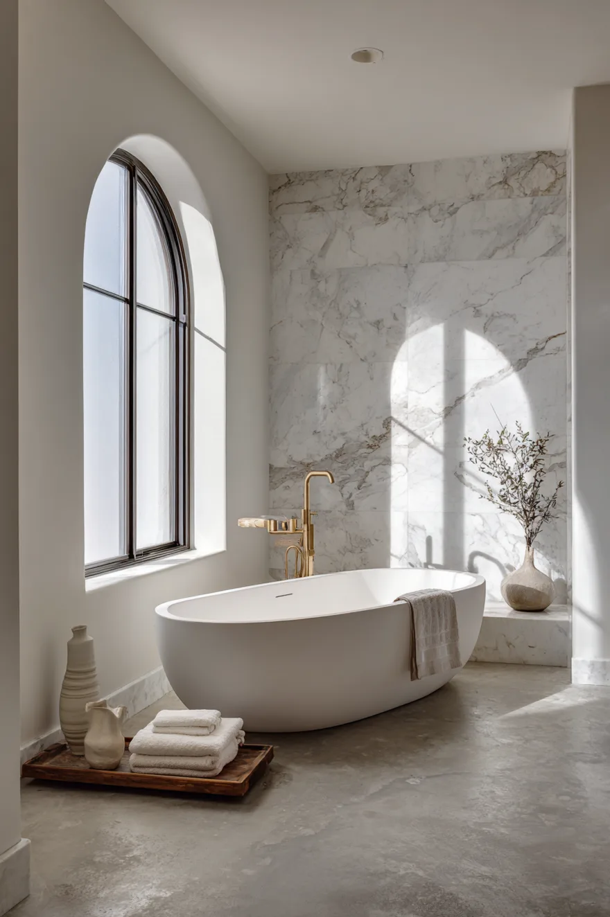
A sculptural freestanding tub works as a focal point only when it’s given full credit – meaning nothing else in the room competes. The mistake I see constantly is people centering the tub and then filling the walls around it with accessories, art, plant arrangements, and a second mirror. You end up with a decorated room that happens to contain a tub, rather than a room organized around a beautiful object.
Place a matte-white or stone-resin freestanding tub against a single uninterrupted Calacatta marble slab, or in front of an arched window with a concrete floor beneath it, and suddenly the tub reads as architecture. The concrete floor is important here – it doesn’t compete, it grounds. Nothing shiny, nothing patterned. A wall-mount faucet in a brushed finish keeps the hardware from cluttering the tub’s silhouette. The whole floor stays clear.
What kills this look faster than anything: a bath mat directly under the tub. Pull it to the side. One small teak stool with a single folded linen towel is all the dressing this vignette needs. The restraint is the point.
The practical move: sketch the room without the tub first. If anything you’re planning to keep (a built-in shelf, a second mirror, a pendant) sits in the same visual plane as the tub, remove it. The tub earns the space by being alone.
2. Gold-Veined Marble Bathroom Done Right
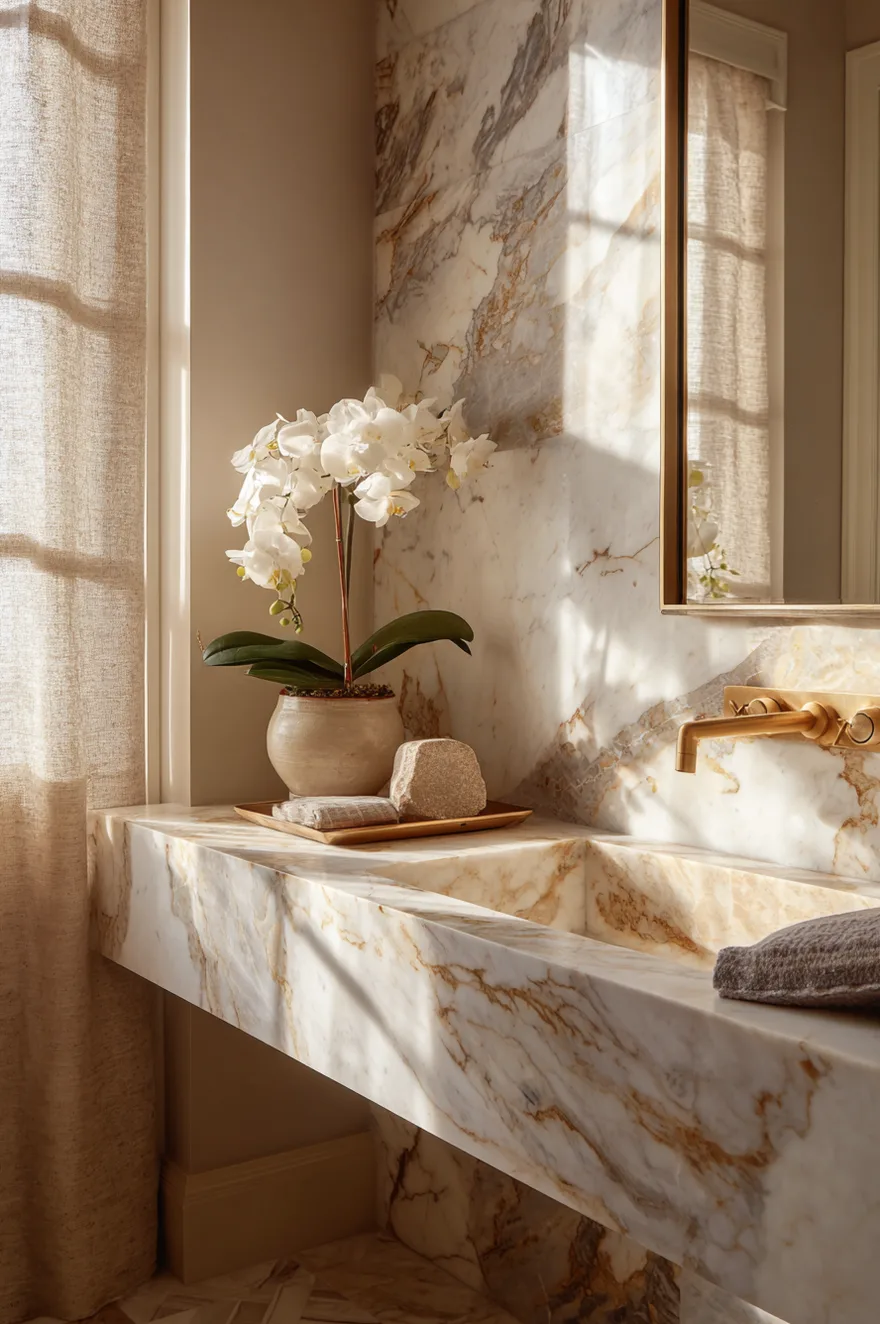
Arabescato and Calacatta Gold marble have a veining scale that can read either sculptural or chaotic, depending entirely on where you stop the stone. A full slab backsplash behind a single wall-mount faucet keeps the pattern contained and readable. Carry it to the floor in herringbone and the veining direction does interesting work at a slight angle, especially in late afternoon light.
The piece that holds this together is the faucet finish. Unlacquered brass against warm-cream marble is honest rather than precious – both materials are going to age, and they age in the same direction. Chrome would fight the veining. Matte black would flatten it. A warm cream vanity below keeps the room from reading like a hotel lobby, which is where gold-veined marble goes wrong: too much polish, not enough warmth.
One practical note: seal the marble. Honed is more forgiving than polished for daily use, and the matte surface makes the veining look more like geology and less like wallpaper.
3. Wood Slat Wall Bathroom Ideas For 2026
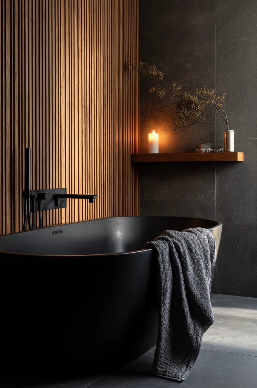
Vertical teak or thermally modified ash slats on a single accent wall do something no tile can: they introduce a material that reads as warm and imperfect. Shot from a doorway, a full-depth bathroom with a matte black built-in tub, a slate-grey tile floor, and one slatted wood wall has genuine visual depth – the eye moves through the room rather than stopping at the first surface.
Thermally modified ash is worth knowing about if budget is a concern. It’s dimensionally stable enough for humid environments and runs significantly cheaper than teak, with a similar grey-brown grain. Keep the slats vertical (not horizontal – horizontal reads like a sauna in a way that can feel costumey). The matte black tub pulls the wood tones toward moody rather than cabin-rustic, which is exactly where you want wood in a 2026 bath.
Seal the slats with a water-resistant penetrating oil, not a surface varnish. Varnish will eventually peel and chip. The oil keeps the grain honest.
4. Dark Tiled Wet Room With A Reason
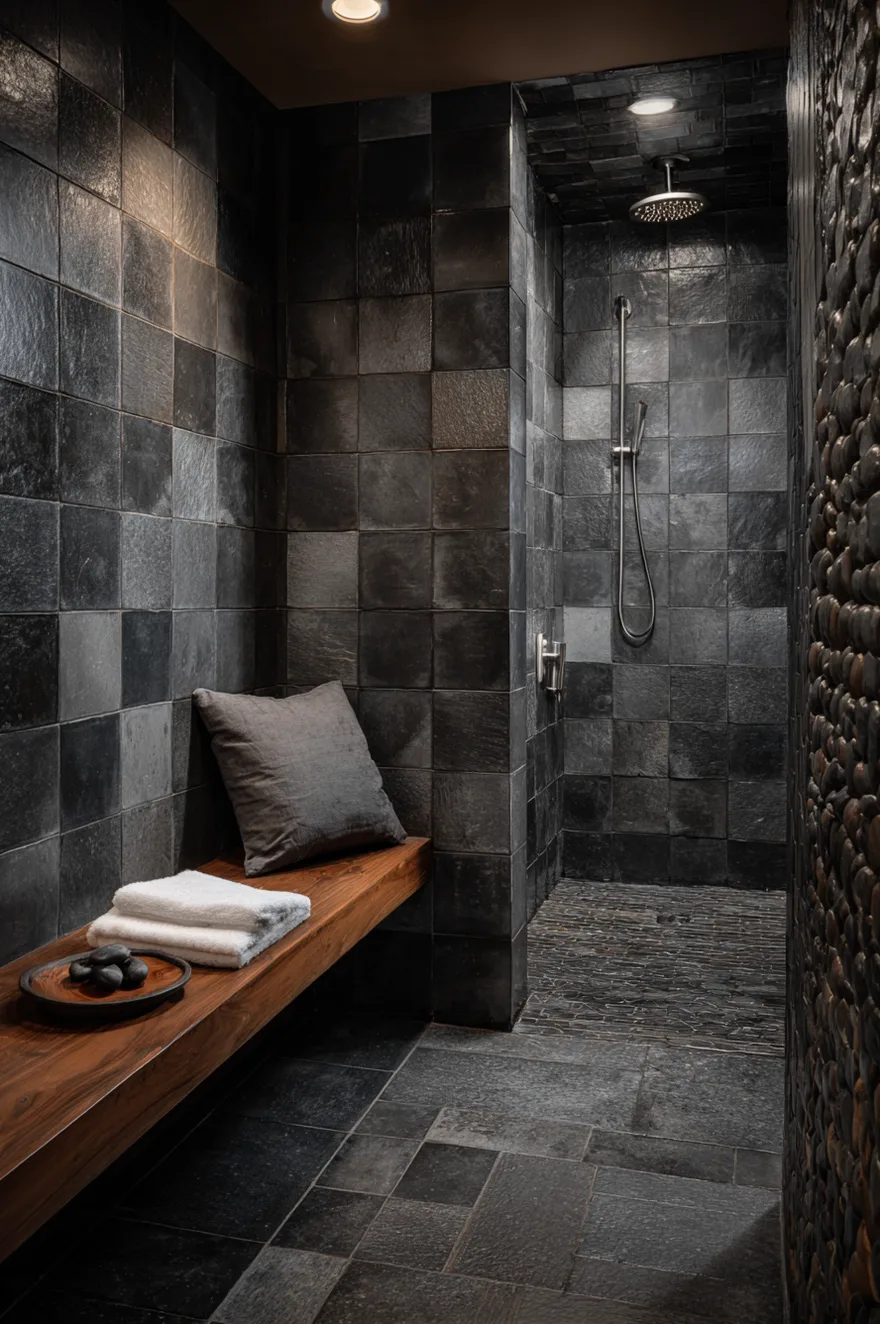
A fully enclosed tile envelope – floor, walls, ceiling, all in charcoal zellige or honed black slate – works because the eye stops searching for where one surface ends and another begins. The room just recedes. A brushed-nickel rain showerhead overhead and a teak bench along one wall provide the only interruption in material. That’s the whole room.
I’ve heard people call this look oppressive before trying it. But zellige in charcoal isn’t flat – the glaze variation catches light the way water does, so the room reads as rich rather than heavy. And the teak bench isn’t there for decoration; the warm grain temperature against all that dark tile is exactly what keeps the space from tipping grim.
If you’re nervous about committing all four surfaces, start with three. Floor, walls, and ceiling in the same tile is a significant move. The shower bench built in matching porcelain makes it architecture.
5. Botanical Bathroom Retreat Without A Greenhouse
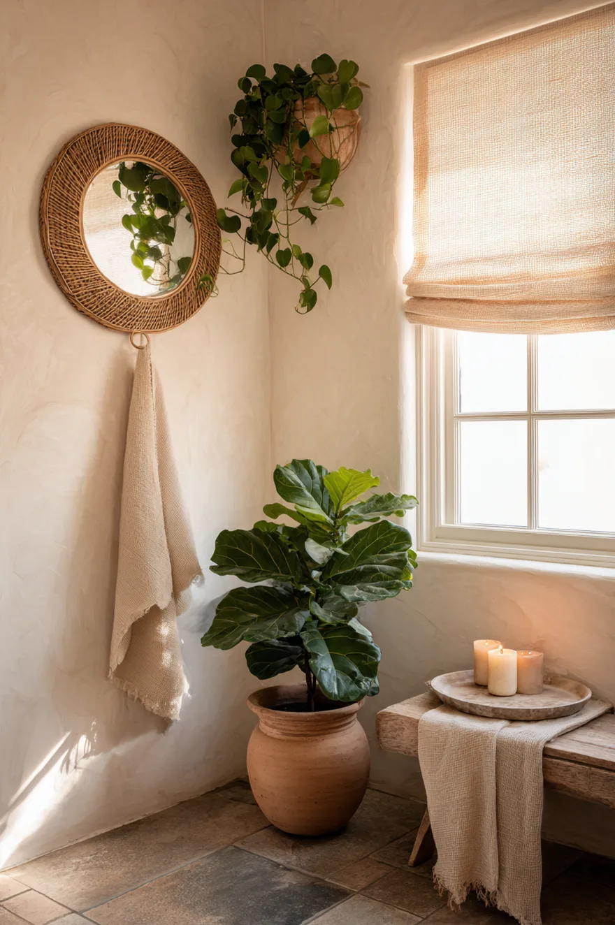
I used to think plants in a bathroom were purely decorative – the kind of thing you see in a photo shoot and then watch die in real life. I was half wrong. The ones that actually survive (pothos, heartleaf philodendron, certain ferns) do better in a bathroom than almost anywhere else in a home, because the humidity does what they’d prefer anyway.
The room that convinced me was a client project where we did warm-white plaster walls and nothing else decorative planned – no art, no textile layering. The homeowner hung a pothos over the window, put a fiddle-leaf fig in a terracotta cachepot in the corner, and added a rattan mirror. That was it. In morning light, the damp stone tiles picked up the green from below, and the whole room just settled. No styling required.
Keep it to two or three plants maximum. A rattan mirror reads in the same material language as the plants without competing. A linen window shade diffuses the morning light enough to make the plaster walls glow rather than glare.
The practical move: skip the plant shelf and just use the floor. A large fig in a terracotta pot on the floor costs less than a custom shelf and anchors a corner nothing else would know what to do with.
6. Small Spa Bathroom Ideas That Actually Work
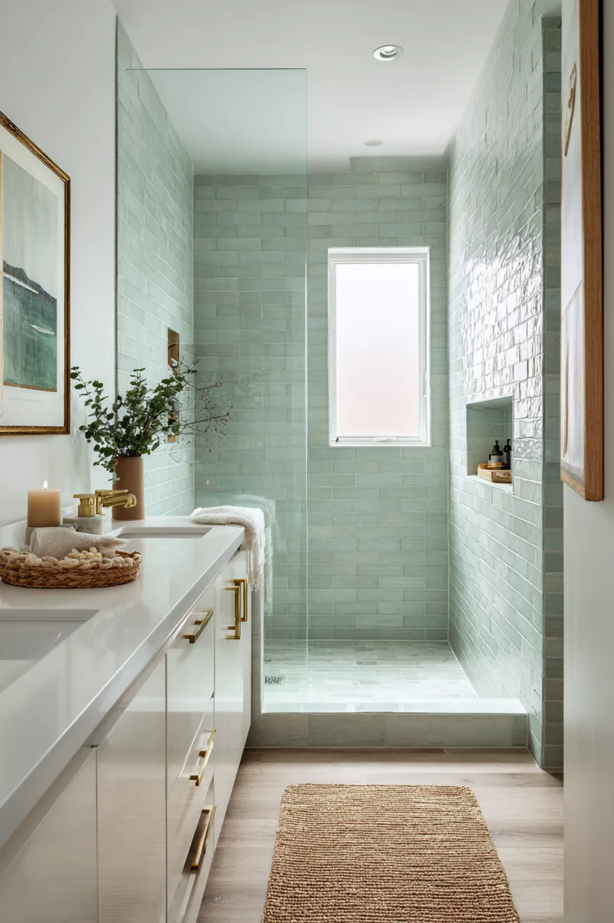
A 5-by-8 bathroom earns a spa reading through material discipline, not through trying to do more. The rooms that feel cramped are usually the ones with too many competing materials – a patterned floor, a colored vanity, a framed mirror, a shower curtain with its own opinion. Reduce all of that to one continuous material decision and the room breathes.
Soft sage green tile running wall-to-floor in a single format is one of the best small-bathroom moves I know. A frameless glass shower door keeps the floor continuous visually. A floating vanity frees six inches of floor space that reads as much more. And a single recessed niche with one candle and one stone soap dish is the only moment of styling the room needs – adding more would break the spell.
Still not sure I’d do this in a room with very low ceilings (the continuous tile can read like a container). But in a standard 8-foot ceiling, it works.
7. Organic Modern Bathroom In Warm Travertine
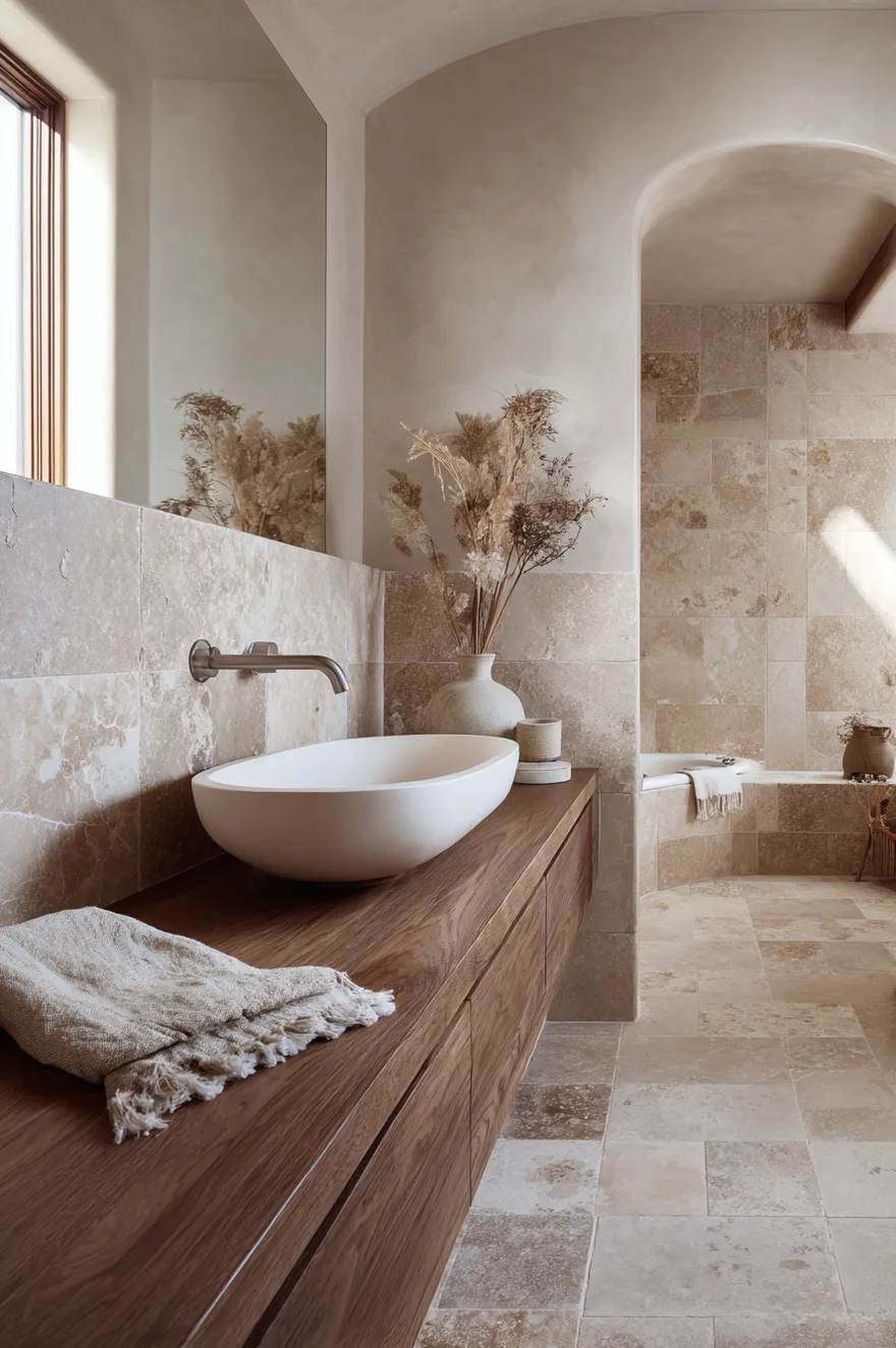
Unfilled travertine has one quality polished stone doesn’t: the voids in the surface catch shadow, which means the tile reads differently at 8am than at 4pm. That movement makes the room feel alive in a way that a consistent polished surface never quite manages.
Use it on the floor and a half-wall, stop it at counter height, and let a plaster ceiling take over above. A walnut floating vanity at that same mid-height brings warmth without adding visual weight. An oval undermount sink – not a vessel, not a square under-mount, specifically oval – is the one shape in this room that introduces a curve. A linen hand towel folded over the edge and a white ceramic vessel beside the faucet are all the dressing this room wants.
The practical note: unfilled travertine in a wet area should be sealed annually. It’s not high-maintenance – it’s one afternoon a year. Worth it.
8. Why Warm Light Changes Everything In Here
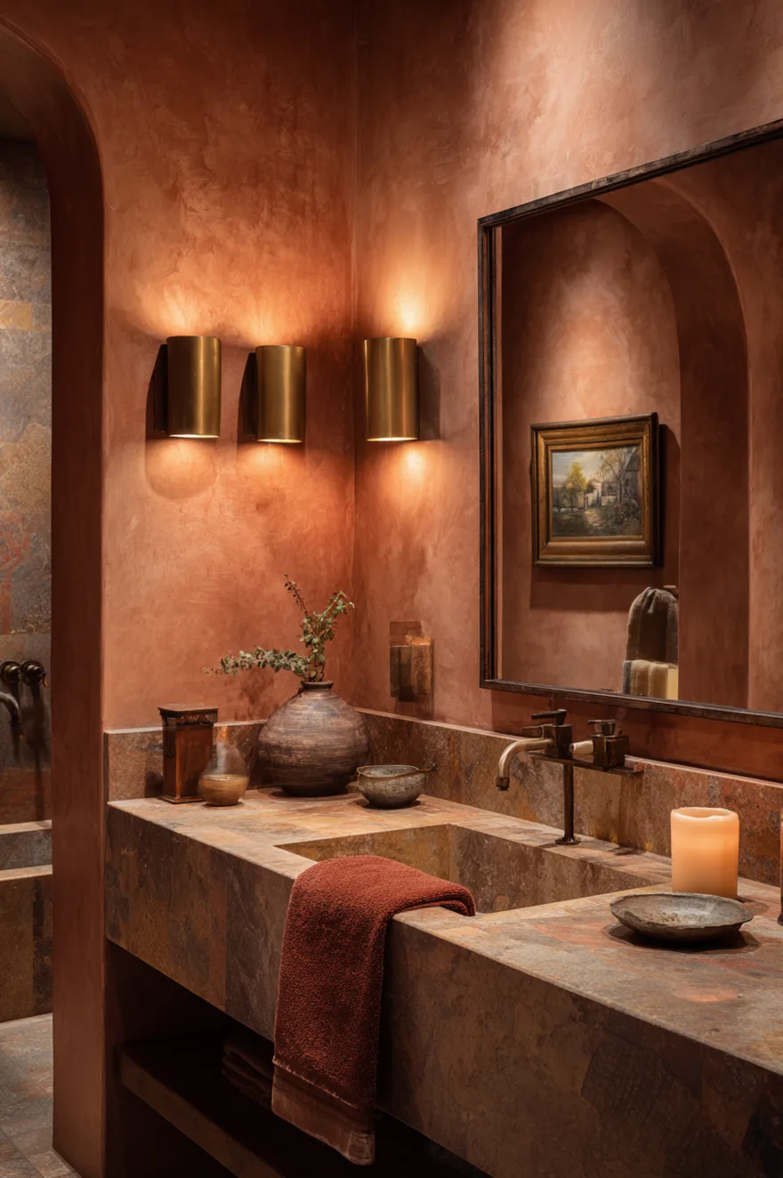
Every bathroom I’ve worked on that felt wrong started with the same fixture: a single overhead can light or a builder-grade bar above the mirror, running at 3000K or higher. Cool overhead light hits the face from one direction and flattens everything. Two wall sconces flanking the mirror at face height, running 2700K on a dimmer, do the opposite – they light you from both sides, make the materials in the room glow amber, and make a honed travertine wall look like it’s warm to the touch.
Add a candle ledge to the shower niche. I know it sounds small. But a lit candle inside the shower niche against terracotta plaster walls at 7pm, with the sconces dimmed down, is genuinely the most inexpensive design upgrade in this entire list. The amber against warm plaster is doing all the work a renovation would do, for the price of a box of matches.
Replace overhead-only fixtures first, before you touch a single tile.
9. Luxury Spa Bathroom Design With Steel Windows
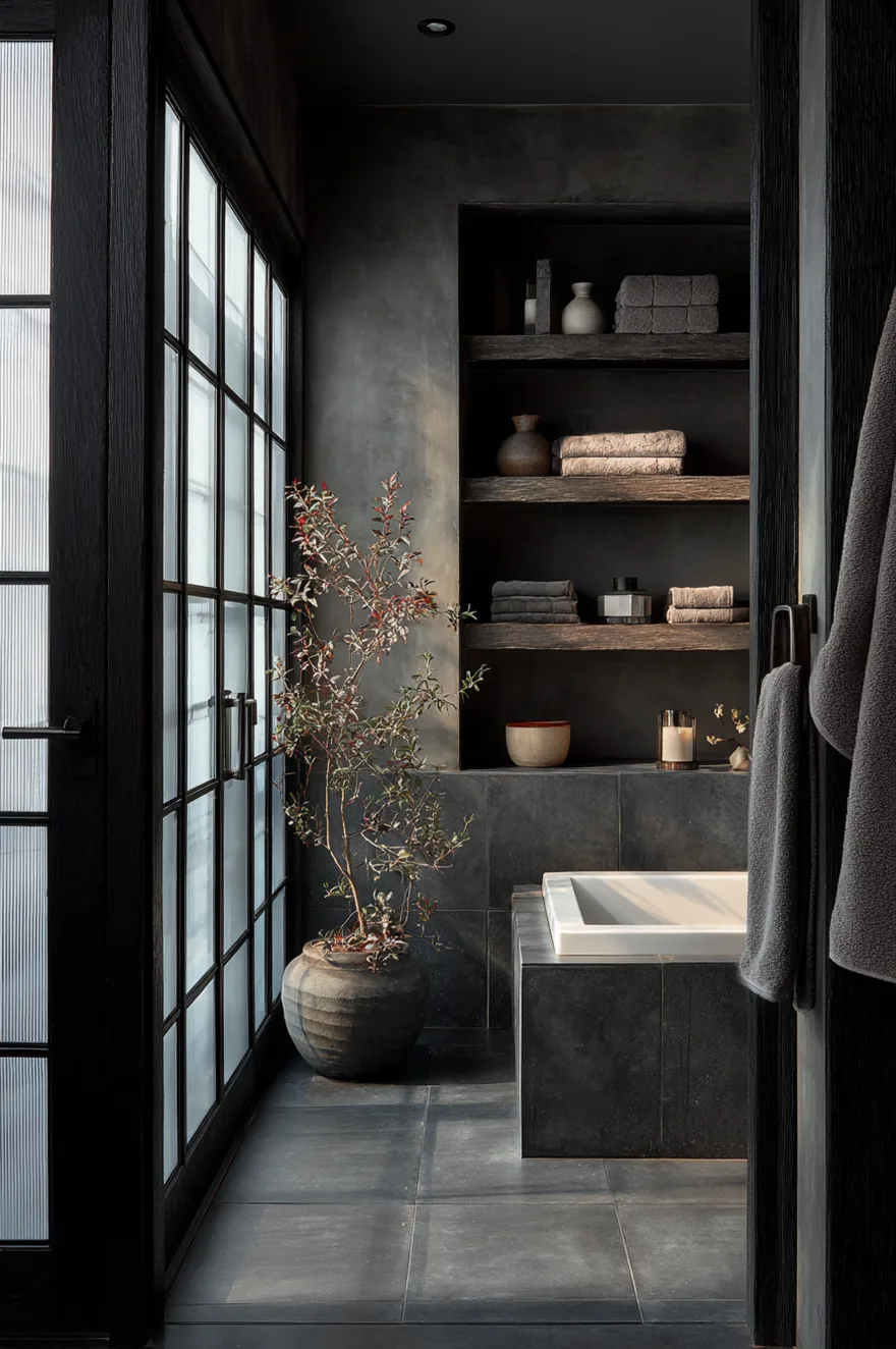
A black steel-frame interior window between a soaking tub alcove and a dressing area does two things simultaneously: it lets light move between the two zones while creating visual separation. The frame itself reads as structural – the same graphic weight as an exposed beam – so it earns its place rather than just decorating it.
Pair it with charcoal cement-look tile floors, white oak shelving built flush into the wall, and a brushed-iron towel bar. The material palette is doing something disciplined here – everything is either dark-industrial or warm-natural, nothing in between. Frosted glass in the steel frame is worth specifying for any tub-adjacent application; the privacy holds without blocking the light transmission. Low afternoon light filtering through frosted panes turns the cement floor silver.
The cost note: steel-frame interior windows are not cheap, running $800 and up for a single custom panel. But they read as permanent architecture, not decor.
10. The Shower Niche Is Not An Afterthought
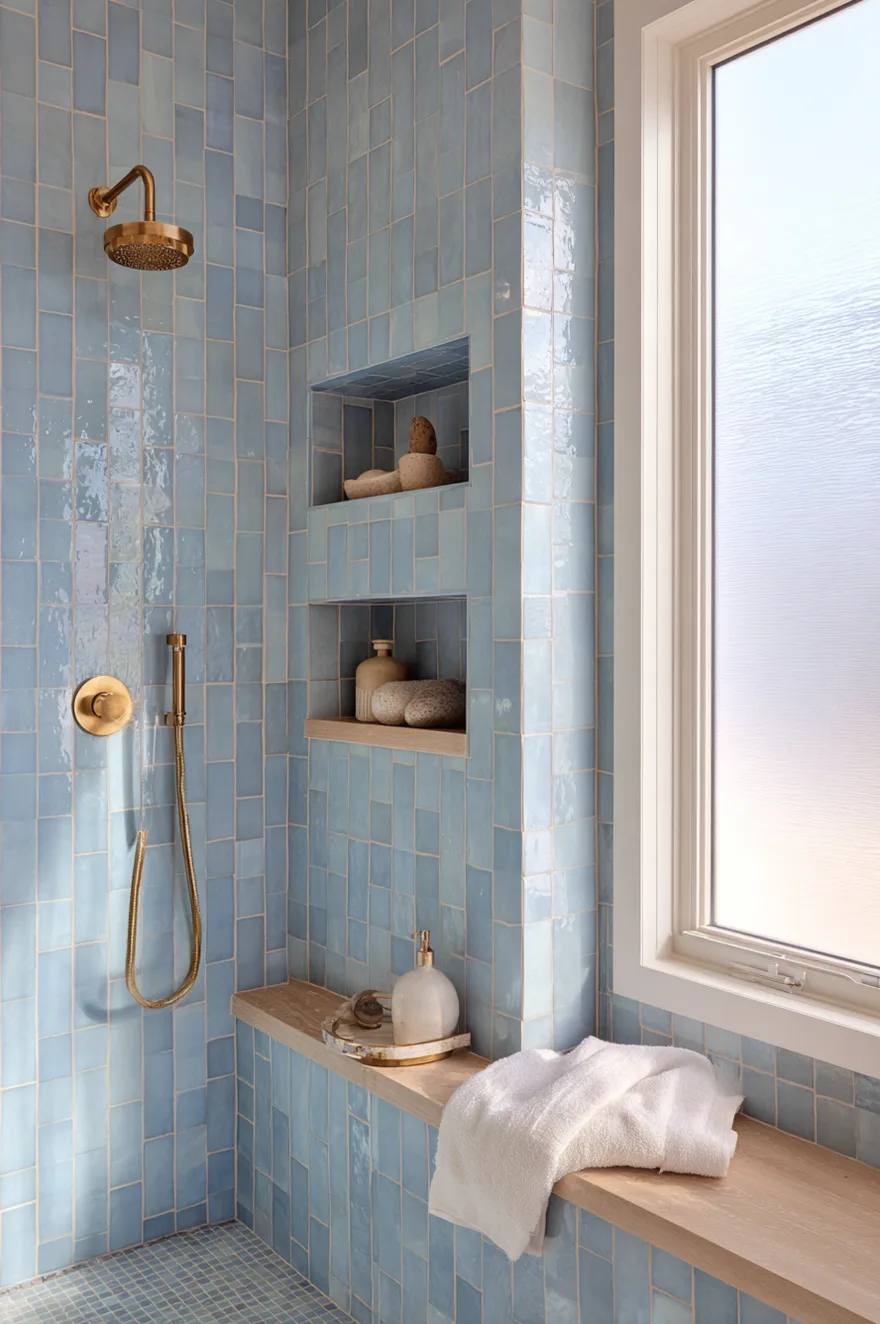
Plan it during framing or don’t plan it at all – a niche cut into an already-tiled wall almost always looks exactly like what it is. But a full-height niche running floor to ceiling beside the shower controls, tiled in the same soft-blue subway tile as the surrounding shower, becomes a vertical design gesture rather than a storage shelf.
Light oak wood shelves floating inside the niche against the blue tile add the only material warmth in an otherwise all-tile environment. A flat brushed-brass faucet at the same wall reads in the same register as the wood. Keep the niche contents minimal: one ceramic bottle, one stone soap dish, one folded washcloth. Everything else can live under the vanity.
11. Spa Bathroom Decor Using Only Natural Texture
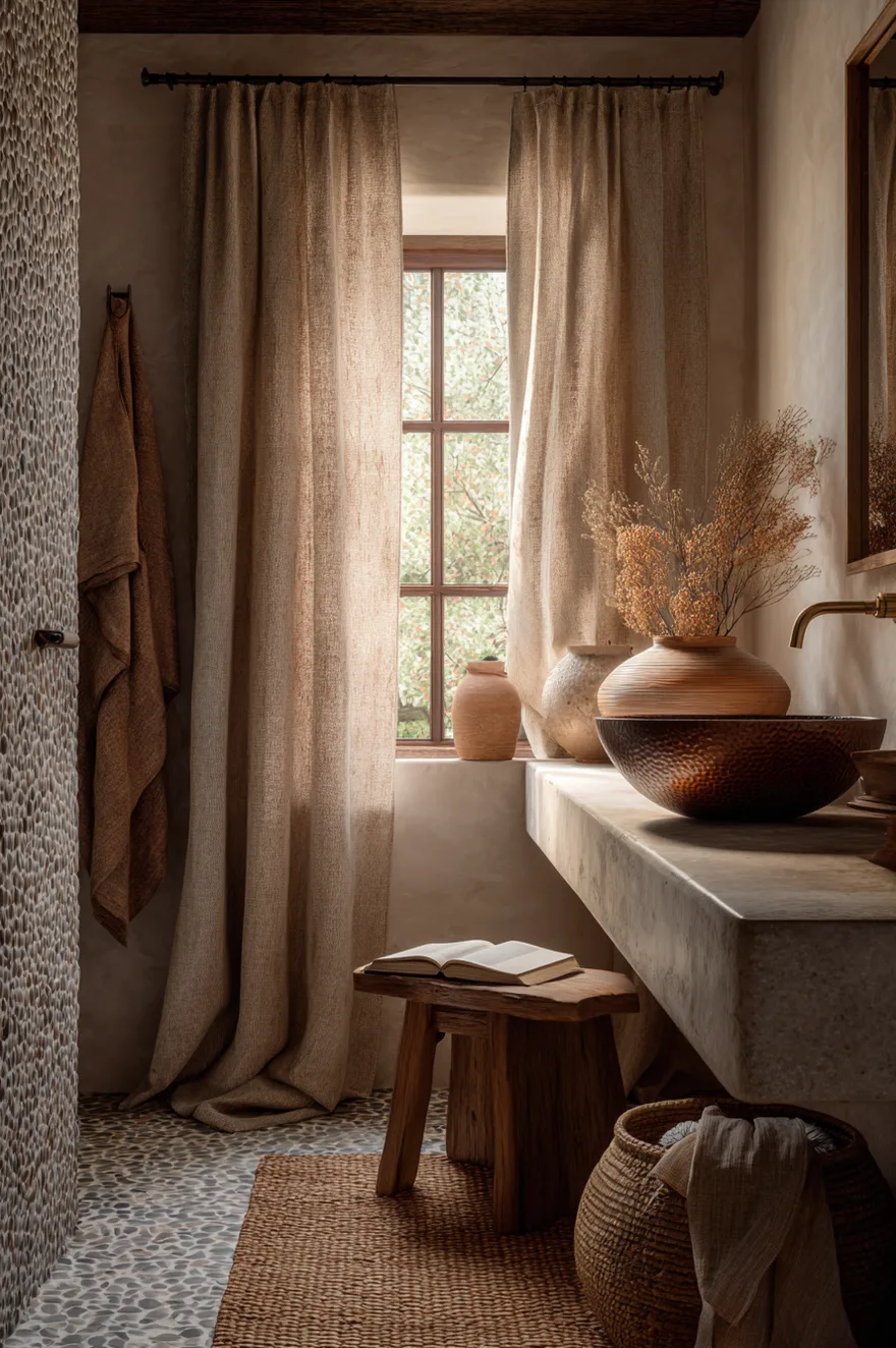
This is the room I keep coming back to when clients say they want a bathroom that feels calm but doesn’t have a “style.” The answer is almost always: build it on texture instead of color or pattern. When every material in a room is natural and slightly irregular, the room reads as coherent without having a mood board.
Rough linen drapes (not curtains – drapes, with weight) at the window. A woven seagrass bath mat instead of a cotton one. A hammered copper basin on a whitewashed plaster vanity. River-stone mosaic on the shower floor. None of these are the same color – the linen is warm cream, the seagrass is khaki-green, the copper is reddish-brown, the plaster is near-white – but they all share the same physical quality: they were made by a process that left marks on them.
And that’s the underlying idea here. Materials that show their making look intentional together even when they’re not technically “matched.” Smooth, machine-finished surfaces require coordination; honest materials take care of themselves.
David built a small teak stool for our bathroom that fits exactly this principle. It’s unfinished on the underside, slightly rough to the touch, and it sits next to the tub holding a ceramic candle and three smooth river stones we picked up on a trip. No one has ever asked me what “style” our bathroom is. They just say it feels good in there.
The practical move: start with the floor and the window. Those two surfaces set the texture register. Everything else follows.
12. Soft Sage Green Reads Calm, Not Trendy
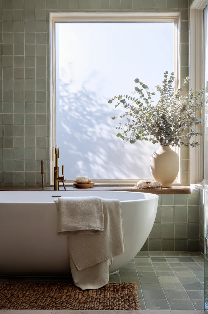
The reason sage green has more staying power than most bathroom colors is simple: it reads differently by hour. In morning light it’s almost grey. In afternoon sun it picks up warmth. Under lamplight it deepens toward something almost eucalyptus. A color that shifts with the light doesn’t wear out the same way a static color does.
Limewash in sage on full tile – not an accent wall, the whole room – works especially well paired with a white cast-iron tub and warm brass fixtures. The brass ages in the same direction as the limewash: both get more interesting over time. Eucalyptus branches in a tall, narrow ceramic vase are the only decorative note this room needs.
I’d skip the bolder greens. Hunter, forest, deep olive – they read strong when new and start fighting the room after a few years. Muted sage holds.
13. Aesthetic Bathroom Decor Starts With The Floor
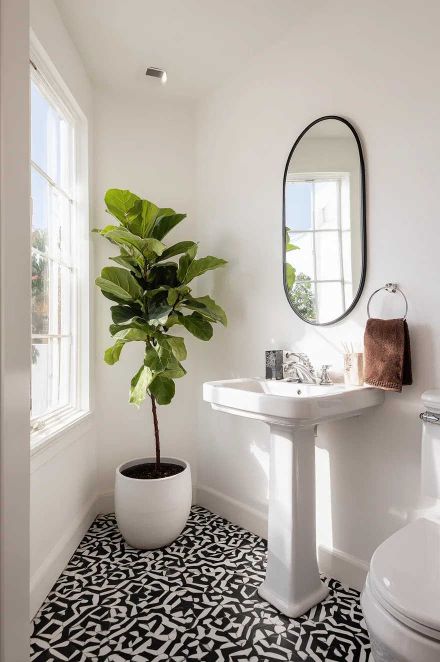
There was a bathroom in a 1910 Seattle bungalow I worked on early in my interiors career where the owner wanted to gut everything. The walls were that generic builder beige. The vanity was laminate. But underneath a vinyl overlay was an original octagonal black-and-white cement tile floor, roughly 1.5 inches per tile, in nearly perfect condition.
We kept everything else completely quiet. White plaster on the walls. A simple pedestal sink. A frameless oval mirror hung at seated eye level – not at the standard builder height, which is too high for most people. An oversized rubber plant in a plain white ceramic pot in the corner. That was it. Shot straight-on from the doorway, the floor pattern leads your eye into the room and everything above it just supports.
The lesson I took: when the floor has something to say, let it say the thing. One graphic gesture and then step back. The pedestal sink, notably, was thirty years old and cost nothing. Nobody ever notices it.
14. Built-In Banquette Or Bench, Not A Chair
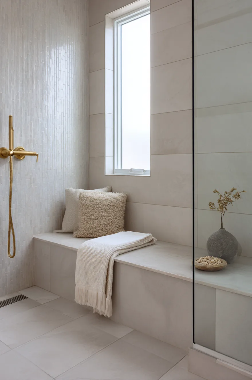
A tiled bench built into the shower or along a wet-room wall in the same continuous porcelain as the floor reads as architecture because it is architecture. A teak stool or a folding chair reads as furniture someone carried in. That distinction matters more than it sounds.
In a narrow bathroom, a bench along one wall actually improves the proportions – it defines the far end of the space instead of leaving it as a vague terminus. Build it at 17 to 18 inches high, 14 inches deep, and tile it in the same format and grout as the floor. It disappears as a separate object and becomes part of the room’s geometry.
15. Spa Bathroom Ideas 2026 In Deep Mushroom Plaster
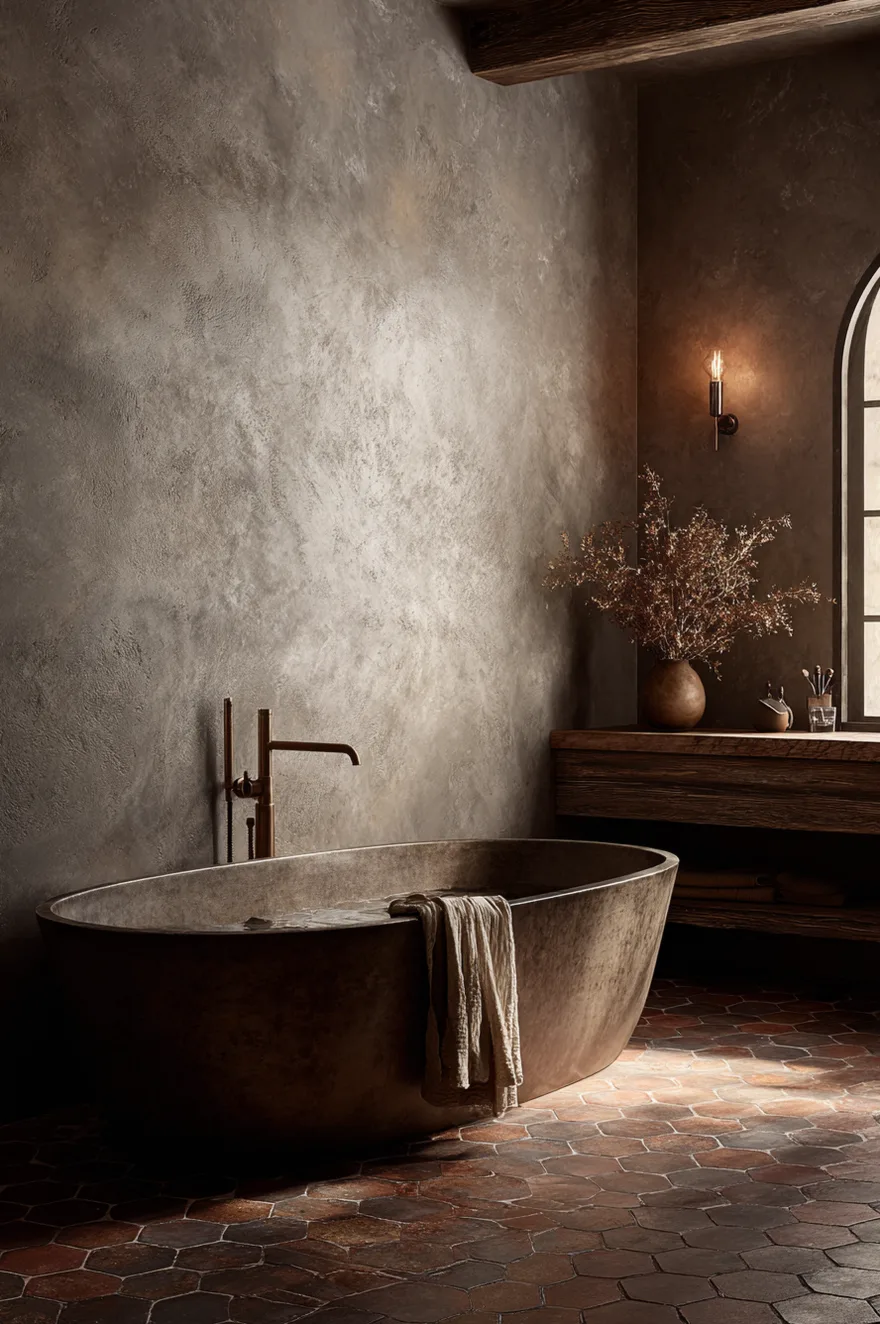
Limewash plaster in a warm greige – not beige, not grey, specifically that deep mushroom tone that sits between the two – is one of the more interesting things happening in bathroom design right now. The tonal variation you get from limewash, where the color shifts lighter at the high points and deeper in the recesses, does exactly what wallpaper tries to do but with more honesty.
Pair it with a brushed-bronze freestanding tub filler and the warmth compounds. Terracotta hexagon floor tiles keep the room grounded in the same earthy register rather than jumping cool. A smoked-oak vanity at counter height brings a horizontal grain that reads against the wall’s vertical variation. The whole room should be photographed at an angle, in low evening sconce light, to catch the plaster’s depth.
The one practical note: limewash plaster in a wet room needs a sealer applied by someone who knows the product. Unsealed, it will mark from water and won’t recover.
16. Why Nobody Regrets More Mirror
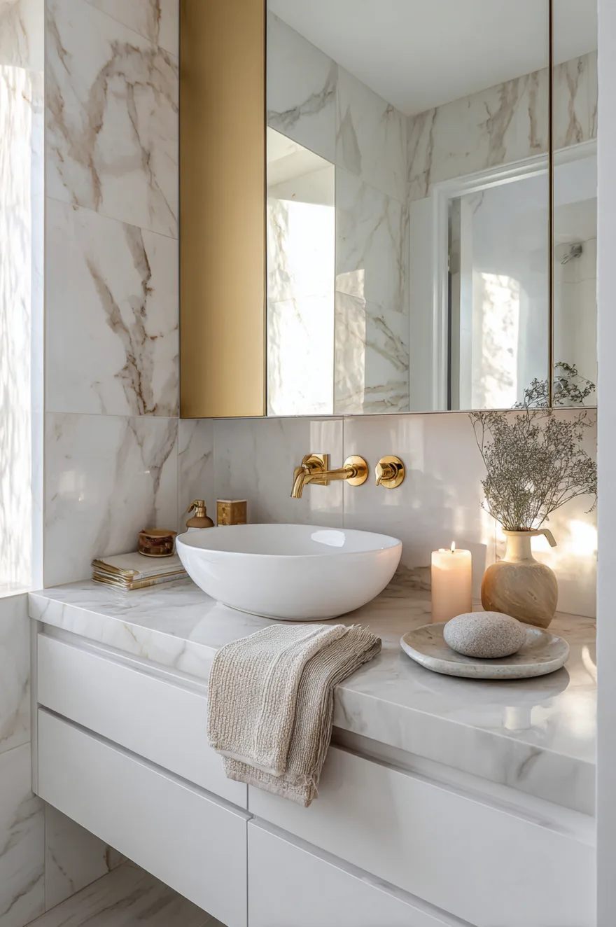
A full-wall mirror running from the vanity top to the ceiling is not the same thing as a large framed mirror hung on a wall. The framed version is decoration. The floor-to-ceiling version erases the back wall entirely. The room doubles in depth, light bounces between surfaces, and a small bathroom reads as a suite.
This is the one upgrade I recommend before any tile change, any fixture swap, any plumbing work. Have a glazier cut the mirror to size and use a simple polished or beveled edge – no frame. The edge alone finishes it. Install it with mirror adhesive and a few discrete clips at the top. Cost runs $200-$500 for a typical vanity wall. Nothing at that price point delivers the same return.
And yes, Frank the cat has walked into it twice.
17. Spa-Like Bathroom Makeover Without Demolition
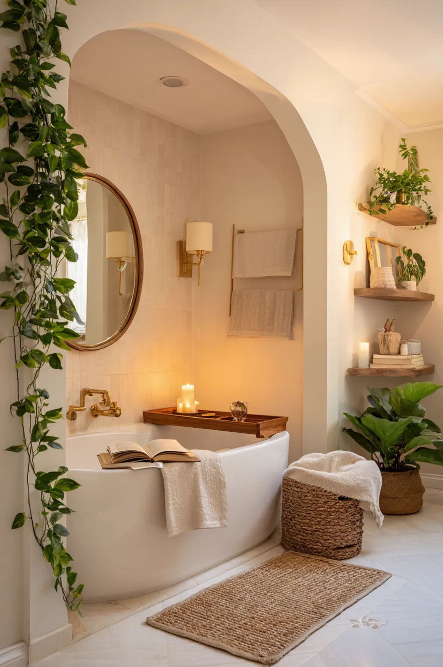
A client in Capitol Hill came to me with a perfectly functional 1990s bathroom she was ready to gut – white subway tile, a builder vanity bar above the mirror, a standard alcove tub, and a showerhead that worked fine. Budget was limited. I told her to put the sledgehammer down.
We swapped the vanity light for two linen-shade sconces flanking a new round mirror, running 2700K bulbs on a dimmer. That alone changed the room’s mood more than any tile ever would. Then a teak bath caddy across the alcove tub – the kind that holds a book, a candle, and a glass – turned a utility tub into a place she actually wanted to spend time. Benjamin Moore White Dove on the walls in matte finish replaced the original builder white, which had a slight cool cast that was making the whole room feel clinical.
Total cost was around $600. No permits, no contractors, no tile work. The sconces are from Schoolhouse, if you want specifics – the Granada in antique bronze. I’ve specified them on three projects now and they’re worth every dollar. The room read completely differently because of three decisions, none of which involved touching a single existing surface.
The move: sconces first, always sconces first.
18. Stone Basin Over Porcelain Every Time
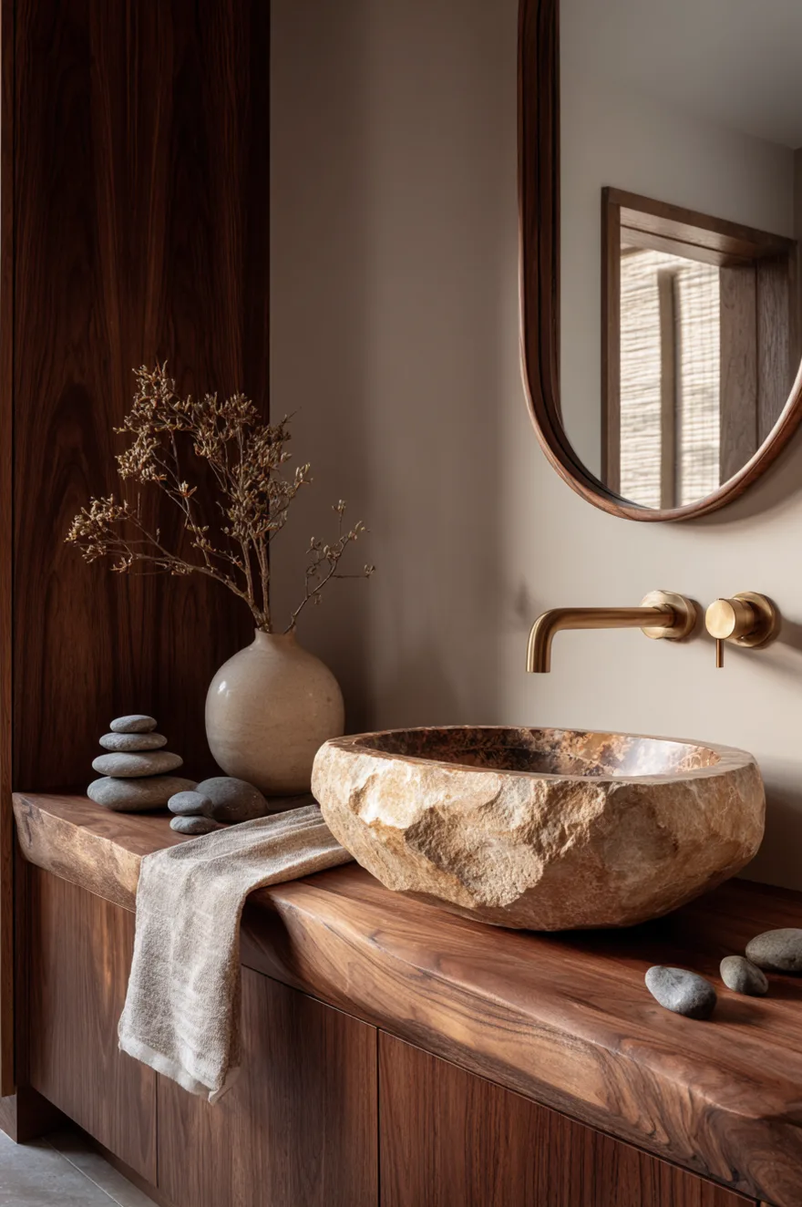
A hand-carved limestone or concrete vessel sink on a floating walnut slab costs roughly the same as a mid-range porcelain undermount from a big-box plumbing supplier. The porcelain reads builder-grade because it looks like a factory made it, which it did. The limestone reads as considered because you can see where the material was shaped.
Material irregularity – the slight variation in a honed stone surface, the casting marks on a concrete basin – registers as quality even when we don’t consciously notice it. It’s the same reason a wool rug feels better than a synthetic one before you’ve even thought about the price. The physical truth of the material comes through.
Pair it with an unlacquered brass wall-mount faucet. Both will age. Both will look better in ten years than they do now.
19. Rattan And Warm Brass In A White Room
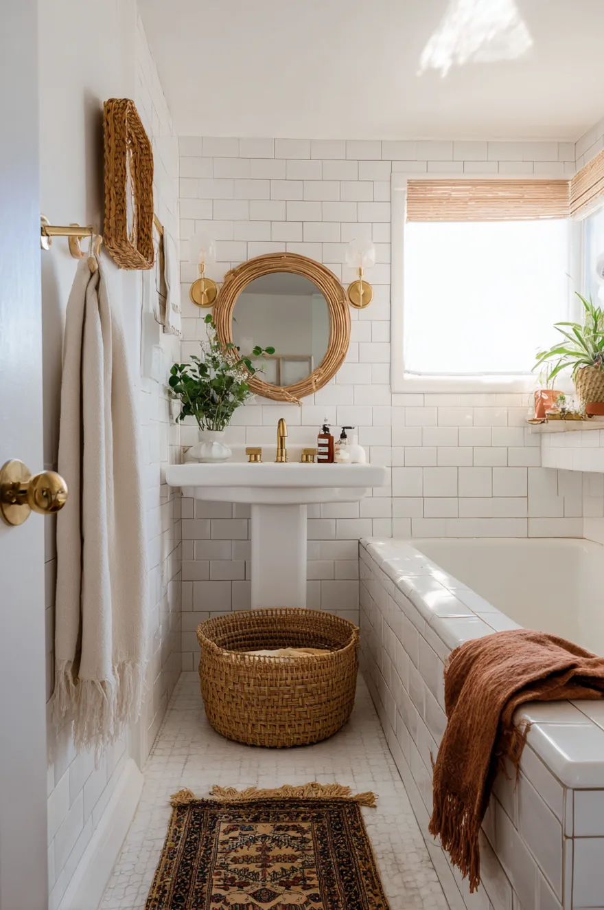
Crisp white subway tile goes cold fast – especially in a north-facing bathroom with limited natural light. The fix isn’t adding color. It’s adding material warmth in the form of texture.
A rattan-wrapped mirror above a pedestal sink introduces a woven organic surface that absorbs light rather than reflecting it, which softens the whole room in one move. A vintage brass wall sconce (or Rejuvenation’s Arched Arm sconce in antique brass, which reads convincingly vintage) brings the right amber warmth without requiring a rewire if you’re replacing an existing fixture. A woven storage basket tucked under a pedestal sink gives the necessary storage while adding another layer of natural texture at floor level. And a rust-toned Turkish towel draped over the tub edge brings the one warm color note the room needs without committing to anything painted.
Bright window light from the side – no overhead fixture visible – is what makes this room work in a photograph and in real life.
20. The Hidden Towel Warming Drawer
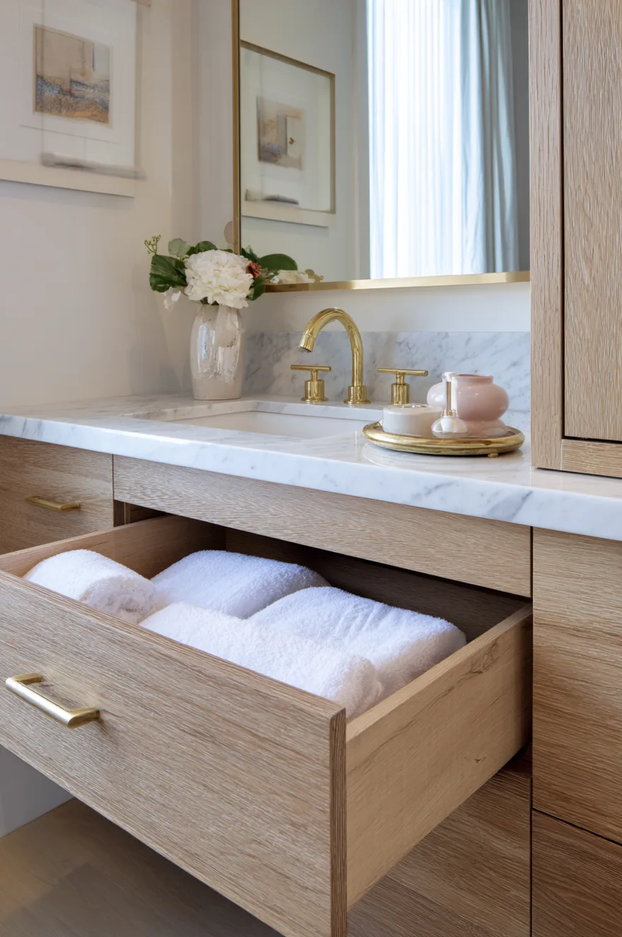
A flush-front toe-kick drawer beneath the vanity cabinet, fitted with a low-wattage warming element, holds four standard bath towels and is invisible when closed. The drawer front sits flush with the base and disappears into the vanity line.
It’s a detail I’d only learned to specify after a client mentioned it on a walkthrough of a house they’d just bought – they assumed it was standard. It isn’t. But it should be. Every single person who encounters it in a finished room asks the same question: where did you find the installer who did this? (Answer: any electrician comfortable with a low-voltage warming element and a competent cabinet maker for the drawer box.)
21. Spa Bathroom Ideas That Age Beautifully
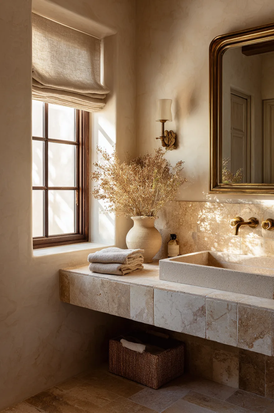
The longest-lasting spa bathroom designs I’ve seen share one material principle: everything in the room was chosen because it gets better with use, not in spite of it. Unlacquered brass darkens at the points you touch it most. Travertine wears to a softer surface at the threshold. Linen softens after every wash. These materials develop a record of the room being used.
Compare that to high-gloss chrome and polished white tile, which show every water spot, every fingerprint, every mineral deposit – and require constant maintenance just to look the way they looked on day one. There’s nothing wrong with those materials. But they’re fighting time rather than working with it.
Choose patina-friendly materials from the start and the room improves as it settles. That’s not a small thing.
If I were picking two ideas to try first, I’d start with the sconces (section 8, and again in section 17 – yes, I brought it up twice, because it works that well) and the full-wall mirror. Neither requires a contractor, both change the room immediately, and together they cost less than new tile for one wall.
Curious which of these is speaking to your particular bathroom situation. Drop a comment and tell me what you’re working with – square footage, existing tile, lighting setup – and I’ll tell you where I’d start.
Talk soon,
Rachel