Scandinavian interior design has moved beyond the all-white minimalism most people picture. These scandinavian interior ideas for 2026 show how Nordic design principles – light management, natural materials, functional beauty – translate to living rooms, bedrooms, kitchens, and bathrooms that feel both contemporary and deeply comfortable. Whether you’re drawn to moody Japandi hybrids, colorful Swedish maximalism, or classic Danish restraint, these approaches prioritize how a space actually functions in daily life.
I’m going to say something that might be unpopular: most American interpretations of Scandinavian design are too cold.
I spent two weeks in Copenhagen last year studying how Nordic design studios actually work – not the Instagram version, the real version. What I found was warmth. Texture. Intentional color. The homes I visited were minimal, yes, but they were never sparse. There’s a crucial difference.
The Scandinavian interiors I saw understood something fundamental: when you live with four hours of winter daylight, every design decision is about managing light and creating warmth. That’s not an aesthetic choice. It’s a survival strategy that happens to look beautiful.
These are the scandinavian interior design principles that actually matter in 2026 – the ones that create spaces you want to live in, not just photograph.
Light Is the Foundation
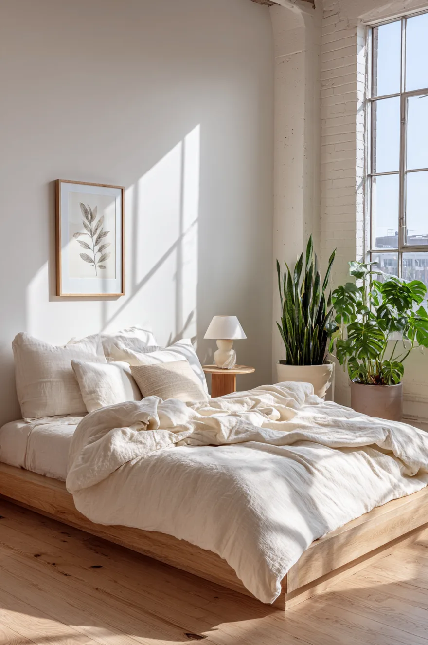
Everything else in Scandinavian interior design serves light. This is not poetic language – it’s the actual design hierarchy.
In the Nordic countries, winter days are brutally short. Designers there don’t think about light as an afterthought or a finishing touch. They design the room around how light will move through it from 9am to 3pm, and then how artificial light will take over for the remaining seventeen hours.
This means: windows stay unobstructed. Wall colors reflect rather than absorb. Surfaces have sheen – lacquered wood, polished stone, glazed ceramic. Every material choice is partly about bounce and refraction.
The American mistake is thinking Scandinavian design is about white walls. It’s about light behavior. White is just one tool in a much larger system.
Why Nordic Living Rooms Feel Bigger
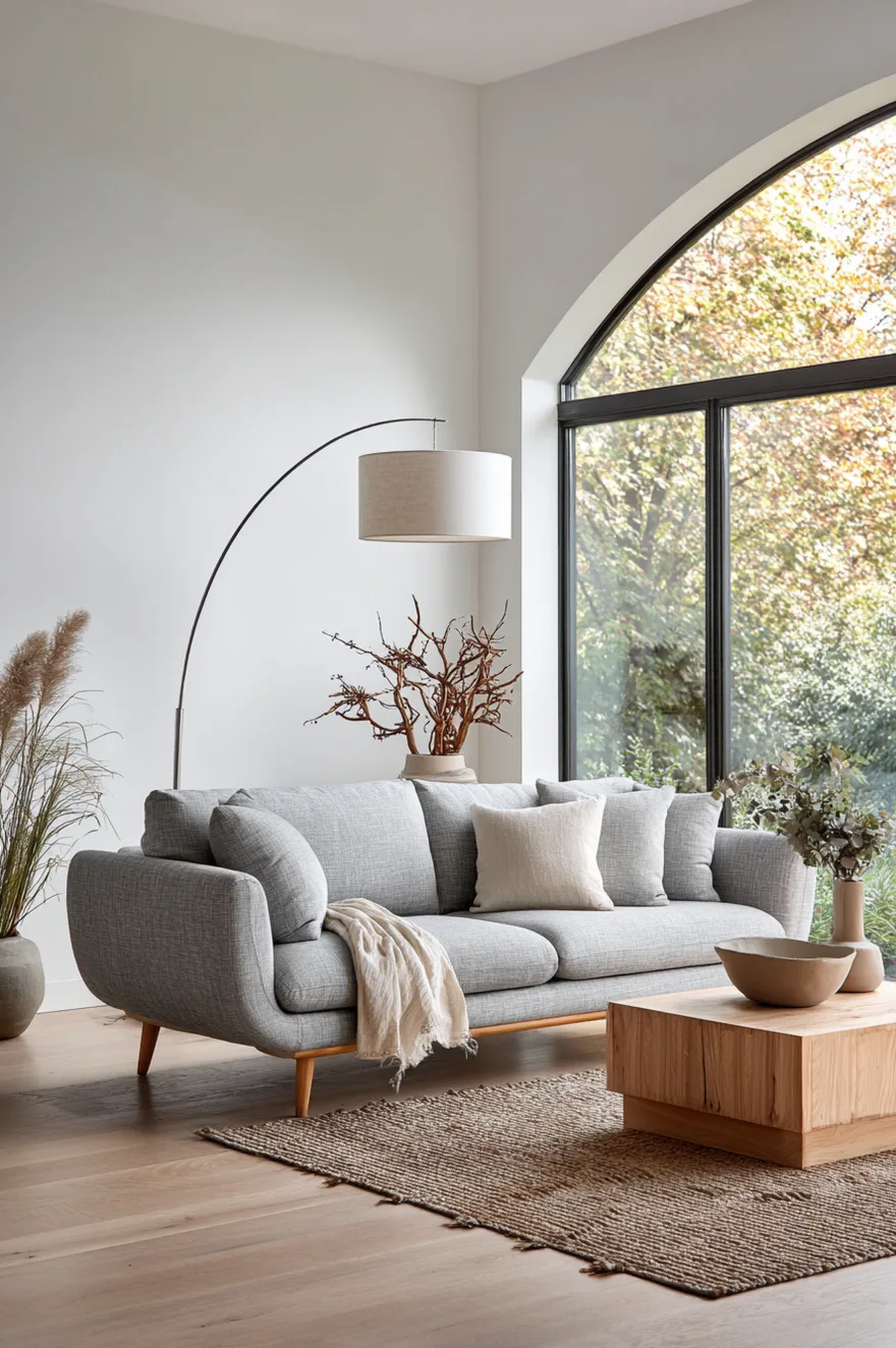
The furniture sits lower and lighter.
I’ve measured this in dozens of projects. Standard American sofas sit 18-19 inches off the floor. Scandinavian-style sofas typically sit 14-16 inches, with thinner arms and exposed legs (usually tapered wood). The lower profile and visible floor space underneath make the room feel more open – not dramatically, but noticeably.
Same principle applies to coffee tables, media consoles, and dining chairs. When you can see under and through furniture, the room reads as larger. This is particularly effective in small living rooms where every visual trick matters.
The trade-off: lower seating can be harder to get out of for older adults or people with mobility issues. Function first, always.
The Kitchen Practicality Test
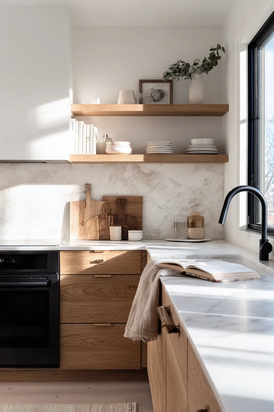
Scandinavian interior kitchens get praised for being beautiful. What gets discussed less: they’re designed for actual cooking.
Open shelving – the Instagram darling – appears in Nordic kitchens, but sparingly. Most storage is closed, handleless cabinetry in matte white or light wood. Counters stay clear because there are dedicated spots for everything: a pull-out cutting board drawer, a utensil rail, appliance garages.
I installed a Scandinavian-style kitchen in Oak Park last year. White oak uppers with integrated handles (the top edge routes out so you can grip from underneath), Carrara marble counters, a single open shelf for daily dishes, everything else concealed. The client cooks six nights a week. The kitchen still looks magazine-ready because clutter has nowhere to accumulate.
If a Scandinavian kitchen only works when it’s empty, it’s not actually Scandinavian. Functionality is the entire foundation.
Material Honesty Over Imitation
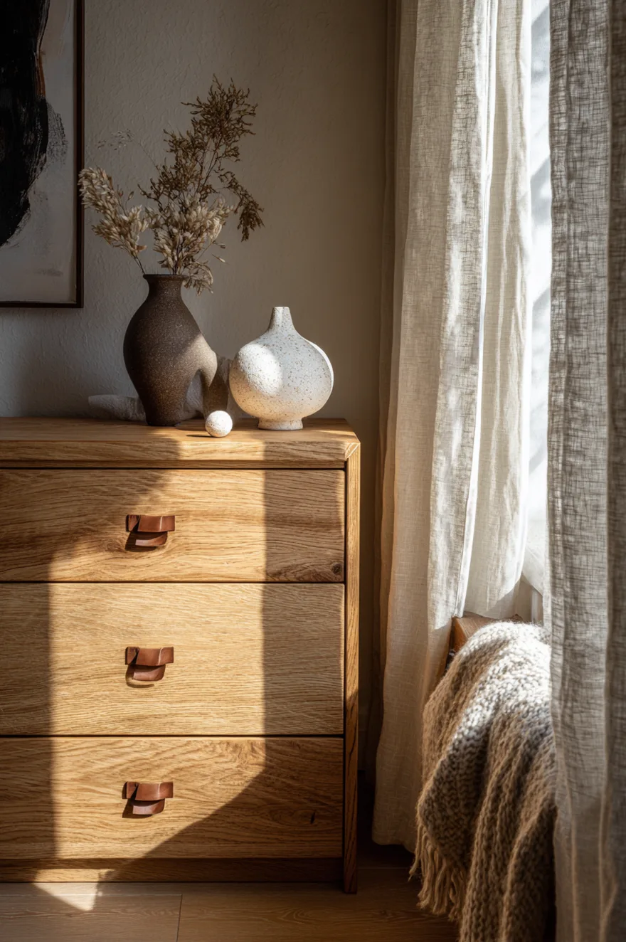
Real materials age better than fake ones.
Scandinavian design has a strong preference for solid wood, natural stone, linen, wool, leather – materials that develop patina rather than deteriorate. This is partly aesthetic (the Scandinavian appreciation for wabi-sabi), partly practical (quality materials last longer in harsh climates), and partly philosophical (honesty as a design value).
In practice: white oak floors instead of oak-look laminate. Carrara marble instead of quartz that imitates marble. Linen curtains instead of polyester that mimics linen. The initial cost is higher. The ten-year cost is often lower, and the room ages infinitely better.
Contemporary Doesn’t Mean Cold
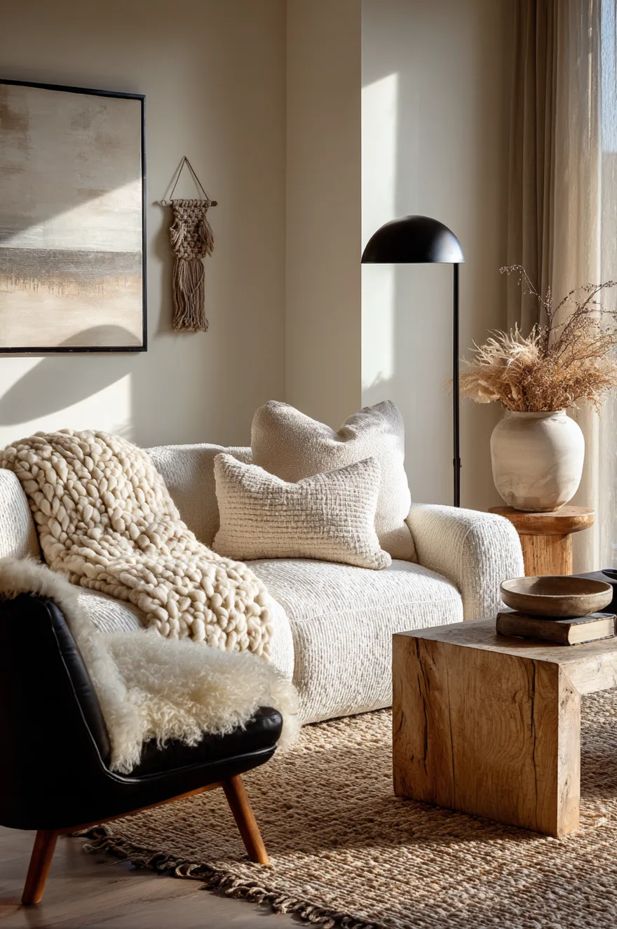
The most common complaint about Scandinavian interior modern spaces: they feel sterile.
This happens when people confuse minimal with cold. A contemporary Scandinavian living room should have fewer items than a traditional room, yes – but each item needs to carry more sensory weight. Texture becomes critical.
Layer it deliberately: a nubby linen sofa, a chunky knit throw, a jute rug with visible weave, raw ceramic vessels, a sheepskin draped over a chair. The color palette might be neutral, but the tactile variety prevents the space from reading as flat or unwelcoming.
I have a simple test: if you walked into the room blindfolded and touched five surfaces, would they all feel different? If yes, the room will read as warm regardless of color. If no, add texture.
Dark Woods Change the Equation
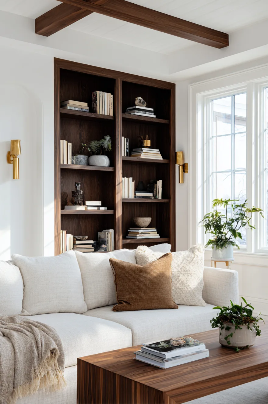
Most people assume Scandinavian means light wood. Sweden and Denmark would agree. Norway less so.
Norwegian interiors – particularly mountain cabins and coastal homes – frequently use darker, richer woods: stained pine, oiled walnut, even ebonized oak. These create a different kind of coziness – more enveloping, less airy. Combined with white walls and good lighting, dark wood reads as grounding rather than oppressive.
I used this approach in a North Shore living room last winter. Walnut built-in shelving on one wall, everything else white (walls, ceiling, sofa), brass sconces for warmth. The dark wood became an anchor – the room felt intentional and slightly dramatic without tipping into moody.
Works best in rooms with excellent natural light. In a dim space, stick with lighter woods.
Bedroom Proportion Matters More Than Furniture Count
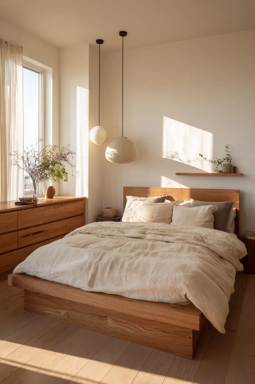
Small Scandinavian bedrooms work because they respect scale.
A queen bed in a 10×12 room is fine if everything else is proportionally restrained: a wall-mounted nightstand instead of a bulky table, a narrow dresser instead of a wide one, a single pendant instead of two table lamps. The bed can dominate – that’s its function – but supporting furniture needs to be edited down to minimum footprint.
I see this done badly constantly: people buy a beautiful Scandinavian-style bed, then surround it with oversized American nightstands, a massive dresser, and two armchairs because the room “needs seating.” The bed becomes crowded rather than showcased.
Less furniture, better scaled. That’s the formula.
The Hygge Myth
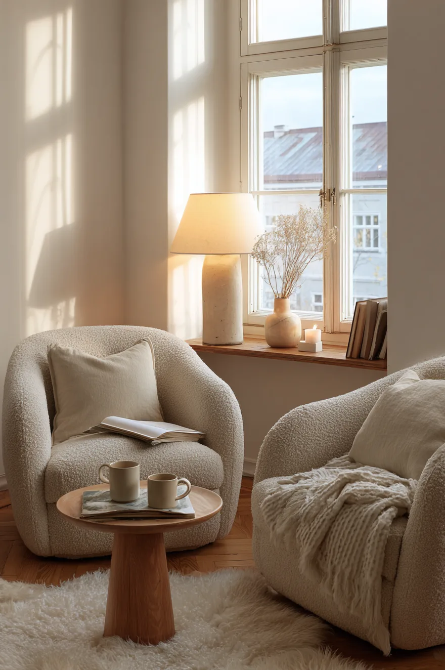
Hygge – the Danish concept of coziness – has been commodified into candles and chunky knit blankets. The actual concept is more interesting and harder to sell.
Hygge is about creating moments of comfort and connection in the context of long, dark winters. It’s sitting with people you care about, warm light, simple food, being present. The design supports this – soft seating, warm lighting, spaces configured for conversation – but buying the aesthetic markers doesn’t create the experience.
A cozy Scandinavian living room needs: comfortable seating arranged to encourage conversation (not all facing a TV), lighting you can dim to create intimacy, surfaces for setting down a mug or glass, and warmth (literally – Scandinavians are not cold-weather stoics, they heat their homes thoroughly).
You can’t buy hygge. You can design for it.
White Oak Is Not Interchangeable
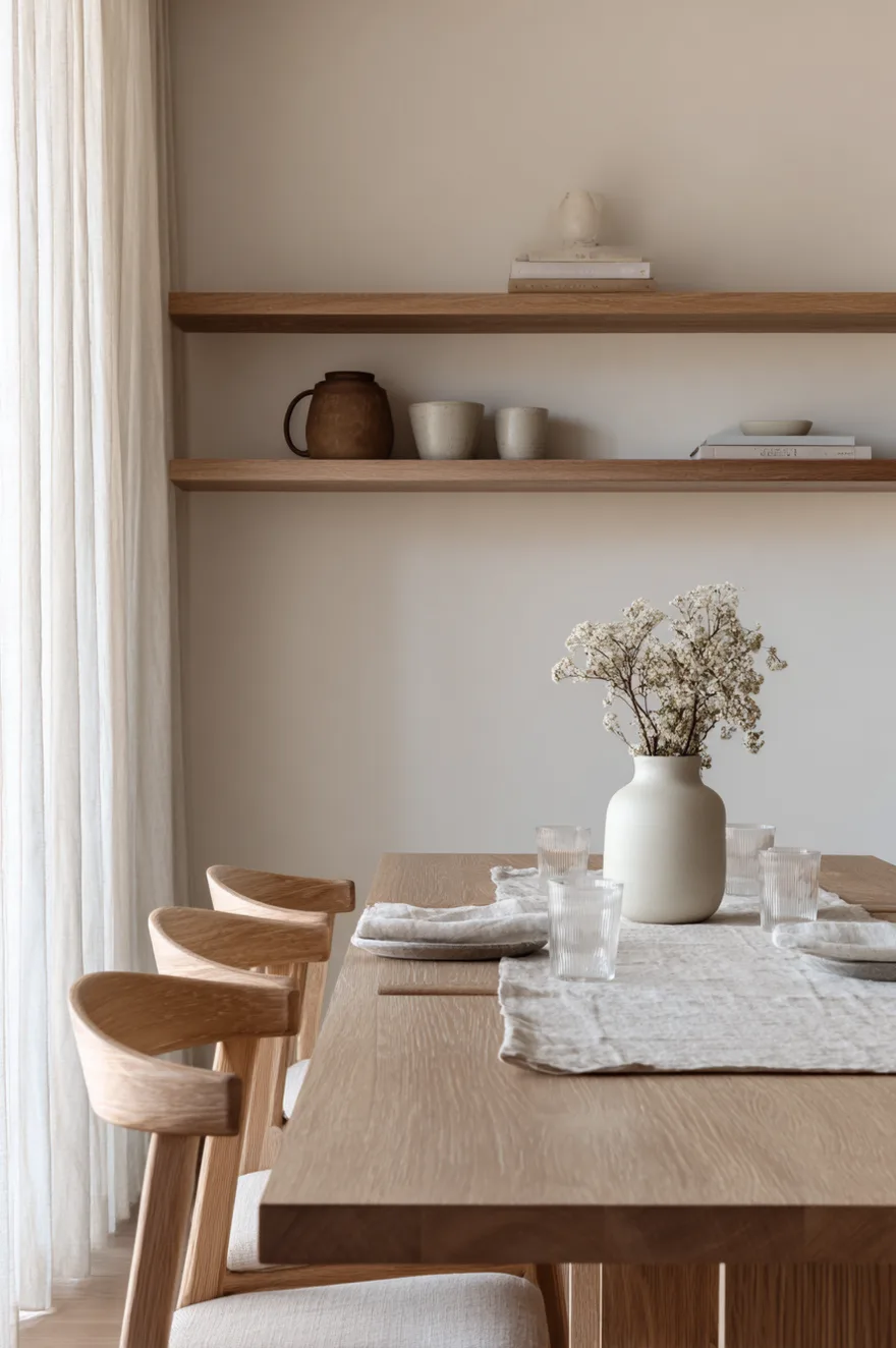
The wood species matters more than most people realize.
White oak has become the default “Scandinavian wood,” but it’s not the only option and it behaves differently than red oak, maple, or walnut. White oak has tighter grain, better water resistance, and a cooler undertone. It reads as more contemporary than red oak (which skews warmer and more traditional) and more casual than walnut (which reads formal even in simple forms).
For Scandinavian interiors specifically: white oak works in any room, any application. Walnut works for accent pieces and darker moods. Birch (more common in actual Scandinavia) is lighter and more affordable but harder to source in the US. Avoid cherry and mahogany entirely – wrong visual language.
If you’re choosing flooring, white oak with a clear matte finish or light natural oil. Skip the orange-toned stains.
Why Scandinavian Bathrooms Feel Spa-Like
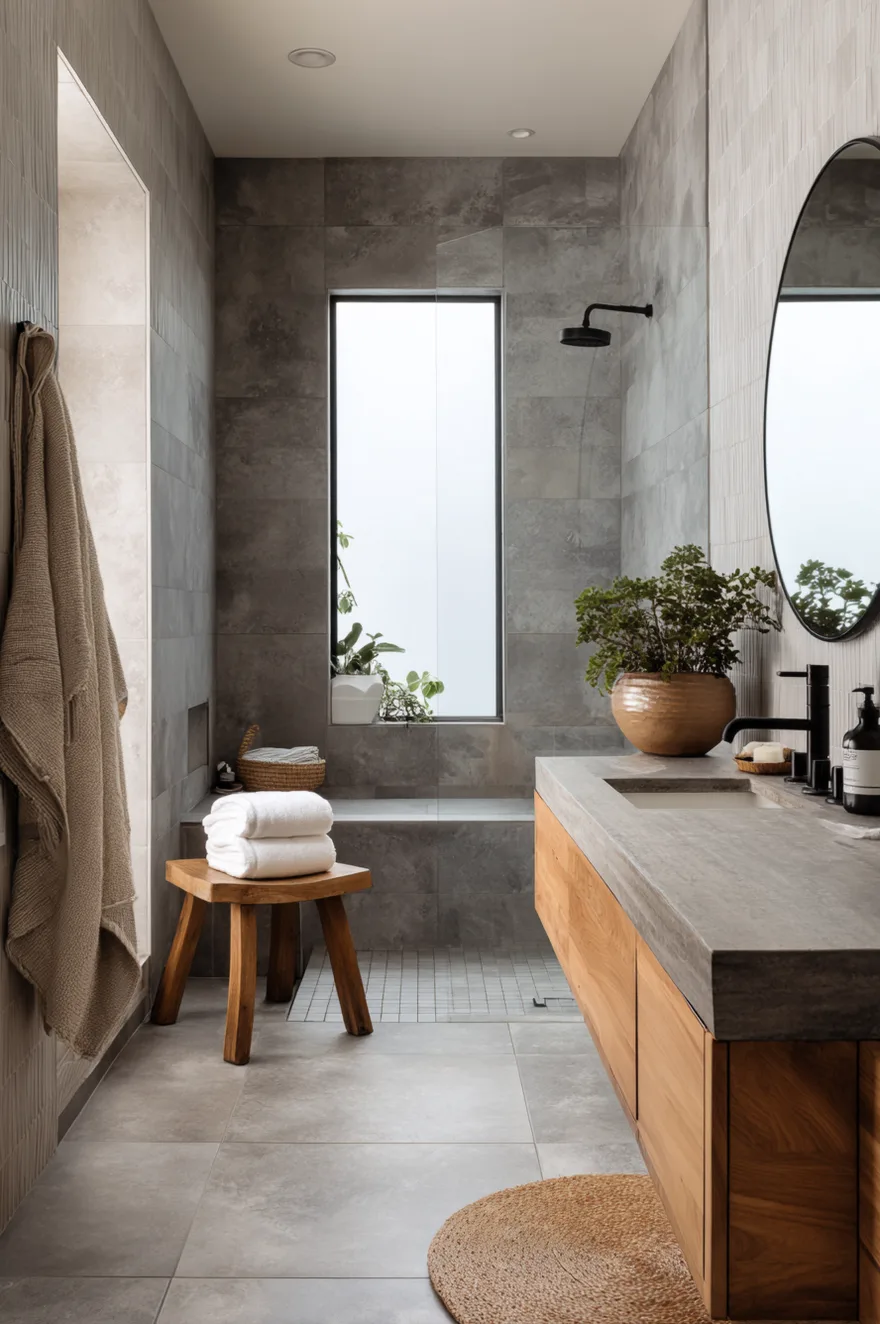
It’s the material continuity, not the size.
Most Scandinavian-style bathrooms use the same material on floors and walls – large-format tile in a single neutral tone, or sometimes whitewashed wood planking. This eliminates visual breaks. Your eye reads the room as one continuous surface, which makes it feel larger and calmer.
Contrast this with typical American bathrooms: different floor tile, different wall tile, possibly a third material on the shower walls, busy grout lines everywhere. Each transition fragments the space.
I renovated a tiny Chicago bathroom last year – 5×8 feet – using 24×24 inch limestone-look porcelain on floors, walls, and shower surround. Same tile, same grout color, everything else white (vanity, fixtures, towels). The room felt twice its actual size because there was nothing to interrupt the visual flow.
Add warmth through wood (vanity, shelving, stool) and brass or black fixtures.
Shelving as Architecture
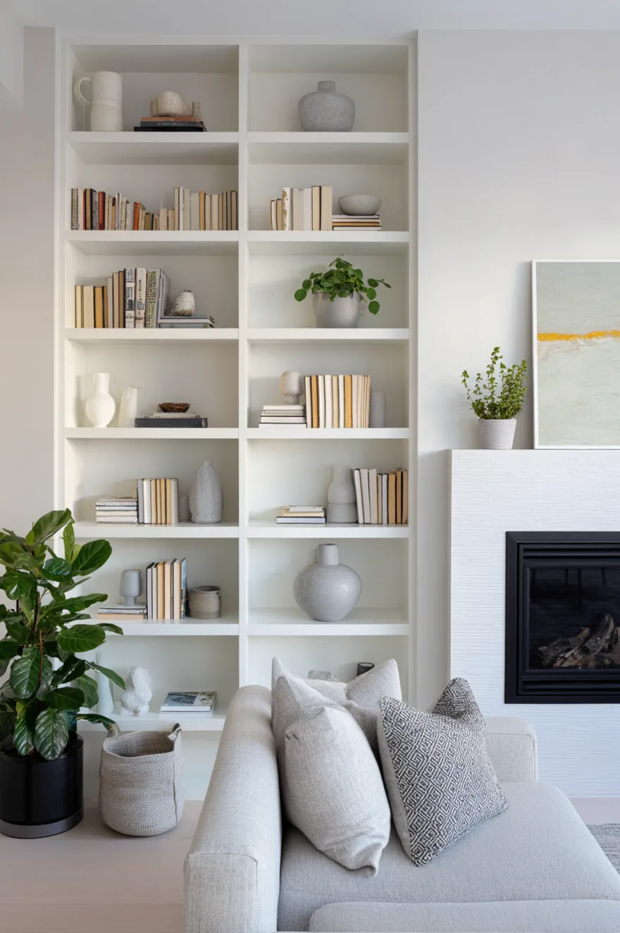
Built-in shelving in Scandinavian interiors is structural, not decorative.
Floor-to-ceiling shelving – particularly flanking a fireplace or along an empty wall – becomes part of the room’s architecture. It should match the trim (usually white or light wood), sit flush with the wall, and have consistent spacing between shelves.
The content matters as much as the structure. Scandinavian shelf styling is restrained: books organized by size and color, a few ceramic or glass objects, one small plant per section, empty space. American tendency is to fill every shelf. Nordic tendency is to leave some shelves nearly empty – the negative space is part of the composition.
I built a white oak shelving wall in a client’s living room two months ago. We discussed what would go on it before I designed the shelf spacing. Her book collection dictated the layout, not arbitrary aesthetics. That’s the Scandinavian approach – form follows function, even in details.
The Japandi Misconception
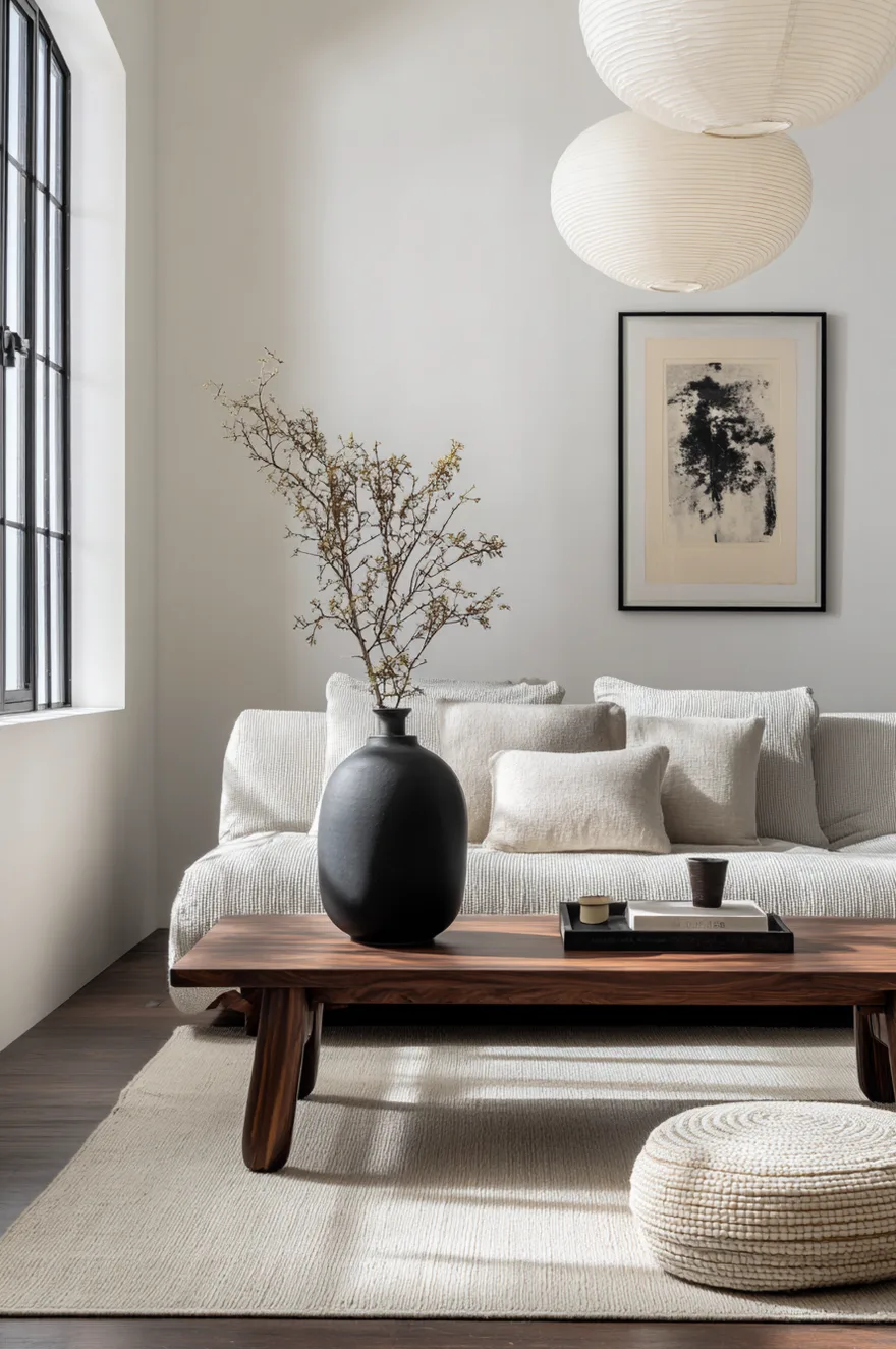
Japandi – the fusion of Japanese and Scandinavian design – has become shorthand for “minimal and beige.” That completely misses what makes the hybrid work.
Both traditions prioritize function and restraint, yes. But Japanese design tends toward darker woods (walnut, ebonized oak), lower furniture, and more deliberate asymmetry. Scandinavian design skews lighter (white oak, birch), higher seating for practicality, and cleaner geometry. The tension between these approaches is what creates interest.
A successful Japandi living room might pair a low Japanese-style walnut coffee table with a higher Scandinavian linen sofa. Dark wood against light fabric. Different design languages that share a philosophy: only what’s necessary, but make it beautiful.
When Japandi spaces feel generic, it’s usually because they’ve smoothed out all the contradictions. The whole point is the productive friction between two aesthetics.
Moody Scandinavian Bathrooms Work
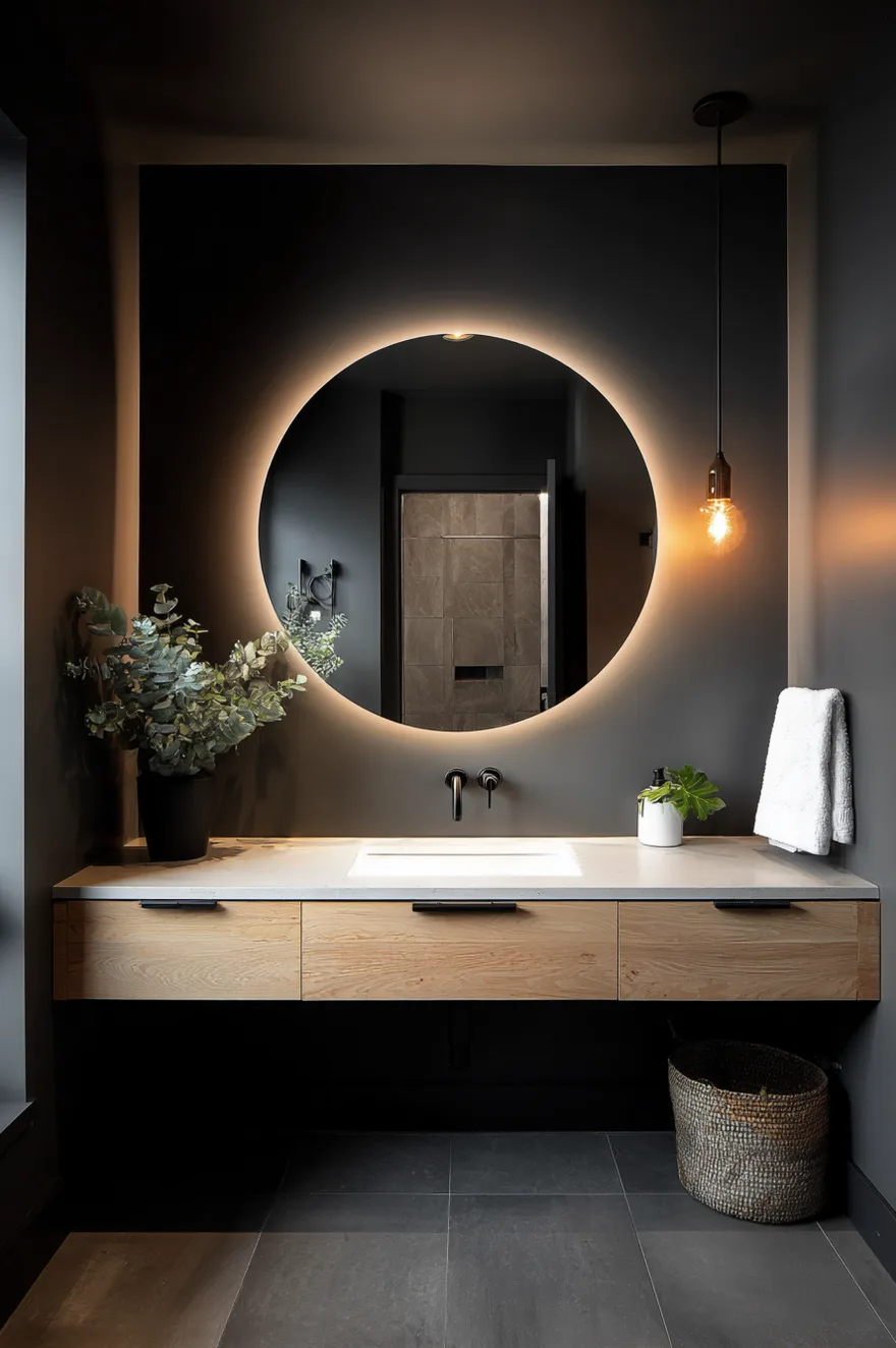
Dark Scandinavian bathrooms are having a moment, and unlike most trends, this one has staying power.
The logic is sound: bathrooms are small, often windowless, and used primarily in early morning or evening when artificial light dominates anyway. A dark bathroom – charcoal tiles, matte black fixtures, deep green walls – can feel more spa-like and intentional than the bright white alternative everyone defaults to.
I designed a moody Scandinavian bathroom last fall for a client in Lincoln Park. Walls in Farrow & Ball Railings (a soft charcoal), white oak floating vanity, brass hardware, one large mirror with integrated LED backlighting. The darkness made the warm light more dramatic, not less. The room felt like a place to linger, not rush through.
Key: you need excellent task lighting. Under-cabinet LED strips for the vanity, a well-placed sconce, dimmable controls. Moody only works if the lighting is sophisticated.
Color Happens in Textiles
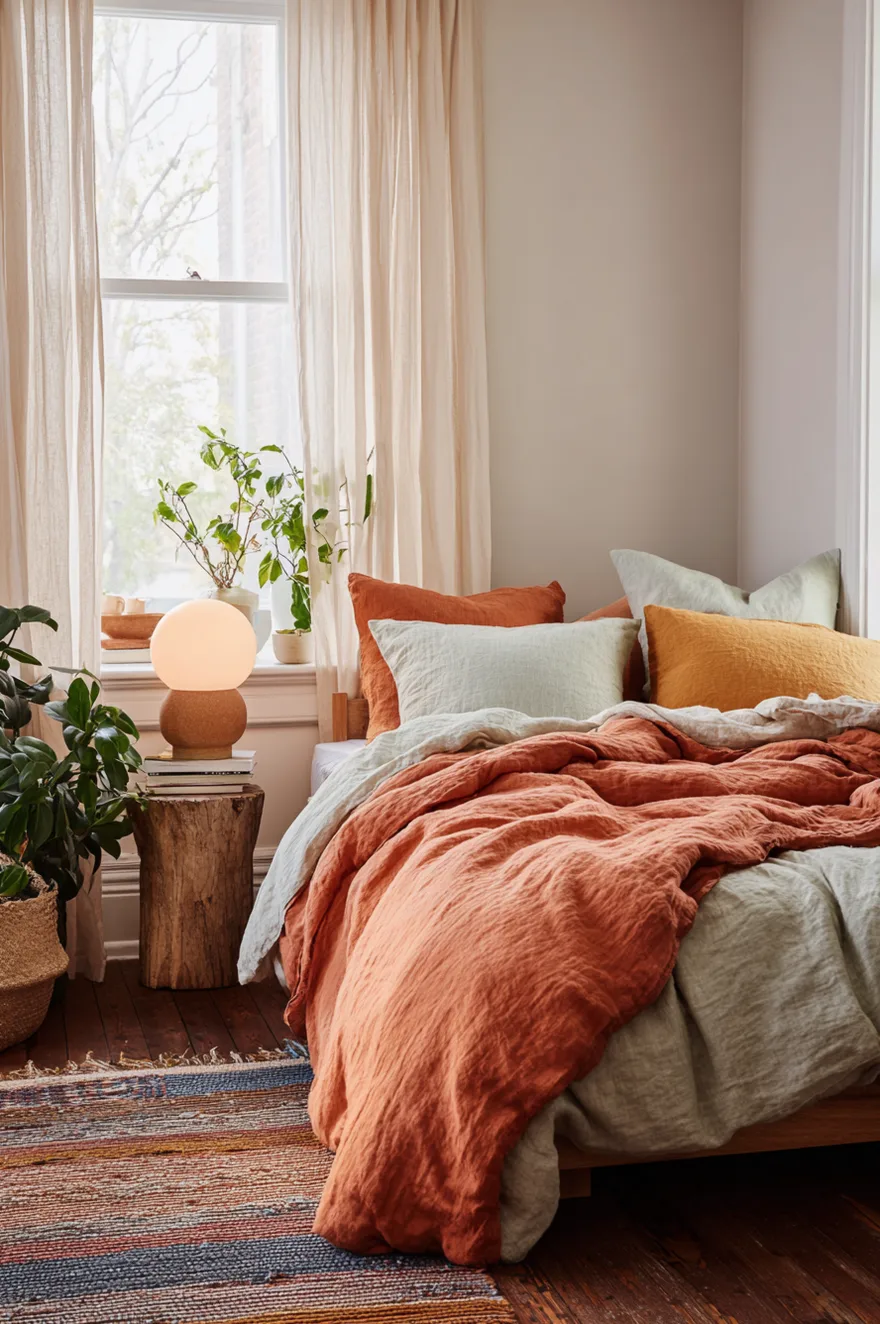
Colorful Scandinavian interiors don’t rely on painted walls or bold furniture. They layer color through textiles – throws, pillows, rugs, curtains. This approach keeps the space adaptable.
A client wanted a colorful bedroom but worried about commitment. We kept walls in Benjamin Moore Swiss Coffee, bed frame in natural oak, and brought in color through a rust-colored linen duvet, sage green throw pillows, a vintage Swedish rag rug in muted reds and blues. The room felt warm and personal without locking her into permanent decisions.
Scandinavian color tends toward nature-based tones: terracotta, ochre, deep green, slate blue, rust. These colors don’t fight with the wood tones that dominate Nordic interiors. They also photograph as warm neutrals, which matters if you’re worried about a room dating quickly.
Pendant Lights Define Zones
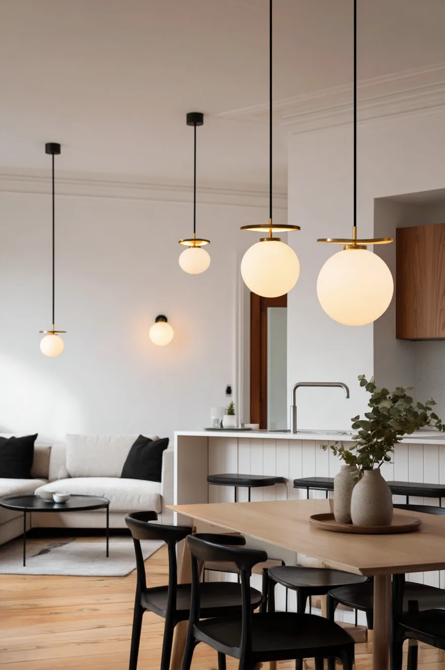
In open-plan Scandinavian interiors, pendant lights mark territory.
A pendant over the dining table says “this is the eating zone” without needing a wall or rug. A pendant over a kitchen island defines the prep area. A pendant in a reading corner establishes that spot as intentional, not leftover space.
The pendants themselves tend toward simplicity: blown glass globes, paper lanterns, brass or black metal with clean geometry, woven natural fiber. Nothing ornate. The goal is soft, diffused light that creates a visual anchor without dominating.
I use this constantly in studio apartments and loft conversions where walls aren’t an option. Three well-placed pendants at different heights can define sleeping, dining, and living zones more effectively than furniture arrangement alone.
Not Everything Needs to Be New
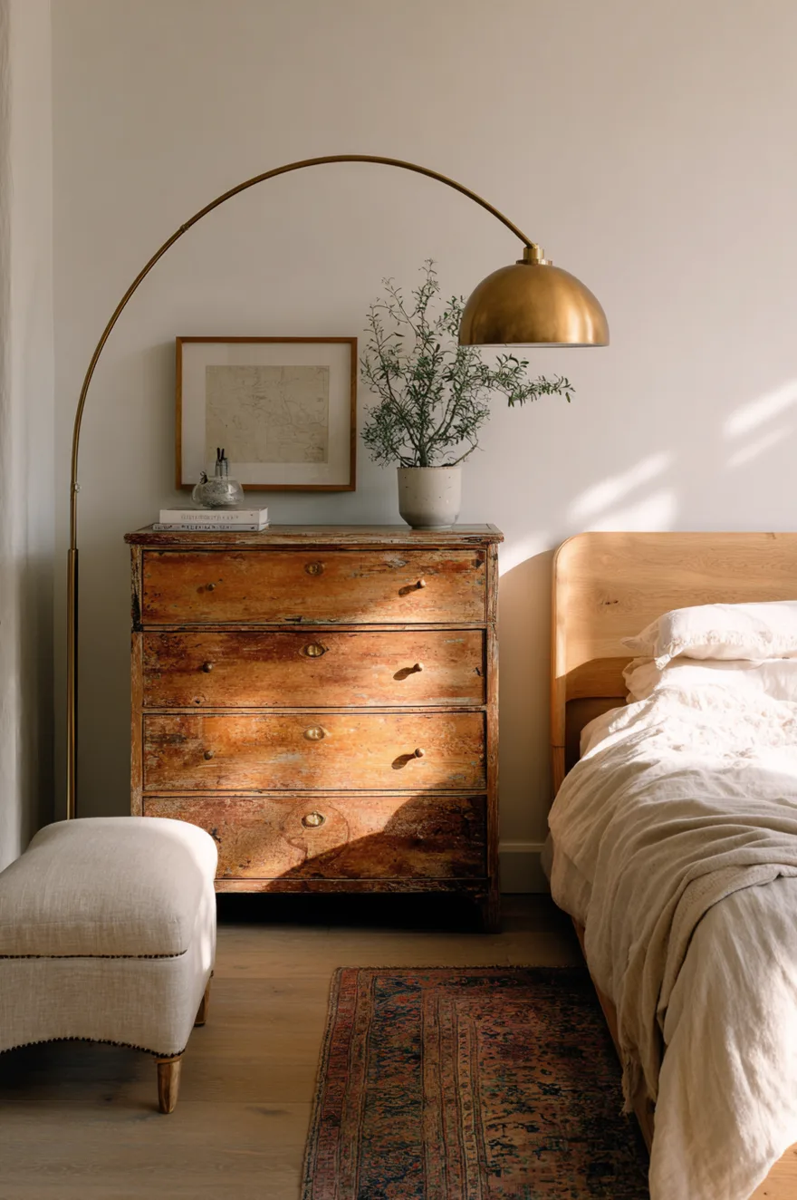
Scandinavian design has a complicated relationship with vintage.
Mid-century modern Scandinavian furniture – Wegner chairs, Eames pieces, vintage teak credenzas – commands high prices specifically because those designers perfected the principles we’re still copying. If you can afford or find authentic pieces, they work seamlessly in contemporary Scandinavian interiors. The design language hasn’t fundamentally changed.
But here’s the less obvious move: thrifted or inherited furniture that isn’t specifically Scandinavian can work if it meets the basic criteria. Simple lines, natural materials, functional form, quality construction. A 1940s oak dresser with clean lines fits better than a brand-new piece with unnecessary ornamentation.
I furnished a client’s bedroom mostly with estate sale finds – a 1950s birch dresser, a simple brass floor lamp from the 70s, a linen-upholstered bench of unknown origin. Total cost under $600. The room felt collected and intentional, not styled from a catalog.
The Real Scandinavian Palette
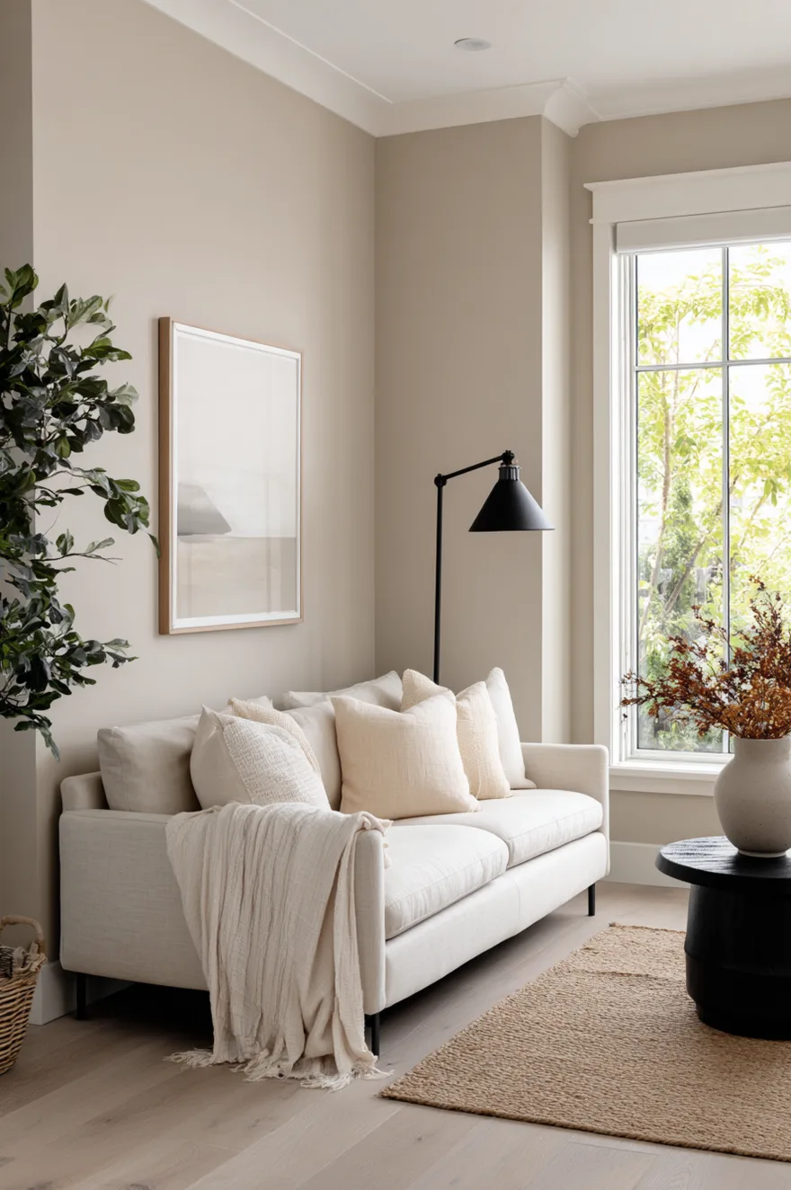
It’s not just white and gray.
Actual Scandinavian interiors use: soft warm whites (Swiss Coffee, White Dove, Pointing), pale grays with warm undertones (Revere Pewter, Agreeable Gray), muted greens (Swedish Green, Vert de Terre), dusty blues (Borrowed Light, Teresa’s Green), ochres and terracottas for accents. These are nature-based colors that shift with light quality throughout the day.
The whites have cream or gray underneath – never stark builder white. The grays lean beige rather than cool blue-gray. Even the “colorful” choices are muted, never saturated.
I painted a client’s Scandinavian-style living room in Benjamin Moore Balboa Mist – a greige that reads warm gray in north light, soft beige in afternoon sun. Paired with white oak floors and cream linen upholstery. The room felt warm and neutral simultaneously, which is exactly the Scandinavian sweet spot.
Test paint in your actual light. Colors that look perfect in a store can read completely differently at home.
Kitchen Islands as Gathering Points
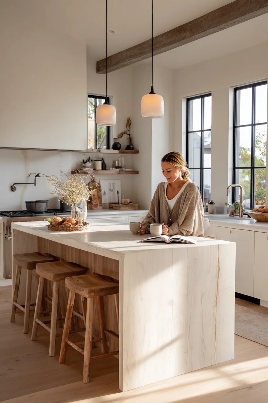
In Scandinavian kitchens, the island isn’t just prep space – it’s the social center.
This means designing for comfort: overhang deep enough for knees (12-15 inches minimum), stools with backs and footrests, task lighting that doesn’t glare, space for setting down a glass or plate. If people can’t comfortably sit at your island for twenty minutes, it’s failing its primary function.
Material choice matters here too. I prefer wood tops for islands – white oak, walnut, butcher block – because they’re warmer to rest your arms on than stone. If you want stone for durability, consider a honed finish rather than polished. Less cold to the touch.
The Scandinavian approach treats the kitchen island as dining alternative, workspace, and conversation spot – not just a place to chop vegetables.
Why Clutter Destroys the Look
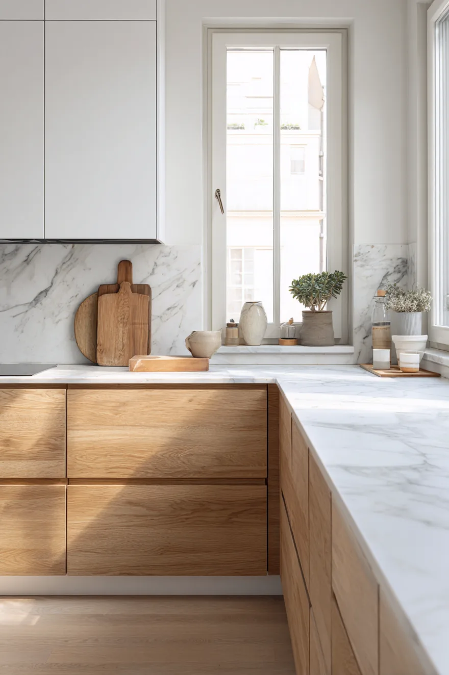
Scandinavian design has zero tolerance for visual noise.
This is the hardest part for most people. The aesthetic requires aggressive editing – not just when you style the room initially, but constantly. Mail piles up. Kids’ toys accumulate. Kitchen counters collect appliances. If these aren’t immediately dealt with, the carefully designed space devolves into generic clutter.
The solution isn’t rigid minimalism – it’s better systems. Closed storage for anything you don’t use daily. A mail sorting station hidden in a drawer. Toy baskets with lids. Appliance garages. Counter canisters only for items you actually use every day.
I tell every client: Scandinavian design is high-maintenance in terms of discipline, low-maintenance in terms of cleaning. Fewer surfaces to dust, but you have to stay on top of visual order.
If you’re not willing to put things away daily, choose a different design style.
Layer Rugs for Warmth
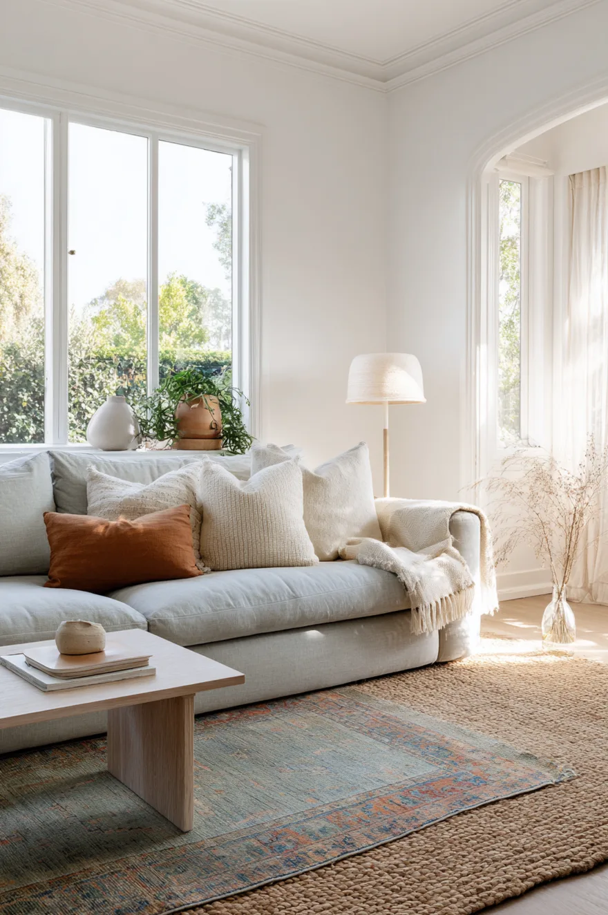
One rug is functional. Two rugs is Scandinavian.
The classic move: a large neutral jute or sisal rug as the base layer, a smaller vintage or patterned rug layered on top. This adds texture, defines seating areas within larger spaces, and introduces pattern without overwhelming the room.
I layered a 9×12 jute rug with a 5×7 vintage Turkish rug in faded blues and terracotta for a Lincoln Park living room. The jute grounded the space and added texture underfoot. The Turkish rug brought in the only pattern and color in the room. Together they created depth that a single rug couldn’t achieve.
Both rugs should have low pile – high-pile rugs layered together create a tripping hazard and look messy. The top rug can be rotated seasonally if you want to change the room’s feel without redecorating.
The Breakfast Nook Advantage

Built-in banquette seating is more Scandinavian than a traditional dining table.
Corner banquettes maximize space efficiency and create an intentionally cozy spot – exactly the hygge principle in action. Add storage underneath the seating, a simple wood table, a pendant light overhead, and you have a complete dining solution in half the footprint of a table with chairs.
I designed one for a Wicker Park kitchen renovation – an L-shaped banquette with cream linen cushions, white oak table, storage drawers under the bench. The clients use it for every meal and as a work-from-home desk. The space works harder than a traditional dining setup ever could.
Cushions are essential – built-in seating without padding feels institutional. Linen or wool in neutral tones, removable covers for washing.
The through line here is restraint paired with warmth – not restraint for its own sake. Every effective Scandinavian interior I’ve designed started with understanding the room’s natural light, then building a material and color palette that enhanced rather than fought it.
Start there. The furniture and styling follow.
See you soon,
Rachel