Mid-century modern living rooms feel dated when you copy the look without understanding the design principles. These mid-century modern living room ideas for 2026 show you how to use authentic vintage furniture, warm wood tones, geometric patterns, and the right color palette to create spaces that feel genuinely retro without looking like a museum. Keep these mid-century modern decor ideas for your next refresh.
Shift In How People Approach Mid-Century Modern
Lately I’ve seen a lot of mid-century modern living rooms that look like they’re trying too hard – Eames knockoffs lined up like a showroom, every piece screaming “1960s,” colors and materials that feel more like costume than design. The rooms look correct on paper but uncomfortable in practice, like someone studied a checklist instead of understanding why mid-century modern worked in the first place.
Real mid-century modern design wasn’t about collecting vintage pieces or hitting a certain aesthetic – it was a response to how people actually lived in the postwar era. Smaller homes, open floor plans, a desire for furniture that was functional and beautiful without being fussy. The designers – Eames, Wegner, Noguchi, Saarinen – were solving problems, not creating a style to be copied 60 years later.
The best mid-century modern living rooms I see now understand this. They use the principles – clean lines, organic forms, a mix of materials, warm wood against color – but they adapt them to how we actually live today. A vintage teak credenza holding a modern TV and router. A classic arc floor lamp next to a contemporary sofa. Geometric art from the 60s on a wall painted in a current neutral. The aesthetic is there, but it’s not performing.
I’m going to walk you through 19 mid-century modern living room ideas that focus on the elements that actually matter – furniture proportions, color relationships, how wood and fabric work together, lighting that creates the right atmosphere. These aren’t rules to follow rigidly. They’re principles you can adapt to your space, your budget, and your life.
Start With The Sofa And Lounge Chairs
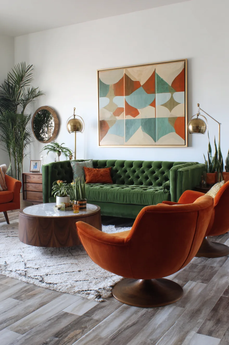
The seating arrangement defines everything else in a mid-century modern living room. A low-profile sofa with clean lines and exposed wood legs, paired with lounge chairs in complementary upholstery, creates the foundation that makes the rest of the design work.
I always start with a sofa that has the right proportions – lower to the ground than contemporary sectionals, with arms that are either minimal or absent entirely, and legs that are visible and usually tapered. The exposed leg detail is what makes mid-century seating look grounded rather than heavy. When the sofa sits on hidden legs or a solid base, it loses that characteristic lightness even if everything else about the design is period-correct.
Pair the sofa with lounge chairs rather than a matching loveseat. Two separate chairs create better conversation zones and give you more flexibility in arranging the room. Look for chairs with organic curves and wood frames – the classic mid-century lounge chair has arms that curve down into the legs in one continuous line. Upholster the chairs in a different color than the sofa but within the same warm palette. Olive green sofa with burnt orange chairs, or a neutral sofa with teal chairs – the contrast in color creates visual interest while the shared material (usually velvet or wool) keeps it cohesive.
Walnut And Teak Are Your Primary Woods
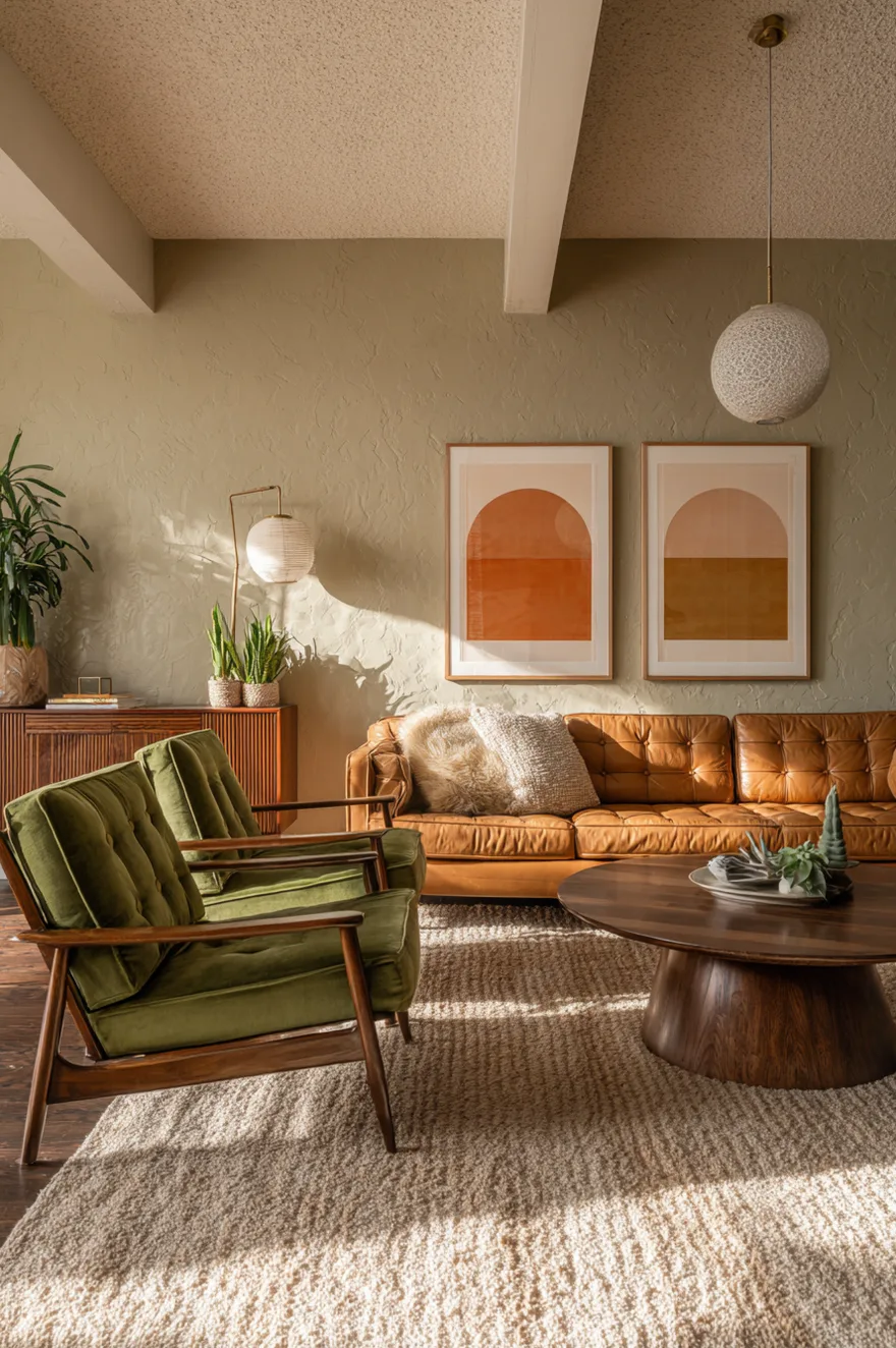
Mid-century modern furniture relies heavily on walnut and teak for a reason – both woods have warm reddish-brown tones that age well and pair beautifully with the era’s typical color palette of greens, oranges, and earth tones. Mixing wood tones haphazardly is one of the fastest ways to make a mid-century room feel disjointed.
Choose either walnut or teak as your primary wood and stick with it for the major pieces – coffee table, credenza, side tables, shelving. Walnut tends to be darker with more dramatic grain, while teak is lighter with a more uniform appearance. Both work, but consistency across pieces creates a sense of intentionality that makes the room feel designed rather than assembled.
The wood finish matters as much as the species. Mid-century modern furniture typically has a satin or matte finish rather than a high gloss. The wood should look natural and warm, not lacquered or overly polished. If you’re buying vintage pieces, look for furniture that still has its original finish or has been refinished to match period-appropriate sheens. Modern reproductions sometimes get this wrong with finishes that are either too matte (looking unfinished) or too shiny (looking like they belong in a different era).
Exposed Wood Ceilings Add Architectural Interest
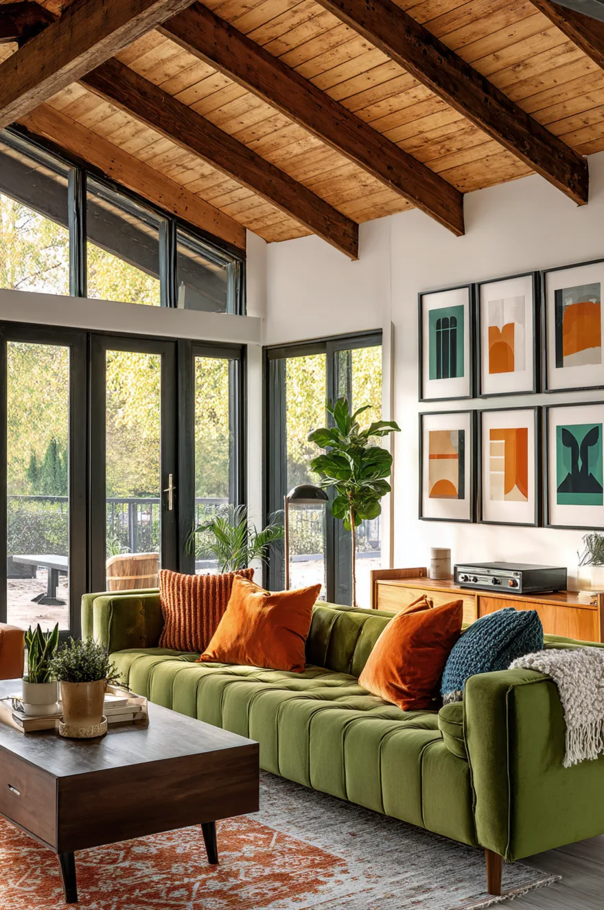
If your home has exposed wood ceiling beams or wood plank ceilings, emphasize them rather than covering them. The horizontal lines of wood planks or beams complement mid-century furniture’s horizontal emphasis and add warmth overhead that balances the visual weight of low-slung furniture below.
I worked on a mid-century renovation where the ceiling had been covered with drywall in the 80s, hiding original tongue-and-groove pine. Exposing that ceiling transformed the room – suddenly the space had architectural character that tied into the period of the furniture, and the wood tone overhead connected to the walnut credenza and coffee table below. The room felt cohesive in a way that painted drywall ceilings never achieve in mid-century spaces.
If your ceiling isn’t wood and you can’t change it, consider adding wood trim or beams. Even a single exposed beam running the length of the room can provide enough visual interest to tie into your furniture. Paint the ceiling a warm white or soft cream rather than stark white – mid-century interiors tend toward warmer neutrals that complement wood tones rather than cool whites that create harsh contrast.
Layer Multiple Light Sources At Different Heights
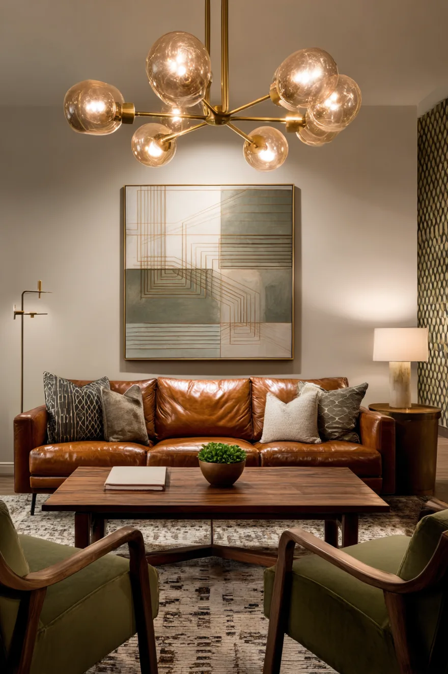
Mid-century modern lighting relies on variety – a combination of floor lamps, table lamps, and overhead fixtures that create pools of light at different levels rather than uniform illumination across the room. The classic arc floor lamp is iconic for a reason: it provides overhead light without requiring ceiling installation, and its sculptural form becomes a design element in itself.
Position an arc floor lamp so the shade hangs over the seating area, creating task lighting for reading while also serving as a focal point. The base should be heavy enough to counterbalance the extended arm – marble, concrete, or heavy metal bases work best. Pair the arc lamp with a table lamp on the credenza or side table. Mid-century table lamps tend to have ceramic or wood bases in organic shapes – bulbous, cylindrical, or geometric forms – with drum shades in white linen or off-white fabric.
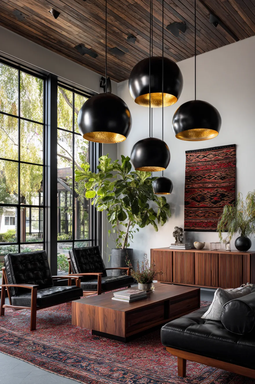
Add a statement chandelier if your ceiling height allows. The Sputnik chandelier is the most recognizable mid-century overhead fixture, but atomic-style chandeliers, globe clusters, or simple brass fixtures with multiple arms also work. The key is choosing a fixture that has visual interest and relates to the organic or geometric forms found elsewhere in the room. Overhead lighting in mid-century spaces should add to the design conversation, not just provide functional illumination.
Use Geometric Abstract Art In A Gallery Wall
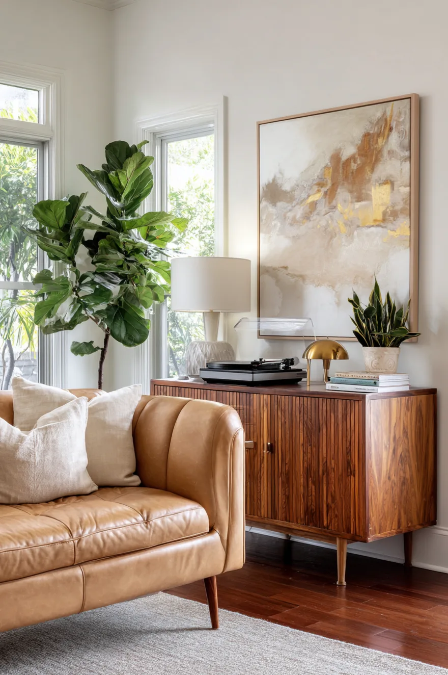
Mid-century modern art leans toward geometric abstraction, organic shapes, and bold graphic compositions in a limited color palette. A gallery wall of framed prints creates a focal point that reinforces the era’s aesthetic without requiring a single expensive original piece.
I typically arrange four to six prints in a grid or asymmetrical cluster. The frames should be consistent – usually thin wood frames in walnut or lighter wood tones, or simple black frames if you want more contrast. The art itself should share a color story with your furniture and textiles. If your sofa is olive green and your chairs are burnt orange, look for prints that incorporate those colors along with neutrals like cream, tan, black, or rust.
The subject matter can be purely abstract (circles, arches, geometric forms) or stylized natural forms (leaves, landscapes reduced to simple shapes). What matters is the composition – mid-century art tends to have strong graphic impact with clean edges and a sense of balance even when asymmetrical. Avoid busy patterns or photorealistic images, which read as too contemporary or too traditional for the aesthetic you’re building.
Built-In Walnut Shelving For Books And Objects
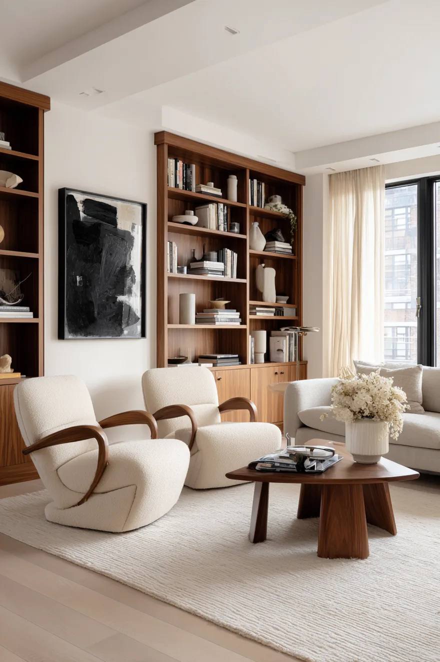
Floor-to-ceiling built-in shelving in walnut provides storage and display space while reinforcing the horizontal lines and warm wood tones that define mid-century interiors. The shelving becomes architectural – a permanent feature rather than furniture that could be moved.
Design the shelving with clean lines and minimal ornamentation. Shelves should be simple rectangles without decorative edges or brackets. If you’re adding doors to hide less attractive storage, use flat-panel or slatted wood doors that match the overall aesthetic. The spacing between shelves can vary to accommodate both books and larger objects, but keep the system feeling ordered and intentional rather than haphazard.
Style the shelves with a mix of books, ceramics, small plants, and sculptural objects. Avoid overcrowding – mid-century styling tends toward restraint, with each object given space to breathe. Group books horizontally and vertically in stacks of different heights. Place ceramics or brass objects at intervals that create visual rhythm. A small potted plant on every third shelf adds life without overwhelming the composition. The goal is a curated look that suggests thoughtful selection rather than accumulated clutter.
The Right Rug Anchors The Furniture Layout
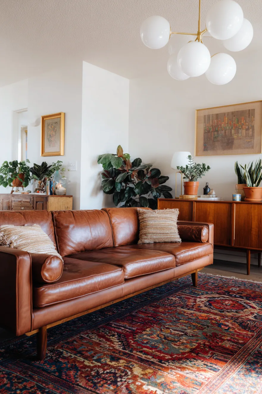
A vintage or vintage-inspired area rug grounds the seating arrangement and introduces pattern and color in a way that complements rather than competes with the furniture. The rug should be large enough that all front legs of the sofa and chairs sit on it – this creates a cohesive seating zone and makes the furniture feel intentionally arranged rather than floating in space.
Look for rugs with geometric patterns, abstract designs, or traditional Persian and Turkish rugs in saturated colors. Vintage Persian rugs pair unexpectedly well with mid-century furniture because they share a focus on rich color and geometric pattern. A rug in rust, navy, cream, and coral can tie together a room with burnt orange chairs, a neutral sofa, and walnut furniture by picking up tones from each element.
Alternatively, a textured solid rug in jute, sisal, or low-pile wool provides a neutral base that lets the furniture and art take center stage. This approach works well in rooms where you’ve already introduced significant pattern through pillows, curtains, or art, and you need the floor to provide visual calm. The texture of natural fiber rugs adds interest without competing for attention, and the neutral tone works with any color palette.
Create A Media Console Display That Balances Function And Style
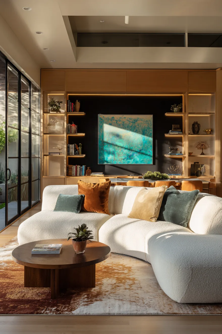
The credenza or media console is where mid-century modern living rooms often succeed or fail. Done well, it provides necessary storage for media equipment while serving as a styled surface for objects and plants. Done poorly, it becomes a cluttered dumping ground for remotes, cables, and random items.
Choose a credenza with sliding doors or hinged doors that can hide your TV components, router, and other necessary-but-unattractive equipment. The doors should close completely – avoid open shelving for media storage unless you’re committed to keeping cables meticulously organized. Walnut credenzas with tapered legs and minimal hardware are the most versatile and authentic to the period.
Style the top surface with restraint. A table lamp on one end provides task lighting and adds height. A small grouping of objects – a ceramic vase, a brass sculpture, a small plant – on the other end balances the lamp without cluttering the surface. Leave the center relatively clear, especially if you’re placing art above the credenza. The credenza’s horizontal line should feel intentional and calm, not busy or crowded.
Introduce Navy Or Teal As An Accent Color
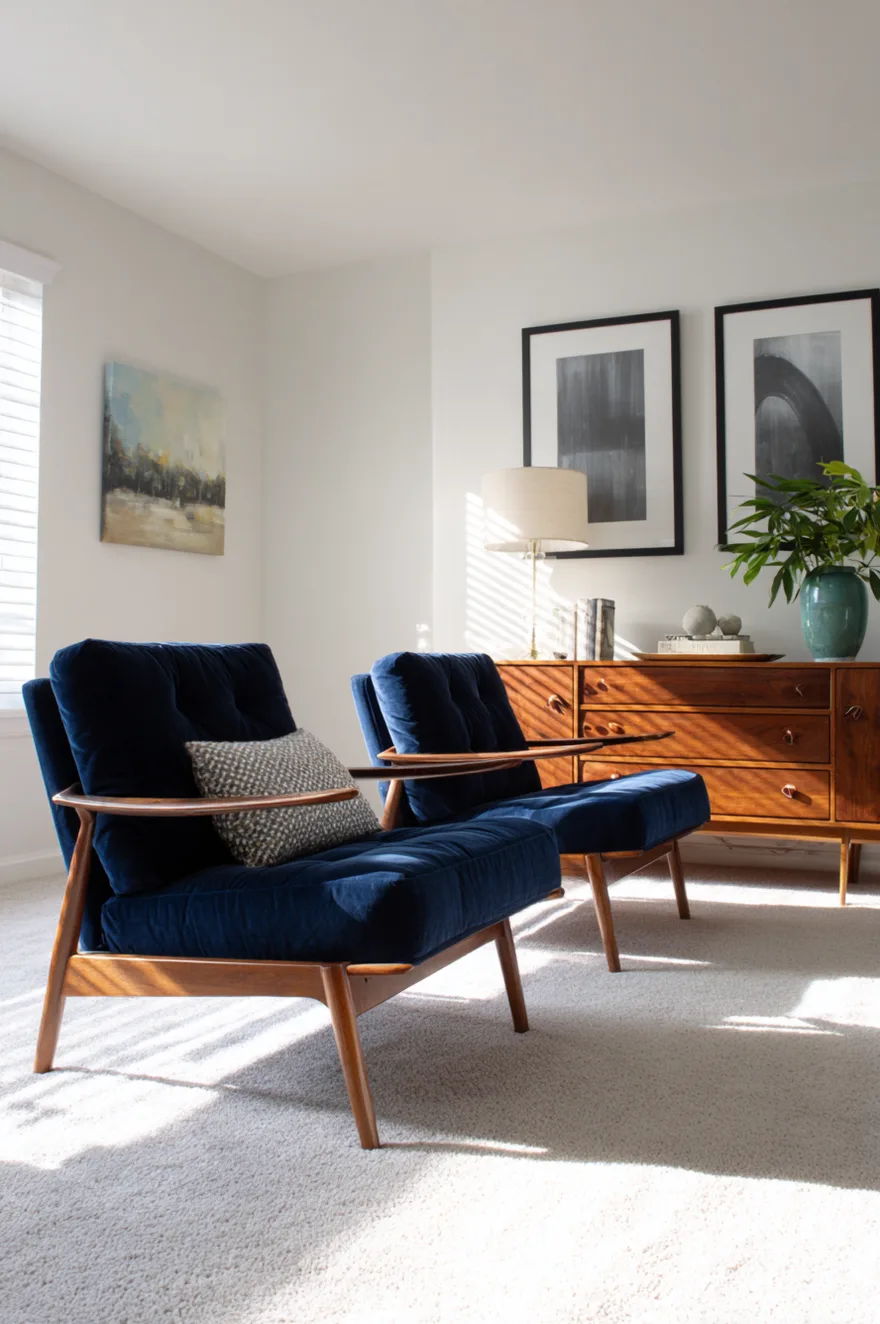
While olive green, burnt orange, and warm browns dominate mid-century color palettes, navy blue and teal provide contrast and depth without feeling out of period. These cooler tones balance the warmth of wood and earth tones while maintaining the saturated color approach that defines the era.
Use navy or teal in upholstery for accent chairs or as a secondary color in pillows and throws. A pair of navy velvet lounge chairs against a rust-colored sofa creates a sophisticated color relationship that feels more complex than the typical all-warm palette. Teal works similarly – it reads as sophisticated rather than playful, especially when used in rich materials like velvet or wool.
These colors also appear frequently in vintage rugs and art from the period, which makes them easy to incorporate authentically. A rug with navy, rust, and cream provides a foundation that ties together furniture in different tones. Art with teal geometric shapes connects to a teal pillow on the sofa and a teal ceramic vase on the credenza, creating visual rhythm across the room.
Window Treatments Should Filter Light Without Blocking It

Mid-century modern homes were designed to bring the outside in, with large windows and sliding glass doors that connected interior spaces to gardens and views. Window treatments should filter harsh light and provide privacy without sacrificing that connection to the outdoors.
Floor-length curtains in natural linen or lightweight cotton work well – they soften the hard edges of windows while maintaining an organic feel that suits the aesthetic. Hang them high and wide so they frame the window rather than cover it, and choose a neutral tone that blends with your walls. When open, the curtains should stack neatly to the sides, not block window area.
For windows where you need more light control, consider roller shades in natural materials like bamboo or woven wood. These provide privacy when down but roll up completely to disappear when you want full light. Avoid heavy drapes, valances, or fussy treatments – mid-century window design is about clean lines and function. The windows themselves are architectural features; your treatments should enhance them, not compete with them.
Coffee Tables With Lower Shelves Add Function
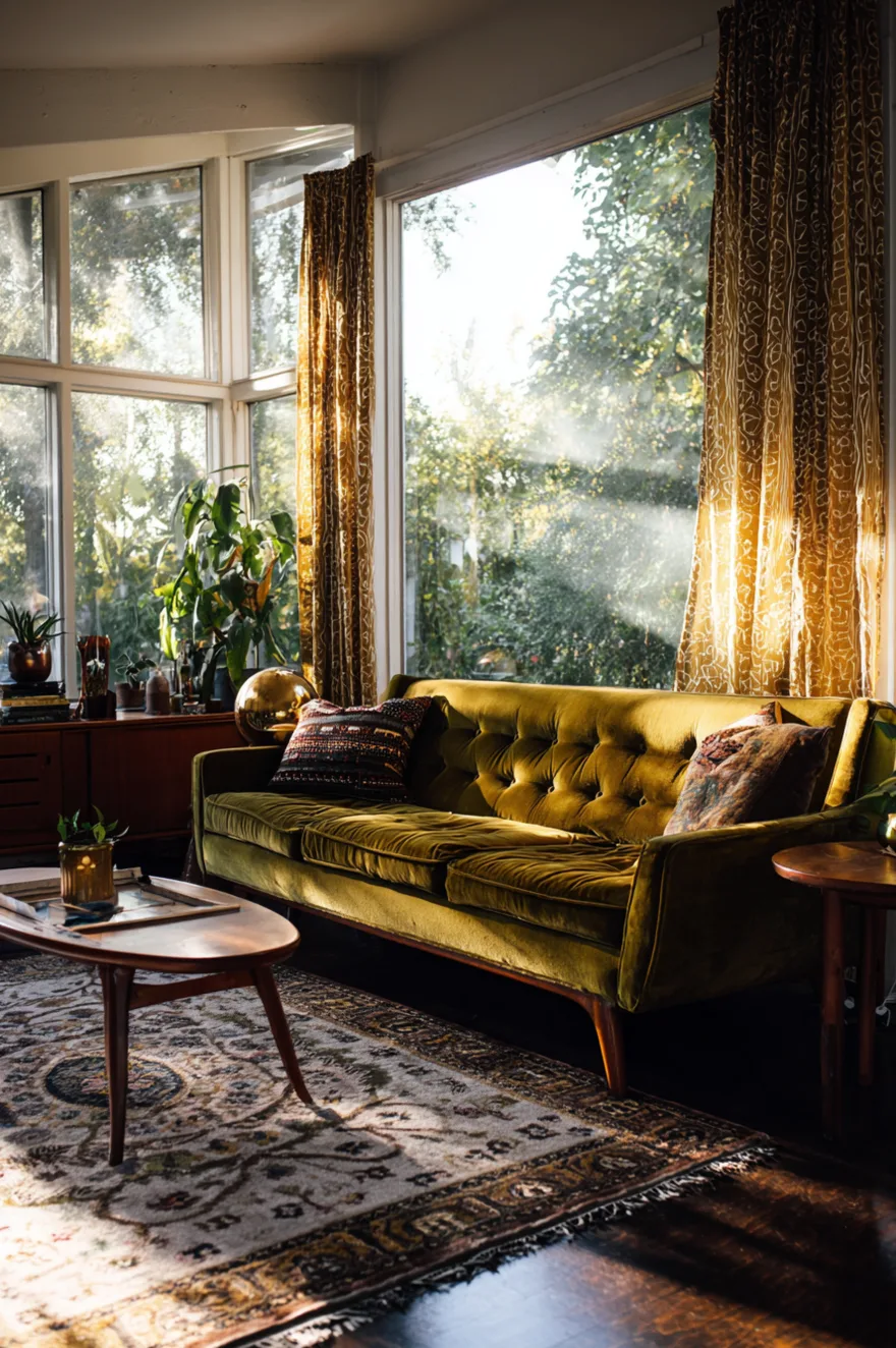
A coffee table with a lower shelf provides additional surface area for books, magazines, or decorative objects while maintaining the low horizontal profile that defines mid-century furniture. The lower shelf creates visual interest and functionality without adding height that would block sightlines across the room.
Look for coffee tables with tapered legs and a simple rectangular or oval top. The lower shelf should be open – either a solid surface or slatted – rather than enclosed storage. This openness keeps the table feeling light despite its two levels. Style the lower shelf with a neat stack of large-format books or a single sculptural object rather than using it as a catch-all for remotes and magazines.
The top surface should remain relatively clear. A small tray holding a candle and a ceramic object, or a low bowl with decorative balls or natural elements, provides enough interest without cluttering the surface. The coffee table is functional – people need to set down drinks and use the surface – so resist the urge to style it so heavily that it becomes unusable.
Gallery Walls Can Include Vintage Photography
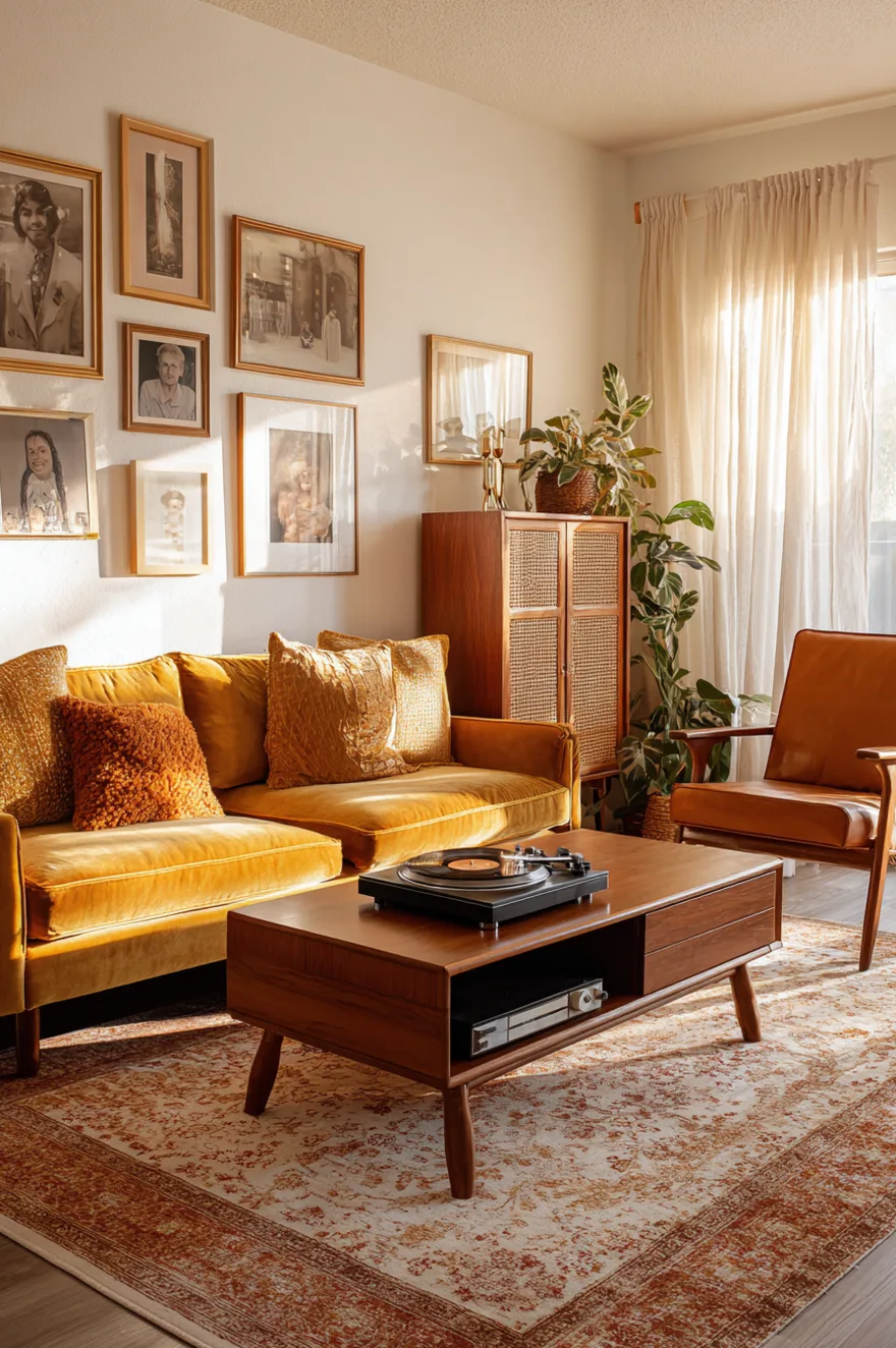
While geometric abstracts are the most common art choice for mid-century modern living rooms, vintage black-and-white photography or vintage portrait prints add another layer of authenticity. Mixed into a gallery wall with abstract prints, photography creates visual variety while staying within the period aesthetic.
Look for photographs with strong composition – architectural details, portraits with dramatic lighting, landscapes with graphic shapes. The content matters less than the quality of the image and how it relates to the other pieces in the arrangement. Frame photographs identically to each other but differently from the abstract prints – black frames for photos and wood frames for abstracts, for example – to create visual distinction while maintaining overall cohesion.
Arrange the gallery wall with intentional spacing between frames. Mid-century styling avoids the tightly packed salon-style arrangements popular in other eras. Leave several inches between each frame and arrange them in a loose grid or carefully considered asymmetrical layout. The negative space between frames is as important as the art itself.
Natural Materials Create Texture Without Pattern
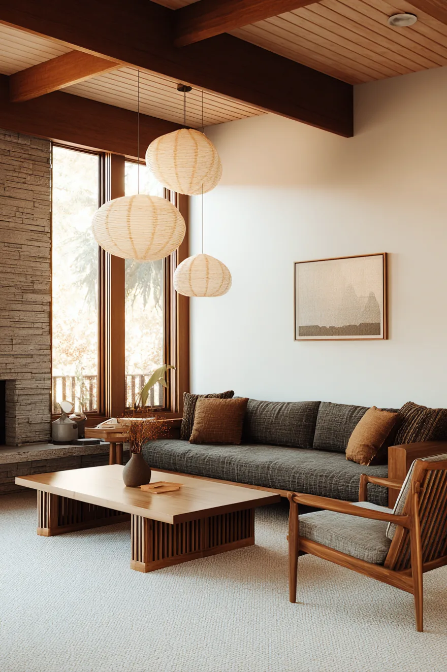
Incorporating natural materials – jute, sisal, leather, linen, wool, wood, ceramic, brass – adds textural variety that keeps a room from feeling flat or one-note. Even in rooms with minimal pattern, the interplay of different materials creates visual interest through texture rather than color or print.
A jute rug under a leather sofa, linen curtains at the windows, a ceramic vase on a walnut table, brass drawer pulls on the credenza – each material has its own quality of light reflection and surface interest. Jute is matte and nubby, leather develops patina and sheen, linen has subtle slubs, ceramic can be glossy or matte, brass develops warm tones as it ages. These variations in texture create depth that makes a room feel layered and considered.
This approach works especially well in rooms with limited color palettes. If your furniture is all in shades of brown, tan, and cream, the variety comes from material rather than color. Smooth leather against rough jute, polished brass against matte ceramic, glossy wood against nubby linen – these tactile contrasts create the same kind of interest that contrasting colors would in a more colorful room.
Add Live Plants For Organic Shapes And Life
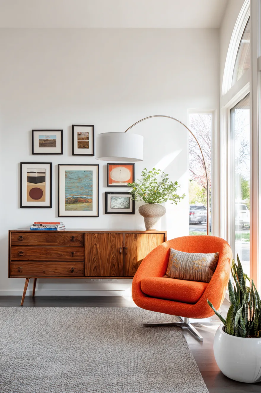
Large-scale plants bring organic forms into mid-century modern living rooms and connect the interior to the natural world in a way that suits the era’s emphasis on indoor-outdoor living. Fiddle leaf figs, rubber plants, and monstera were popular in the 60s and 70s and remain appropriate choices for mid-century-inspired spaces today.
Place a tall plant in a corner near the windows where it will get adequate light and fill vertical space that would otherwise be empty. The plant should be in scale with the furniture – a 6-foot fiddle leaf fig makes sense in a room with 8- or 9-foot ceilings, while a smaller rubber plant works better in rooms with lower ceilings or less floor space. Use simple planters in natural materials like ceramic, terracotta, or woven baskets rather than decorative pots that would compete with the plant’s form.
Add smaller plants on the credenza, coffee table, or shelving to create visual rhythm. These don’t need to be the same species as your larger plants, but they should have clean forms – a snake plant in a simple ceramic pot, a pothos in a brass planter, small succulents in minimal containers. The plants should feel like part of the design composition, not like afterthoughts or clutter.
Colorful Accent Chairs Provide Visual Punctuation
If your main seating is neutral – a tan leather or beige linen sofa – a single bold accent chair in saturated color provides visual interest without overwhelming the room. The accent chair becomes a focal point that draws the eye and creates a second conversation area or reading spot.
Choose a chair with a strong silhouette – the classic egg chair, a womb chair, or a sculptural lounge chair with curved organic lines. The form should be interesting enough that the chair works as a design element even before you consider the color. Then upholster it in a rich saturated tone – burnt orange, mustard yellow, teal, or deep rust. The color should relate to tones found elsewhere in the room (in pillows, art, or rug) but be bold enough to stand out as its own statement.
Position the accent chair where it will be seen from the main seating area but slightly separated – near a window with a reading lamp, angled toward the sofa to create a conversation zone, or in a corner with a side table and plant to create a vignette. The chair should feel like an intentional addition that serves a purpose, not just decoration placed randomly in the room.
Balance Vintage And Contemporary Pieces
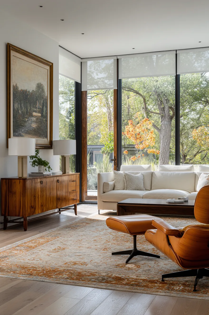
A successful mid-century modern living room in 2026 doesn’t require that every piece be authentic vintage – in fact, mixing vintage furniture with contemporary pieces often creates a more livable and personal space than a room that looks like a period museum.
The key is maintaining consistent proportions and materials. A new sofa with clean lines and exposed legs works alongside a vintage walnut credenza and a reproduction arc lamp as long as the scale and design language are compatible. What breaks the aesthetic is introducing furniture that has radically different proportions – an oversized contemporary sectional with hidden legs next to delicate vintage chairs, or a chunky modern coffee table next to refined vintage lounge chairs.
When you’re mixing eras, let the vintage pieces set the tone and choose contemporary pieces that defer to them. If you have an authentic Eames lounge chair, build the room around its scale and wood tone. Your new sofa should complement the chair, not compete with it. This approach creates rooms that feel collected over time rather than purchased all at once, which is ultimately more interesting and more authentic to how real homes evolve.
Understanding Scale And Proportion
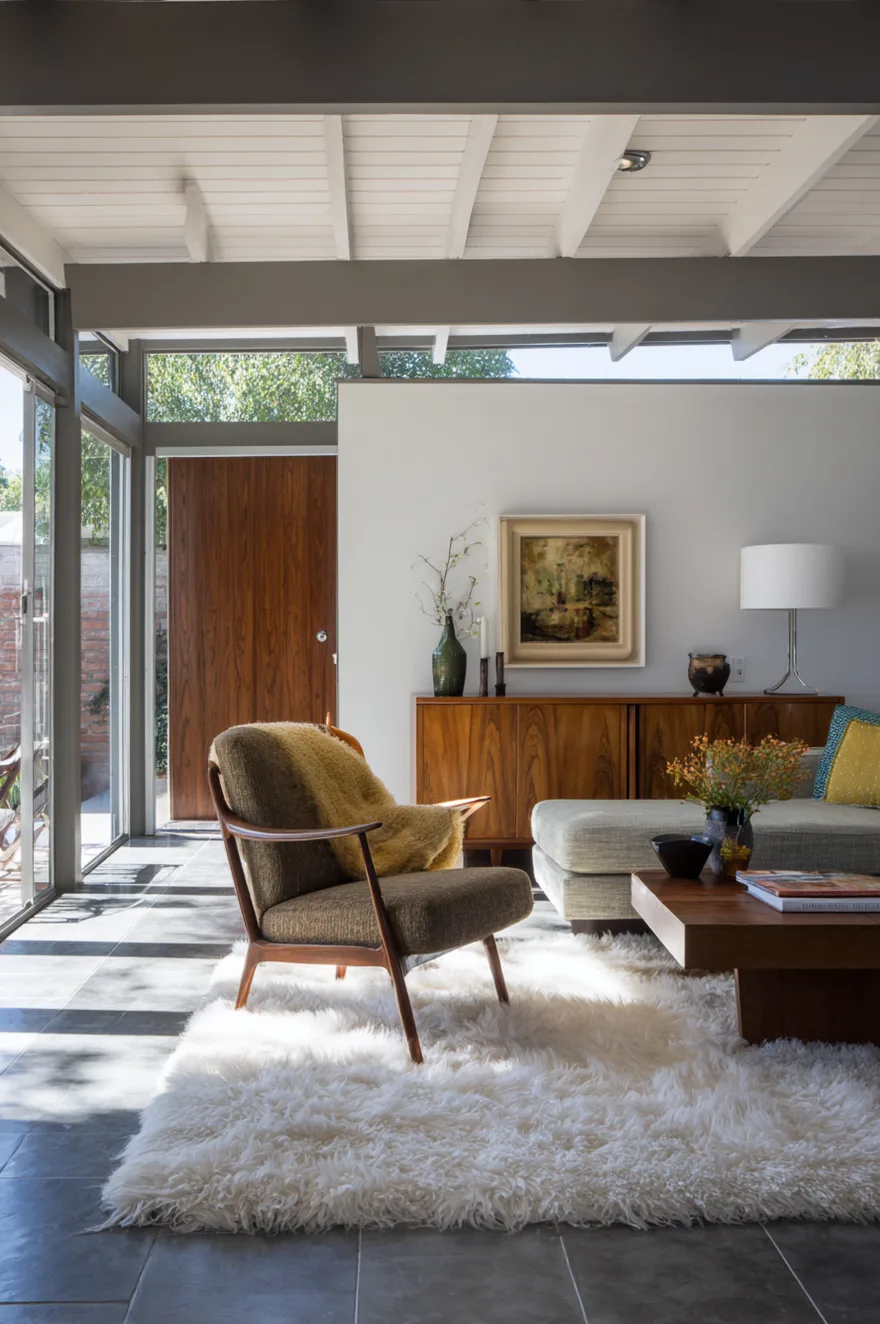
Mid-century modern furniture tends to sit lower and have slimmer profiles than contemporary furniture, which means getting the scale right is essential to making the aesthetic work. A room full of authentic mid-century pieces feels balanced because all the furniture shares similar proportions – low seats, horizontal emphasis, visible legs that create breathing room between furniture and floor.
When you’re selecting new furniture to work with vintage pieces or reproductions, pay close attention to seat height and leg height. A sofa with an 18-inch seat height works with lounge chairs that sit 16 inches off the ground. A sofa with a 22-inch seat height will dwarf those same chairs and make them look fragile or childlike. Similarly, coffee tables should sit at or just below seat height – typically 16 to 18 inches tall rather than the 20+ inches common in contemporary designs.
The horizontal emphasis matters too. Mid-century furniture tends to be wider and shallower than contemporary equivalents. A credenza might be 6 feet wide but only 18 inches deep. A sofa might be 7 feet long but have arms that are only 6 inches wide. These proportions create a sense of spaciousness even in small rooms because the furniture doesn’t protrude far into the space. When you substitute deeper contemporary pieces, the room starts to feel crowded even if you haven’t added more furniture.
Color Relationships Matter More Than Specific Colors
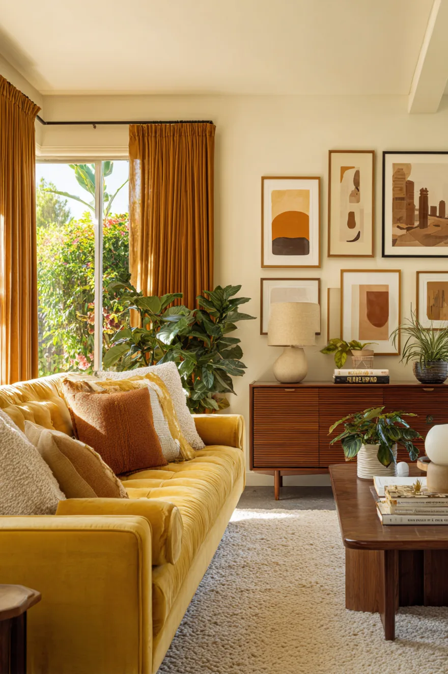
The exact shades of green, orange, or brown you choose matter less than how those colors relate to each other and to the wood tones in the room. A successful mid-century color palette has internal logic – the colors feel like they belong together because they share similar saturation levels and warm or cool undertones.
Start with your wood tone and build from there. Walnut has warm reddish-brown tones, which means colors with warm undertones – olive green (not kelly green), burnt orange (not bright red-orange), warm rust (not cool burgundy) – will harmonize naturally. If you’re working with teak, which is lighter and more golden, you can use slightly brighter or more saturated colors because the wood won’t compete.
Test colors against each other in the actual room at different times of day. A paint chip or fabric swatch that looks perfect under store lighting might read completely differently in your space with your specific light quality. The afternoon sun coming through your windows, the artificial lighting you’ve installed, even the reflection from nearby surfaces – all these factors affect how colors appear. Live with samples for a few days before committing to large purchases like sofas or paint colors.
Mid-Century Modern Living Room Curtains That Frame Views
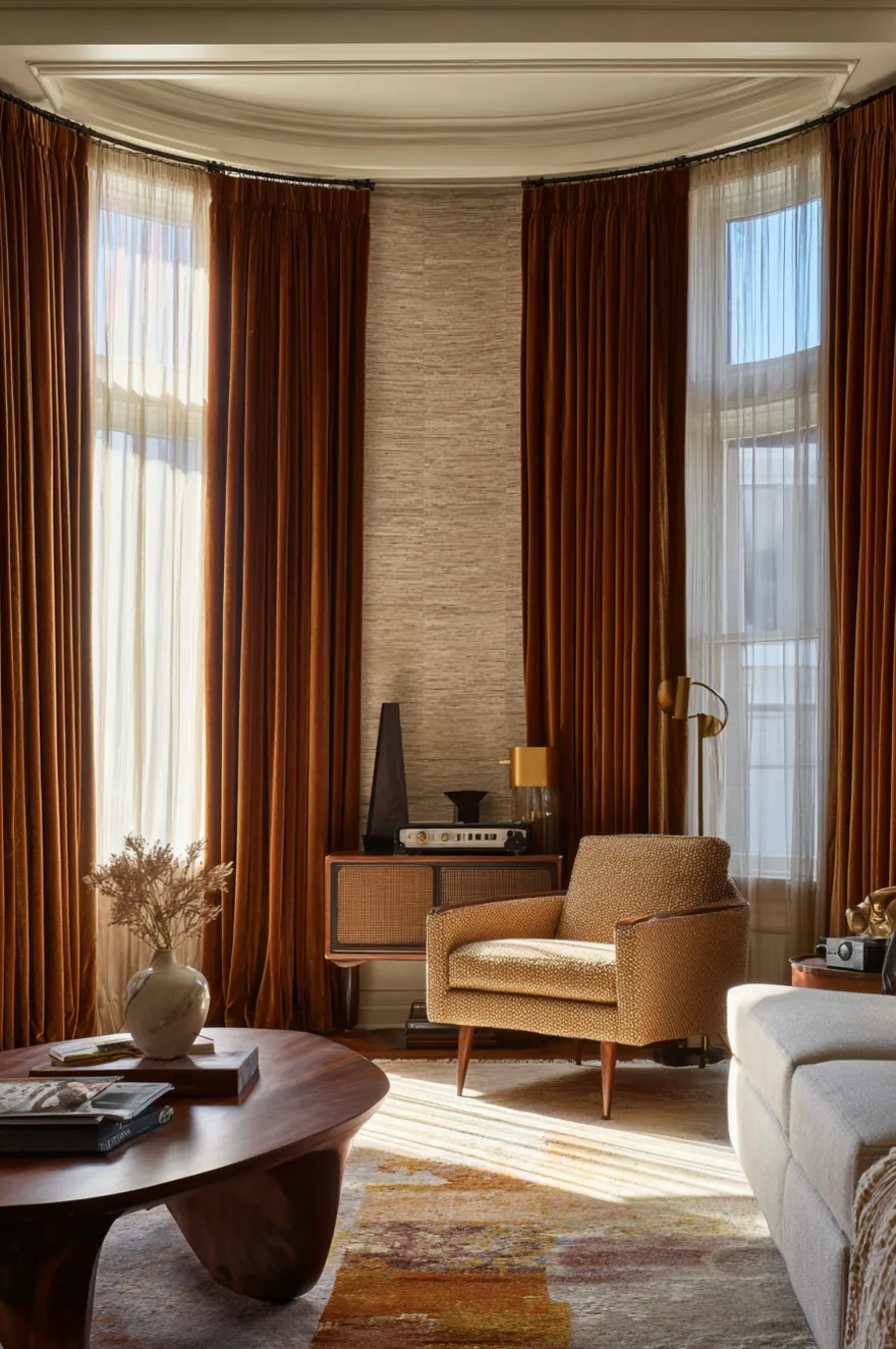
Window treatments in mid-century modern living rooms serve a dual purpose – they soften architectural lines while maintaining the connection to outdoor spaces that defines the era. The right curtains filter light without blocking views, and they add texture and warmth without overwhelming the clean lines of the furniture.
Floor-length curtains in natural materials work best. Look for linen, cotton, or linen-cotton blends in warm neutrals – cream, sand, rust, or terracotta. The color should complement your wall tone and wood furniture rather than contrasting sharply. Hang the curtains as close to the ceiling as possible using simple rods in brass, bronze, or wood, and let them puddle slightly on the floor for a relaxed, organic feel.
Layer sheer curtains with heavier panels if you need more light control. The sheers stay closed during the day to diffuse harsh sunlight while maintaining privacy, and the heavier panels can be drawn at night. This layered approach adds depth to the windows and creates interesting plays of light and shadow throughout the day. Skip valances, tiebacks, or fussy hardware – mid-century window treatments are about function and simplicity, not decoration.
Mid-Century Modern Living Room Furniture Arrangement For Conversation
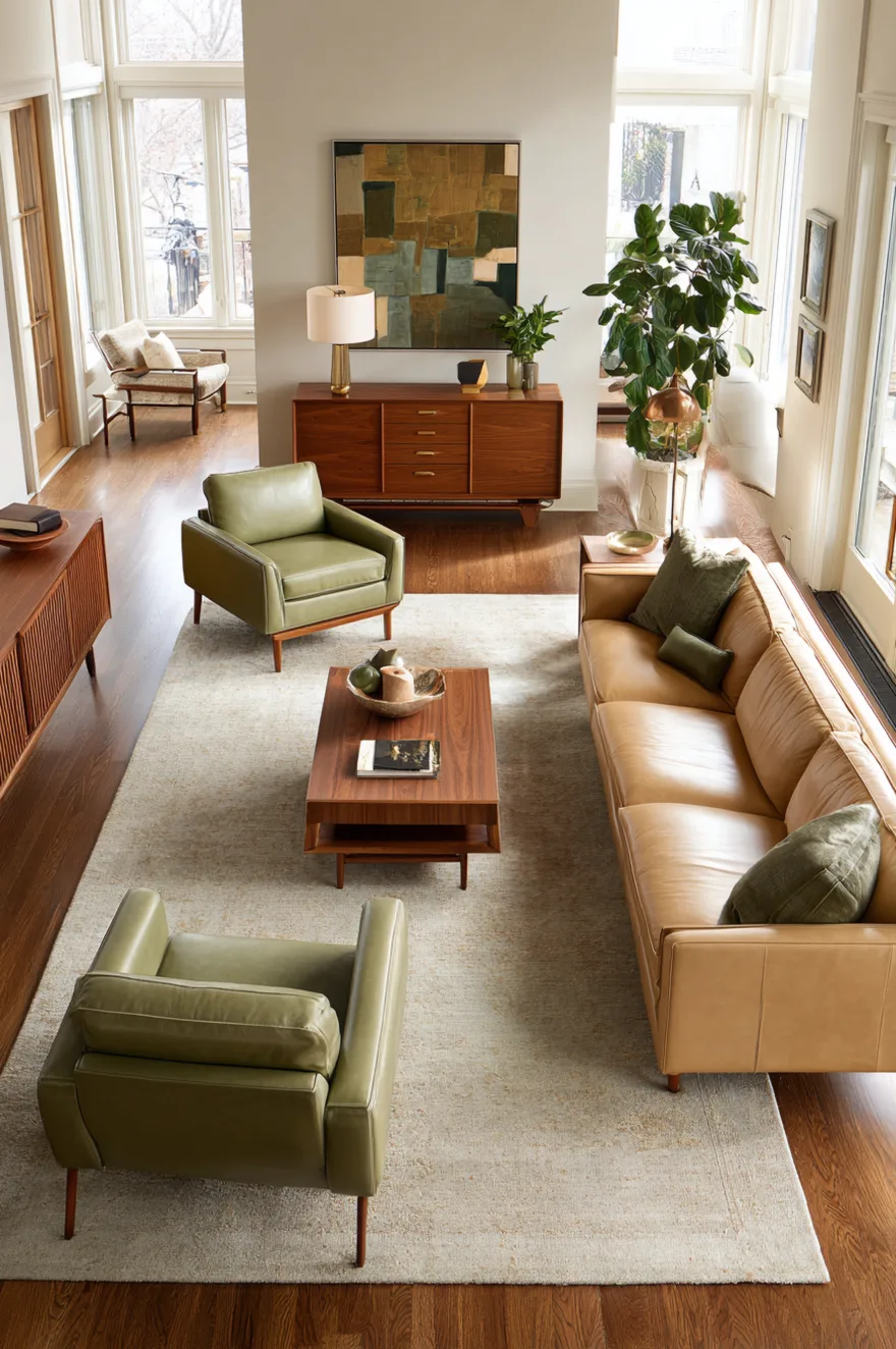
The furniture layout in a mid-century modern living room prioritizes conversation and connection over television viewing or formal symmetry. Chairs and sofas are arranged to face each other at comfortable distances, creating intimate zones where people can actually talk without shouting across the room.
Position your sofa and chairs in an L-shape or facing configuration rather than all lined up against the walls. The seating should be close enough that people can converse comfortably – typically 4 to 8 feet apart – but with enough space between pieces that the room doesn’t feel cramped. A coffee table sits in the center of the grouping within easy reach of all seating, serving as a focal point and functional surface.
Leave circulation space around the seating group so people can move through the room without squeezing between furniture. Mid-century layouts tend to float furniture away from walls, using area rugs to define the seating zone and leaving open floor space at the perimeter. This approach makes even small rooms feel more spacious because you’re not cramming furniture against every wall. The negative space becomes as important as the furniture itself in creating a sense of openness and flow.
Bringing It All Together
Mid-century modern living rooms work when you understand the underlying principles rather than just copying the look. Low-profile furniture with visible legs, warm wood tones in consistent species, a color palette built around earth tones with one or two saturated accents, geometric or abstract art, layered lighting at multiple heights, natural materials that add textural interest – these are the elements that create the aesthetic.
Start with the largest pieces – sofa, chairs, credenza – and make sure those get the proportions and materials right. Everything else can be added gradually as you find pieces that work with what you already have. A mid-century modern living room that evolves over time as you discover the right vintage coffee table or the perfect arc lamp will always feel more authentic than a room where everything arrives at once from a single retailer.
Which of these mid-century modern living room ideas resonates most with the space you’re working on? The beauty of this aesthetic is its flexibility – you can go all-in with saturated colors and bold patterns, or you can take a more restrained approach with neutral tones and minimal pattern. Either direction works as long as you’re consistent in how you apply the principles.
See you soon,
Rachel